
Vector data layers can be edited within QGIS Desktop. Editing allows you to add, delete, and modify features in vector datasets. The first step is to put the dataset into edit mode. Select the layer in the Layers panel and click on Toggle Editing under Layer. Alternatively, you can right-click on a layer in the Layers panel and choose Toggle Editing from the context menu. Multiple layers can be edited at a time. The layer currently being edited is the one selected in the Layers panel. Once you are in the edit mode, the digitizing toolbar (shown in the following screenshot) can be used to add, delete, and modify features:

From left to right, the tools in the digitizing toolbar are as follows:
The Current Edits tool allows you to manage your editing session. Here, you can save and roll back edits for one or more selected layers.
The Toggle Editing tool provides an additional means to begin or end an editing session for a selected layer.
The Save Layer Edits tool allows you to save edits for the selected layer(s) during an editing session.
The Add Features tool will change to the appropriate geometry, depending on whether a point, line, or polygon layer is selected. Points and vertices of lines and polygons are created by clicking on the map canvas. To complete a line or polygon feature, right-click. After adding a feature, you will be prompted to enter the attributes.
The Add circular string tool (enabled only when editing lines and polygons) allows you to add a line with a set radius. This tool has two options, accessed through the drop-down menu: Add circular string, and Add circular string by radius. The Add circular string tool allows you to create a circular string freehand by clicking to create two nodes, then dragging your mouse to create the arc. Add circular string by radius allows you to specify the radius of the string numerically.
The Move Feature(s) tool lets you move features by clicking on them and dragging them to the new position.
The Node Tool lets you move individual feature vertices. Click on a feature once with the tool to select it and the vertices will change into red boxes. Click again on an individual vertex to select it. The selected vertex will turn into a dark-blue box. Now, the vertex can be moved to the desired location. Additionally, edges between vertices can be selected and moved. To add vertices to a feature, simply double-click on the edge where you want the vertex to be added. Selected vertices can be deleted by pressing the Delete key on the keyboard.
Features can be deleted, cut, copied, and pasted using the Delete Selected, Cut Features, Copy Features, and Paste Features tools.
Snapping is an important editing consideration. It is a specified distance (tolerance) within which vertices of one feature will automatically align with vertices of another feature. The specific snapping tolerance can be set for the whole project or per layer. The method for setting the snapping tolerance for a project varies according to the operating system, which is as follows:
For Windows, navigate to Settings | Options | Digitizing
For Mac, navigate to QGIS | Preferences | Digitizing
For Linux, navigate to Edit | Options | Digitizing
In addition to setting the snapping tolerance, here the snapping mode can also be set to vertex, segment, or vertex and segment. Snapping can be set for individual layers by navigating to Settings | Snapping options. Individual layer snapping settings will override those of the project. The following screenshot shows examples of multiple snapping option choices:

Note that there are also checkboxes for Enable topological editing and Enable snapping on intersection, which are covered in more detail in Chapter 6, Advanced Data Creation and Editing.
Tip
There are many digitizing options that can be set by navigating to Settings | Options | Digitizing. These include settings for Feature Creation, Rubberband, Snapping, Vertex markers, and Curve Offset Tool. There is also an Advanced Digitizing toolbar, which is covered in Chapter 6, Advanced Data Creation and Editing.
When you load spatial data layers into QGIS Desktop, they are styled with a random single symbol rendering. To change this, navigate to Layer | Properties | Style.
There are several rendering choices available from the menu in the top-left corner, which are as follows:
Single Symbol: This is the default rendering in which one symbol is applied to all the features in a layer.
Categorized: This allows you to choose a categorical attribute field to style the layer. Choose the field and click on Classify, and QGIS will apply a different symbol to each unique value in the field. You can also use the Set column expression button to enhance the styling with a SQL expression.
Graduated: This allows you to classify the data by a numeric field attribute into discrete categories. You can specify the parameters of the classification (classification type and number of classes) and use the Set column expression button to enhance the styling with a SQL expression.
Rule-based: This is used to create custom rule-based styling. Rules will be based on SQL expressions.
Point Displacement: If you have a point layer with stacked points, this option can be used to displace the points so that they are all visible.
Inverted Polygons: This is a new renderer that allows a feature polygon to be converted into a mask. For example, a city boundary polygon that is used with this renderer would become a mask around the city. It also allows the use of Categorized, Graduated, and Rule-based renderers and SQL expressions.
Heatmap: This allows you to create a heat map rendering of point data based on an attribute.
2.5 D: This allows you to extrude data into 2.5 D space. A common use case is to extrude building footprints upward, creating an almost 3D rendering.
The following screenshot shows the Style properties available for a vector data layer:

In the preceding screenshot, the renderer is the layer symbol. For a given symbol, you can work with the first level, which gives you the ability to change the transparency and color. You can also click on the second level, which gives you control over parameters such as fill, border, fill style, border style, join style, border width, and X/Y offsets. These parameters change depending on the geometry of your layer. You can also use this hierarchy to build symbol layers, which are styles built from several symbols that are combined vertically.
You also have many choices when styling raster data in QGIS Desktop. There is a different choice of renderers for raster datasets, which are as follows:
Multiband color: This is for rasters with multiple bands. It allows you to choose the band combination that you prefer.
Paletted: This is for singleband rasters with an included color table. It is likely that it will be chosen by QGIS automatically, if this is the case.
Singleband gray: This allows a singleband raster or a single band of a multiband raster to be styled with either a black-to-white or white-to-black color ramp. You can control contrast enhancement and how minimum and maximum values are determined.
Singleband pseudocolor: This allows a singleband raster to be styled with a variety of color ramps and classification schemes.
The following is a screenshot of the Style tab of a raster file's Layer Properties, showing where the aforementioned style choices are located:

Another important consideration with raster styling is the settings that are used for contrast enhancement when rendering the data. Let's start by loading the Jemez_dem.img image and opening the Style menu under Layer Properties (shown in the following figure). This is an elevation layer and the data is being stretched on a black-to-white color ramp from the Min and Max values listed under Band rendering. By default, these values only include those that are from 2 percent to 98 percent of the estimation of the full range of values in the dataset, and cut out the outlying values. This makes rendering faster, but it is not necessarily the most accurate.
Next, we will change these settings to get a full stretch across all the data values in the raster. To do this, perform the following steps:
Under the Load min/max values section, choose Min / max and under Accuracy, choose Actual (slower).
Click on Load.
You will notice that the minimum and maximum values change. Click on Apply.
As shown in the following figure, by enhancing the contrast, the raster is displayed with much more detail, and is more visually attractive, too:
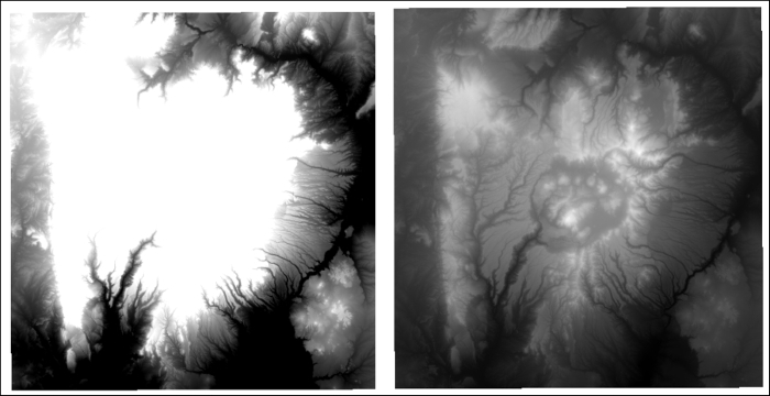
Default singleband contrast enhancement (left) and more accurate contrast enhancement (right)
You can specify the default settings for rendering rasters by navigating to Settings | Options | Rendering. Here, the defaults for the Contrast enhancement, Load min/max values, and Cumulative count cut thresholds, and the standard deviation multiplier, can be set.
The blending modes allow for more sophisticated rendering between GIS layers. Historically, these tools have only been available in graphics programs and they are a fairly new addition to QGIS. Previously, only layer transparency could be controlled. There are now 13 different blending modes that are available: Normal, Lighten, Screen, Dodge, Addition, Darken, Multiply, Burn, Overlay, Soft light, Hard light, Difference, and Subtract. These are much more powerful than simple layer transparency, which can be effective but typically results in the underneath layer being washed out or dulled. With blending modes, you can create effects where the full intensity of the underlying layer is still visible. Blending mode settings can be found at the bottom of the Style menu under Layer Properties in the Layer Rendering section (for vectors) and Color rendering section (for rasters).
As an example of using blending modes, we will show vegetation data (Jemez_vegetation.tif) in combination with a hillshade image (Jemez_hillshade.img). Both datasets are loaded and the vegetation data is dragged to the top of the layer list. Vegetation is then styled with a singleband pseudocolor renderer; you can do this by performing the following steps:
Choose Random colors.
Set Mode to Equal interval.
Set the number of Classes to 13.
Click on Classify.
Click on Apply.
The following screenshot shows what the Style properties should look like after following the preceding steps:

At the bottom of the Style menu, under Layer Properties, set the Blending mode to Multiply and the Contrast to 45, and click on Apply. The blending mode allows all the details of both the datasets to be seen. Experiment with different blending modes to see how they change the appearance of the image. The following screenshot shows an example of how blending and contrast settings can work together to make a raster pop off the screen:
