Book Image

Tabular Modeling with SQL Server 2016 Analysis Services Cookbook

By : Derek Wilson
Book Image

Tabular Modeling with SQL Server 2016 Analysis Services Cookbook

By: Derek Wilson

Overview of this book

SQL Server Analysis Service (SSAS) has been widely used across multiple businesses to build smart online analytical reporting solutions. It includes two different types of modeling for analysis services: Tabular and Multi Dimensional. This book covers Tabular modeling, which uses tables and relationships with a fast in-memory engine to provide state of the art compression algorithms and query performance. The book begins by quickly taking you through the concepts required to model tabular data and set up the necessary tools and services. As you learn to create tabular models using tools such as Excel and Power View, you’ll be shown various strategies to deploy your model on the server and choose a query mode (In-memory or DirectQuery) that best suits your reporting needs. You’ll also learn how to implement key and newly introduced DAX functions to create calculated columns and measures for your model data. Last but not least, you’ll be shown techniques that will help you administer and secure your BI implementation along with some widely used tips and tricks to optimize your reporting solution. By the end of this book, you’ll have gained hands-on experience with the powerful new features that have been added to Tabular models in SSAS 2016 and you’ll be able to improve user satisfaction with faster reports and analytical queries.
Table of Contents (18 chapters)
Tabular Modeling with SQL Server 2016 Analysis Services Cookbook
Credits
About the Author
About the Reviewer
www.PacktPub.com
Customer Feedback
Preface

Editing visualization properties in Power BI


There are many properties that you can modify to change the appearance of your visualizations. These properties allow you to modify properties such as background, title, borders, and colors. In this recipe you will modify the stacked bar chart to understand how properties affect the visualization.

Getting ready

Complete the initial visualization in the recipe Visualizing the crash data in Power BI.

How to do it...

  1. Select the graph and click on the paint roller icon under the Visualization to bring up the Properties window:

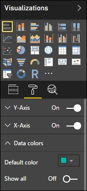
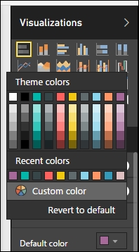
  2. Select the data colors and click the down arrow to show the available properties to change. On the Default color select the drop down and change the color to purple to change the bar graph colors:

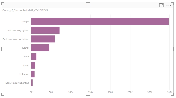
  3. The chart is now updated to reflect the new color:

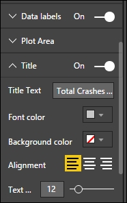
  4. Next expand the Title property to change the Title Text to Total Crashes based on Reported Light Condition and increase the Text Size to 12:

  5. Now to show the values of each bar chart...