

The chart command is useful for turning data across two dimensions. It is useful for both tables and charts. Let's start with one of our examples from stats:
sourcetype="tm1*" error | chart count over date_month by date_wday
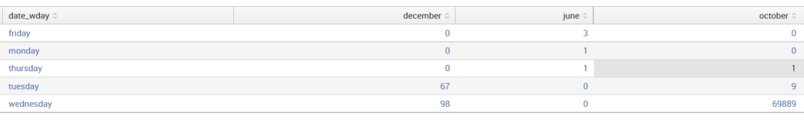
The resultant table looks like this:

If you look back at the results from stats, the data is presented as one row per combination. Instead of a row per combination, chart generates the intersection of the two fields. You can specify multiple functions, but you may only specify one field each for over and by.
Switching the fields (by rearranging our search statement a bit) turns the data the other way:
By simply clicking on the Visualization tab (to the right of the Statistics tab), we can see these results in a chart:

This is an Area chart, with particular format options set. Within the chart area, you can click on Area to change the chart type (Line, Area, Column, Bar, and so on) or Format to change the format options (Stack, Null Values, Multi-series...