

In this recipe, you will learn how to create a dual-axis map. We will build on what we learned in the Building a map recipe and learn how to implement a dual axis.
Building a dual-axis map
Getting ready
Connect to the Baby_names.csv dataset and open a new worksheet.
How to do it...
- Drag and drop State from Dimensions into the worksheet workspace so that a basic map appears.
- Drag and drop Latitude (generated) from Measures into the Rows shelf to the right of the Latitude (generated) pill, which is already there:
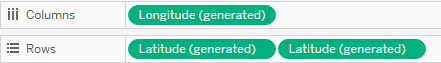
Now we have two maps, one beneath the other. Also, notice how new sections have appeared in the Marks card. There is the All section, followed by Latitude (generated), which refers to the upper map, and Latitude (generated) (2), which refers to the bottom map:
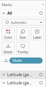
- Click on the second section, Latitude (generated), in the Marks card to expand it.
- Drag and drop Frequency from Measures onto Color:
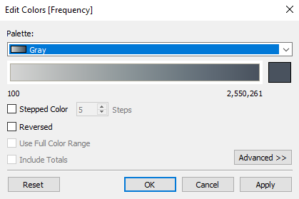
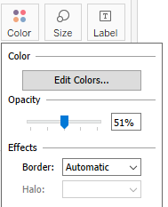
- Click on the Color button and select Edit Colors….
- From the Palette drop-down menu, select Gray, and click on OK:
- Click on the Color button again, and use the slider to decrease the opacity to around 51%:
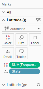
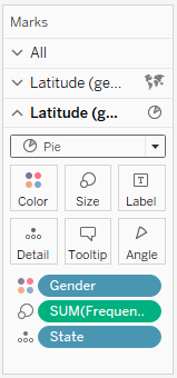
- Click on the third section, Latitude (generated) (2), to expand it. In it, drag and drop Gender from Dimensions onto Color.
- Drag and drop Frequency from Measures onto Size.
- Click on the Automatic drop-down menu and change the mark type to Pie:
- Let's set the dual axis. In the Rows shelf, hover over the second Latitude (generated) pill so that a small white arrow appears on it:
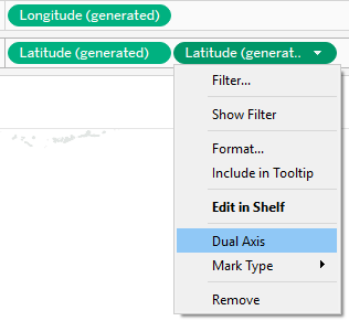
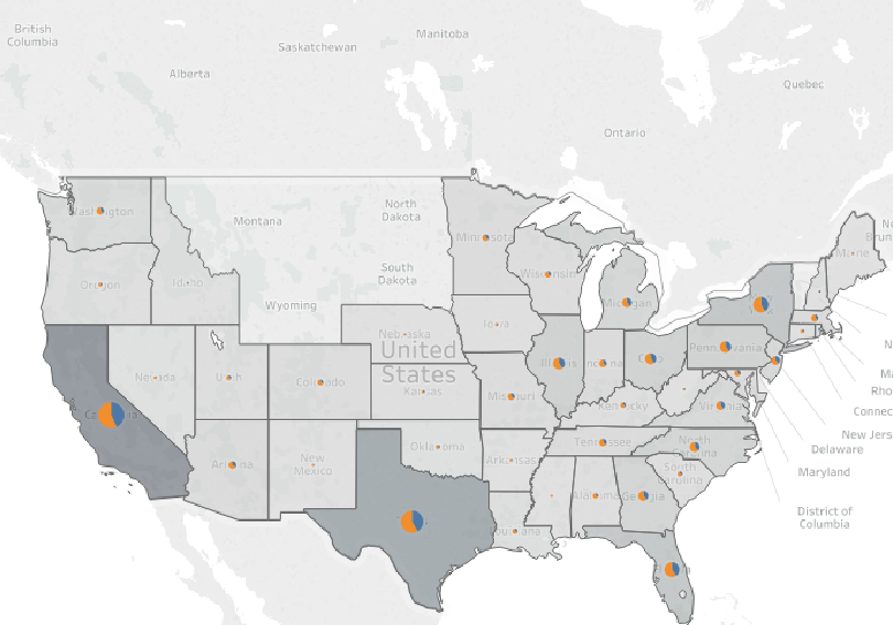
- Click on the arrow, select Dual Axis, and you will get the following result:
How it works...
Adding the Latitude measure to the Rows shelf twice duplicates our view, making two maps instead of one. The two maps initially have the same specifications in the Marks card and State in Detail. However, we then build them separately by adding different dimensions and measures on each of them, and they show different information. We have finally implemented the dual axis, and we have also made the maps overlap. We ended up with one map that has two layers.
There's more...
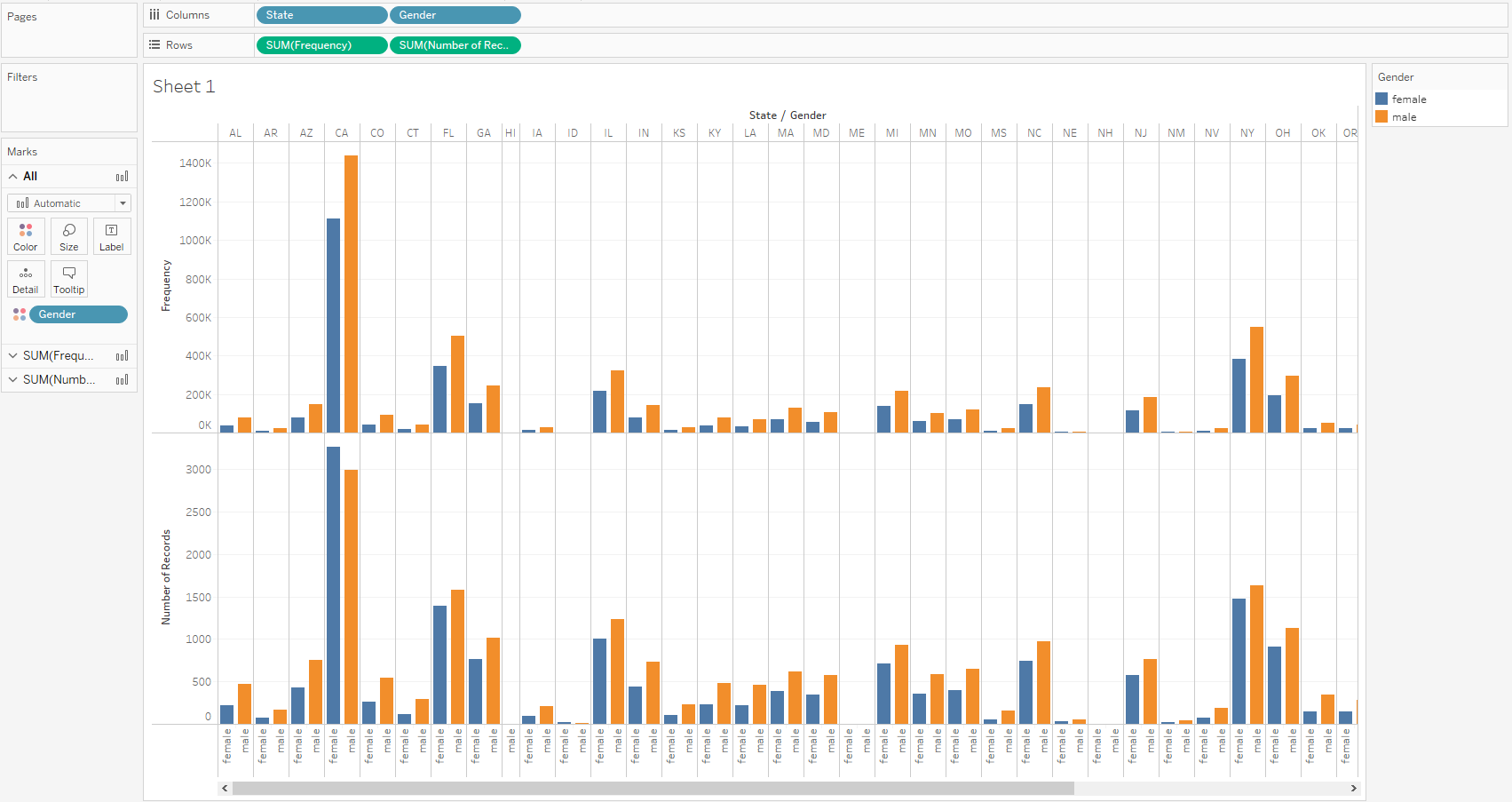
The dual axis can be implemented with different types of visualizations, not just maps. In the following example, we can see two different measures in the rows so that the upper bar chart shows Frequency and the lower chart shows Number of Records:
If we implement dual axis, both measures will be displayed in one chart:
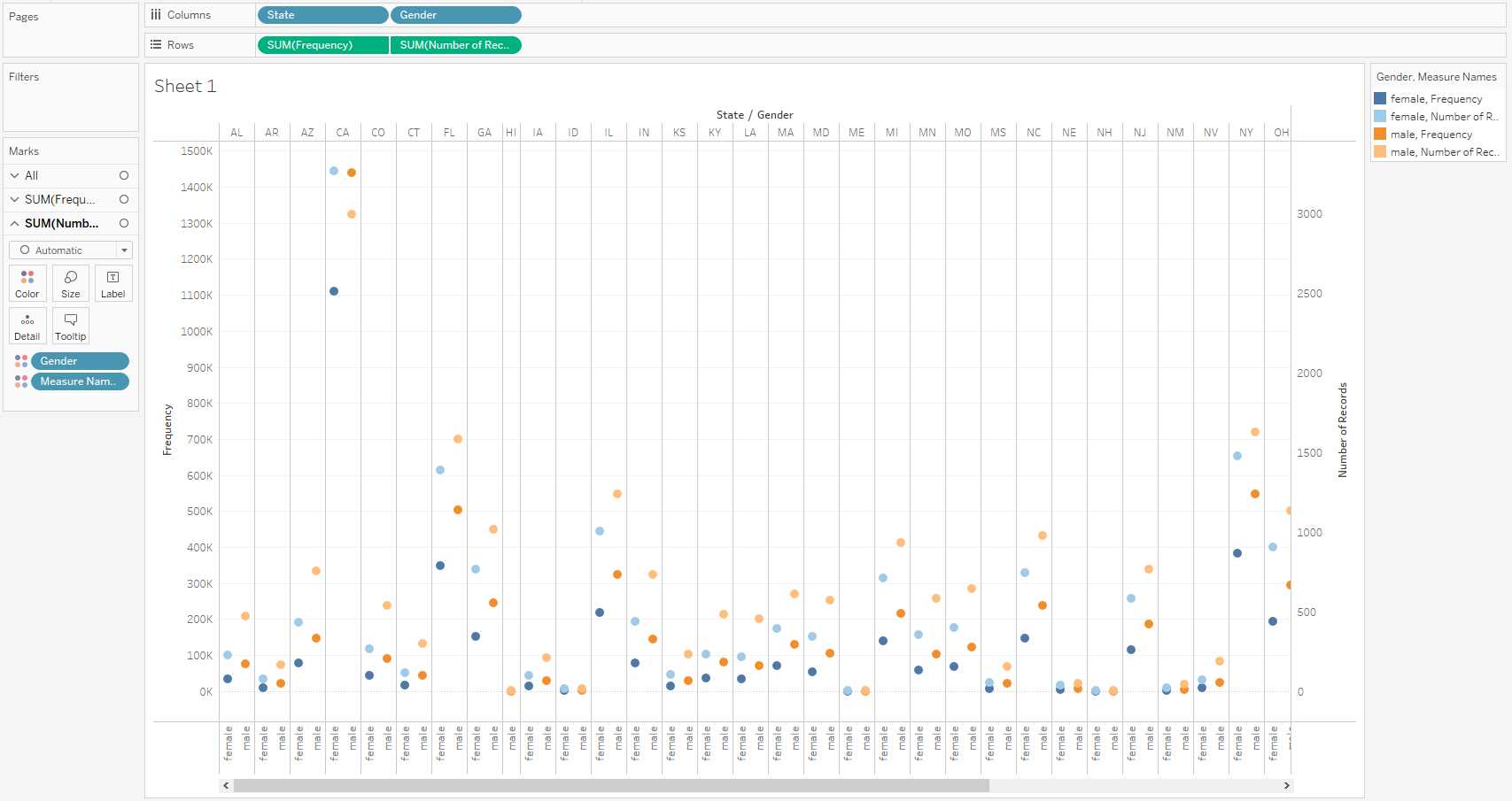
However, we must notice that the new chart has two y axes on each side—one showing Frequency and the other showing Number of Records. The axes are very different, as these two measures have different scales, thus showing that the same scale would make the measure with the narrower scale, in this case, Number of Records, look flat on the chart. However, Tableau does offer an option for synchronizing the axes, which is useful when the scales are similar.
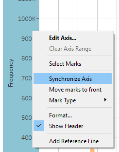
To implement it, right-click on any of the two y axes and select Synchronize Axis:
See also
- For more information, see the Tableau Knowledge Base article on dual axis: https://kb.tableau.com/articles/howto/dual-axis-bar-chart-multiple-measures