
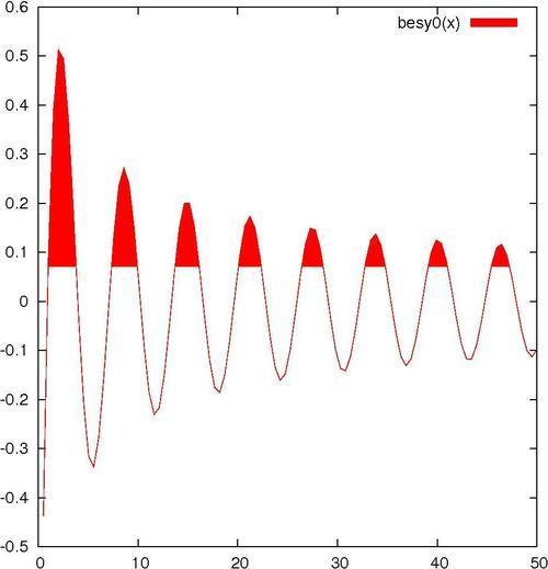
When you want to highlight the difference between two curves or datasets, or show when your data values exceed some reference value, the filled curve style, with some encouragement, can be made to serve. The following figure shows an example of filled curves:
For the main recipe, you should be ready to go. If you want to try the commands for creating the second plot in this section, as shown in the next figure, you need another datafile intersection, which we have provided. This consists of the numerical output of a program that simply calculated the coordinates of a straight line and a parabola. You can substitute your own data, as long as it is the format described in the following There's more... section.
The following command creates the previous figure:
plot [0:50] besy0(x) with filledcurves above y1=0.07
This simple use of the filledcurves style colors in the area showing when the plotted Bessel function exceeds 0.07. We let gnuplot use the default color and shading style.
You can change the color (to blue, for example) by appending lt rgb blue to the plotting command. If you want to change the fill style to use a pattern rather than a solid color, precede the plotting command with the following command:
set style fill pattern n
In this command n is an integer that specifies the fill style from those available in your terminal. To see a list of these, just issue the command test.
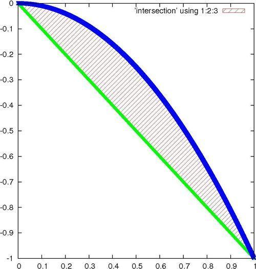
Suppose you are plotting data from a file, and the data is arranged in a table in the following format:
x1 y1 z1
x2 y2 z2
x3 y3 z3
...
You can fill in the difference between the two curves y versus x and z versus x with the following command:
plot <'file'> using 1:2:3 with filledcurves
Following is the complete script for creating the plot shown in the previous figure:
set style fill pattern 5
plot 'intersection' using 1:2:3 with filledcurves,\'' using 1:2 lw 3 notitle, '' using 1:3 lw 3 notitle
This plot shows the difference between a parabola and a straight line.
The fill pattern is similar to what you will get with the X11, Postscript, and some other terminals, but, as with all patterns and styles selected by an index number, this is dependent on the terminal. On the Macintosh using the Aquaterm terminal, for example, all the fill patterns are solid colors, and selecting an index merely changes the color.
The plot command used here exploits some features that we have not covered before. The using keyword selects the column from the datafile; using 1:2:3 means to plot all columns, and the filledcurves style knows how to fill in the difference between the curves in this case. After this, we plot the parabola and line separately, using a blank filename to select the previous name. The purpose of the last two plot components of the command is to plot the thick lines that delimit the filled area; the lw 3 chooses the line thickness, and the notitle tells gnuplot not to add an entry into the legend for these plot components, which would be redundant.
But what if you want to make something similar to the previous figure without making an intermediate datafile? You can make a plot that fills the area between two functions by using gnuplot's special filenames. This is a facility that allows you to do things that normally can only be done with datafiles right on the command line or in a script, without having to make a datafile.
Following is another way to get the previous figure:
set style fill pattern 5
plot [0:1] '+' using 1:(-$1):(-$1**2) with filledcurves,\-x lw 3 notitle, -x**2 lw 3 notitle
The + refers to a fictitious datafile where the first column consists of the automatically calculated sample points.
We've already encountered another of gnuplot's special files, the file called '' (an empty string), which refers to the previously named datafile, and we used it to avoid having to type its name multiple times.