Book Image

SAP BusinessObjects Dashboards 4.0 Cookbook

Book Image

SAP BusinessObjects Dashboards 4.0 Cookbook

Overview of this book

Xcelsius 2008 was recently included in SAP’s BusinessObjects 4.0 family, rebranding “Xcelsius Enterprise” as “SAP BusinessObjects Dashboards 4.0”. With features like flexible design and what-if scenarios, the powerful dashboarding software allows enterprises to make business decisions at a glance, and this book allows you to go far beyond the basics of these techniques. This cookbook full of practical and applicable recipes will enable you to use the full latest capabilities of Dashboard Design to visually transform your business data. A wide range of recipes will equip you with the knowledge and confidence to perform tasks like configuring charts, creating drill- downs, making component colors dynamic, using alerts in maps, building pop-up screens, setting up What-If scenarios, and many more.The recipes begin by covering best practices for using the Dashboard Design spreadsheet, the data-model, and the connection with the components on the canvas, later moving on to some from-the-trenches tricks for using Excel within Dashboard Design. The book then guides you through the exploration of various data visualization components and dashboard interactivity, as well as offering recipes on using alerts, dashboard connectivity, and making the most of the aesthetics of the dashboard. Finally, the recipes conclude by considering the most important add-ons available for Dashboard Design and enabling you to perform relevant and useful tasks straight away.
Table of Contents (22 chapters)
SAP BusinessObjects Dashboards 4.0 Cookbook
Credits
Foreword
About the Authors
Acknowledgement
Acknowledgement
About the Reviewers
www.PacktPub.com
Preface
Index

Adding a line chart to your dashboard


A line chart is very useful to visualize data that changes over time. It consists of a set of data points that are connected by a line. The horizontal x-axis typically shows the categories in which the data is divided. The vertical y-axis shows us the values.

This recipe shows how to add a line chart to a dashboard and how to link it to the data in the spreadsheet. Also, we will discuss the components that are similar to the line chart component—Bar chart, column chart, area chart, and stacked charts.

Getting ready

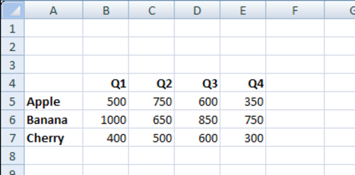
Open a new Dashboard Design file and enter the data into the spreadsheet, as shown in the following screenshot:

How to do it...

  1. Drag a Line Chart component from the Components browser into the canvas.

    Tip

    You can also click on the Line Chart component in the Components browser, move your cursor to the canvas area (the arrow will now change into a cross), and click again. You can use whatever method you prefer.

  2. Select the Line Chart component you...