Book Image

SAP BusinessObjects Dashboards 4.0 Cookbook

Book Image

SAP BusinessObjects Dashboards 4.0 Cookbook

Overview of this book

Xcelsius 2008 was recently included in SAP’s BusinessObjects 4.0 family, rebranding “Xcelsius Enterprise” as “SAP BusinessObjects Dashboards 4.0”. With features like flexible design and what-if scenarios, the powerful dashboarding software allows enterprises to make business decisions at a glance, and this book allows you to go far beyond the basics of these techniques. This cookbook full of practical and applicable recipes will enable you to use the full latest capabilities of Dashboard Design to visually transform your business data. A wide range of recipes will equip you with the knowledge and confidence to perform tasks like configuring charts, creating drill- downs, making component colors dynamic, using alerts in maps, building pop-up screens, setting up What-If scenarios, and many more.The recipes begin by covering best practices for using the Dashboard Design spreadsheet, the data-model, and the connection with the components on the canvas, later moving on to some from-the-trenches tricks for using Excel within Dashboard Design. The book then guides you through the exploration of various data visualization components and dashboard interactivity, as well as offering recipes on using alerts, dashboard connectivity, and making the most of the aesthetics of the dashboard. Finally, the recipes conclude by considering the most important add-ons available for Dashboard Design and enabling you to perform relevant and useful tasks straight away.
Table of Contents (22 chapters)
SAP BusinessObjects Dashboards 4.0 Cookbook
Credits
Foreword
About the Authors
Acknowledgement
Acknowledgement
About the Reviewers
www.PacktPub.com
Preface
Index

Data insertion with the Source data component


The Source Data component enables us to insert data into spreadsheet cells by changing the selected index value of the component. This is a different approach to inserting data than we saw in Chapter 3 when we were discussing selectors and drill downs.

Getting ready

Open a new dashboard design file and enter the data into the spreadsheet as shown in the following screenshot:

How to do it...

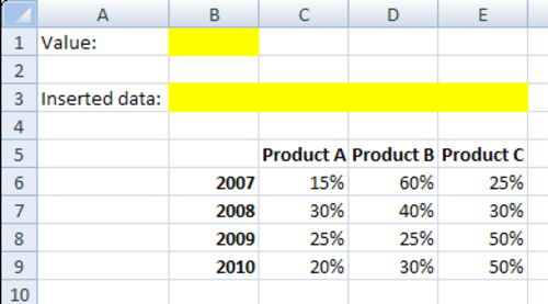
  1. Drag a pie chart component to the canvas.

  2. Bind the Chart field to cell B3 and leave the Subtitle field empty.

  3. Bind the Data Values field to the spreadsheet range from C3 to E3. Select the Data in Rows options.

  4. Bind the Labels field to cells C5 to E5.

  5. Drag a horizontal slider component to the canvas.

  6. Bind the Data field to cell B1.

  7. Set the Minimum Limit to 0 and the Maximum Limit to 3.

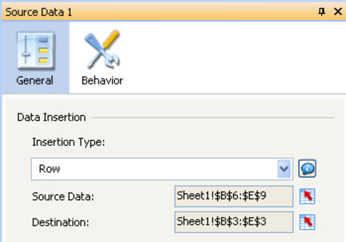
  8. Now drag the source data component to the canvas.

  9. Select Insertion Type Row.

  10. Bind the Source Data field to cell range B6 to E9.

  11. Bind the Destination field to cells B3 to E3.

  12. Go to the Behavior...