

In the next two recipes, we want to create a better way of representing the data found in this Wikipedia article: http://en.wikipedia.org/wiki/Letter_frequency.
The idea is to create a 3D graph of the frequency with which letters are used in various languages and to overlay this graph on an actual keyboard image, so the letters that are used the most are represented by keys that stick out more from the base keyboard, as shown in the following screenshot:
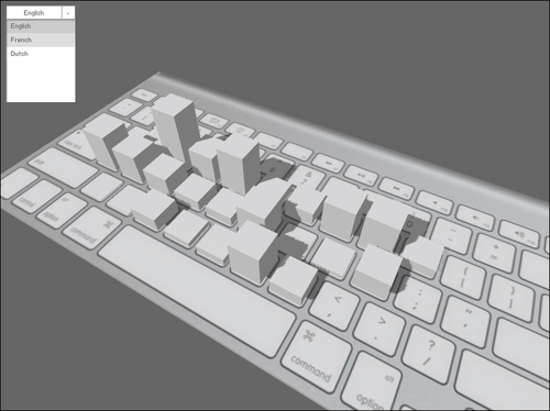
We will create this in two steps: in the first recipe, we'll look at how to create the 3D model of the keyboard and the bars. In the second recipe, we'll add the actual data to the chart.
This chapter will use the
Away3D 4 library. So to get started, you should set up your workspace, exactly as in the previous chapter. Also copy over the Main and Graph3D classes from the Graphing a function in three dimensions recipe in Chapter 9, Creating Three-Dimensional Graphs.