

A Highcharts' chart is composed of several parts, which could be mandatory or optional parts depending on the chart that you will create. In this section, we will show you the main elements that are composing a Highcharts' chart, and we will reuse the chart, previously created in order to illustrate these different core concepts.
For each Highcharts' chart, you can set a title and a subtitle. In the previous section, we have already declared the chart with the title Sales by city. We will now add a subtitle section with the text Statistics of 2012.
Add the subtitle section and set the text to Statistics of 2012:
subtitle: {
   text: 'Statistics of 2012'
}
You should have the expected result as shown in the following chart:

In the credits parts, you will be able to set the source or the copyright of your chart. By default, it is set to Highcharts.com. We will change this default value to Packt Publishing. The URL of the credit by default is http://www.highcharts.com, but you can change it by setting the href parameter with your own URL. We will change this value with http://www.packtpub.com.
Add the credit section and set the text to
Packt Publishingand set thehrefsection withhttp://www.packtpub.com:credits: { text: 'Packt Publishing', href: 'http://www.packtpub.com' }You should have the expected result as shown in the following chart:

The series section is a mandatory one of Highcharts, which you will have to include for every chart, that you will create. A series is simply a set of data that will be defined with a name and an array of data. We will now modify the previous series section by adding another section that will represent the sales of two different years for the three cities already defined:
Rename the previous
serieswith the name2011and add anotherserieswith the name2012and a new set of data:series: [{ name: '2011', data: [1000, 2500, 1500] }, { name: '2012', data: [1200, 2200, 1700] }]You should have the expected result as shown in the following chart:

The axes sections will be set for some charts, such as line and column charts, but will not be included for charts, such as pie charts or donut charts. Axes are divided into two types: Y Axes and X Axes. Then, each axis is divided into four categories:
Linear Axis: This category of axis will use a linear scale like our Y Axis.
Logarithmic Axis: This category of axis will follow a logarithmic scale.
Category Axis: This axis will display different categories of data. Our X-Axis is a category axis.
Time Axis: You will have to use this category of axis when you want to represent your data along a time axis.
By default, the axis is calculated automatically, but you can set a minimum or maximum value if you set the 'min' and 'max' parameters of your axis. Then, you can add plot lines and plot bands for each of your axes. Plot lines and plot bands can be used when you want to display a limit or when you want to point out some parts of your axis.
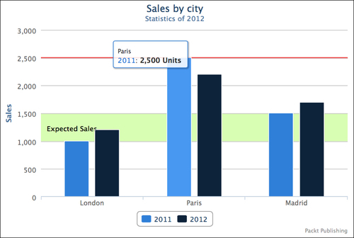
For our chart, we will add a plot line, which will represent the best sales of the company and a plot band, which will represent the expected sales:
For the plot line, we add our element inside the
plotLinessection of our Y Axis with a red color set in hexadecimal format with a width of2pixels and a value set to2500.plotLines: [{ color: '#FF0000', width: 2, value: 2500 }]Then, for the plot band, we add our element inside the
plotBandssection of our Y Axis with a green color set in RGBA format from the values1000to1500. The fourth parameter of ourrgbafunction will allow us to have a bit of transparency. This parameter has to be set between zero (Transparent) and one (Opaque). We will also add a label with a text set toExpected Sales.plotBands: [{ color: 'rgba(124,252,0, 0.3)', from: 1000, to: 1500, label: { text: 'Expected Sales' } }]For your
yAxis, you should have the following code:yAxis: { title: { text: 'Sales' }, plotLines: [{ color: '#FF0000', width: 2, value: 2500 }], plotBands: [{ color: 'rgba(124,252,0, 0.3)', from: 1000, to: 1500, label: { text: 'Expected Sales' } }] }You should have the expected result as shown in the following chart:

The tool tip element appears when you are pointing your mouse over an element. Highcharts sets a default tool tip, but you can override it by setting a new template. In our example, we will modify the tool tip by adding a measurement unit, which will simply be Units in our case.
Add the
tooltipsection and set the parametervalueSuffixwith the valueUnits. This parameter defines the text that will be added at the end of the number.tooltip: { valueSuffix: 'Units' }You should have the expected result as shown in the following chart:
The chart legend can be displayed by default on some Highcharts' charts. Nevertheless, you can hide or customize the legend. In order to retrieve some space in our chart, we will change the legend position to the top right side of the chart.
Add the
legendsection. Set thealignparameter to the right andverticalAlignto the top, in order to move the legend to the top right side. Then, set thefloatingparameter totrue. This parameter will be used in order to have the legend over our chart.legend: { align: 'right', verticalAlign: 'top', floating: true }You should have the expected result as shown in the following chart:

The final code looks like:
$(function () {
var chart = $('#myFirstChartContainer').highcharts({
chart: {
type: 'column'
},
title: {
text: 'Sales by city'
},
subtitle: {
text: 'Statistics of 2012'
},
credits: {
   text: 'Packt Publishing',
   href: 'http://www.packtpub.com'
},
xAxis: {
categories: ['London', 'Paris', 'Madrid']
},
yAxis: {
title: {
text: 'Sales'
},
plotLines: [{
color: '#FF0000',
width: 2,
value: 2500
}],
plotBands: [{
color: 'rgba(124,252,0, 0.3)',
from: 1000,
to: 1500,
label: {
text: 'Expected Sales'
}
}]
},
tooltip: {
valueSuffix: ' Units'
},
legend: {
align: 'right',
verticalAlign: 'top',
floating: true
},
series: [{
       name: '2011',
       data: [1000, 2500, 1500]
   },
   {
       name: '2012',
       data: [1200, 2200, 1700]
}]
});
});At the end of this section, you have created the main elements that comprise a chart, and you will now be able to reuse it to any charts that you would want to create.