

As you start to use Highcharts, you will realize that there are a wide variety of things that you can do with it. This section will teach you all about the most commonly performed tasks and most commonly used features in Highcharts.
In this section, we will create a line chart with a time axis and two Y axes. We will also customize the chart by customizing the tool tip and by adding the possibility to zoom inside the chart.
We will now create the code for this chart:
You start the creation of your chart by implementing the constructor of your Highcharts' chart:
var chart = $('#myFirstChartContainer').highcharts({
});
We will now set the different sections inside the constructor. We start by the chart section. Since we'll be creating a line chart, we define the
typeelement with the valueline. Then, we implement the zoom feature by setting thezoomTypeelement. You can set the value tox,y,orxydepending on which axes you want to be able to zoom. For our chart, we will implement the possibility to zoom on the x-axis:chart: { type: 'line', zoomType: 'x' },We define the title of our chart:
title: {
   text: 'Energy consumption linked to the temperature'
},
Now, we create the x axis. We set the type to
datetimebecause we are using time data, and we remove thetitleby setting thetexttonull. You need to set a null value in order to disable the title of thexAxis:xAxis: { type: 'datetime', title: { text: null } },We then configure the Y axes. As defined, we add two Y axes with the titles
TemperatureandElectricity consumed (in KWh), which we override with a minimum value of0. We set theoppositeparameter totruefor the second axis in order to have the second y axis on the right side:yAxis: [ { title: { text: 'Temperature' }, min:0 }, { title: { text: 'Energy consumed (in KWh)' }, opposite:true, min:0 } ],We will now customize the
tooltipsection. We use thecrosshairsoption in order to have a line for ourtooltipthat we will use to follow values of both series. Then, we set the shared value totruein order to have values of both series on the sametooltip.tooltip: { crosshairs: true, shared: true },Further, we set the series section. For the datetime axes, you can set your series section by using two different ways. You can use the first way when your data follow a regular time interval and the second way when your data don't necessarily follow a regular time interval. We will use both the ways by setting the two series with two different options. The first series follows a regular interval. For this series, we set the
pointIntervalparameter where we define the data interval in milliseconds. For our chart, we set an interval of one day. We set thepointStartparameter with the date of the first value. We then set the data section with our values. Thetooltipsection is set with thevalueSuffixelement, where we define the suffix to be added after the value inside our tool tip. We set ouryAxiselement with the axis we want to associate with our series. Because we want to set this series to the first axis, we set the value to0(zero). For the second series, we will use the second way because our data is not necessarily following the regular intervals. But you can also use this way, even if your data follows a regular interval. We set our data by couple, where the first element represents the date and the second element represents the value. We also override thetooltipsection of the second series. We then set theyAxiselement with the value1because we want to associate this series to the second axis. For your chart, you can also set your date values with a timestamp value instead of using the JavaScript functionDate.UTC.series: [ { name: 'Temperature', pointInterval: 24 * 3600 * 1000, pointStart: Date.UTC(2013, 0, 01), data: [17.5, 16.2, 16.1, 16.1, 15.9, 15.8, 16.2], tooltip: { valueSuffix: ' °C' }, yAxis: 0 }, { name: 'Electricity consumption', data: [ [Date.UTC(2013, 0, 01), 8.1], [Date.UTC(2013, 0, 02), 6.2], [Date.UTC(2013, 0, 03), 7.3], [Date.UTC(2013, 0, 05), 7.1], [Date.UTC(2013, 0, 06), 12.3], [Date.UTC(2013, 0, 07), 10.2] ], tooltip: { valueSuffix: ' KWh' }, yAxis: 1 } ]You should have this as the final code:
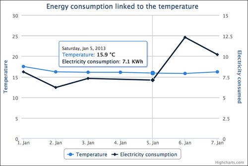
$(function () {
    var chart = $(‘#myFirstChartContainer’).highcharts({
        chart: {
            type: ‘line’,
            zoomType: ‘x’
        },
        title: {
            text: ‘Energy consumption linked to the temperature’
        },
        xAxis: {
            type: ‘datetime’,
            title: {
                text: null
            }
        },
        yAxis: [
            {
                title: {
                    text: ‘Temperature’
                },
                min:0
            },
            {
                title: {
                    text: ‘Electricity consumed’
                },
                opposite:true,
                min:0
            }
        ],
        tooltip: {
            crosshairs: true,
            shared: true
        },
        series: [
            {
                name: ‘Temperature’,
                pointInterval: 24 * 3600 * 1000,
                pointStart: Date.UTC(2013, 0, 01),
                data: [17.5, 16.2, 16.1, 16.1, 15.9, 15.8, 16.2],
                tooltip: {
                    valueSuffix: ‘ °C’
                },
                yAxis: 0
            },
            {
                name: ‘Electricity consumption’,
                data: [
                     [Date.UTC(2013, 0, 01), 8.1],
                     [Date.UTC(2013, 0, 02), 6.2],
                     [Date.UTC(2013, 0, 03), 7.3],
                     [Date.UTC(2013, 0, 05), 7.1],
                     [Date.UTC(2013, 0, 06), 12.3],
                     [Date.UTC(2013, 0, 07), 10.2]
                ],
                tooltip: {
                    valueSuffix: ‘ KWh’
                },
                yAxis: 1
            }
        ]
    });
});
You should have the expected result as shown in the following screenshot:
In this section, we will create a stacked bar chart, where we will define the color of the different series.
We will now create the code for this chart:
You start the creation of your chart by implementing the constructor of your Highcharts' chart:
var chart = $('#myFirstChartContainer').highcharts({
});
We now set the different sections inside the constructor. We start by the
chartsection. Because we are creating a bar chart, we define thetypeelement with the valuebar:chart: { type: 'bar' },We define the title of our chart:
title: {
   text: 'Age pyramid of employees'
},
We create the
xAxissection. In this section, we set the three categories of our chart:xAxis: { categories: ['40-55', '25-40', '18-25'] },We configure the
yAxissection. We set the title of this axis with the valueNumber of employees:yAxis: { title: { text: 'Number of employees' } },We now set the
plotOptionssection. Inside this section, you will be able to customize some parameters for your chart or for your series. For our chart, we customize theserieselement by setting the stacking option tonormal. You can also set this value topercent, if you prefer to stack by using percentages instead of values.plotOptions: { series: { stacking: 'normal' } },Further, we configure the series section of our chart. We set two series with the name
MaleandFemaleand a set of data. Then, we set thestackparameter. Thestackparameter defines the stacking groups. You can set this value with a number, a string, or other types of data. If you want to stack several series together, your different series will have to match the same value. For our chart, we set this element for our two series with the value1. Finally, we define the color of our series by overriding the color element in the hexadecimal format.series: [ { name: 'Male', data: [835, 2635, 1437], stack: 1, color: '#6495ED' }, { name: 'Female', data: [785, 2435, 1657], stack: 1, color: '#DC143C' } ]You should have the expected code as follows:
$(function () {
    var chart = $('#myFirstChartContainer').highcharts({
        chart: {
            type: 'bar'
        },
        title: {
            text: 'Age pyramid of employees'
        },
        xAxis: {
            categories: ['40-55', '25-40', '18-25']
        },
        yAxis: {
            title: {
                text: 'Number of employees'
            }
        },
        plotOptions: {
            series: {
                stacking: 'normal'
            }
        },
        series: [
            {
                name: 'Male',
                data: [835, 2635, 1437],
                stack: 1,
                color: '#6495ED'
            },
            {
                name: 'Female',
                data: [785, 2435, 1657],
                stack: 1,
                color: '#DC143C'
            }
        ]
    });
});
You should have the expected result:

In this section, we will create a pie chart. Compared to charts that we have created in the previous section, this type of chart doesn't contain any axes.
We will now create the code of this chart:
You start the creation of your chart by implementing the constructor of your Highcharts' chart:
var chart = $('#myFirstChartContainer').highcharts({
});
We now set the different sections inside the constructor. We start with the
chartsection. Since we are creating a pie chart, we define thetypeelement with the valuepie:chart: { type: 'pie' },We define the title of our chart:
title: {
   text: 'Operating Systems used in a company'
},
We customize the display of the chart by overriding the
plotOptionssection. Because we are creating a pie chart, we override the parameters of the subsectionpie. We set theallowPointSelectattribute totruein order to have an interactive chart when a user clicks on some part of the pie chart. For the pie chart, the legend is not displayed by default. In order to display the legend, we set theshowInLegendattribute totrue. Then, we override thetooltipsection in order to add the percentage suffix inside our tool tip. Finally, we create labels around the chart by implementing thedataLabelsattribute. Inside this attribute, we setenabledtotruein order to activate this feature. Then, thecolorattribute defines the color of the label and theconnectorColorattribute defines the color of the line between the pie chart and the label. The formatter option defines a function that is used in order to format our label. When you implement the formatter parameter for any type of chart, you can use the following data for your template:this.percentage: It is the percentage of your selection (For stacked and pie charts only).this.point: It is the point object. You can access to some information of the point object, such as the point name withthis.pointname. If you use a JavaScript debugger, such as Firebug, you will be able to know all data available for this object.this.series: It is the series object. You can access to some information concerning the selected series, such as the series name with this.series.name. If you use a JavaScript debugger, such as Firebug, you will be able to know all data available for this object.this.total: It is the total of all your values for stacked series only.this.x: It is the x value.this.y: It is the y value.
For our chart, the label will display the point name in bold with the percentage of the data
plotOptions: {
   pie: {
      allowPointSelect: true,
      showInLegend: true,
      tooltip: {
         valueSuffix: ' %'
      },
      dataLabels: {
          enabled: true,
          color: '#000000',
          connectorColor: '#888888',
          formatter: function() {
              return '<b>'+ this.point.name +'</b>: '+
                this.percentage +' %';
          }
       }
   }
},
We then set the
seriessection. For pie charts, you only need to create one series with anameand yourdata. You can set your data in two different ways. The first way consists of using couple of data, with the name of your element in the first parameter and your value in the second parameter. The second way consists of using an array of objects with several attributes, such asnamewhich defines the name of the object,colorwhich defines the color your data, andywhich defines the data value. The second way can be used when you want to manually set the color of your data. For our series, we will use both ways,but for your own chart, you may choose the best option for your project.series: [{ name: 'Operating Systems', data: [ ['Windows 7', 45], ['Windows XP', 35], //First way { name: 'Mac OS X', color: '#CC0033',' y: 20 } //Second way ] }]You should get the following code:
$(function () {
    var chart = $(‘#myFirstChartContainer’).highcharts({
       chart: {
          type: ‘pie’
       },
       title: {
          text: ‘Operating Systems used in a company’
       },
       plotOptions: {
          pie: {
             allowPointSelect: true,
             showInLegend: true,
             tooltip: {
                valueSuffix: ‘ %’
             },
             dataLabels: {
                enabled: true,
                color: ‘#000000’,
                connectorColor: ‘#888888’,
                formatter: function() {
                   return ‘<b>‘+ this.point.name +’</b>: ‘+
                          this.percentage +’ %’;
                }
             }
          }
       },
       series: [{
          name: ‘Operating Systems’,
          data: [
             [‘Windows 7’, 45],
             [‘Windows XP’, 35], //First way
             {
                name: ‘Mac OS X’,
                color: ‘#CC0033’,
                y: 20
             } //Second way
          ]
       }]
    });
});
You should have the expected result as follows:

In the previous sections, we have created static charts. In this section, we will create a dynamic area chart by using Ajax technology. Highcharts charts are set with the JavaScript Object Notation (JSON) notation, which is used in JavaScript in order to represent objects by using couple of attributes and values, such as in the following code:
{
   attribute1: "value1",
   attribute2: 2,
   attributeArray: [0,1,2],
   subcategory:
   {
       attribute3: "value3"
   }
}
For the creation of our dynamic chart, we will firstly create our JSON string on the server side. For our example we will use PHP language, but you can use any programming language. Then, this JSON string will be retrieved on the client side by sending an Ajax request, and will be converted into a JSON object. This JSON object will be reused inside our Highcharts constructor.
We begin by creating our server side script server_side.php. You can create your JSON string directly by using your programming language or use some libraries, such as json_encode for PHP or JSON library in Java. In our case, we will use the json_encode function, which transforms associative arrays into JSON objects. In order to have a more readable code, we will create PHP variables for each section of our Highcharts' chart, which we will gather into a single array. Then, this array will be encoded into a JSON string at the end of our script.
We start our JSON string by creating the chart section. Because we are creating an area chart, we create an associative array with the key
typeand the valuearea:$chartSection = array('type' => 'area');We set the title section of our chart. We create an associative array with the key
textand the valueSales evolution:$titleSection = array('text' => 'Sales evolution');We set the category section of our chart. We create an associative array with the key
categoriesand the value with an array of categories:$xAxisSection = array('categories' => array('Jan', 'Feb', 'Mar', 'Apr'));We set the
yAxisSectionof our chart. We create an associative array with the keytitleand the value with another associative array with a keytextand a valueSales:$yAxisSection = array('title' => array('text' => 'Sales'));We set the
seriesSectionof our chart. We create an array with an associative array with the keynameand a valueCitiesand the keydataand an array of data as values:$seriesSection = array(array('name' => 'Cities', 'data' => array(1250, 1500, 1300, 1450)))We regroup all our variables already created inside an associative array with the keys
chart,title,xAxis,yAxisandseries,which correspond to our main Highcharts sections:$highchartChart = array('chart' => $chartSection, 'title' => $titleSection, 'xAxis' => $xAxisSection, 'yAxis' => $yAxisSection, 'series' => $seriesSection);We transform our final array into a JSON string by using the function
json_encode,which will be displayed in output:echo json_encode($highchartChart);
You should have the following code:
<?php
   $chartSection = array('type' => 'area');

   $titleSection = array('text' => 'Sales evolution');

   $xAxisSection = array('categories' => array('Jan',
     'Feb','Mar', 'Apr'));

   $yAxisSection = array('title' => array('text' =>
     'Sales'));

   $seriesSection = array(array('name' => 'Sales', 'data'
     => array(1250, 1500, 1300, 1450)));

   $highchartChart = array('chart' => $chartSection,'title'
     => $titleSection, 'xAxis' => $xAxisSection, 'yAxis' =>
       $yAxisSection, 'series' => $seriesSection);

   echo json_encode($highchartChart);
?>
You should obtain the following output. It has been formatted to make it more readable.
{
       “chart”:{
             “type”:”area”
       },
       “title”:{
             “text”:”Sales evolution”
       },
       “xAxis”:{
             “categories”:[“Jan”,”Feb”,”Mar”,”Apr”]
       },
       “yAxis”:{
             “title”:{
                    “text”:”Sales”
             }
       },
       “series”:[
             {
                    “name”:”Sales”,
                    “data”:[1250,1500,1300,1450]
             }
       ]
}
You can also create your JSON string with your own logic and with your own data retrieved within a database or other data sources.
Now that we have created our JSON string, we will create our script on the client side:
We start the creation of our script by creating the Ajax request. We use the
ajaxfunction of jQuery with the URL of our server side script in parameter. We override thesuccessfunction in order to retrieve the result of ourajaxrequest.$.ajax("http://localhost:8080/server_side.php", { success: function (result) { } });Inside the
successfunction, we transform our JSON string into ajson object:var jsonObject = jQuery.parseJSON(result);
Then, we create our Highcharts' chart by using our
jsonObjectinside our constructor:var chart = $('#myFirstChartContainer').highcharts(jsonObject);You should have the following code on the client side:
$(function () {
   $.ajax("http://localhost:8080/server_side.php", {
      success: function (result) {
        var jsonObject = jQuery.parseJSON(result)
        var chart =
$('#myFirstChartContainer').highcharts(jsonObject);
       }
   });

});
You should have the following result:
