

Plotting the RNAseq data en masse or for individual genes or features is an important step in QC and understanding. In this recipe, we'll see how to make gene count plots in samples of interest, how to create an MA plot that plots counts against fold change and allows us to spot expression-related sample bias, and how to create a volcano plot that plots significance against fold change and allows us to spot the most meaningful changes easily.
Plotting and presenting RNAseq data
Getting ready
In this recipe, we'll use the DESeq2 package, the ggplot2 package, magrittr, and dplyr. We'll use the DESeqDataSet object we created for the modencodefly data in Recipe 2—a saved version is in the datasets/ch1/modencode_dds.RDS file in this book's data repository.
How to do it...
- Load libraries and create a dataframe of RNAseq results:
library(DESeq2)
library(magrittr)
library(ggplot2)

dds <- readRDS("~/Desktop/r_book/datasets/ch1/modencode_dds.RDS")
- Create a boxplot of counts for a single gene, conditioned on "stage":
plotCounts(dds, gene="FBgn0000014", intgroup = "stage", returnData = TRUE) %>%
  ggplot() + aes(stage, count) + geom_boxplot(aes(fill=stage)) + scale_y_log10() + theme_bw()
- Create an MA plot with coloring conditioned on significance:
result_df <- results(dds, contrast=c("stage","L2Larvae","L1Larvae"), tidy= TRUE) %>%
  dplyr::mutate(is_significant=padj<0.05)

ggplot(result_df) + aes(baseMean, log2FoldChange) + geom_point(aes(colour=is_significant)) + scale_x_log10() + theme_bw()
- Create a volcano plot with coloring conditioned on significance:
ggplot(result_df) + aes(log2FoldChange, -1 * log10(pvalue)) + geom_point(aes(colour=is_significant)) + theme_bw()
How it works...
Step 1 is brief and loads the dataset and libraries we'll need.
In Step 2, we take advantage of a couple of useful parameters in the plotCounts() and results() functions from DESeq2. The returnData flag in plotCounts() will optionally return a tidy dataframe of count information for a given gene in a given condition, hence allowing us to send the data through ggplot() to make a boxplot for an individual gene. The magrittr %>% operator allows us to send the return value of plotCounts() straight to the first positional argument of ggplot() without saving in an intermediate variable.
In Step 3, we use the results() function from DESeq2 to get the results dataframe, which we pipe to dplyr mutate() in order to add a new column called is_significant containing TRUE if the value of the padj column is lower than 0.05. We then use the returned result_df dataframe in a ggplot() command to make a scatter plot of baseMean (count) against log2 fold change, with points colored by the is_significant variable, effectively colored by whether the P value is lower than 0.05 or not.
In Step 4, we use the same result_df dataframe to plot log2fold change against the negative log10 of the 'pvalue' to give a 'volcano' plot of the relationship between P and differential expression level:
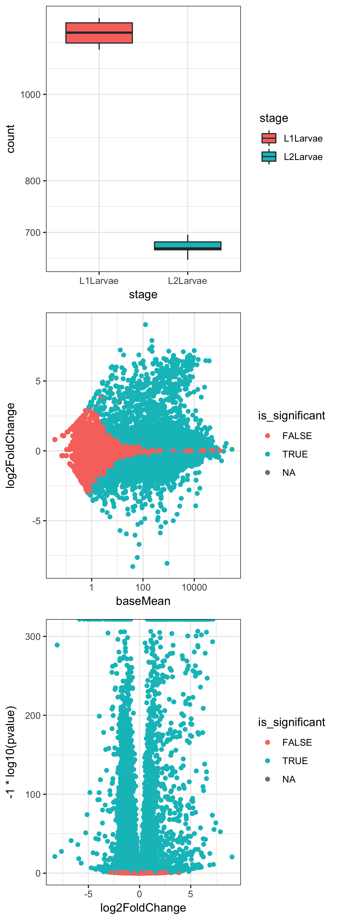
The preceding three plots are the combined resultant output of these three ggplot() commands.