

Modifying the text fonts
LaTeX already does some formatting automatically; for example, we've seen that section headings are bigger than normal text and bold-faced. Now we will learn how to modify the appearance of the text ourselves.
Adjusting the font shape
In this example, we will emphasize an important word in our text, and we will see how to make words appear in bold, italic, or slanted. We shall also figure out how to highlight words in a specific part of the text that's already emphasized.
Let's take a look:
- Create a new document containing the following code:
\documentclass{article} \begin{document} Text can be \emph{emphasized}. Besides from \textit{italics}, words can be \textbf{bold}, \textsl{slanted}, or typeset in \textsc {Small Caps}. Such commands can be \textit{\textbf{nested}}. \emph{See how \emph{emphasizing} looks when nested.} \end{document} - Click Typeset and have a look at the output:
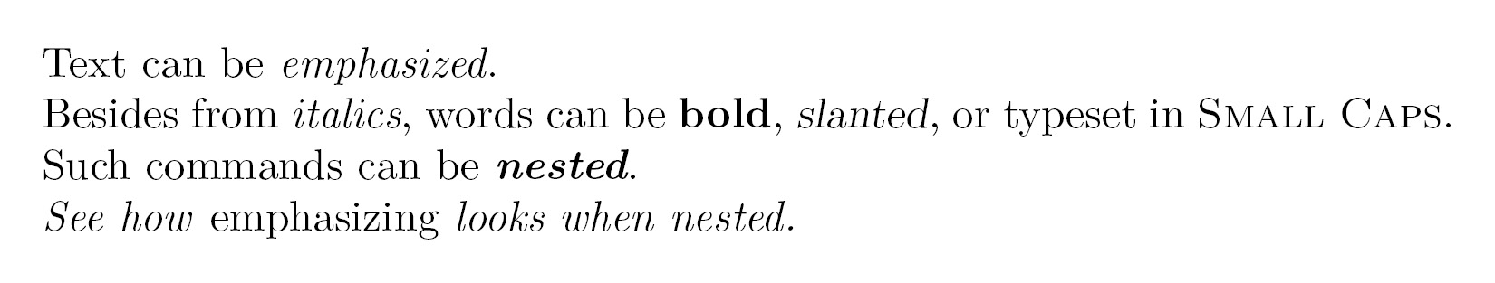
Figure 2.3 – Emphasizing phrases
At first, we used the \emph command, giving one word as an argument to this command. This argument will be typeset in italic because this is the default way LaTeX emphasizes text.
Text-formatting commands usually look like \text**{argument}, where ** stands for a two-letter abbreviation such as bf for bold face, it for italic, and sl for slanted. The argument will then be formatted accordingly, as we've seen in our example. After the command, the subsequent text will continue being typeset as it was before the command—precisely after the closing curly brace, marking the end of the argument.
We nested the \textit and \textbf commands, which allowed us to achieve a combination of those styles, and the text appears in both italic and bold.
Most font commands will show the same effect if they are applied twice, such as \textbf{\textbf{words}}. Here, the words won't become bolder.
But \emph behaves differently. We've seen that \emph changes text to italic, but if we use \emph on a piece of text that is already in italic, it will change from italic to upright font. Imagine an important theorem completely typeset in italic and you would like to highlight a word inside this theorem; that word should not be in italic but formatted as upright font again.
Change the font shape sensibly
Combining font shapes, such as marking bold and italic at the same time, might be considered a questionable style choice. Change the font shape wisely—and consistently.
Choosing the font family
The default LaTeX font is a serif font (also called a Roman font). That means small lines or strokes, called serifs, are attached to letters. If such serifs are absent, we call the font a sans-serif font.
Compare the two lines in Figure 2.4. Look closely at the first letter, T, which clearly shows the difference between serif and sans-serif fonts:

Figure 2.4 – Serif versus sans-serif font
These different types of fonts are called font families or typefaces.
Another typeface is monospaced; here, all letters have the same width. Monospaced fonts are also called typewriter fonts.
Let's switch font families in a small example document. We will start with bold text, but bold text with serif looks very heavy. So, we will use sans-serif bold text instead. The following text will contain an internet address, and we will choose a typewriter font to emphasize it.
Follow these instructions:
- Create a LaTeX document with the following code:
\documentclass{article} \begin{document} \textsf{\textbf{Get help on the Internet}} \texttt{https://latex.org} is a support forum for \LaTeX. \end{document} - Click on Typeset and look at the result:

Figure 2.5 – Text with a URL
Here, we encountered further font commands—by using \textsf, we've chosen the sans-serif font in the heading line, and we used the \texttt command to get the typewriter font for the internet address. Those commands can be used just like the font commands we've learned about before.
Serifs, those small decorative details at the end of a letter's strokes, improve readability by leading the reader's eyes along the line; therefore, they are widely used in printed books and newspapers.
Headings are often done without serifs. Sans-serif fonts are also a good choice for screen text because of their better readability on lower-resolution screens or on mobile phone displays with small font sizes. Sans-serif fonts are often preferred for text in e-books and on internet pages.
Monospaced or typewriter fonts are preferred for writing the source code of computer programs, both in print and in text editors. As in our previous example, this book generally uses a typewriter font to distinguish source code and web addresses from normal text.
The commands we've seen applied formatting to the text in the argument in curly braces. LaTeX also provides commands without arguments, which work like switches.
Using the following instructions, we will modify the previous example using font family switching commands:
- Edit the previous example to get the following code:
\documentclass{article} \begin{document} \sffamily\bfseries Get help on the Internet \normalfont\ttfamily https://latex.org\normalfont\ is a support forum for \LaTeX. \end{document} - Click on Typeset to compile.
- Compare the output to the previous example; it's the same.
By using the \sffamily command, we switched to the sans-serif typeface. The \bfseries command switched the text to bold. We used the \normalfont command to return to the default LaTeX font, and then we used the \ttfamily command to switch to a typewriter font. After the internet address, we used \normalfont again to switch to the default font.
Such switching commands don't produce any output themselves, but they will affect the text that follows it, so they are declarations.
Let's summarize the font commands and their corresponding declarations together with their meanings:
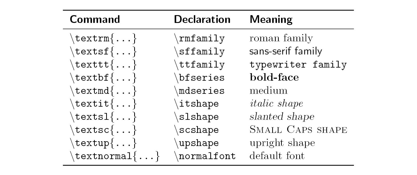
Figure 2.6 – Font commands
Note on emphasizing
The corresponding declaration to \emph is \em.
Confining the effect of commands by braces
In the previous example, we wrote \normalfont to switch the font back to the default font, but there's another way. We shall use curly braces to tell LaTeX where to apply a command and where to stop it:
- Shorten and modify our font shape example that produced Figure 2.3 to get this code:
\documentclass{article} \begin{document} Besides from {\itshape italics}, words can be {\bfseries bold}, {\slshape slanted}, or typeset in {\scshape Small Caps}. \end{document} - Click on Typeset and check out the output:

Figure 2.7 – Using declarations to change the font weight and shape
When we change the font using a declaration, we start with an opening curly brace, and then the font declaration command follows. The effect of that command lasts until we stop it with the corresponding closing brace.
An opening curly brace tells LaTeX to begin a group. The following commands are valid for the subsequent text until a closing curly brace ends the group. Groups can be nested as follows:
Normal text, {\sffamily sans serif text {\bfseries and bold}}.
The area where a command is valid is called its scope. We have to be careful to complete each group. For every opening brace, there has to be a closing brace.
So, in short, groups are defined by curly braces and they contain and confine the effect of local commands.
Exploring font sizes
Now we will try out every font size available with LaTeX's default font size commands:
- Create a document with the following code:
\documentclass{article} \begin{document} \tiny We \scriptsize start \footnotesize very \smallsmall, \normalsize get \large big \Large and \LARGE bigger, \huge huge, \Huge gigantic! \end{document} - Click on Typeset and observe the output:

Figure 2.8 – Font sizes
We used all 10 available font size declarations, starting small with \tiny and ending really big with \Huge. There are no corresponding commands taking arguments, so we would have to use curly braces to delimit their scope, as we learned before.
The actual resulting font size scales with the base font size. If your document has a base font of 12 points, then \tiny would result in text bigger than the base font of 10 points.
Use \footnotesize if you wish to get the same size LaTeX uses for footnotes or use \scriptsize if you wish to create a style with a size matching LaTeX subscripts and superscripts. Document classes provide carefully selected and well-suited font size selections, so you normally don't need to set a certain physical size. This and other advanced font tweaking commands are covered in Chapter 3, Adjusting Fonts, in the LaTeX Cookbook, Packt Publishing.
For practice, we used many predefined font commands in this section. The next level is to create our own logical formatting commands to use them instead of physical font commands within the document body text.