
Breaking lines and paragraphs
Generally, when you're writing text, you don't need to care about the line wrapping. Just by typing the text with your editor, LaTeX will make it fit to the line and it will take care of the justification. If you want to begin a new paragraph, just insert an empty line before you continue with your text for the next paragraph.
Now we will find out how to control the line wrapping. First, we will see how to improve the automatic hyphenation, and second, we will learn commands to insert breaks directly.
Improving hyphenation
If you look at longer documents, you will notice that it's outstanding how the text is fully justified by LaTeX and how the spacing between words is evenly distributed on the lines. If necessary, LaTeX will divide words and put hyphens at the end of the line in order to break the lines in a better way. LaTeX already uses very good algorithms to hyphenate words, but it may happen that it can't find an acceptable way to divide a word. The previous example pointed out this problem: breaking the word acronym would improve the output, but LaTeX does not know where to divide it. We shall find out how to solve that.
No matter how good the justification is, text in very narrow columns is extremely hard to justify. To achieve full justification, LaTeX inserts big gaps between the words.
In the following example, we will tell LaTeX how a word could be divided, to give LaTeX more flexibility for paragraph justification:
- Insert the following line into the preamble of the previous example:
\hyphenation{acro-nym} - Click on Typeset and look at the output:
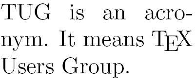
Figure 2.15 – A paragraph with improved hyphenation
We've told LaTeX that the word acronym may have a division point between acro and nym. That means a hyphen might be placed after acro at the end of the line and nym moves down to the following line.
The \hyphenation command tells LaTeX where the division points of a word may be. Its argument may contain several words separated by spaces. For each word, we can indicate several points. For instance, we could extend the argument by more division points and more word variants, like this:
\hyphenation{ac-ro-nym ac-ro-nym-ic a-cro-nym-i-cal-ly}
You could also indicate division points in the body text by inserting a backslash followed by a hyphen, such as ac\-ro\-nym. But by using the \hyphenation command in the preamble, you would collect all rules there and they will be used consistently; so, use it especially in the rare cases where LaTeX's automation fails.
Preventing hyphenation
If you want to prevent the hyphenation of a certain word at all, there are two possible ways:
- Declare it in the preamble by using it in the
\hyphenationargument without any division points, such as\hyphenation{indivisible}. - Protect it inside the text using the
\mboxcommand:The following word is \mbox{indivisible}.
Loading the hyphenat package gives us two more choices:
\usepackage[none]{hyphenat}prevents hyphenation throughout the document.\usepackage[htt]{hyphenat}enables hyphenation for typewriter text; otherwise, such monospaced words won't be hyphenated by default.
These optional arguments to \usepackage are called package options. They configure the behavior of a package. The mentioned options may be combined, separated by commas. Even if you don't use the none option, you can disable hyphenation for short pieces of text using the \nohyphens{text} command. Try out these features if you want to benefit from them. The package documentation explains more features that you may sometimes need, such as hyphenation after special characters such as numerals and punctuation.
Improving the justification
Today's most popular TeX compiler is pdfTeX, which directly produces PDF output. When Hàn Thế Thành developed pdfTeX, he extended TeX with micro-typographic capabilities. When we typeset directly to a PDF, we're actually using pdfLaTeX and we can benefit from the new features by using the microtype package.
Let's improve our previous example by loading the microtype package:
- Insert the following line into the preamble of the previous example:
\usepackage{microtype} - Click on Typeset and look at the output:
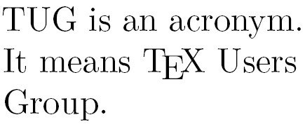
Figure 2.16 – A paragraph with better justification
We have loaded the microtype package without any options, relying on its default behavior. It introduces font expansion to tweak the justification and uses hanging punctuation to improve the optical appearance of the margins. This may reduce the need for hyphenation and avoids having large gaps between words for achieving full justification. You've seen its effect on a narrow column, so imagine the improvement on wide text—keep that in mind and try it out later!
Though microtype provides powerful features and options for the advanced typesetter, we usually won't need to do more than just load it to benefit from it. There's extensive package documentation if you want to study it in depth. microtype does nice tweaking but it's not a cure-all; we should still take care of proper hyphenation when necessary.
Breaking lines manually
We might choose to end a line ourselves, overriding the automation. Here, we will learn about several commands with different effects for ending a line.
We will type the beginning of a famous poem by Edgar Allan Poe. As the poet has specified where a verse has to end, we shall insert line breaks there.
So, let's write up the beginning of the poem:
- Create a document containing these lines:
\documentclass{article} \begin{document} \noindent\emph{Annabel Lee}\\ It was many and many a year ago,\\ In a kingdom by the sea,\\ That a maiden there lived whom you may know\\ By the name of Annabel Lee \end{document} - Click on Typeset and view the output:
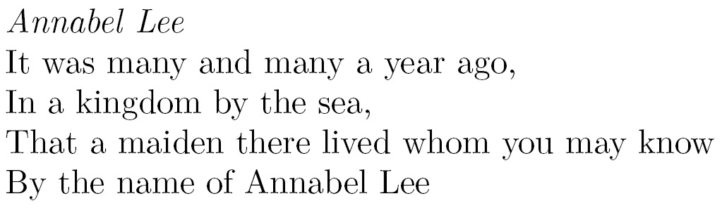
Figure 2.17 – Manually broken lines
The very short \\ command ended a line, while the following text was moved to the next line. That's different from a paragraph break as we're still using the same paragraph. The \newline command also has the same effect.
The \noindent command suppresses the paragraph indentation. Otherwise, the first line in the paragraph would be indented by default. Indenting is actually intended for visually separating paragraphs. We suppressed indentation manually because there is no section heading. After headings, there's no indentation by default. You normally don't need the \noindent command. For generally removing paragraph indentation and replacing it with vertical inter-paragraph spacing, load the parskip package. You can see this in Figure 2.23 and the corresponding code.
Note that although we inserted line endings, it is still a single paragraph. So, a line break doesn't cause a paragraph indentation since it's logically the same paragraph.
Exploring line breaking options
The \\ command understands optional arguments with the following syntax:
\\[value]inserts additional vertical space after the break depending on thevalue, such as\\[3mm].\\*[value]is a variation of the previous argument but prevents a page break before the next line of text.
There's another command called \linebreak that tells LaTeX to end the line but to keep the full justification, therefore the space between the words would be stretched to reach the right margin. This could cause unpleasant gaps—that's why that command is rarely used.
\linebreak[number] can be used to tweak the line break. If number is 0, a line break is allowed; 1 means it's desired; 2 and 3 mark more insistent requests; 4 will enforce it. The latter is the default behavior if no number is given.
You may try out these numbers; for example, change the heading of our poem example to the following:
\emph{Annabel Lee}\\[3mm]
That inserts an additional 3 mm space between our heading and the poem fragment. Continue playing with the options to see their effects.
Preventing line breaks
The \linebreak command has a direct counterpart: \nolinebreak. This command prevents a line break at the current position.
Like its counterpart, it takes an optional argument. If you write \nolinebreak[0], you recommend not to break the line there. Using 1, 2, or even 3 makes the request stronger and \nolinebreak[4] forbids it completely. The latter option will be presumed if you don't provide an argument.
The already mentioned \mbox{text} command not only disables the hyphenation of a word but will also prevent a line break for the complete text.
LaTeX will break lines at spaces between words if meaningful. The ~ symbol stands for an interword space where no break is allowed; if you write Dr.~Watson, the title Dr. would never stand lonely at the end of a line.
By default, the text is fully justified. That means lines are stretched to the right margin if needed. This may result in undesirable gaps between words in a stretched line. Let's see how to disable it if we want to.