
Using the preview
The upper-right corner of the Android Studio code editor contains three buttons, Code, Split, and Design (Figure 1.2):
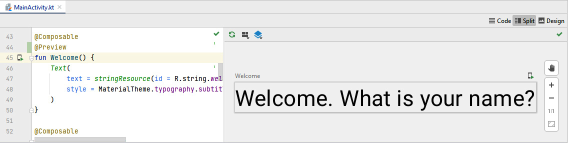
Figure 1.2 – Compose preview (Split mode)
They switch between the following different display modes:
- Code only
- Code and preview
- Preview only
To use the Compose preview, your composable functions must contain an additional annotation, @Preview, which belongs to the androidx.compose.ui.tooling.preview package. This requires an implementation dependency to androidx.compose.ui:ui-tooling-preview in your build.gradle file.
Unfortunately, if you try to add @Preview to Greeting(), you will see an error message like this:
Composable functions with non-default parameters are not supported in Preview unless they are annotated with @PreviewParameter.
So, how can you preview composables that take parameters?
Preview parameters
The most obvious solution is a wrapper composable:
@Composable
@Preview
fun GreetingWrapper() {
  Greeting("Jetpack Compose")
}
This means that you write another composable function that takes no parameters but invokes your existing one and provides the required parameter (in my example, a text). Depending on how many composable functions your source file contains, you might be creating quite a lot of boilerplate code. The wrappers don't add value besides enabling the preview.
Fortunately, there are other options. You can, for example, add default values to your composable:
@Composable
fun AltGreeting(name: String = "Jetpack Compose") {
While this looks less hacky, it alters how your composable functions can be invoked (that is, without passing a parameter). This may not be desirable if you had a reason for not defining a default value in the first place.
With @PreviewParameter, you can pass values to a composable that affect only the preview. Unfortunately, this is a little verbose, though, because you need to write a new class:
class HelloProvider : PreviewParameterProvider<String> {
  override val values: Sequence<String>
    get() = listOf("PreviewParameterProvider").asSequence()
}
The class must extend androidx.compose.ui.tooling.preview.PreviewParameterProvider because it will provide a parameter for the preview. Now, you can annotate the parameter of the composable with @PreviewParameter and pass your new class:
@Composable
@Preview
fun AltGreeting2(@PreviewParameter(HelloProvider::class)
        name: String) {
In a way, you are creating boilerplate code, too. So, which method you choose in the end is a matter of personal taste. The @Preview annotation can receive quite a few parameters. They modify the visual appearance of the preview. Let's explore some of them.
Configuring previews
You can set a background color for a preview using backgroundColor =. The value is a Long type and represents an ARGB color. Please make sure to also set showBackground to true. The following snippet will produce a solid red background:
@Preview(showBackground = true, backgroundColor =
         0xffff0000)
By default, preview dimensions are chosen automatically. If you want to set them explicitly, you can pass heightDp and widthDp:
@Composable
@Preview(widthDp = 100, heightDp = 100)
fun Welcome() {
  Text(
    text = stringResource(id = R.string.welcome),
    style = MaterialTheme.typography.subtitle1
  )
}
Figure 1.3 shows the result. Both values are interpreted as density-independent pixels, so you don't need to add .dp as you would do inside your composable function.
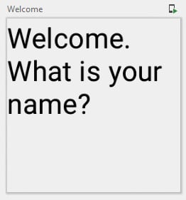
Figure 1.3 – Setting the width and height of a preview
To test different user locales, you can add the locale parameter. If, for example, your app contains German strings inside values-de-rDE, you can use them by adding the following:
@Preview(locale = "de-rDE")
The string matches the directory name after values-. Please recall that the directory is created by Android Studio if you add a language in the Translations Editor.
If you want to display the status and action bars, you can achieve this with showSystemUi:
@Preview(showSystemUi = true)
To get an idea of how your composables react to different form factors, aspect ratios, and pixel densities, you can utilize the device parameter. It takes a string. Pass one of the values from Devices, for example, Devices.PIXEL_C or Devices.AUTOMOTIVE_1024p.
In this section, you have seen how to configure a preview. Next, I will introduce you to preview groups. They are very handy if your source code file contains more than a few composable functions that you want to preview.
Grouping previews
Android Studio shows composable functions with a @Preview annotation in the order of their appearance in the source code. You can choose between Vertical Layout and Grid Layout (Figure 1.4):
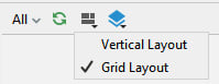
Figure 1.4 – Switching between Vertical Layout and Grid Layout
Depending on the number of your composables, the preview pane may at some point feel crowded. If this is the case, just put your composables into different groups by adding a group parameter:
@Preview(group = "my-group-1")
You can then show either all composable functions or just those that belong to a particular group (Figure 1.5):
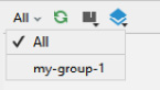
Figure 1.5 – Switching between groups
So far, I have shown you what the source code of composable functions looks like and how you can preview them inside Android Studio. In the next section, we will execute a composable on the Android Emulator or a real device, and you will learn how to connect composable functions to the other parts of an app. But before that, here is one more tip:
Export a Preview as an Image
If you click on a Compose preview with the secondary mouse button, you will see a small pop-up menu. Select Copy Image to put a bitmap of the preview on the system clipboard. Most graphics applications allow you to paste it into a new document.