

Now that we have seen how to create reports, it is time to use these reports and create a graphical representation. A dashboard is a single snapshot view of the reports using charts. We will use the point-and-click dashboard builder to create charts for our reports.
Dashboards can contain up to 20 components. They visualize the data of multiple reports on a single page. The dashboard can take a snapshot of the entire organization in a single view. They can also be scheduled for e-mail distribution.
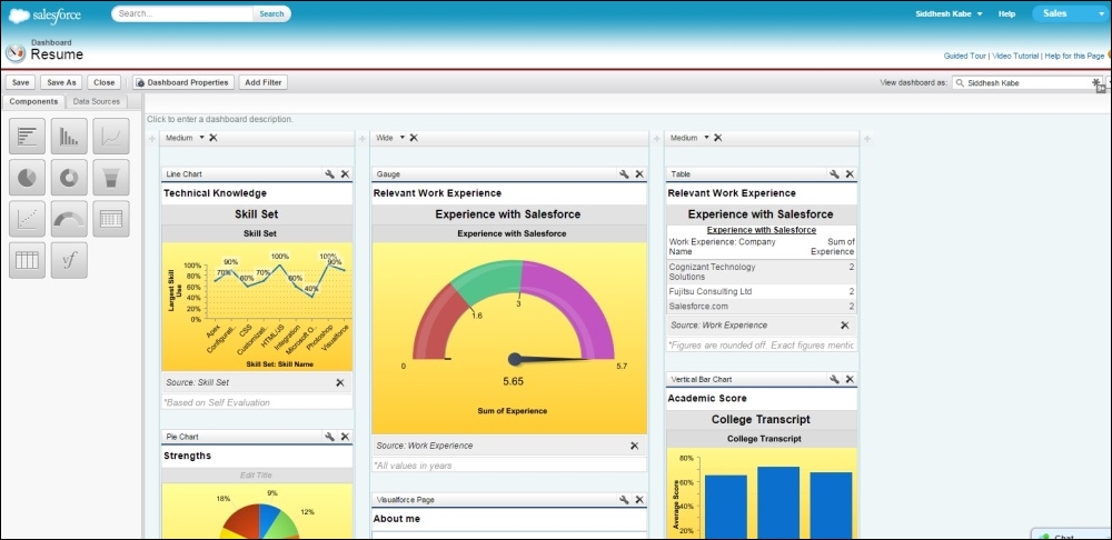
The following screenshot is an example of a dashboard that shows information about the education and experience of a person:

The dashboard builder is the cloud utility used to build stunning dashboards of charts. It has easy-to-use drag-and-drop features.
On the left-hand side panel, we can choose the types of available charts to create a dashboard from. We can add the following types of charts to the dashboard:
Bar chart
Vertical bar...