
Understanding your data is the first step to build successful models. Without intimate knowledge of your data, you might build a model that performs beautifully in the lab but fails gravely in production. Exploring the dataset is also a great way to see if there are any problems with the data contained within.
To follow this recipe, you need to have OpenRefine and virtually any Internet browser installed on your computer. See the Opening and transforming data with OpenRefine recipe's Getting ready subsection to see how to install OpenRefine.
We assume that you followed the previous recipe so your data is already loaded to OpenRefine and the data types are now representative of what the columns hold. No other prerequisites are required.
Exploring data in OpenRefine is easy with Facets. An OpenRefine Facet can be understood as a filter: it allows you to quickly either select certain rows or explore the data in a more straightforward way. A facet can be created for each column—just click on the down-pointing arrow next to the column and, from the menu, select the Facet group.
There are four basic types of facet in OpenRefine: text, numeric, timeline, and scatterplot.
Tip
You can create your own custom facets or also use some more sophisticated ones from the OpenRefine arsenal such as word or text lengths facets (among others).
The text facet allows you to get a sense of the distribution of text columns from your dataset quickly. For example, we can see which city in our dataset had the most sales between May 15, 2008 and May 21, 2008. As expected, since we analyze data from the Sacramento area, the city tops the list, followed by Elk Grove, Lincoln, and Roseville, as shown in the following screenshot:
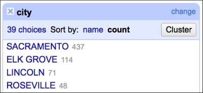
This gives you a very easy and straightforward insight on whether the data makes sense or not; you can readily determine whether the provided data is what it was supposed to be.
The numeric facet allows you to glimpse the distribution of your numeric data. We can, for instance, check the distribution of prices in our dataset, as shown in the following screenshot:
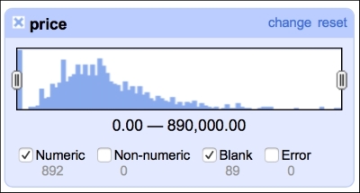
The distribution of the prices roughly follows what we would expect: left (positive) skewed distribution of sales prices makes sense, as one would expect less sales at the far right end of the spectrum, that is, people having money and willingness to purchase a 10-bedroom villa.
This facet reveals one of the flaws of our dataset: there are 89 missing observations in the price column. We will deal with these later in the book, in the Imputing missing observations recipe.
It is also good to check whether there are any blanks in the timeline of sales, as we were told that we would get seven days of data (May 15 to May 21, 2008):
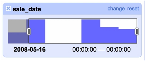
Our data indeed spans seven days but we see two days with no sales. A quick check of the calendar reveals that May 17 and May 18 was a weekend so there are no issues here. The timeline facet allows you to filter the data using the sliders on each side; here, we filtered observations from May 16, 2008 onward.
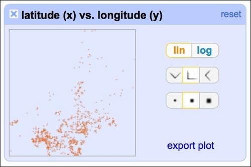
The scatterplot facet lets you analyze interactions between all the numerical variables in the dataset:
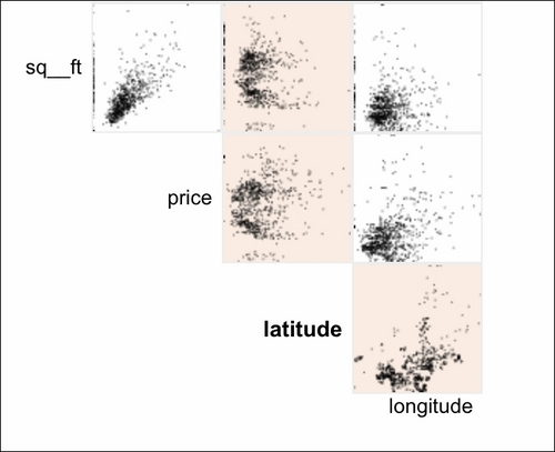
By clicking at the particular row and column, you can analyze the interactions in greater detail: