

XY charts are typically used in scientific data to show multiple values at various points. They can display negative values as well. They also overlay multiple sets of values for easy readability. Let's build a simple XY chart with two points. Copy the following code into your Python file and run the application, and save your SVG file output as xy_chart.svg:
# -*- coding: utf-8 -*-
import pygal

xy_chart = pygal.XY()
xy_chart.add('Value 1', [(-50, -30), (100, 45)])

xy_chart.render_to_file("xy_chart.svg")
Open the xy_chart.svg file; the result is shown in the following screenshot:
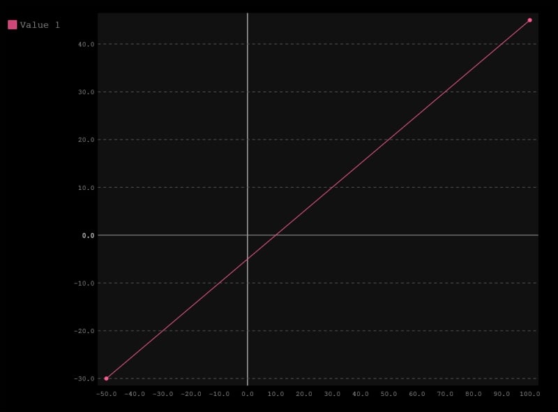
Note how pygal highlights the 0 lines on both the x and y coordinates; again, this is free styling provided by the pygal library to indicate negative values. Also, take note of the add() function, of how each value is noted as an (x, y) coordinate, grouped together in an array. Let's build another chart, this time with two plots; in this case, we build with Value 1 and Value 2. Copy the following code and...