
Along with with
graphics, the base R installation also includes the lattice package. This package implements a family of techniques known as Trellis graphics, proposed by William Cleveland to visualize complex datasets with multiple variables. The objective of those design principles was to ensure the accurate and faithful communication of data information. These principles are embedded into the package and are already evident in the default plot design settings. One interesting feature of Trellis plots is the option of multipanel conditioning, which creates multiple plots by splitting the data on the basis of one variable. A similar option is also available in ggplot2, but in that case, it is called faceting.
In lattice, we also have functions that are able to generate a plot with one single call, but once the plot is drawn, it is already final. Consequently, plot details as well as additional elements that need to be included in the graph, need to be specified already within the call to the main function. This is done by including all the specifications in the panel function argument. These specifications can be included directly in the main body of the function or specified in an independent function, which is then called; this last option usually generates more readable code, so this will be the approach used in the following examples. For instance, if we want to draw the same plot we just generated in the previous section with graphics, containing the age and circumference of trees and also the regression and smooth lines, we need to specify such elements within the function call. You may see an example of the code here; remember that lattice needs to be loaded in the workspace:
require(lattice)              ##Load lattice if needed
myPanel <- function(x,y){
panel.xyplot(x,y)            # Add the observations
panel.lmline(x,y,col="blue")   # Add the regression
panel.loess(x,y,col="red")      # Add the smooth line
}
xyplot(age~circumference, data=Orange, panel=myPanel)
This code produces the plot in Figure 1.5:
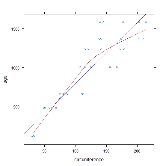
Figure 1.5: This is a scatter plot of the Orange data with the regression line (in blue) and the smooth line (in red) realized with lattice
As you would have noticed, taking aside the code differences, the plot generated does not look very different from the one obtained with graphics. This is because we are not using any special visualization feature of lattice. As mentioned earlier, with this package, we have the option of multipanel conditioning, so let's take a look at this. Let's assume that we want to have the same plot but for the different trees in the dataset. Of course, in this case, you would not need the regression or the smooth line, since there will only be one tree in each plot window, but it could be nice to have the different observations connected. This is shown in the following code:
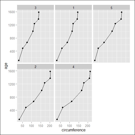
myPanel <- function(x,y){
panel.xyplot(x,y, type="b") #the observations
}
xyplot(age~circumference | Tree, data=Orange, panel=myPanel)
This code generates the graph shown in Figure 1.6:
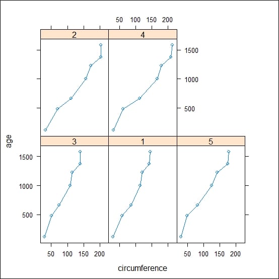
Figure 1.6: This is a scatterplot of the Orange data realized with lattice, with one subpanel representing the individual data of each tree. The number of trees in each panel is reported in the upper part of the plot area
As illustrated, using the vertical bar |, we are able to obtain the plot conditional to the value of the variable Tree. In the upper part of the panels, you would notice the reference to the value of the conditional variable, which, in this case, is the column Tree. As mentioned before, ggplot2 offers this option too; we will see one example of that in the next section.
In the next section, You would find a quick reference to how to convert a typical plot type from lattice to ggplot2. In this case, the examples are adapted to the typical plotting style of the lattice plots.
To plot the graph using lattice, use the following code:
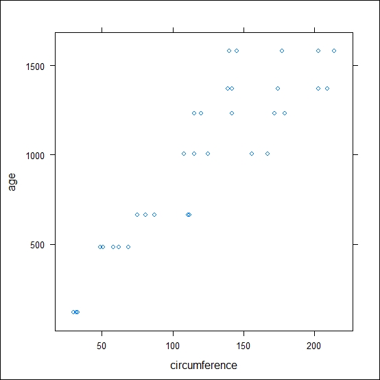
xyplot(age~circumference, data=Orange)
The preceding code results in the following output:
To plot the graph using ggplot2, use the following code:
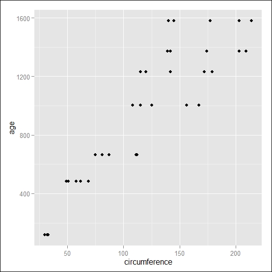
qplot(circumference,age, data=Orange)
The preceding code results in the following output:
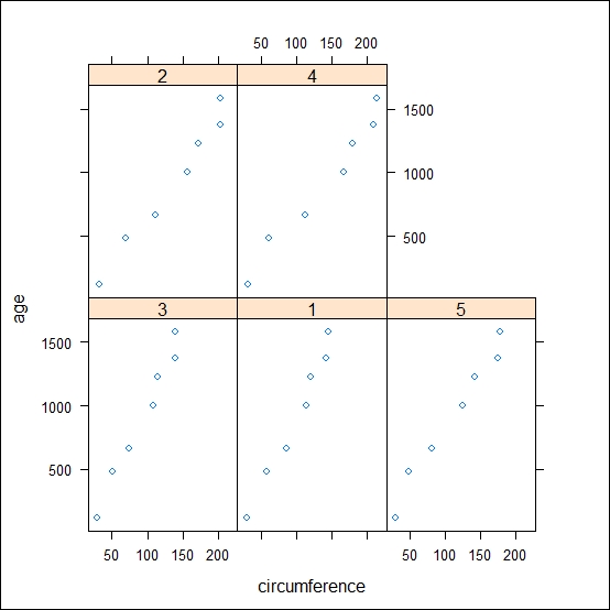
To plot the graph using lattice, use the following code:
xyplot(age~circumference|Tree, data=Orange)
The preceding code results in the following output:
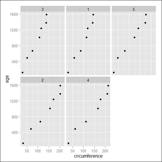
To plot the graph using ggplot2, use the following code:
qplot(circumference,age, data=Orange, facets=~Tree)
The preceding code results in the following output:
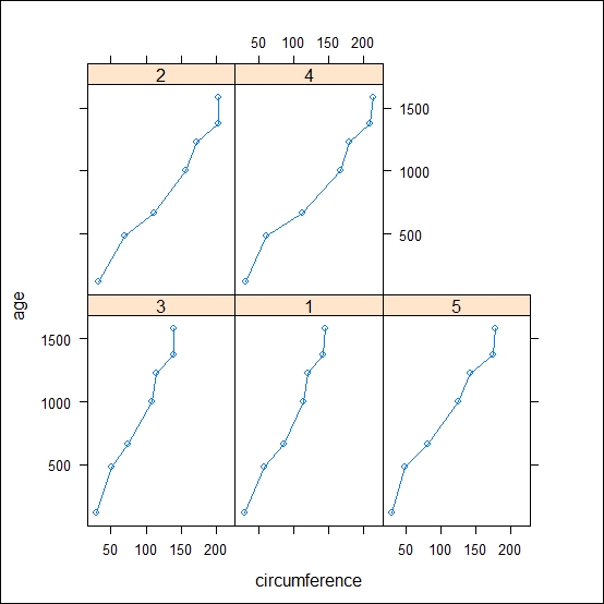
To plot the graph using lattice, use the following code:
xyplot(age~circumference|Tree, data=Orange, type="b")
The preceding code results in the following output:
To plot the graph using ggplot2, use the following code:
qplot(circumference,age, data=Orange, geom=c("line","point"), facets=~Tree)
The preceding code results in the following output:
To plot the graph using lattice, use the following code:
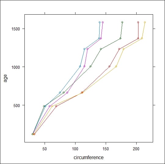
xyplot(age~circumference, data=Orange, groups=Tree, type="b")
The preceding code results in the following output:
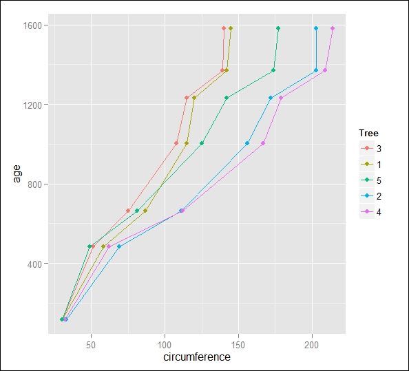
To plot the graph using ggplot2, use the following code:
qplot(circumference,age, data=Orange,color=Tree, geom=c("line","point"))
The preceding code results in the following output:
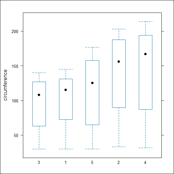
To plot the graph using lattice, use the following code:
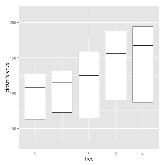
bwplot(circumference~Tree, data=Orange)
The preceding code results in the following output:
To plot the graph using ggplot2, use the following code:
qplot(Tree,circumference, data=Orange, geom="boxplot")
The preceding code results in the following output:
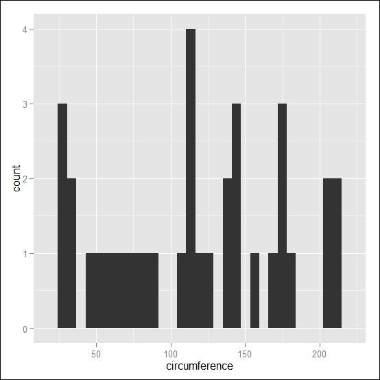
To plot the graph using lattice, use the following code:
histogram(Orange$circumference, type = "count")

To plot the graph using ggplot2, use the following code:
qplot(circumference, data=Orange, geom="histogram")
The preceding code results in the following output:
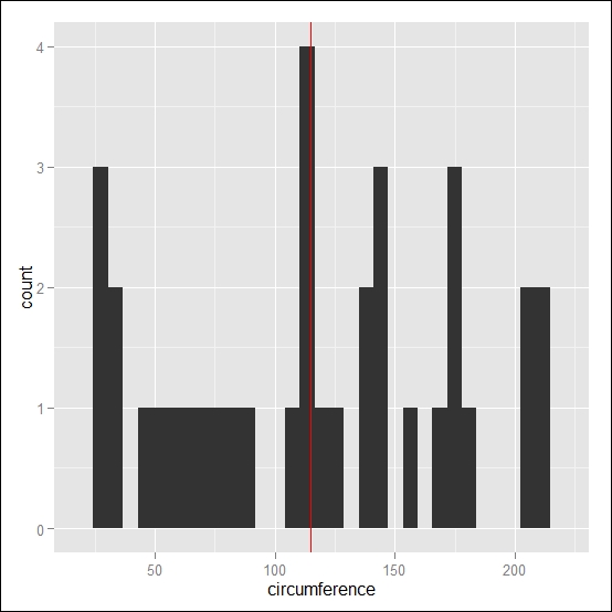
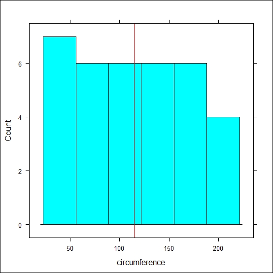
To plot the graph using lattice, use the following code:
histogram(~circumference, data=Orange, type = "count", panel=function(x,...){panel.histogram(x, ...);panel.abline(v=median(x), col="red")})
The preceding code results in the following output:
To plot the graph using ggplot2, use the following code:
qplot(circumference, data=Orange, geom="histogram")+geom_vline(xintercept = median(Orange$circumference), colour="red")
The preceding code results in the following output: