

Apart from the line chart, the bar chart is one of the most popular and useful charts you need to have in your tool belt. We will start by creating some data and then visualize it using Excel's Quick Analysis feature that is available in the 2013 version:
Fire up Excel 2013 and create a new spreadsheet. Manually enter the following data, as shown in the following screenshot:
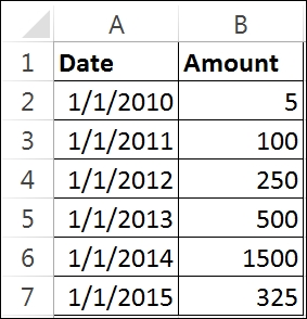
Figure 9.1
Highlight cells A1 through B7 and you will see a button appear in the bottom-right corner of your data, as shown in the following screenshot:
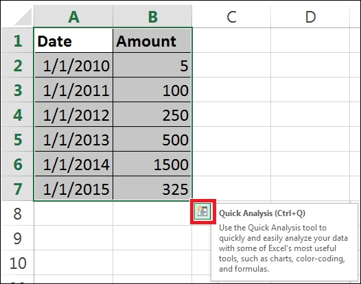
Figure 9.2
Click on the Quick Analysis button and select the CHARTS option.
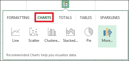
Figure 9.3
Hover over each of the different chart types and Excel will render the chosen chart type using your data. Pretty neat! Since we want to create a bar chart, click on the Cluster… option, and you will now have a chart that looks similar to the following screenshot:
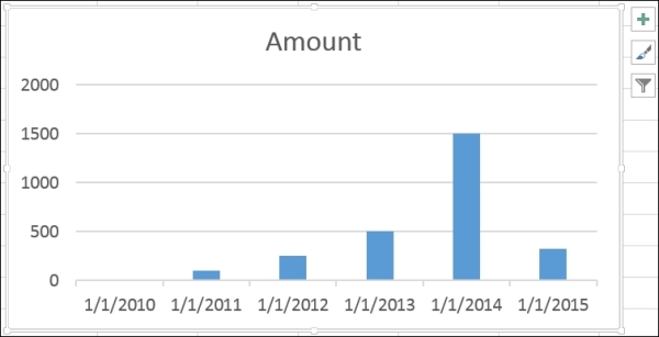
Figure 9.4
Let's pause here for a second and marvel at what just happened. All we did was highlight our data...