Book Image

Ensemble Machine Learning Cookbook

By : Dipayan Sarkar, Vijayalakshmi Natarajan
Book Image

Ensemble Machine Learning Cookbook

By: Dipayan Sarkar, Vijayalakshmi Natarajan

Overview of this book

Ensemble modeling is an approach used to improve the performance of machine learning models. It combines two or more similar or dissimilar machine learning algorithms to deliver superior intellectual powers. This book will help you to implement popular machine learning algorithms to cover different paradigms of ensemble machine learning such as boosting, bagging, and stacking. The Ensemble Machine Learning Cookbook will start by getting you acquainted with the basics of ensemble techniques and exploratory data analysis. You'll then learn to implement tasks related to statistical and machine learning algorithms to understand the ensemble of multiple heterogeneous algorithms. It will also ensure that you don't miss out on key topics, such as like resampling methods. As you progress, you’ll get a better understanding of bagging, boosting, stacking, and working with the Random Forest algorithm using real-world examples. The book will highlight how these ensemble methods use multiple models to improve machine learning results, as compared to a single model. In the concluding chapters, you'll delve into advanced ensemble models using neural networks, natural language processing, and more. You’ll also be able to implement models such as fraud detection, text categorization, and sentiment analysis. By the end of this book, you'll be able to harness ensemble techniques and the working mechanisms of machine learning algorithms to build intelligent models using individual recipes.
Table of Contents (14 chapters)

Exploratory data analysis

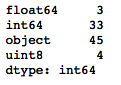
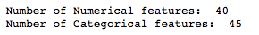
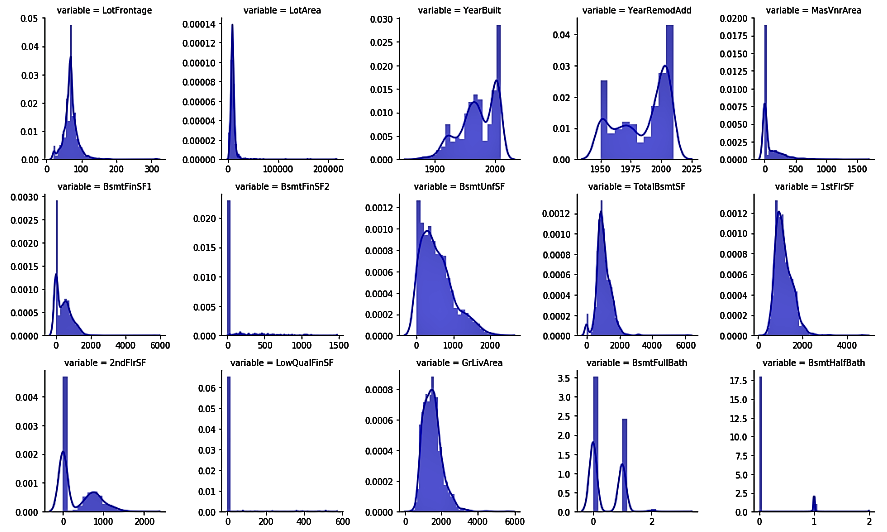
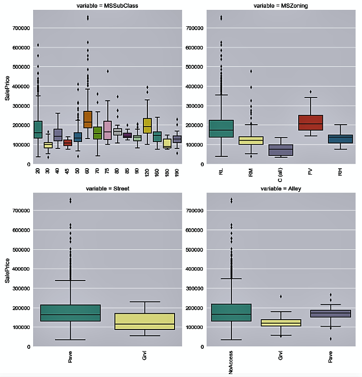
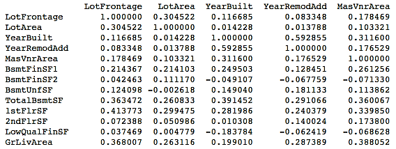
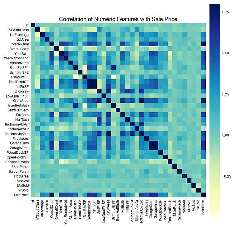
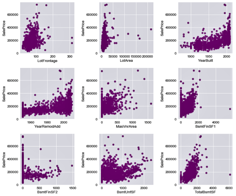
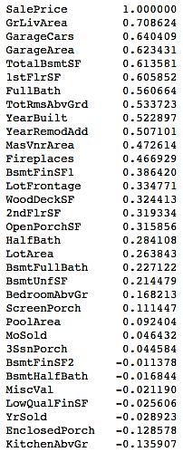
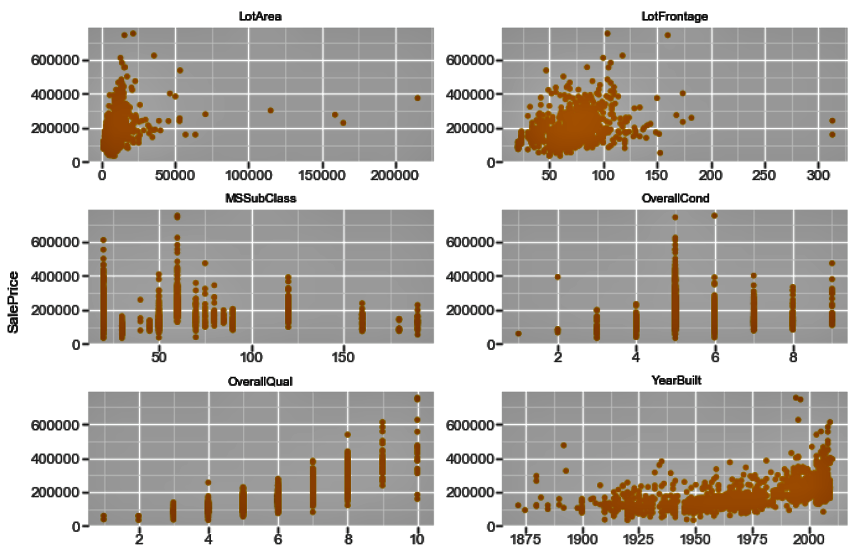
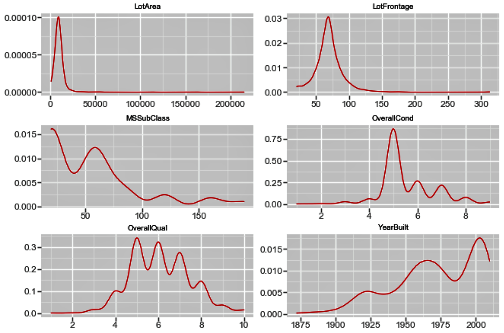
We will continue from where we left off in the previous section, on analyzing and treating missing values. Data scientists spend the majority of their time doing data preparation and exploration, not model building and optimization. Now that our dataset has no missing values, we can proceed with our exploratory data analysis.

How to do it...

  1. In the first section on data manipulation, we saw the summary statistics for our datasets. However, we have not looked at this since imputing the missing values.

Let's now look at the data and its basic statistics using the following code:

# To take a look at the top 5 rows in the dataset
housepricesdata.head(5)

# To display the summary statistics for all variables
housepricesdata.describe()
  1. With the preceding code, we can see the summary statistics of the variables in the earlier section.

Now let's see how many columns there are by datatype:

# How many columns with different datatypes are there?
housepricesdata.get_dtype_counts()

The following code shows us how many variables there are for each datatype. We can see that we have 3 float-type variables, 33 integer-type variables, 45 object-type variables, and 4 unsigned integers that hold the one-hot encoded values for the LotShape variable:

  1. Let's create two variables to hold the names of the numerical and categorical variables:
# Pulling out names of numerical variables by conditioning dtypes NOT equal to object type
numerical_features = housepricesdata.dtypes[housepricesdata.dtypes != "object"].index
print("Number of Numerical features: ", len(numerical_features))

# Pulling out names of categorical variables by conditioning dtypes equal to object type
categorical_features = housepricesdata.dtypes[housepricesdata.dtypes == "object"].index
print("Number of Categorical features: ", len(categorical_features))

This shows us the amount of numerical and categorical variables there are:

  1. We will now use the numerical_features variable that we previously created to see the distributions of numerical variables. We will use the seaborn library to plot our charts:
We use the melt() method from pandas to reshape our DataFrame. You may want to view the reshaped data after using the melt() method to understand how the DataFrame is arranged.
melt_num_features = pd.melt(housepricesdata, value_vars=numerical_features)

grid = sns.FacetGrid(melt_num_features, col="variable", col_wrap=5, sharex=False, sharey=False)
grid = grid.map(sns.distplot, "value", color="blue")

The preceding code shows us the univariate distribution of the observations of numerical variables using distribution plots:

  1. Now, we use the categorical_features variable to plot the distribution of house prices by each categorical variable:
melt_cat_features = pd.melt(housepricesdata, id_vars=['SalePrice'], value_vars=categorical_features)

grid = sns.FacetGrid(melt_cat_features, col="variable", col_wrap=2, sharex=False, sharey=False, size=6)
grid.map(sns.boxplot, "value", "SalePrice", palette="Set3")
grid.fig.subplots_adjust(wspace=1, hspace=0.25)

for ax in grid.axes.flat:
plt.setp(ax.get_xticklabels(), rotation=90)
In our dataset, we see that various attributes are present that can drive house prices. We can try to see the relationship between the attributes and the SalesPrice variable, which indicates the prices of the houses.

Let's see the distribution of the house sale prices by each categorical variable in the following plots:

  1. We will now take a look at the correlation matrix for all numerical variables using the following code:
# Generate a correlation matrix for all the numerical variables
corr=housepricesdata[numerical_features].corr()
print(corr)

This will give you the following output:

It might be tough to view the correlations displayed in the preceding format. You might want to take a look at the correlations graphically.

  1. We can also view the correlation matrix plot for the numerical variables. In order to do this, we use the numerical_features variable that we created in Step 3 to hold the names of all the numerical variables:
# Get correlation of numerical variables
df_numerical_features= housepricesdata.select_dtypes(include=[np.number])

correlation= df_numerical_features.corr()
correlation["SalePrice"].sort_values(ascending=False)*100
# Correlation Heat Map (Seaborn library)
f, ax= plt.subplots(figsize=(14,14))
plt.title("Correlation of Numerical Features with Sale Price", y=1, size=20)

# cmap - matplotlib colormap name or object - can be used to set the color options
# vmin and vmax is used to anchor the colormap
sns.heatmap(correlation, square= True, vmin=-0.2, vmax=0.8, cmap="YlGnBu")
In the preceding code, we used select_dtypes(include=[np.number]) to create the df_numeric_features variable. However, in Step 3, we used dtypes[housepricesdata.dtypes != "object"].index. Note that select_dtypes() returns a pandas.DataFrame, whereas dtypes[].index returns a pandas.Index object.

We can now visualize the correlation plot as follows:

cmap is a Matplotlib color map object.There are various categories of color map, including sequential, diverging, and qualitative. Among the sequential colors, you may choose to set your cmap parameter to BuPu or YlGn. For qualitative colors, you can set it to values such as Set3, Pastel2, and so on. More information on color options can be found at https://matplotlib.org/tutorials/colors/colormaps.html.
  1. You may also want to evaluate the correlation of your numerical variables with SalePrice to see how these numerical variables are related to the prices of the houses:
row_count = 11
col_count = 3

fig, axs = plt.subplots(row_count, col_count, figsize=(12,36))
exclude_columns = ['Id', 'SalePrice']
plot_numeric_features = [col for col in numerical_features if col not in exclude_columns]

for eachrow in range(0, row_count):
for eachcol in range(0, col_count):
i = eachrow*col_count + eachcol
if i < len(plot_numeric_features):
sns.regplot(housepricesdata[plot_numeric_features[i]], housepricesdata['SalePrice'], \
ax = axs[eachrow][eachcol], color='purple', fit_reg=False)

# tight_layout automatically adjusts subplot params so that the subplot(s) fits in to the figure area
plt.tight_layout()
plt.show()

The following screenshot shows us the correlation plots. Here, we plot the correlation between each of the numerical variables and SalePrice:


  1. If you want to evaluate the correlation of your numerical variables with the sale prices of the houses numerically, you can use the following commands:
# See correlation between numerical variables with house prices
corr=housepricesdata.corr()["SalePrice"]

# Sort the correlation values.
# Use [::-1] to sort it in descending manner
# Use [::+1] to sort it in ascending manner
corr[np.argsort(corr)[::-1]]

You can view the correlation output sorted in a descending manner in the following table:

How it works...

In Step 1, we started by reading and describing our data. This step provided us with summary statistics for our dataset. We looked at the number of variables for each datatype in Step 2.

In Step 3, we created two variables, namely, numerical_features and categorical_features, to hold the names of numerical and categorical variables respectively. We used these two variables in the steps when we worked with numerical and categorical features separately.

In Step 4 and Step 5, we used the seaborn library to plot our charts. We also introduced the melt() function from pandas, which can be used to reshape our DataFrame and feed it to the FacetGrid() function of the seaborn library. Here, we showed how you can paint the distribution plots for all the numerical variables in one single go. We also showed you how to use the same FacetGrid() function to plot the distribution of SalesPrice by each categorical variable.

We generated the correlation matrix in Step 6 using the corr() function of the DataFrame object. However, we noticed that with too many variables, the display does not make it easy for you to identify the correlations. In Step 7, we plotted the correlation matrix heatmap by using the heatmap() function from the seaborn library.

The corr() function computes the pairwise correlation of variables, excluding the missing values. The pearson method is used as the default for computing the correlation. You can also use the kendall or spearman methods, depending on your requirements. More information can be found at https://bit.ly/2CdXr8n.

In Step 8, we saw how the numerical variables correlated with the sale prices of houses using a scatter plot matrix. We generated the scatter plot matrix using the regplot() function from the seaborn library. Note that we used a parameter, fit_reg=False, to remove the regression line from the scatter plots.

In Step 9, we repeated Step 8 to see the relationship of the numerical variables with the sale prices of the houses in a numerical format, instead of scatter plots. We also sorted the output in descending order by passing a [::-1] argument to the corr() function.

There's more...

We have seen a few ways to explore data, both statistically and visually. There are quite a few libraries in Python that you can use to visualize your data. One of the most widely used of these is ggplot. Before we look at a few commands, let's learn how ggplot works.

There are seven layers of grammatical elements in ggplot, out of which, first three layers are mandatory:

  • Data
  • Aesthetics
  • Geometrics
  • Facets
  • Statistics
  • Coordinates
  • Theme

You will often start by providing a dataset to ggplot(). Then, you provide an aesthetic mapping with the aes() function to map the variables to the x and y axes. With aes(), you can also set the color, size, shape, and position of the charts. You then add the type of geometric shape you want with functions such as geom_point() or geom_histogram(). You can also add various options, such as plotting statistical summaries, faceting, visual themes, and coordinate systems.

The following code is an extension to what we have used already in this chapter, so we will directly delve into the ggplot code here:

f = pd.melt(housepricesdata, id_vars=['SalePrice'],value_vars= numerical_features[0:9])
ggplot(f,aes('value', 'SalePrice')) + geom_point(color='orange') + facet_wrap('variable',scales='free')

The preceding code generates the following chart:

Similarly, in order to view the density plot for the numerical variables, we can execute the following code:

f_1 = pd.melt(housepricesdata, value_vars=numerical_features[0:9])
ggplot(f_1, aes('value')) + geom_density(color="red") + facet_wrap('variable',scales='free')

The plot shows us the univariate density plot for each of our numerical variables. The geom_density() computes and draws a kernel density estimate, which is a smoothed version of the histogram:

See also