Book Image

Hands-On Machine Learning with Microsoft Excel 2019

By : Julio Cesar Rodriguez Martino
Book Image

Hands-On Machine Learning with Microsoft Excel 2019

By: Julio Cesar Rodriguez Martino

Overview of this book

We have made huge progress in teaching computers to perform difficult tasks, especially those that are repetitive and time-consuming for humans. Excel users, of all levels, can feel left behind by this innovation wave. The truth is that a large amount of the work needed to develop and use a machine learning model can be done in Excel. The book starts by giving a general introduction to machine learning, making every concept clear and understandable. Then, it shows every step of a machine learning project, from data collection, reading from different data sources, developing models, and visualizing the results using Excel features and offerings. In every chapter, there are several examples and hands-on exercises that will show the reader how to combine Excel functions, add-ins, and connections to databases and to cloud services to reach the desired goal: building a full data analysis flow. Different machine learning models are shown, tailored to the type of data to be analyzed. At the end of the book, the reader is presented with some advanced use cases using Automated Machine Learning, and artificial neural network, which simplifies the analysis task and represents the future of machine learning.
Table of Contents (17 chapters)
Free Chapter
1
Section 1: Machine Learning Basics
4
Section 2: Data Collection and Preparation
8
Section 3: Analytics and Machine Learning Models
11
Section 4: Data Visualization and Advanced Machine Learning

Building data distributions using histograms

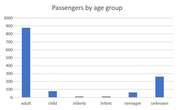
We used histograms in Chapter 5, Correlations and the Importance of Variables, without formally introducing them. This type of chart shows the count of values, either numerical or categorical. To show numerical data, we can build categories, as we did with the age of the Titanic passengers:

Or, we could have used the age variable as a number and distributed the values in bins (groups of data points falling between the same numerical range):

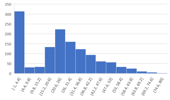
The preceding histogram was created following these steps:

  1. Navigate to Insert | Histogram.
  2. Double-click the x axis to set the number of bins to 15.

We can immediately see a large amount of entries in the first bin corresponding to the missing age values, which we defined as -1 to identify them easily. We also notice that the larger number of passengers were between 20 and 26 years old and that...