

So far, this lesson has focused on the features and basic usage of Jupyter. Now, we'll put this into practice and do some data exploration and analysis.
The dataset we'll look at in this section is the so-called Boston housing dataset. It contains US census data concerning houses in various areas around the city of Boston. Each sample corresponds to a unique area and has about a dozen measures. We should think of samples as rows and measures as columns. The data was first published in 1978 and is quite small, containing only about 500 samples.
Now that we know something about the context of the dataset, let's decide on a rough plan for the exploration and analysis. If applicable, this plan would accommodate the relevant question(s) under study. In this case, the goal is not to answer a question but to instead show Jupyter in action and illustrate some basic data analysis methods.
Our general approach to this analysis will be to do the following:
Load the data into Jupyter using a Pandas DataFrame
Quantitatively understand the features
Look for patterns and generate questions
Answer the questions to the problems
Oftentimes, data is stored in tables, which means it can be saved as a comma-separated variable (CSV) file. This format, and many others, can be read into Python as a DataFrame object, using the Pandas library. Other common formats include tab-separated variable (TSV), SQL tables, and JSON data structures. Indeed, Pandas has support for all of these. In this example, however, we are not going to load the data this way because the dataset is available directly through scikit-learn.
Note
An important part after loading data for analysis is ensuring that it's clean. For example, we would generally need to deal with missing data and ensure that all columns have the correct datatypes. The dataset we use in this section has already been cleaned, so we will not need to worry about this. However, we'll see messier data in the second lesson and explore techniques for dealing with it.
In the
lesson 1Jupyter Notebook, scroll toSubtopic AofOur First Analysis: The Boston Housing Dataset.The Boston housing dataset can be accessed from the
sklearn.datasetsmodule using theload_bostonmethod.Run the first two cells in this section to load the Boston dataset and see the
datastructurestype: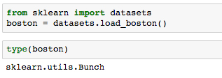
The output of the second cell tells us that it's a scikit-learn
Bunchobject. Let's get some more information about that to understand what we are dealing with.Run the next cell to import the base object from scikit-learn
utilsand print the docstring in our Notebook: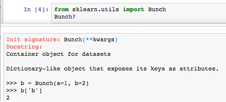
Reading the resulting docstring suggests that it's basically a dictionary, and can essentially be treated as such.
Print the field names (that is, the keys to the dictionary) by running the next cell.
We find these fields to be self-explanatory:
['DESCR', 'target', 'data', 'feature_names'].Run the next cell to print the dataset description contained in
boston['DESCR'].Note that in this call, we explicitly want to print the field value so that the Notebook renders the content in a more readable format than the string representation (that is, if we just type
boston['DESCR']without wrapping it in aprintstatement). We then see the dataset information as we've previously summarized:Boston House Prices dataset =========================== Notes ------ Data Set Characteristics: :Number of Instances: 506 :Number of Attributes: 13 numeric/categorical predictive :Median Value (attribute 14) is usually the target :Attribute Information (in order): - CRIM per capita crime rate by town … … - MEDV Median value of owner-occupied homes in $1000's :Missing Attribute Values: NoneOf particular importance here are the feature descriptions (under
Attribute Information). We will use this as reference during our analysis.Now, we are going to create a Pandas DataFrame that contains the data. This is beneficial for a few reasons: all of our data will be contained in one object, there are useful and computationally efficient DataFrame methods we can use, and other libraries such as Seaborn have tools that integrate nicely with DataFrames.
In this case, we will create our DataFrame with the standard constructor method.
Run the cell where Pandas is imported and the docstring is retrieved for
pd.DataFrame: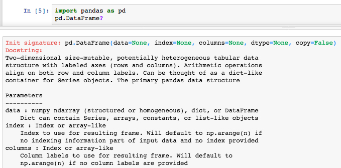
The docstring reveals the DataFrame input parameters. We want to feed in
boston['data']for the data and useboston['feature_names']for the headers.Run the next few cells to print the data, its shape, and the feature names:
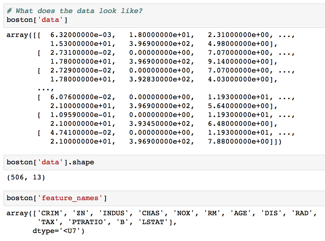
Looking at the output, we see that our data is in a 2D NumPy array. Running the command
boston['data'].shapereturns the length (number of samples) and the number of features as the first and second outputs, respectively.Load the data into a Pandas DataFrame
dfby running the following:df = pd.DataFrame(data=boston['data'], columns=boston['feature_names'])
In machine learning, the variable that is being modeled is called the target variable; it's what you are trying to predict given the features. For this dataset, the suggested target is MEDV, the median house value in 1,000s of dollars.
Run the next cell to see the shape of the target:
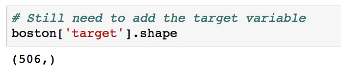
We see that it has the same length as the features, which is what we expect. It can therefore be added as a new column to the DataFrame.
Add the target variable to
dfby running the cell with the following:df['MEDV'] = boston['target']
To distinguish the target from our features, it can be helpful to store it at the front of our DataFrame.
Move the target variable to the front of
dfby running the cell with the following:y = df['MEDV'].copy() del df['MEDV'] df = pd.concat((y, df), axis=1)
Here, we introduce a dummy variable
yto hold a copy of the target column before removing it from the DataFrame. We then use the Pandas concatenation function to combine it with the remaining DataFrame along the 1st axis (as opposed to the 0th axis, which combines rows).Now that the data has been loaded in its entirety, let's take a look at the DataFrame. We can do
df.head()ordf.tail()to see a glimpse of the data andlen(df)to make sure the number of samples is what we expect.Run the next few cells to see the head, tail, and length of
df: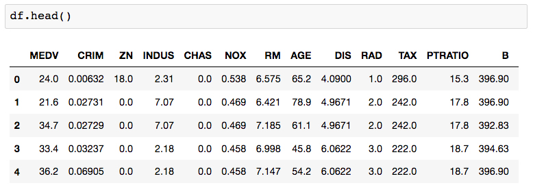
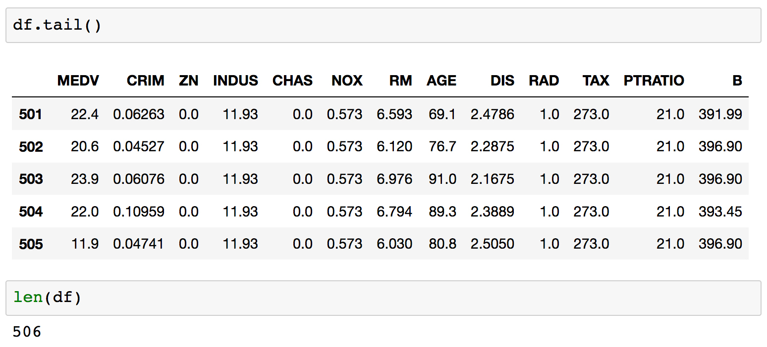
Each row is labeled with an index value, as seen in bold on the left side of the table. By default, these are a set of integers starting at 0 and incrementing by one for each row.
Printing
df.dtypeswill show the datatype contained within each column.Run the next cell to see the datatypes of each column.
For this dataset, we see that every field is a float and therefore most likely a continuous variable, including the target. This means that predicting the target variable is a regression problem.
The next thing we need to do is clean the data by dealing with any missing data, which Pandas automatically sets as
NaNvalues. These can be identified by runningdf.isnull(), which returns a Boolean DataFrame of the same shape asdf. To get the number of NaNs per column, we can dodf.isnull().sum().Run the next cell to calculate the number of
NaNvalues in each column: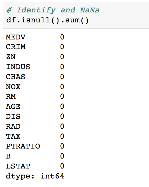
For this dataset, we see there are no NaNs, which means we have no immediate work to do in cleaning the data and can move on.
To simplify the analysis, the final thing we'll do before exploration is remove some of the columns. We won't bother looking at these, and instead focus on the remainder in more detail.
Remove some columns by running the cell that contains the following code:
for col in ['ZN', 'NOX', 'RAD', 'PTRATIO', 'B']:
    del df[col]
Since this is an entirely new dataset that we've never seen before, the first goal here is to understand the data. We've already seen the textual description of the data, which is important for qualitative understanding. We'll now compute a quantitative description.
Navigate to
Subtopic B: Data explorationin the Jupyter Notebook and run the cell containingdf.describe():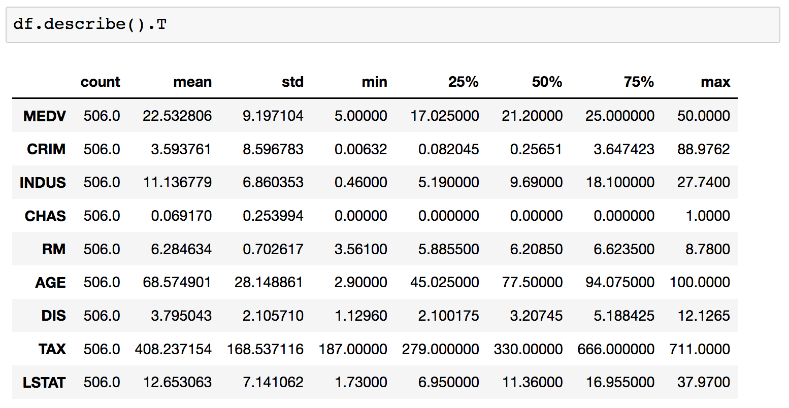
This computes various properties including the mean, standard deviation, minimum, and maximum for each column. This table gives a high-level idea of how everything is distributed. Note that we have taken the transform of the result by adding a
.Tto the output; this swaps the rows and columns.Going forward with the analysis, we will specify a set of columns to focus on.
Run the cell where these "focus columns" are defined:
cols = ['RM', 'AGE', 'TAX', 'LSTAT', 'MEDV']
This subset of columns can be selected from
dfusing square brackets. Display this subset of the DataFrame by runningdf[cols].head():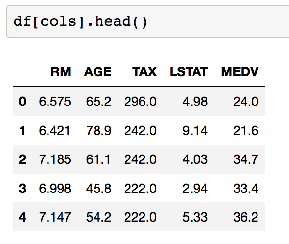
As a reminder, let's recall what each of these columns is. From the dataset documentation, we have the following:
        - RM       average number of rooms per dwelling
        - AGE      proportion of owner-occupied units built prior to 1940
        - TAX      full-value property-tax rate per $10,000
        - LSTAT    % lower status of the population
        - MEDV     Median value of owner-occupied homes in $1000's
To look for patterns in this data, we can start by calculating the pairwise correlations using
pd.DataFrame.corr.Calculate the pairwise correlations for our selected columns by running the cell containing the following code:
df[cols].corr()

This resulting table shows the correlation score between each set of values. Large positive scores indicate a strong positive (that is, in the same direction) correlation. As expected, we see maximum values of 1 on the diagonal.
Note
Pearson coefficient is defined as the covariance between two variables, divided by the product of their standard deviations:

The covariance, in turn, is defined as follows:

Here, n is the number of samples, xi and yi are the individual samples being summed over, and
 and
and  are the means of each set.
 Instead of straining our eyes to look at the preceding table, it's nicer to visualize it with a heatmap. This can be done easily with Seaborn.
Run the next cell to initialize the plotting environment, as discussed earlier in the lesson. Then, to create the heatmap, run the cell containing the following code:
import matplotlib.pyplot as plt
import seaborn as sns
%matplotlib inline
ax = sns.heatmap(df[cols].corr(),
                 cmap=sns.cubehelix_palette(20, light=0.95, dark=0.15))
ax.xaxis.tick_top() # move labels to the top
plt.savefig('../figures/lesson-1-boston-housing-corr.png',
            bbox_inches='tight', dpi=300)
We call
sns.heatmapand pass the pairwise correlation matrix as input. We use a custom color palette here to override the Seaborn default. The function returns amatplotlib.axesobject which is referenced by the variableax. The final figure is then saved as a high resolution PNG to thefiguresfolder.For the final step in our dataset exploration exercise, we'll visualize our data using Seaborn's
pairplotfunction.Visualize the DataFrame using Seaborn's
pairplotfunction. Run the cell containing the following code:sns.pairplot(df[cols], plot_kws={'alpha': 0.6}, diag_kws={'bins': 30})
Having previously used a heatmap to visualize a simple overview of the correlations, this plot allows us to see the relationships in far more detail.
Looking at the histograms on the diagonal, we see the following:
a: RM and MEDV have the closest shape to normal distributions.
b: AGE is skewed to the left and LSTAT is skewed to the right (this may seem counterintuitive but skew is defined in terms of where the mean is positioned in relation to the max).
c: For TAX, we find a large amount of the distribution is around 700. This is also evident from the scatter plots.
Taking a closer look at the MEDV histogram in the bottom right, we actually see something similar to TAX where there is a large upper-limit bin around $50,000. Recall when we did df.describe(), the min and max of MDEV was 5k and 50k, respectively. This suggests that median house values in the dataset were capped at 50k.
Continuing our analysis of the Boston housing dataset, we can see that it presents us with a regression problem where we predict a continuous target variable given a set of features. In particular, we'll be predicting the median house value (MEDV). We'll train models that take only one feature as input to make this prediction. This way, the models will be conceptually simple to understand and we can focus more on the technical details of the scikit-learn API. Then, in the next lesson, you'll be more comfortable dealing with the relatively complicated models.
Scroll to
Subtopic C: Introduction to predictive analyticsin the Jupyter Notebook and look just above at the pairplot we created in the previous section. In particular, look at the scatter plots in the bottom-left corner: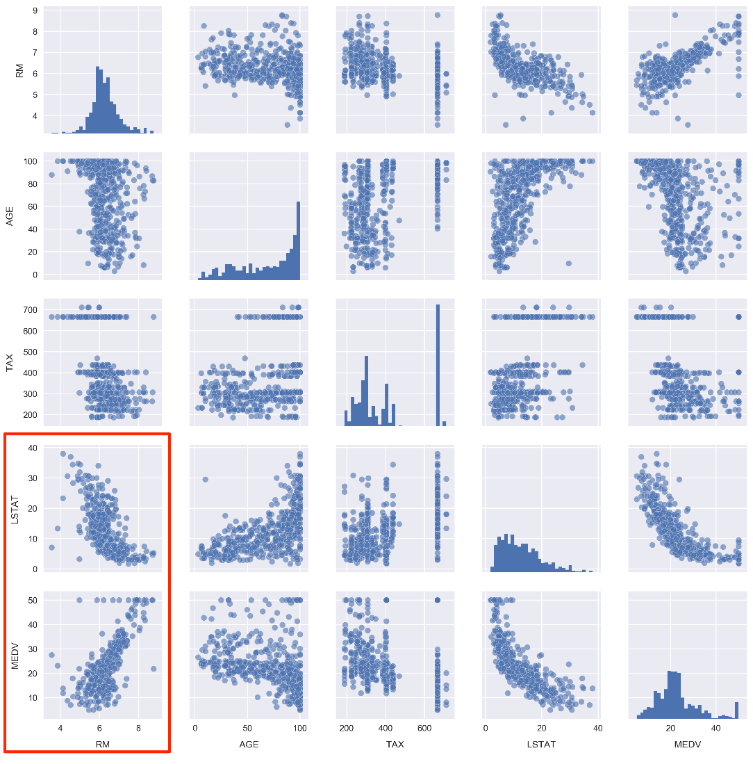
Note how the number of rooms per house (RM) and the % of the population that is lower class (LSTAT) are highly correlated with the median house value (MDEV). Let's pose the following question: how well can we predict MDEV given these variables?
To help answer this, let's first visualize the relationships using Seaborn. We will draw the scatter plots along with the line of best fit linear models.
Draw scatter plots along with the linear models by running the cell that contains the following:
fig, ax = plt.subplots(1, 2)
sns.regplot('RM', 'MEDV', df, ax=ax[0],
            scatter_kws={'alpha': 0.4}))
sns.regplot('LSTAT', 'MEDV', df, ax=ax[1],
            scatter_kws={'alpha': 0.4}))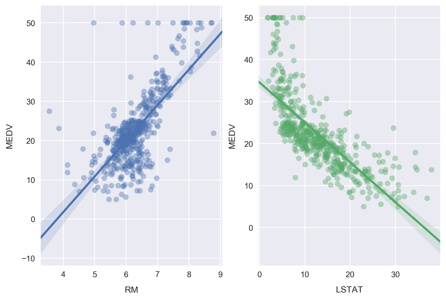
The line of best fit is calculated by minimizing the ordinary least squares error function, something Seaborn does automatically when we call the
regplotfunction. Also note the shaded areas around the lines, which represent 95% confidence intervals.Note
These 95% confidence intervals are calculated by taking the standard deviation of data in bins perpendicular to the line of best fit, effectively determining the confidence intervals at each point along the line of best fit. In practice, this involves Seaborn bootstrapping the data, a process where new data is created through random sampling with replacement. The number of bootstrapped samples is automatically determined based on the size of the dataset, but can be manually set as well by passing the
n_bootargument.Seaborn can also be used to plot the residuals for these relationships. Plot the residuals by running the cell containing the following:
fig, ax = plt.subplots(1, 2)
ax[0] = sns.residplot('RM', 'MEDV', df, ax=ax[0],
                      scatter_kws={'alpha': 0.4})
ax[0].set_ylabel('MDEV residuals $(y-\hat{y})$')
ax[1] = sns.residplot('LSTAT', 'MEDV', df, ax=ax[1],
                      scatter_kws={'alpha': 0.4})
ax[1].set_ylabel('')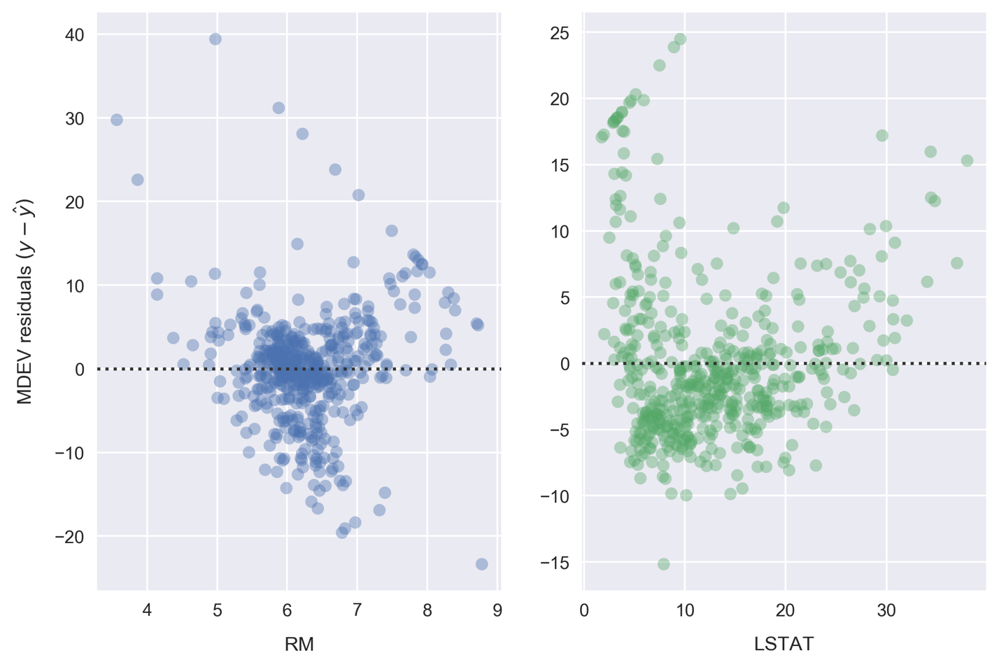
Each point on these residual plots is the difference between that sample (
y) and the linear model prediction (ŷ). Residuals greater than zero are data points that would be underestimated by the model. Likewise, residuals less than zero are data points that would be overestimated by the model.Patterns in these plots can indicate suboptimal modeling. In each preceding case, we see diagonally arranged scatter points in the positive region. These are caused by the $50,000 cap on MEDV. The RM data is clustered nicely around 0, which indicates a good fit. On the other hand, LSTAT appears to be clustered lower than 0.
Moving on from visualizations, the fits can be quantified by calculating the mean squared error. We'll do this now using scikit-learn. Define a function that calculates the line of best fit and mean squared error, by running the cell that contains the following:
def get_mse(df, feature, target='MEDV'): # Get x, y to model y = df[target].values x = df[feature].values.reshape(-1,1) ... ... error = mean_squared_error(y, y_pred) print('mse = {:.2f}'.format(error)) print()In the get_mse function, we first assign the variables y and x to the target MDEV and the dependent feature, respectively. These are cast as NumPy arrays by calling the values attribute. The dependent features array is reshaped to the format expected by scikit-learn; this is only necessary when modeling a one-dimensional feature space. The model is then instantiated and fitted on the data. For linear regression, the fitting consists of computing the model parameters using the ordinary least squares method (minimizing the sum of squared errors for each sample). Finally, after determining the parameters, we predict the target variable and use the results to calculate the MSE.
Call the
get_msefunction for both RM and LSTAT, by running the cell containing the following:get_mse(df, 'RM') get_mse(df, 'LSTAT')
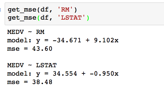
Comparing the MSE, it turns out the error is slightly lower for LSTAT. Looking back to the scatter plots, however, it appears that we might have even better success using a polynomial model for LSTAT. In the next activity, we will test this by computing a third-order polynomial model with scikit-learn.
Forgetting about our Boston housing dataset for a minute, consider another real-world situation where you might employ polynomial regression. The following example is modeling weather data. In the following plot, we see temperatures (lines) and precipitations (bars) for Vancouver, BC, Canada:
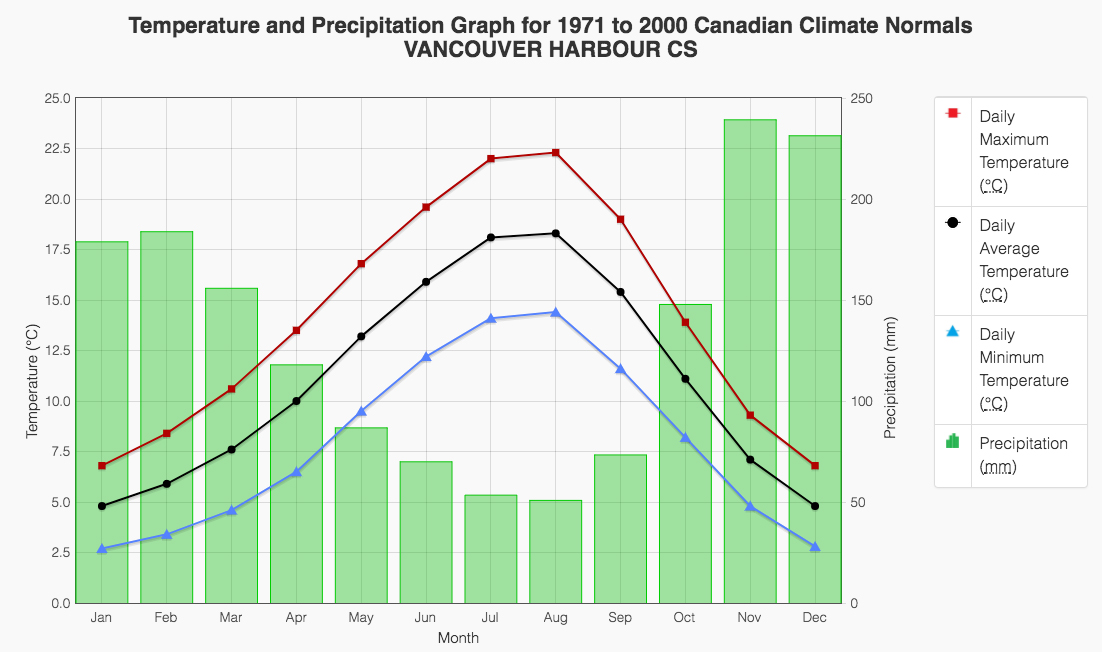
Any of these fields are likely to be fit quite well by a fourth-order polynomial. This would be a very valuable model to have, for example, if you were interested in predicting the temperature or precipitation for a continuous range of dates.
You can find the data source for this here: http://climate.weather.gc.ca/climate_normals/results_e.html?stnID=888.
Shifting our attention back to the Boston housing dataset, we would like to build a third-order polynomial model to compare against the linear one. Recall the actual problem we are trying to solve: predicting the median house value, given the lower class population percentage. This model could benefit a prospective Boston house purchaser who cares about how much of their community would be lower class.
Use scikit-learn to fit a polynomial regression model to predict the median house value (MEDV), given the LSTAT values. We are hoping to build a model that has a lower mean-squared error (MSE).
Scroll to the empty cells at the bottom of
Subtopic Cin your Jupyter Notebook. These will be found beneath the linear-model MSE calculation cell under theActivityheading.Given that our data is contained in the DataFrame
df, we will first pull out our dependent feature and target variable using the following:y = df['MEDV'].values x = df['LSTAT'].values.reshape(-1,1)
This is identical to what we did earlier for the linear model.
Check out what
xlooks like by printing the first few samples withprint(x[:3]):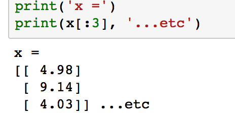
Notice how each element in the array is itself an array with length 1. This is what
reshape(-1,1)does, and it is the form expected by scikit-learn.Next, we are going to transform
xinto "polynomial features". The rationale for this may not be immediately obvious but will be explained shortly.Import the appropriate transformation tool from scikit-learn and instantiate the third-degree polynomial feature transformer:
from sklearn.preprocessing import PolynomialFeatures
poly = PolynomialFeatures(degree=3)
At this point, we simply have an instance of our feature transformer. Now, let's use it to transform the LSTAT feature (as stored in the variable
x) by running thefit_transformmethod.Build the polynomial feature set by running the following code:
x_poly = poly.fit_transform(x)
Check out what
x_polylooks like by printing the first few samples withprint(x_poly[:3]).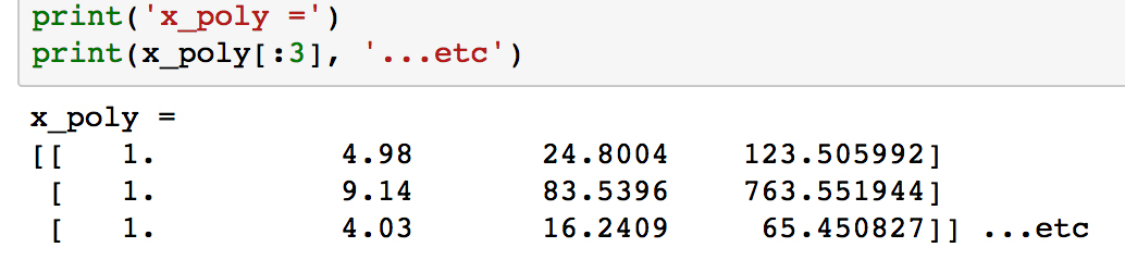
Unlike
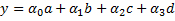
x, the arrays in each row now have length 4, where the values have been calculated as x0, x1, x2 and x3.We are now going to use this data to fit a linear model. Labeling the features as a, b, c, and d, we will calculate the coefficients α0, α1, α2, and α3 and of the linear model:
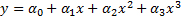
We can plug in the definitions of a, b, c, and d, to get the following polynomial model, where the coefficients are the same as the previous ones:
We'll import the
LinearRegressionclass and build our linear classification model the same way as before, when we calculated the MSE. Run the following:from sklearn.linear_model import LinearRegression clf = LinearRegression() clf.fit(x_poly, y)
Extract the coefficients and print the polynomial model using the following code:
a_0 = clf.intercept_ + clf.coef_[0] # intercept
a_1, a_2, a_3 = clf.coef_[1:] 		# other coefficients
msg = 'model: y = {:.3f} + {:.3f}x + {:.3f}x^2 + {:.3f}x^3'\
		.format(a_0, a_1, a_2, a_3)
print(msg)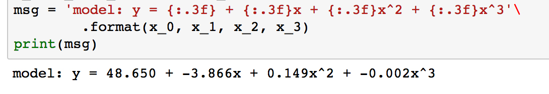
To get the actual model intercept, we have to add the
intercept_andcoef_[0]attributes. The higher-order coefficients are then given by the remaining values ofcoef_.Determine the predicted values for each sample and calculate the residuals by running the following code:
y_pred = clf.predict(x_poly)
resid_MEDV = y - y_pred
Print some of the residual values by running
print(resid_MEDV[:10]):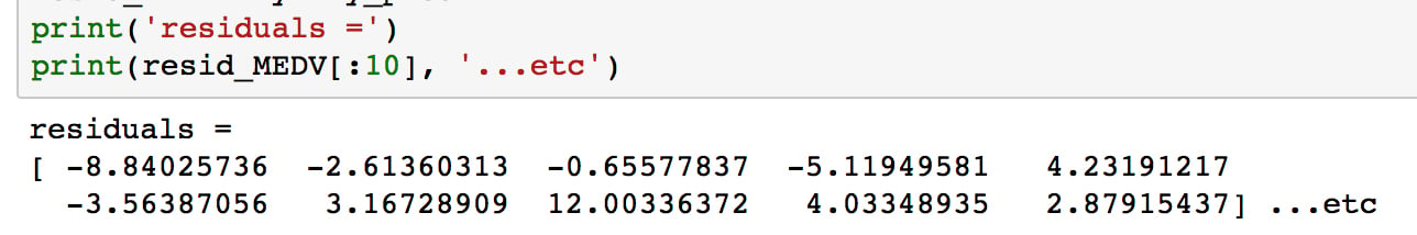
We'll plot these soon to compare with the linear model residuals, but first we will calculate the MSE.
Run the following code to print the MSE for the third-order polynomial model:
from sklearn.metrics import mean_squared_error
error = mean_squared_error(y, y_pred)
print('mse = {:.2f}'.format(error))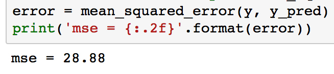
As can be seen, the MSE is significantly less for the polynomial model compared to the linear model (which was 38.5). This error metric can be converted to an average error in dollars by taking the square root. Doing this for the polynomial model, we find the average error for the median house value is only $5,300.
Now, we'll visualize the model by plotting the polynomial line of best fit along with the data.
Plot the polynomial model along with the samples by running the following:
fig, ax = plt.subplots()
# Plot the samples
ax.scatter(x.flatten(), y, alpha=0.6)
# Plot the polynomial model
x_ = np.linspace(2, 38, 50).reshape(-1, 1)
x_poly = poly.fit_transform(x_)
y_ = clf.predict(x_poly)
ax.plot(x_, y_, color='red', alpha=0.8)
ax.set_xlabel('LSTAT'); ax.set_ylabel('MEDV');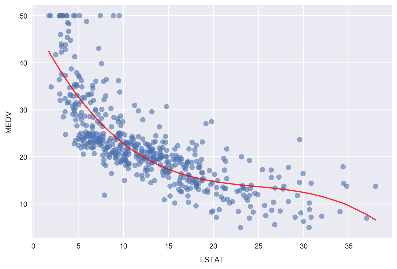
Here, we are plotting the red curve by calculating the polynomial model predictions on an array of
xvalues. The array ofxvalues was created usingnp.linspace, resulting in 50 values arranged evenly between 2 and 38.Now, we'll plot the corresponding residuals. Whereas we used Seaborn for this earlier, we'll have to do it manually to show results for a scikit-learn model. Since we already calculated the residuals earlier, as reference by the
resid_MEDVvariable, we simply need to plot this list of values on a scatter chart.Plot the residuals by running the following:
fig, ax = plt.subplots(figsize=(5, 7))
ax.scatter(x, resid_MEDV, alpha=0.6)
ax.set_xlabel('LSTAT')
ax.set_ylabel('MEDV Residual $(y-\hat{y})$')
plt.axhline(0, color='black', ls='dotted');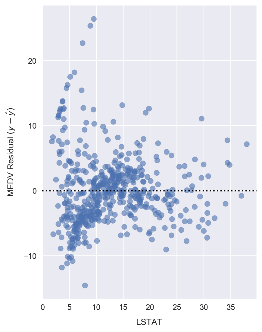
Compared to the linear model LSTAT residual plot, the polynomial model residuals appear to be more closely clustered around y - ŷ = 0. Note that
yis the sample MEDV andŷis the predicted value. There are still clear patterns, such as the cluster near x = 7 and y = -7 that indicates suboptimal modeling.
Having successfully modeled the data using a polynomial model, let's finish up this lesson by looking at categorical features. In particular, we are going to build a set of categorical features and use them to explore the dataset in more detail.
Often, we find datasets where there are a mix of continuous and categorical fields. In such cases, we can learn about our data and find patterns by segmenting the continuous variables with the categorical fields.
As a specific example, imagine you are evaluating the return on investment from an ad campaign. The data you have access to contain measures of some calculated return on investment (ROI) metric. These values were calculated and recorded daily and you are analyzing data from the previous year. You have been tasked with finding data-driven insights on ways to improve the ad campaign. Looking at the ROI daily timeseries, you see a weekly oscillation in the data. Segmenting by day of the week, you find the following ROI distributions (where 0 represents the first day of the week and 6 represents the last).
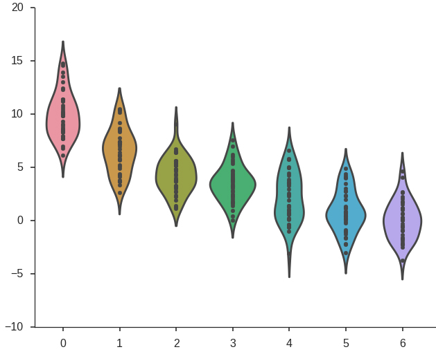
This shows clearly that the ad campaign achieves the largest ROI near the beginning of the week, tapering off later. The recommendation, therefore, may be to reduce ad spending in the latter half of the week. To continue searching for insights, you could also imagine repeating the same process for ROI grouped by month.
Since we don't have any categorical fields in the Boston housing dataset we are working with, we'll create one by effectively discretizing a continuous field. In our case, this will involve binning the data into "low", "medium", and "high" categories. It's important to note that we are not simply creating a categorical data field to illustrate the data analysis concepts in this section. As will be seen, doing this can reveal insights from the data that would otherwise be difficult to notice or altogether unavailable.
Scroll up to the pairplot in the Jupyter Notebook where we compared MEDV, LSTAT, TAX, AGE, and RM:
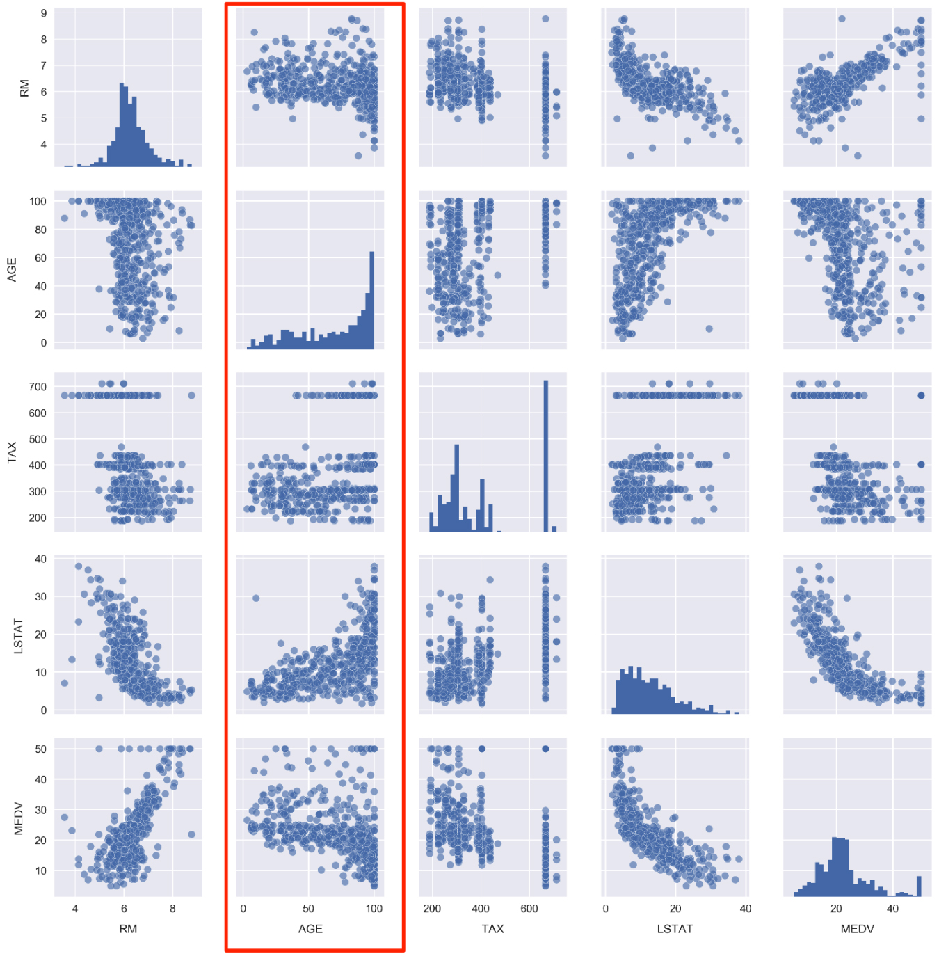
Take a look at the panels containing AGE. As a reminder, this feature is defined as the proportion of owner-occupied units built prior to 1940. We are going to convert this feature to a categorical variable. Once it's been converted, we'll be able to replot this figure with each panel segmented by color according to the age category.
Scroll down to
Subtopic D: Building and exploring categorical featuresand click into the first cell. Type and execute the following to plot the AGE cumulative distribution:sns.distplot(df.AGE.values, bins=100, hist_kws={'cumulative': True}, kde_kws={'lw': 0}) plt.xlabel('AGE') plt.ylabel('CDF') plt.axhline(0.33, color='red') plt.axhline(0.66, color='red') plt.xlim(0, df.AGE.max());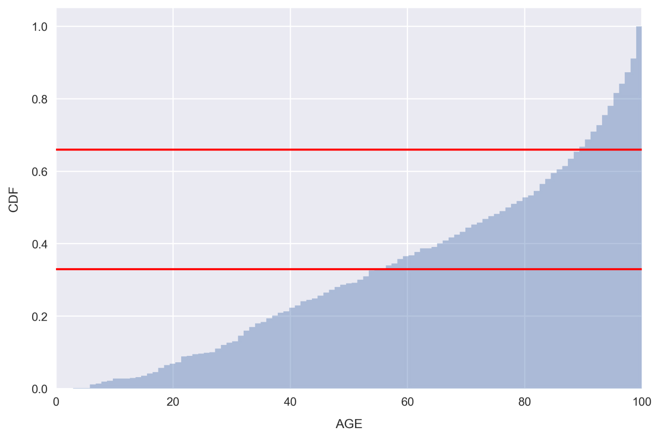
Note that we set
kde_kws={'lw': 0}in order to bypass plotting the kernel density estimate in the preceding figure.Looking at the plot, there are very few samples with low AGE, whereas there are far more with a very large AGE. This is indicated by the steepness of the distribution on the far right-hand side.
The red lines indicate 1/3 and 2/3 points in the distribution. Looking at the places where our distribution intercepts these horizontal lines, we can see that only about 33% of the samples have AGE less than 55 and 33% of the samples have AGE greater than 90! In other words, a third of the housing communities have less than 55% of homes built prior to 1940. These would be considered relatively new communities. On the other end of the spectrum, another third of the housing communities have over 90% of homes built prior to 1940. These would be considered very old.
We'll use the places where the red horizontal lines intercept the distribution as a guide to split the feature into categories: Relatively New, Relatively Old, and Very Old.
Setting the segmentation points as 50 and 85, create a new categorical feature by running the following code:
def get_age_category(x):
	if x < 50:
		return 'Relatively New'
	elif 50 <= x < 85:
		return 'Relatively Old'
	else:
	return 'Very Old'
df['AGE_category'] = df.AGE.apply(get_age_category)
Here, we are using the very handy Pandas method
apply, which applies a function to a given column or set of columns. The function being applied, in this caseget_age_category, should take one argument representing a row of data and return one value for the new column. In this case, the row of data being passed is just a single value, the AGE of the sample.Note
The
applymethod is great because it can solve a variety of problems and allows for easily readable code. Often though, vectorized methods such aspd.Series.strcan accomplish the same thing much faster. Therefore, it's advised to avoid using it if possible, especially when working with large datasets. We'll see some examples of vectorized methods in the upcoming lessons.Check on how many samples we've grouped into each age category by typing
df.groupby('AGE_category').size()into a new cell and running it: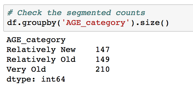
Looking at the result, it can be seen that two class sizes are fairly equal, and the Very Old group is about 40% larger. We are interested in keeping the classes comparable in size, so that each is well-represented and it's straightforward to make inferences from the analysis.
Note
It may not always be possible to assign samples into classes evenly, and in real-world situations, it's very common to find highly imbalanced classes. In such cases, it's important to keep in mind that it will be difficult to make statistically significant claims with respect to the under-represented class. Predictive analytics with imbalanced classes can be particularly difficult. The following blog post offers an excellent summary on methods for handling imbalanced classes when doing machine learning: https://svds.com/learning-imbalanced-classes/.
Let's see how the target variable is distributed when segmented by our new feature
AGE_category.Make a violin plot by running the following code:
sns.violinplot(x='MEDV', y='AGE_category', data=df,
				order=['Relatively New', 'Relatively Old', 'Very Old']);

The violin plot shows a kernel density estimate of the median house value distribution for each age category. We see that they all resemble a normal distribution. The Very Old group contains the lowest median house value samples and has a relatively large width, whereas the other groups are more tightly centered around their average. The young group is skewed to the high end, which is evident from the enlarged right half and position of the white dot in the thick black line within the body of the distribution.
This white dot represents the mean and the thick black line spans roughly 50% of the population (it fills to the first quantile on either side of the white dot). The thin black line represents boxplot whiskers and spans 95% of the population. This inner visualization can be modified to show the individual data points instead by passing
inner='point'tosns.violinplot(). Let's do that now.Redo the violin plot adding the
inner='point'argument to thesns.violinplotcall: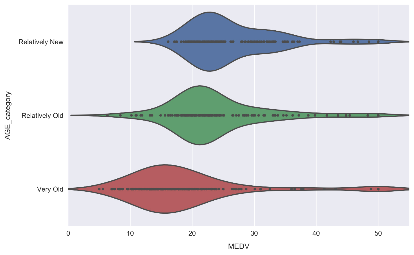
It's good to make plots like this for test purposes in order to see how the underlying data connects to the visual. We can see, for example, how there are no median house values lower than roughly $16,000 for the Relatively New segment, and therefore the distribution tail actually contains no data. Due to the small size of our dataset (only about 500 rows), we can see this is the case for each segment.
Re-do the pairplot from earlier, but now include color labels for each AGE category. This is done by simply passing the
hueargument, as follows:cols = ['RM', 'AGE', 'TAX', 'LSTAT', 'MEDV', 'AGE_category'] sns.pairplot(df[cols], hue='AGE_category', hue_order=['Relatively New', 'Relatively Old', 'Very Old'], plot_kws={'alpha': 0.5}, diag_kws={'bins': 30});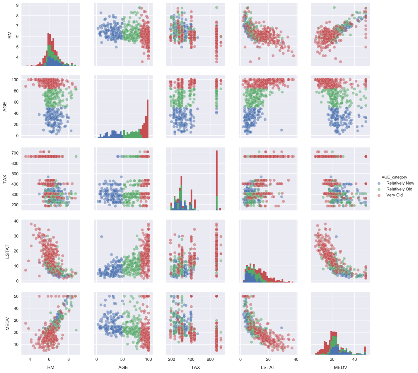
Looking at the histograms, the underlying distributions of each segment appear similar for RM and TAX. The LSTAT distributions, on the other hand, look more distinct. We can focus on them in more detail by again using a violin plot.
Make a violin plot comparing the LSTAT distributions for each
AGE_categorysegment: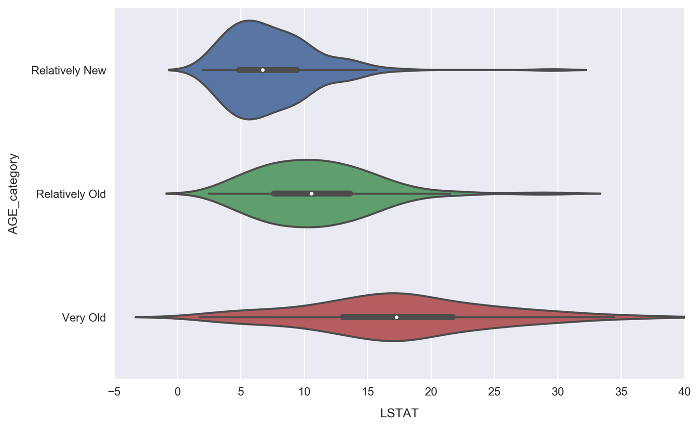
Unlike the MEDV violin plot, where each distribution had roughly the same width, here we see the width increasing along with AGE. Communities with primarily old houses (the Very Old segment) contain anywhere from very few to many lower class residents, whereas Relatively New communities are much more likely to be predominantly higher class, with over 95% of samples having less lower class percentages than the Very Old communities. This makes sense, because Relatively New neighborhoods would be more expensive.