

In this recipe, we will build a simple table that includes two dimension, and one measure. Dimensions will define the column and row headers, while the measure will be aggregated.
Building a text table
Getting ready
Connect to the Baby_names.csv dataset and open a new worksheet.
How to do it...
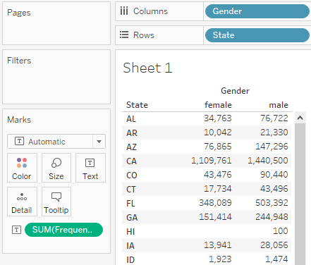
- Drag and drop State from Dimensions into the Rows shelf.
- Drag and drop Gender from Dimensions into the Columns shelf.
- Drag and drop Frequency from Measures onto Text in the Marks card:
How it works...
We have placed State and Gender, two discrete dimensions, into the rows and columns of our table. However, this still leaves the table itself empty. We can only see the Abc placeholder text. When we place Frequency, a continuous measure, onto Text, Tableau fills our table with that measure, and automatically aggregates it along the dimensions we placed in rows and columns.
There's more...
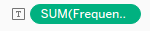
When you place a continuous measure into a view, Tableau needs to aggregate it. It will use SUM as the default aggregation function. You can also see that if you look at the Frequency pill in Text, in the Marks card, it says SUM(Frequency):
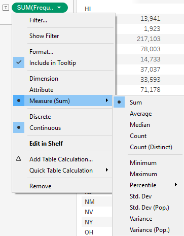
However, you can change the aggregation function. Hover over the SUM(Frequency) pill in the Marks card, so that a white arrow appears on it, and click on the arrow. If you hover over Measure (Sum) in the drop-down menu, it opens another drop-down menu. From it, you can choose from a range of aggregation functions, as shown in the following screenshot:
Keep in mind that this method of aggregation only affects the worksheet it is applied in. To change the default aggregation function for a particular measure across all worksheets, consider using the Default Properties function, which is available in the drop-down menu that will appear when we right-click a field under Measures.
See also
- For more on text tables, see the Tableau Help page on this topic at https://onlinehelp.tableau.com/current/pro/desktop/en-us/buildexamples_text.html