Book Image

R Statistics Cookbook

By : Francisco Juretig
2 (2)
Book Image

R Statistics Cookbook

2 (2)
By: Francisco Juretig

Overview of this book

R is a popular programming language for developing statistical software. This book will be a useful guide to solving common and not-so-common challenges in statistics. With this book, you'll be equipped to confidently perform essential statistical procedures across your organization with the help of cutting-edge statistical tools. You'll start by implementing data modeling, data analysis, and machine learning to solve real-world problems. You'll then understand how to work with nonparametric methods, mixed effects models, and hidden Markov models. This book contains recipes that will guide you in performing univariate and multivariate hypothesis tests, several regression techniques, and using robust techniques to minimize the impact of outliers in data.You'll also learn how to use the caret package for performing machine learning in R. Furthermore, this book will help you understand how to interpret charts and plots to get insights for better decision making. By the end of this book, you will be able to apply your skills to statistical computations using R 3.5. You will also become well-versed with a wide array of statistical techniques in R that are extensively used in the data science industry.
Table of Contents (12 chapters)

Modeling sequences with the TraMineR package

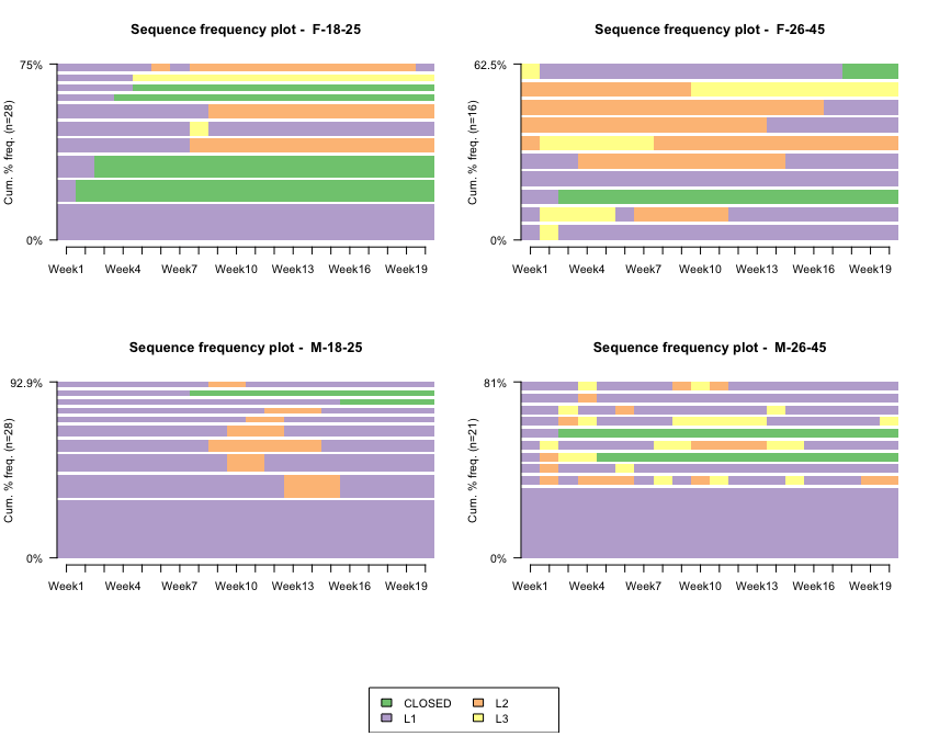
The TraMineR package allows us to work with categorical sequences, to characterize them, and to plot them in very useful ways. These sequences arise in a multiplicity of situations, such as describing professional careers: university→Company A→unemployed→Company B, or for example when describing what some clients are doing—opening account→buying→closing account.

In order to work with this package, we typically want one record per unit or person. We should have multiple columns—one for each time step. For each time step, we should have a label that indicates to which category that unit or person belongs to, at that particular time. In general, we are interested in doing some of the following—plotting the frequency of units at each category for each time step, analyzing how homogeneous the data is for each time step, and finding representative sequences. We will generally be interested in carrying these analyses by certain cohorts.

Getting ready

The TraMineR package can be installed via install.packages("TraMineR") function.

How to do it...

In this example, we will use the TraMineR package to analyze data from a club membership. The clients can choose from three membership levels/tiers—L1 (cheap membership), L2 (general membership), or L3 (VIP membership), and they can obviously cancel their membership. We want to characterize these levels further by age and sex tiers. We have four cohorts defined by the intersection between two age groups (18-25 and 26-45) and sex (F or M).

This club offers a discount after 12 weeks, in order to entice clients to jump into either the L2 or L3 membership (which are obviously more premium, and thus more expensive). We should expect to see the majority of customers on the L1 membership initially, and then observe them jumping to L2 or L3.

  1. Import the library:
library(TraMineR)
  1. Load the data and set the labels and the short labels for the plots:
datax       <- read.csv("./data__model.csv",stringsAsFactors = FALSE)
mvad.labels <- c("CLOSED","L1", "L2", "L3")
mvad.scode <- c("CLD","L1", "L2", "L3")
mvad.seq <- seqdef(datax, 3:22, states = mvad.scode,labels = mvad.labels)
group__ <- paste0(datax$Sex,"-",datax$Age)
  1. The seqfplot function can be used to plot the most frequent sequences:
seqfplot(mvad.seq, with.legend = T, border = NA, title = "Sequence frequency plot")

This results in the following output:

How it works...

These plots represent the most typical sequences for each cohort. We have one color for each class (level). The height represents the proportion of cases. The number of the upper-left part indicates the proportion of the data represented in this plot.

As we can see, there are obvious patterns by age group-sex combination. Let's direct our attention towards the ones in the lower part (male plots). Evidently, the majority of them stay in the Level-1 group forever (lower tall bars); a substantial amount spend most of their time in Level 1, although they sometimes switch to either group L2 (orange) or close their accounts (green). Clearly, the 18-25 age range is much more stable and less prone to jumping into other memberships. Indirectly, we could conclude that most of them are quite happy with L1 membership.

We could extend the same analysis for the females, although it is quite interesting that the ones from 18-25 are quite prone to closing their accounts in the first 2-3 weeks. Interestingly, the females in the 26-45 grouping are more prone to enrolling directly in the L2 or L3 memberships, which is quite a distinctive characteristic of this cohort.

In general, we observe that clients enrolled in L1 are more likely to cancel their subscriptions than those in L2 or L3. This makes sense, as clients paying more (L2 or L3) should be, in principle, more happy with the club.

There's more...

The TraMineR package allows us to plot histograms for the sequences. The interpretation is analogous to a regular histogram, with the obvious difference that the histogram is indexed by time:

seqdplot(mvad.seq, with.legend = T,group=group__, border = NA, title = "State distribution plot")

The following screenshot shows the TraMineR histograms:

For every case, L1 is the most frequent tier, maybe except for females F-26-45. In this case, L3 and L2 are quite important. It seems that for both groups between 18 and 25, there are no clients moving to groups L2/L3 until Week 10, and even when they do, they don't seem to stay much time in either one compared to both groups in the 26-45 range. We can also confirm that females F-18-25 are generally more likely to close their accounts.