Book Image

Python Feature Engineering Cookbook

By : Soledad Galli
Book Image

Python Feature Engineering Cookbook

By: Soledad Galli

Overview of this book

Feature engineering is invaluable for developing and enriching your machine learning models. In this cookbook, you will work with the best tools to streamline your feature engineering pipelines and techniques and simplify and improve the quality of your code. Using Python libraries such as pandas, scikit-learn, Featuretools, and Feature-engine, you’ll learn how to work with both continuous and discrete datasets and be able to transform features from unstructured datasets. You will develop the skills necessary to select the best features as well as the most suitable extraction techniques. This book will cover Python recipes that will help you automate feature engineering to simplify complex processes. You’ll also get to grips with different feature engineering strategies, such as the box-cox transform, power transform, and log transform across machine learning, reinforcement learning, and natural language processing (NLP) domains. By the end of this book, you’ll have discovered tips and practical solutions to all of your feature engineering problems.
Table of Contents (13 chapters)

Identifying a linear relationship

Linear models assume that the independent variables, X, take a linear relationship with the dependent variable, Y. This relationship can be dictated by the following equation:

Here, X specifies the independent variables and β are the coefficients that indicate a unit change in Y per unit change in X. Failure to meet this assumption may result in poor model performance.

Linear relationships can be evaluated by scatter plots and residual plots. Scatter plots output the relationship of the independent variable X and the target Y. Residuals are the difference between the linear estimation of Y using X and the real target:

If the relationship is linear, the residuals should follow a normal distribution centered at zero, while the values should vary homogeneously along the values of the independent variable. In this recipe, we will evaluate the linear relationship using both scatter and residual plots in a toy dataset.

How to do it...

Let's begin by importing the necessary libraries:

  1. Import the required Python libraries and a linear regression class:
import pandas as pd
import numpy as np
import matplotlib.pyplot as plt
import seaborn as sns
from sklearn.linear_model import LinearRegression

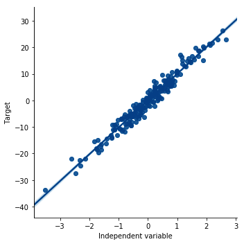
To proceed with this recipe, let's create a toy dataframe with an x variable that follows a normal distribution and shows a linear relationship with a y variable.

  1. Create an x variable with 200 observations that are normally distributed:
np.random.seed(29)
x = np.random.randn(200)
Setting the seed for reproducibility using np.random.seed() will help you get the outputs shown in this recipe.
  1. Create a y variable that is linearly related to x with some added random noise:
y = x * 10 + np.random.randn(200) * 2
  1. Create a dataframe with the x and y variables:
data = pd.DataFrame([x, y]).T
data.columns = ['x', 'y']
  1. Plot a scatter plot to visualize the linear relationship:
sns.lmplot(x="x", y="y", data=data, order=1)
plt.ylabel('Target')
plt.xlabel('Independent variable')

The preceding code results in the following output:

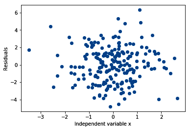
To evaluate the linear relationship using residual plots, we need to carry out a few more steps.

  1. Build a linear regression model between x and y:
linreg = LinearRegression()
linreg.fit(data['x'].to_frame(), data['y'])
Scikit-learn predictor classes do not take pandas Series as arguments. Because data['x'] is a pandas Series, we need to convert it into a dataframe using to_frame().

Now, we need to calculate the residuals.

  1. Make predictions of y using the fitted linear model:
predictions = linreg.predict(data['x'].to_frame())
  1. Calculate the residuals, that is, the difference between the predictions and the real outcome, y:
residuals = data['y'] - predictions
  1. Make a scatter plot of the independent variable x and the residuals:
plt.scatter(y=residuals, x=data['x'])
plt.ylabel('Residuals')
plt.xlabel('Independent variable x')

The output of the preceding code is as follows:

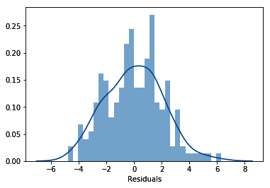
  1. Finally, let's evaluate the distribution of the residuals:
sns.distplot(residuals, bins=30)
plt.xlabel('Residuals')

In the following output, we can see that the residuals are normally distributed and centered around zero:

Check the accompanying Jupyter Notebook for examples of scatter and residual plots in variables from a real dataset which can be found at https://github.com/PacktPublishing/Python-Feature-Engineering-Cookbook/blob/master/Chapter01/Recipe-5-Identifying-a-linear-relationship.ipynb.

How it works...

In this recipe, we identified a linear relationship between an independent and a dependent variable using scatter and residual plots. To proceed with this recipe, we created a toy dataframe with an independent variable x that is normally distributed and linearly related to a dependent variable y. Next, we created a scatter plot between x and y, built a linear regression model between x and y, and obtained the predictions. Finally, we calculated the residuals and plotted the residuals versus the variable and the residuals histogram.

To generate the toy dataframe, we created an independent variable x that is normally distributed using NumPy's random.randn(), which extracts values at random from a normal distribution. Then, we created the dependent variable y by multiplying x 10 times and added random noise using NumPy's random.randn(). After, we captured x and y in a pandas dataframe using the pandas DataFrame() method and transposed it using the T method to return a 200 row x 2 column dataframe. We added the column names by passing them in a list to the columns dataframe attribute.

To create the scatter plot between x and y, we used the seaborn lmplot() method, which allows us to plot the data and fit and display a linear model on top of it. We specified the independent variable by setting x='x', the dependent variable by setting y='y', and the dataset by setting data=data. We created a model of order 1 that is a linear model, by setting the order argument to 1.

Seaborn lmplot() allows you to fit many polynomial models. You can indicate the order of the model by utilizing the order argument. In this recipe, we fit a linear model, so we indicated order=1

Next, we created a linear regression model between x and y using the LinearRegression() class from scikit-learn. We instantiated the model into a variable called linreg and then fitted the model with the fit() method with x and y as arguments. Because data['x'] was a pandas Series, we converted it into a dataframe with the to_frame() method. Next, we obtained the predictions of the linear model with the predict() method.

To make the residual plots, we calculated the residuals by subtracting the predictions from y. We evaluated the distribution of the residuals using seaborn's distplot(). Finally, we plotted the residuals against the values of x using Matplotlib scatter() and added the axis labels by utilizing Matplotlib's xlabel() and ylabel() methods.

There's more...

In the GitHub repository of this book (https://github.com/PacktPublishing/Python-Feature-Engineering-Cookbook), there are additional demonstrations that use variables from a real dataset. In the Jupyter Notebook, you will find the example plots of variables that follow a linear relationship with the target, variables that are not linearly related.

See also