
When you first connect to a data source, such as the Superstore file, Tableau will display the data connection and the fields in the data pane on the left sidebar. Fields can be dragged from the data pane onto the canvas area or onto various shelves, such as Rows, Columns, Color, or Size. We'll see that placement of the fields will result in different encodings of the data, based on the type of field.
The fields from the data source are visible in the data pane and are divided into measures and dimensions. The difference between measures and dimensions is a fundamental concept to understand when using Tableau:
- Measures: Measures are values that are aggregated. That is, they can be summed, averaged, and counted, or have a minimum or maximum.
- Dimensions: Dimensions are values that determine the level of detail at which measures are aggregated. You can think of them as slicing the measures or creating groups into which the measures fit. The combination of dimensions used in the view defines the view's basic level of detail.
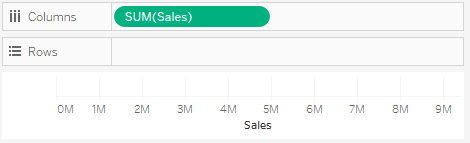
As an example (which you can view in the Chapter 01 Starter workbook on the Measures and Dimensions sheet), consider a view created using the fields Region and Sales from the Superstore connection, as shown here:
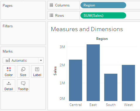
The Sales field is used as a measure in this view. Specifically, it is being aggregated as a sum. When you use a field as a measure in the view, the type aggregation (such as SUM, MIN, MAX, AVG) will be shown on the active field. In the preceding example, the active field on Rows clearly indicates the sum aggregation of Sales: SUM(Sales).
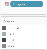
The Region field is a dimension with one of four values for each record of data: Central, East, South, or West. When the field is used as a dimension in the view, it slices the measure. So instead of an overall sum of sales, the preceding view shows the sum of sales for each region.
Another important distinction to make with fields is whether a field is being used as discrete or continuous. Whether a field is discrete or continuous, determines how Tableau visualizes it based on where it is used in the view. Tableau will give you a visual indication of the default for a field (the color of the icon in the data pane) and how it is being used in the view (the color of the active field on a shelf). Discrete fields, such as Region in the previous example, are blue, and continuous fields, such as Sales, are green.
Note
In the screenshots, in the print version of this book, you should be able to distinguish a slight difference in shading between discrete (green) and continuous (blue) fields, but pay special attention to the interface as you follow along using Tableau.
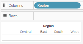
Discrete (blue) fields have values that are shown as distinct and separate from each other. Discrete values can be reordered and still make sense.
When a discrete field is used on the Rows or Columns shelves, the field defines headers. Here the discrete field Region defines column headers:
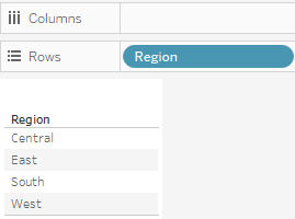
Here, it defines row headers:
When used for color, a discrete field defines a discrete color palette in which each color aligns with a distinct value of the field:
Continuous (green) fields have values that flow from first to last. Numeric and date fields are often used as continuous fields in the view. The values of these fields have an order, which would make little sense to change.
When used on Rows or Columns, a continuous field defines an axis:
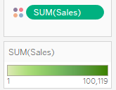
When used for color, a continuous field defines a gradient:
It is very important to note that continuous and discrete are different concepts from measure and dimension. While most dimensions are discrete by default and most measures are continuous by default, it is possible to use any measure as a discrete field and some dimensions as continuous fields.
Note
To change the default of a field, right-click on the field in the data pane and select Convert to Discrete or Convert to Continuous. To change how a field is used in the view, right-click on the field in the view and select it to be either discrete or continuous.
In general, you can think of whether a field is continuous or discrete, as telling Tableau, how to display the data (header or axis, single colors or gradient) and measure or dimension, and how to organize the data (aggregate it or slice/group it).
As you work through the examples in this chapter, pay attention to the fields you are using to create the visualizations, whether they are dimensions or measures, and whether they are discrete or continuous. Experiment with changing fields in the view from continuous to discrete and vice versa to gain an understanding of the difference in the visualization.