

The XAI medical diagnosis timeline
We often think we can see a doctor, and we will get a straight explanation of what we are suffering from and what the solution is. Although it might be true in simple cases, it is far from reality in situations in which the symptoms are either absent or difficult to detect. The case study in this chapter describes a case with confusing symptoms and unexpected outcomes.
We can represent such a patient's history, from the diagnosis process to the treatment protocols, in a timeline. A medical diagnosis timeline starts when a doctor first discovers the symptoms of a patient. A simple disease will lead to a rapid diagnosis. When the same symptoms can describe several diseases, the timeline stretches out, and it might take several days or weeks to reach the end of the process and come up with a diagnosis.
Let's introduce a standard AI prototype that will help a general practitioner. The practitioner must deal with a persistent fever symptom that will extend the medical diagnosis timeline over several days. The standard prototype will be a classical AI program, and we will then add XAI once it's created.
The standard AI program used by a general practitioner
In this section, we will explore the basic version of an experimental AI program used by a general practitioner in France. According to the World Health Organization, France is one of the top-ranking countries in the world when it comes to healthcare. Online medical consulting is already in place, and doctors are curious about AI decision-making tools that could help them in making their diagnoses. We will imagine ourselves in a fictional situation, albeit based on real events transformed for this chapter. The doctor, the patient, and the program were created for this chapter. However, the disease we will explore in this chapter, the West Nile virus, is real.
We will begin by exploring a simple KNN algorithm that can predict a disease with a few symptoms. We will limit our study to detecting the flu, a cold, or pneumonia. The number of symptoms will be limited to a cough, fever, headache, and colored sputum.
From the doctor's perspective, the symptoms are generally viewed as follows:
- A mild headache and a fever could be a cold
- A cough and fever could be a flu
- A fever and a cough with colored sputum could be pneumonia
Notice the verb is "could" and not "must." A medical diagnosis remains a probability in the very early stages of a disease. A probability becomes certain only after a few minutes to a few days, and sometimes even weeks.
Let's start by defining our AI model, a KNN algorithm, before implementing it.
Definition of a KNN algorithm
The KNN algorithm is best explained with a real-life example. Imagine you are in a supermarket. The supermarket is the dataset. You are at point pn in an aisle of the supermarket. You are looking for bottled water. You see many brands of bottled water spread over a few yards (or meters). You are also tempted by some cans of soda you see right next to you; however, you want to avoid sugar.
In terms of what's best for your diet, we will use a scale from 1 (very good for your health) to 10 (very bad for your health). pn is at point (0, 0) in a Euclidian space in which the first term is x and the second y.
The many brands of bottled water are between (0, 1) and (2, 2) in terms of their features in terms of health standards. The many brands of soda, which are generally bad in terms of health standards, have features between (3, 3) and (10, 10).
To find the nearest neighbors in terms of health features, for example, the KNN algorithm will calculate the Euclidean distance between pn and all the other points in our dataset. The calculation will run from p1 to pn–1 using the Euclidean distance formula. The k in KNN represents the number of "nearest neighbors" the algorithm will consider for classification purposes. The Euclidean distance (d1) between two given points, such as between pn(x1y1) and p1(x2y2), for example, is as follows:

Intuitively, we know that the data points located between (0, 1) and (2, 2) are closer to our point (0, 0) than the data points located between (3, 3) and (10, 10). The nearest neighbors of our point (0, 0), are the bottled water data points.
Note that these are representations of the closest features to us, not the physical points in the supermarket. The fact that the soda is close to us in the real world of the supermarket does not bring it any closer to our need in terms of our health requirements.
Considering the number of distances to calculate, a function such as the one provided by sklearn.neighbors proves necessary. We will now go back to our medical diagnosis program and build a KNN in Python.
A KNN in Python
In this section, we will first create an AI model that we will then explain in the next sections.
Open KNN.ipynb on Google Colaboratory. You can run the program with other environments but might have to adapt the names of the directories and the code required to import the dataset.
We will be using pandas, matplotlib, and sklearn.neighbors:
import pandas as pd
from matplotlib import pyplot as plt
from sklearn.neighbors import KNeighborsClassifier
import os
from google.colab import drive
The program imports the data file from GitHub (default):
repository = "github"
if repository == "github":
  !curl -L https://raw.githubusercontent.com/PacktPublishing/Hands-On-Explainable-AI-XAI-with-Python/master/Chapter01/D1.csv --output "D1.csv"

  # Setting the path for each file
  df2 = "/content/D1.csv"
  print(df2)
If you want to use Google Drive, change repository to "google":
# Set repository to "google" to read the data from Google
repository = "google"
A prompt will provide instructions to mount the drive. First, upload the files to a directory named XAI. Then provide the full default path, shown as follows:
if repository == "google":
  # Mounting the drive. If it is not mounted, a prompt will
  # provide instructions.
  drive.mount('/content/drive')
  # Setting the path for each file
  df2 = '/content/drive/My Drive/XAI/Chapter01/D1.csv'
  print(df2)
You can choose to change the name of the path to the Google Drive files.
We now read the file and display a partial view of its content:
df = pd.read_csv(df2)
print(df)
The output shows the features we are using and the class column:
     colored_sputum  cough  fever  headache  class
0               1.0    3.5    9.4       3.0    flu
1               1.0    3.4    8.4       4.0    flu
2               1.0    3.3    7.3       3.0    flu
3               1.0    3.4    9.5       4.0    flu
4               1.0    2.0    8.0       3.5    flu
..              ...    ...    ...       ...    ...
145             0.0    1.0    4.2       2.3    cold
146             0.5    2.5    2.0       1.7    cold
147             0.0    1.0    3.2       2.0    cold
148             0.4    3.4    2.4       2.3    cold
149             0.0    1.0    3.1       1.8    cold
The four features are the four symptoms we need: colored sputum, cough, fever, and headache. The class column contains the three diseases we must predict: cold, flu, and pneumonia.
The dataset was created through an interview with a general practitioner based on a group of random patients with a probable diagnosis based on the early symptoms of a disease. After a few days, the diagnosis can change depending on the evolution of the symptoms.
The values of each of the features in the dataset range from 0 to 9.9. They represent the risk level of a symptom. Decimal values are used when necessary. For example:
colored_sputum: If the value is0, the patient does not cough sputum. If the value is3, the patient is coughing some sputum. If the value is9, then the condition is serious. If it is9.9then the colored sputum is at the maximum level.A patient that has high levels of all features must be rushed to the hospital.
cough: If the value ofcoughis1, andcolored_sputumalso has a low value, such as1, then the patient is not acutely ill. If the value is high, such as7, andcolored_sputumis high as well, the patient might have pneumonia. The value offeverwill provide more information.fever: Iffeveris low, such as level2, and the other values are also low, there is not much to worry about for the moment. However, iffevergoes up with one of the other features going up, then the program will use the labels to train and provide a prediction and an explanation ifheadachealso has a high level.headache: For the West Nile virus, a high-valueheadache, such as7, along with a high level of coughing, is a trigger to send the patient to the hospital immediately to test for the virus and avoid encephalitis, for example. The general practitioner I interviewed was faced with such a difficult diagnosis in January 2020. It took several days to finally understand that the patient had been in contact with a rare virus in an animal reserve.
At the same time, the novel coronavirus, COVID-19, was beginning to appear, making a diagnosis even more difficult. A severe headache with high fever and coughing led away from COVID-19 as a hypothesis. Many patients have serious symptoms that are not from COVID-19.
As I'm finalizing this chapter, the general practitioner I interviewed and a second one I asked to confirm the idea of this chapter, are in contact with many patients that have one or all of the symptoms in the dataset. When the disease is COVID-19, the diagnosis can be made by checking the lungs' respiratory capacity, for example. However, even in the period of the COVID-19 pandemic, patients still come in with other diseases. AI can surely help a general practitioner facing an overwhelming number of incoming patients.
Warning
This dataset is not a medical dataset. The dataset only shows how such a system could work. DO NOT use it to make real-life medical diagnoses.
The model is now trained using the default values of the KNN classifier and the dataset:
# KNN classification labels
X = df.loc[:, 'colored_sputum': 'headache']
Y = df.loc[:, 'class']
# Trains the model
knn = KNeighborsClassifier()
knn.fit(X, Y)
The output shows the default values of the KNN classifier that we will have to explain at some point. For the moment, we simply display the values:
KNeighborsClassifier(algorithm='auto', leaf_size=30,
                     metric='minkowski', metric_params=None,
                     n_jobs=None, n_neighbors=5, p=2,
                     weights='uniform')
If an expert requested an explanation, an interface could provide the following details:
algorithm='auto': This will choose the best algorithm based on the values.leaf_size=30: The leaf size sent toBallTreeor toKDTree.metric='minkowski': The distance metric is the Minkowski metric, which uses a specific tensor for the calculation.metric-params=None: Additional options.n_jobs=None: The number of parallel jobs that can be run.n_neighbors=5: The number of neighbors to take into account.p=2: Options for the Minkowski metric.weights='uniform': All weights have a uniform value.
The first level of XAI in this chapter is not to explain AI to developers. The goal of the experiment is to explain how the program came up with the West Nile virus in such a way that a general practitioner could trust the prediction and send the patient to hospital for treatment.
If an expert wants to go deeper, then a link to the documentation can be provided in the XAI interface, such as this: https://scikit-learn.org/stable/modules/generated/sklearn.neighbors.KNeighborsClassifier.html
We now can now move on and visualize the trained model's output using matplotlib:
df = pd.read_csv(df2)
# Plotting the relation of each feature with each class
figure, (sub1, sub2, sub3, sub4) = plt.subplots(
    4, sharex=True, sharey=True)
plt.suptitle('k-nearest neighbors')
plt.xlabel('Feature')
plt.ylabel('Class')
X = df.loc[:, 'colored_sputum']
Y = df.loc[:, 'class']
sub1.scatter(X, Y, color='blue', label='colored_sputum')
sub1.legend(loc=4, prop={'size': 5})
sub1.set_title('Medical Diagnosis Software')
X = df.loc[:, 'cough']
Y = df.loc[:, 'class']
sub2.scatter(X, Y, color='green', label='cough')
sub2.legend(loc=4, prop={'size': 5})
X = df.loc[:, 'fever']
Y = df.loc[:, 'class']
sub3.scatter(X, Y, color='red', label='fever')
sub3.legend(loc=4, prop={'size': 5})
X = df.loc[:, 'headache']
Y = df.loc[:, 'class']
sub4.scatter(X, Y, color='black', label='headache')
sub4.legend(loc=4, prop={'size': 5})
figure.subplots_adjust(hspace=0)
plt.show()
The plot produced provides useful information for the XAI phase of the project:

Figure 1.5: KNN figure
The doctor can use an intuitive form to quickly enter the severity of each symptom on a scale of 0 to 9.9:

Figure 1.6: Evaluation form
The form was generated by the following code:
# @title Evaluation form
colored_sputum = 1 # @param {type:"integer"}
cough = 3          # @param {type:"integer"}
fever = 7          # @param {type:"integer"}
headache = 5       # @param {type:"integer"}
The program uses these values to create the input of the prediction the KNN now runs:
# colored_sputum, cough, fever, headache
cs = colored_sputum; c = cough; f = fever; h = headache;
X_DL = [[cs, c, f, h]]
prediction = knn.predict(X_DL)
print("The prediction is:", str(prediction).strip('[]'))
The output is displayed as follows:
The prediction is: 'flu'
The doctor decides that for the moment, the diagnosis is probably the flu. The diagnosis might evolve in a few days, depending on the evolution of the symptoms.
The critical issue we have as AI specialists resides in the fact that, at first, the doctor does not trust AI or any other system to make life or death decisions. In this chapter, our concern was to explain AI to a doctor, not a developer. A user needs to be able to trust the XAI system enough to make a decision. The whole point of this chapter is to use charts, plots, graphs, or any form of information that will explain the predictions made by machine learning (ML) to the doctor for the case we are dealing with in this chapter. Doctors are ready to use AI. We need to explain the predictions, not just make them.
However, let's say that in our fictitious scenario, we know that the West Nile virus has infected the patient. Both the AI program and the doctor have made a mistake. The error has gone undetected, although the KNN has run with perfect accuracy.
We are now at the heart of XAI. When the KNN runs with perfect accuracy but does not provide the diagnosis that will save a patient's life, the prediction is either a false positive if it produces the wrong prediction, or a false negative if it missed it! The whole point of people-centered AI, as we will see in the following chapters, is to detect weaknesses in our ML predictions and find innovative ways of improving the prediction.
In our case, the general dataset did not contain enough information to make a real-life prediction, although the KNN was well trained. XAI goes beyond theoretical AI and puts the human user at the center of the process, forcing us to get involved in the field the dataset was built for.
We need to find a better prediction with better data. The core concept of this section is that XAI is not only for developers, but for users too! We need users to trust AI in order for AI to see widespread adoption in decision-making situations. For a user such as a doctor to understand and accept our predictions, we need to go the extra mile!
Let's take a closer look at the West Nile virus, its itinerary, and the vector of contamination.
West Nile virus – a case of life or death
XAI involves the ability to explain the subject matter expert (SME) aspects of a project from different perspectives. A developer will not have the same need for explanations as an end user, for example. An AI program must provide information for all types of explanations.
In this chapter, we will go through the key features of XAI using a critical medical example of an early diagnosis of an infection in a human of the dangerous West Nile virus. We will see that without AI and XAI, the patient might have lost his life.
The case described is a real one that I obtained from a doctor that dealt with a similar case and disease. I then confirmed this approach with another doctor. I transposed the data to Chicago, used U.S. government healthcare data and Pasteur Institute information on the West Nile virus. The patient's name is fictitious, and I modified real events and replaced the real dangerous virus with another one, but the situation is very real, as we will see in this section.
We will imagine that we are using AI software to help a general practitioner find the right diagnosis before it's too late for this particular patient. We will see that XAI can not only provide information but also save lives.
Our story has four protagonists: the patient, the West Nile virus, the doctor, and the AI + XAI program.
Let's first start by getting acquainted with the patient and what happened to him. This information will prove vital when we start running XAI on his diagnosis.
How can a lethal mosquito bite go unnoticed?
We need to understand the history of our patient's life to provide the doctor with vital information. In this chapter, we will use the patient's location history through Google Maps.
Jan Despres, the patient, lives in Paris, France. Jan develops ML software in Python on cloud platforms for his company. Jan decided to take ten days off to travel to the United States to visit and see some friends.
Jan first stopped in New York for a few days. Then Jan flew to Chicago to see his friends. One hot summer evening during the last days of September 2019, Jan was having dinner with some friends on Eberhart Avenue, Chicago, Illinois, USA.
Jan Despres was bitten by a mosquito, hardly noticing it. It was just a little mosquito bite, as we all experience many times in the summer. Jan did not even think anything of it. He went on enjoying the meal and conversation with his friends. The problem was that the insect was not a common mosquito—it was a Culex restuans, which carries the dangerous West Nile virus.
The day after the dinner, Jan Despres flew back to Paris and went on a business trip to Lyon for a few days. It was now early October and it was still the summer. You might find it strange to see "October" and "still the summer" in the same sentence. Climate change has moved the beginning and the end of our seasons. For example, in France, for meteorologists, the winters are shorter, the "summers" are longer. This leads to many new propagations of viruses, for example. We all are going to have to update our season perceptions to climate change 2.0.
In our case, the weather was still hot, but some people were coughing on the train when Jan took the train back from Lyon. He washed his hands on the train and was careful to avoid the people that were coughing. A few days later, Jan started to cough but thought nothing of it. A few days after that, he came up with a mild fever that began to peak on Thursday evening. He took medication to bring the fever down. We will refer to this medication as MF (medication for fever). On Friday morning, his body temperature was nearly normal, but he wasn't feeling good. On Friday, he went to see his doctor, Dr. Modano.
We know at this point that Jan was bitten by a mosquito once or several times at the end of September, around September 30th. We know that he flew back to Paris in early October. During that time, the incubation period of the infection had begun. The following approximate timeline goes from the estimated mosquito bite in Chicago to the trip back to Paris:

Figure 1.7: Timeline of the patient
Jan was tired, but thought it was just jetlag.
Jan then traveled to Lyon on October 13-14th. The symptoms began to appear between October 14th and October 17th. Jan only went to see his doctor on October 18th after a bad night on the 17th. The following timeline shows an approximate sequence of events:

Figure 1.8: Timeline of the patient
We have Jan's itineraries in natural language. We will use this information later on in this chapter for our XAI program.
Let's now meet the West Nile virus and see how it got to Chicago.
What is the West Nile virus?
As for Jan's itinerary, we will be using that data in this section for our XAI program. Being able to track the virus and inform the doctor will be critical in saving Jan's life.
The West Nile virus is a zoonosis. A zoonosis is one of the many infectious diseases caused by parasites, viruses, and bacteria. It spreads between animals and humans.
Other diseases, such as Ebola and salmonellosis, are zoonotic diseases. HIV was a zoonotic disease transmitted to humans before it mutated in humans. Sometimes swine and bird flu, which are zoonotic diseases, can combine with human flu strains and produce lethal pandemics. The 1918 Spanish flu infected 500+ million people and killed 20+ million victims.
The West Nile virus usually infects animals such as birds that constitute a good reservoir for its development. Mosquitos then bite the birds to feed, and then infect the other animals or humans they bite. Mosquitos are the vectors of the West Nile virus. Humans and horses are unwilling victims.
West Nile virus usually appears during warmer seasons such as spring, summer, warm early autumn, or any other warm period depending on the location—the reason being that mosquitos are very active during warm weather.
The West Nile virus is known to be transmitted by blood transfusions and organ transplants.
The incubation period can range from a few days to 14 days. During that period, the West Nile virus propagates throughout our bodies. When detected, in about 1% of the cases, it is very dangerous, leading to meningitis or encephalitis. In many cases, such as with COVID-19, most people don't even realize they are infected. But when a person is infected, in 1% of cases or sometimes more, the virus reaches a life or death level.
Our patient, Jan, is part of that 1% of infected humans for which the West Nile virus was mortally dangerous. In an area in which hundreds of humans are infected, a few will be in danger.
In 80% of cases, the West Nile virus is asymptomatic, meaning there are no symptoms at all. The infection propagates and creates havoc along the way. If a patient is part of the 1% at risk, the infection might only be detected when meningitis or encephalitis sets in, creating symptoms.
In 20% of cases, there are symptoms. The key symptom is a brutal fever that usually appears after three to six days of incubation. The other symptoms are headaches, backaches, muscle pain, nausea, coughing, stomachaches, skin eruptions, breathing difficulties, and more.
In 1% of those cases, neurological complications set in, such as meningitis or encephalitis. Our patient, Jan, is part of the approximately 1% of those cases and the approximately 20% with mild to severe symptoms.
We now know how the West Nile virus infected Jan. We have first-hand information. However, when we start running our XAI program, we will have to investigate to find this data. We have one last step to go before starting our investigations. We need to know how the West Nile virus got to Chicago and what type of mosquito we are dealing with.
How did the West Nile virus get to Chicago?
It puzzles many of us to find that the West Nile virus that originally came from Africa can thrive in the United States. It is even more puzzling to see the virus infect people in the United States without it coming from somewhere else in 2019. In 2019, the West Nile virus infected hundreds of people and killed many of the infected patients. Furthermore, in 2019, many cases were neuroinvasive. When the virus is neuroinvasive, it goes from the bloodstream to the brain and causes West Nile encephalitis.
Migratory birds sometimes carry the West Nile virus from one area to another. In this case, a migratory bird went from Florida to Illinois and then near New York City, as shown on the following map:

Figure 1.9: Migratory map
During its stay in Illinois, it flew around two areas close to Chicago. When the bird was near Chicago, it was bitten by a Culex pipiens mosquito that fed on its blood. The authorities in Chicago had information provided from mosquito traps all around the city. In this case, a Gravid trap containing "mosquito soup" attracted and captured the Culex pipiens mosquitos, which tested positive for the West Nile virus:

Our patient, Jan, was visiting Chicago at that time and was bitten on Eberhard Avenue while visiting friends during the period. In that same period, the Gravid traps produced positive results on mosquitos carrying the West Nile virus on Eberhart Avenue:

The following map provides the details of the presence of Culex pipiens/restuans mosquitos at the same location Jan, our patient, was, at the same time, as shown by the following map:

Figure 1.10: Mosquito traps map
Our patient, Jan, is now infected, but since he is in the incubation period, he feels nothing and flies back to France unknowingly carrying the West Nile virus with him, as shown in the following map (the flight plan goes far to the North to get the jet stream and then down over the UK back to Paris):

Figure 1.11: Patient's location history map
The West Nile virus does not travel from human to human. We are "dead-ends" for the West Nile virus. Either our immune system fights it off before it infects our brain, for example, or we lose the battle. In any case, it is not contagious from human to human. This factor indicates that Jan could not have been infected in France and will be a key factor in tracing the origin of the infection back to Chicago. Location history is vital in any case. In the early days of COVID-19, it was important to know which patients arrived from China, for example.
Jan, our patient, traveled with his smartphone. He had activated Google's Location History function to have a nice representation of his trip on a map when he got home.
We will now explore the data with Google Location History, an extraction tool. The tool will help us enhance our AI program and also implement XAI, which will allow us to explain the prediction process in sufficient detail for our application to be trustworthy enough for a doctor using its predictions to send the patient to the emergency room.
XAI can save lives using Google Location History
The protagonists of our case study are the patient, the doctor, the AI, and the XAI prototype. The patient provides information to the doctor, mainly a persistent fever. The doctor has used the standard AI medical diagnosis program, seen previously in this chapter, which predicts that the patient has the flu. However, the fever remains high over several days.
When this situation occurs, a doctor generally asks the patient about their recent activities. What did the patient recently eat? Where did the patient go?
In our case, we will track where the patient went to try to find out how he was infected. To do that, we will use Google Location History. We start by downloading the data.
Downloading Google Location History
Google Location History saves where a user goes with a mobile device. To access this service, you need to sign in to your Google account, go to the Data & personalization tab, and turn your Location History on:

Figure 1.12: Google account
If you click on Location History, you will reach the option that enables you to activate or deactivate the function:

Figure 1.13: Turning on Location History
Once activated, Google will record all the locations you visit. You can then access the history and also export the data. In our case, we will use the data for our XAI project. If you click on Manage activity, you can access the history of your locations on an interactive map:
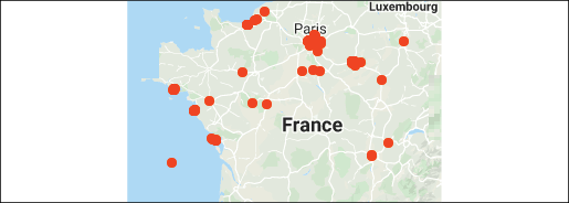
Figure 1.14: Location History map
The interface contains many interesting functions we can use for XAI:
- Locations a user visited
- Dates
- Location maps
- And more!
We will now move forward and explore Google's Location History extraction tool and retrieve the data we need for our XAI prototype.
Google's Location History extraction tool
We first need to extract data and make sure our hypothesis is correct. For that, we will use a data extraction tool designed by the Google Data Liberation Front:

Figure 1.15: Google Data Liberation Front logo
The Google Data Liberation Front was started by a team of Google engineers, whose goal is to make Google data available. They developed many tools such as Google Takeout, the Data Transfer Project, and more. We will focus on Google Takeout for our experiment.
The tool is available through your Google account at this link: https://takeout.google.com/settings/takeout.
Once you have reached this page, many data display and retrieval options are available. Scroll down to Location History:

Figure 1.16: Google Takeout page
Make sure Location History is activated as shown in the preceding screenshot, and then click on Multiple formats.
A screen will pop up and ask you to choose a format. Choose JSON and press OK. You will be taken back to the main window with JSON as your choice:

Figure 1.17: JSON selected
Go to the top of the page, click on Deselect all and then check Location History again. Then, go to the bottom of the page and click on Next step to reach the export page. Choose your export frequency and then click on Create export:

Figure 1.18: Report options
You will be notified by email when you can download the file:

Figure 1.19: Archive download
When you click on Download archive, you will reach a download window:

Figure 1.20: Download window
The file will only be available for a certain period. I recommend you download it as soon as it arrives.
The downloaded file is a ZIP archive. Unzip the file, and now we can read it. Find the Location History.json file and rename it to Location_History.json.
We now have access to the raw data. We could just rush, parse it in memory and add some features, in memory as well, to the data we loaded for KNN.ipynb. In just a few lines of code, our program could run in memory and make predictions. But a user will not trust a prediction from a black box decision-making process.
We must make our process visible by reading and displaying the data in such a way that the user understands how our AI program reached its prediction.
Reading and displaying Google Location History data
We could take the raw data of the location history provided and run an AI black box process to provide a quick diagnosis. However, most users do not trust AI systems that explain nothing, especially when it comes to life and death situations. We must build a component that can explain how and why we used Google's Location History data.
We will first address an important issue. Using a person's location history data requires privacy policies. I recommend starting the hard way by logging in and downloading data, even if it takes an online service with humans to do this for a limited number of people when requested. In a data-sensitive healthcare project, for example, do not rush to automate everything. Start carefully with a people-centered approach controlling the privacy and legal constraints, the quality of the data, and every other important aspect of such critical data.
When you are ready to move into a fully automatic process, get legal advice first, and then use automatic data extraction tools later.
That being said, let's open GoogleLocationHistory.ipynb in Google Colaboratory.
We will now focus on the data. A raw record of a Google Location History JSON file contains the structured information we are looking for:
{
  "locations" : [ {
    "timestampMs" : "1468992488806",
    "latitudeE7" : 482688285,
    "longitudeE7" : 41040263,
    "accuracy" : 30,
    "activity" : [ {
      "timestampMs" : "1468992497179",
      "activity" : [ {
        "type" : "TILTING",
        "confidence" : 100
      } ]
    }, {
      "timestampMs" : "1468992487543",
      "activity" : [ {
        "type" : "IN_VEHICLE",
        "confidence" : 85
      }, {
        "type" : "ON_BICYCLE",
        "confidence" : 8
      }, {
        "type" : "UNKNOWN",
        "confidence" : 8
      } ]
We must transform the input data to run our AI models. We could just read it and use it, but we want to be able to explain what we are doing to the expert in our case study: the doctor.
To do so, we need to read, transform, and display the data to convince our expert, the doctor, that the KNN algorithm provided the correct output. That output will ultimately save our patient's life, as we will see once we have gone through the process of explaining AI to our expert.
We first need to display the data and explain the process we applied to reach our unusual but correct diagnosis. Let's start by installing the basemap packages.
Installation of the basemap packages
basemap is part of the Matplotlib Basemap toolkit. basemap can plot two-dimensional maps in Python. Other mapping tools provide similar features, such as MATLAB's mapping toolbox, GrADS, and other tools.
basemap relies on other libraries such as the GEOS library.
Please refer to the official Matplotlib documentation to install the necessary packages: https://matplotlib.org/basemap/users/installing.html
In this section, we will install the basemap packages on Google Colaboratory. If you encounter any problems, please refer to the preceding link.
On Google Colaboratory, you can use the following code for the installation of the necessary packages for basemap:
!apt install proj-bin libproj-dev libgeos-dev
!pip install https://github.com/matplotlib/basemap/archive/v1.1.0.tar.gz
To be sure, update once the two previous packages have been installed:
!pip install -U git+https://github.com/matplotlib/basemap.git
We can now select the modules we need to build our interface.
The import instructions
We will be using pandas, numpy, mpl_toolkits.basemap, matplotlib, and datetime:
import pandas as pd
import numpy as np
from mpl_toolkits.basemap import Basemap
import matplotlib.pyplot as plt
from datetime import datetime as dt
import os
We are now ready to import the data we need to process the location history data of our patient.
Importing the data
We will need Location_History.json, which exceeds the size authorized on GitHub.
Upload Location_History.json to Google Drive. The program will then access it. You will be prompted to grant an authorization to your drive if it is not mounted. The code is set to only read Google Drive:
# @title Importing data <br>
# repository is set to "google"(default) to read the data
# from Google Drive {display-mode: "form"}
import os
from google.colab import drive
# Set repository to "github" to read the data from GitHub
# Set repository to "google" to read the data from Google
repository = "google"
# if repository == "github":
# Location_History.json is too large for GitHub
if repository == "google":
  # Mounting the drive. If it is not mounted, a prompt will
  # provide instructions.
  drive.mount('/content/drive')
  # Setting the path for each file
  df2 = '/content/drive/My Drive/XAI/Chapter01/Location_History.json'
  print(df2)
We now read the file and display the number of rows in the data file:
df_gps = pd.read_json(df2)
print('There are {:,} rows in the location history dataset'.format(
    len(df_gps)))
The output will print the name of the file and the number of rows in the file:
/tmp/nst/Location_History.json
There are 123,143 rows in the location history dataset
A black box algorithm could use the raw data. However, we want to build a white box, explainable, and interpretable AI interface. To do so, we must process the raw data we have imported.
Processing the data for XAI and basemap
Before using the data to access and display the location history records, we must parse, convert, and drop some unnecessary columns.
We will parse the latitudes, longitudes, and the timestamps stored inside the location columns:
df_gps['lat'] = df_gps['locations'].map(lambda x: x['latitudeE7'])
df_gps['lon'] = df_gps['locations'].map(lambda x: x['longitudeE7'])
df_gps['timestamp_ms'] = df_gps['locations'].map(
    lambda x: x['timestampMs'])
The output now shows the raw parsed data stored in df_gps:
                                           locations  ...   timestamp_ms
0       {'timestampMs': '1468992488806', 'latitudeE7':...  ...  1468992488806
1       {'timestampMs': '1468992524778', 'latitudeE7':...  ...  1468992524778
2       {'timestampMs': '1468992760000', 'latitudeE7':...  ...  1468992760000
3       {'timestampMs': '1468992775000', 'latitudeE7':...  ...  1468992775000
4       {'timestampMs': '1468992924000', 'latitudeE7':...  ...  1468992924000
...                                                   ...  ...            ...
123138  {'timestampMs': '1553429840319', 'latitudeE7':...  ...  1553429840319
123139  {'timestampMs': '1553430033166', 'latitudeE7':...  ...  1553430033166
123140  {'timestampMs': '1553430209458', 'latitudeE7':...  ...  1553430209458
123141  {'timestampMs': '1553514237945', 'latitudeE7':...  ...  1553514237945
123142  {'timestampMs': '1553514360002', 'latitudeE7':...  ...  1553514360002
As you can see, the data must be transformed before we can use it for basemap. It does not meet the standard of XAI or even a basemap input.
We need decimalized degrees for the latitudes and longitudes. We also need to convert the timestamp to date-time with the following code:
df_gps['lat'] = df_gps['lat'] / 10.**7
df_gps['lon'] = df_gps['lon'] / 10.**7
df_gps['timestamp_ms'] = df_gps['timestamp_ms'].astype(float) / 1000
df_gps['datetime'] = df_gps['timestamp_ms'].map(
    lambda x: dt.fromtimestamp(x).strftime('%Y-%m-%d %H:%M:%S'))
date_range = '{}-{}'.format(df_gps['datetime'].min()[:4],
                            df_gps['datetime'].max()[:4])
Before displaying some of the records in our location history, we will drop the columns we do not need anymore:
df_gps = df_gps.drop(labels=['locations', 'timestamp_ms'],
                     axis=1, inplace=False)
We can display clean data we can use for both XAI purposes and basemap:
df_gps[1000:1005]
The output is perfectly understandable:
              lat         lon               datetime
1000    49.010427    2.567411    2016-07-29 21:16:01
1001    49.011505    2.567486    2016-07-29 21:16:31
1002    49.011341    2.566974    2016-07-29 21:16:47
1003    49.011596    2.568414    2016-07-29 21:17:03
1004    49.011756    2.570905    2016-07-29 21:17:19
We have the data we need to display a map of the data to make it easy to interpret for a user.
Setting up the plotting options to display the map
To prepare the dataset to be displayed, we will first define the colors that will be used:
land_color = '#f5f5f3'
water_color = '#cdd2d4'
coastline_color = '#f5f5f3'
border_color = '#bbbbbb'
meridian_color = '#f5f5f3'
marker_fill_color = '#cc3300'
marker_edge_color = 'None'
land_color: The color of the landwater_color: The color of the watercoastline_color: The color of the coastlineborder_color: The color of the bordersmeridian_color: The color of the meridianmarker_fill_color: The fill color of a markermarker_edge_color: The color of the edge of a marker
Before displaying the location history, we will now create the plot:
fig = plt.figure(figsize=(20, 10))
ax = fig.add_subplot(111, facecolor='#ffffff', frame_on=False)
ax.set_title('Google Location History, {}'.format(date_range),
             fontsize=24, color='#333333')
Once the plot is created, we will draw the basemap and its features:
m = Basemap(projection='kav7', lon_0=0, resolution='c',
            area_thresh=10000)
m.drawmapboundary(color=border_color, fill_color=water_color)
m.drawcoastlines(color=coastline_color)
m.drawcountries(color=border_color)
m.fillcontinents(color=land_color, lake_color=water_color)
m.drawparallels(np.arange(-90., 120., 30.), color=meridian_color)
m.drawmeridians(np.arange(0., 420., 60.), color=meridian_color)
We are finally ready to plot the history points as a scatter graph:
x, y = m(df_gps['lon'].values, df_gps['lat'].values)
m.scatter(x, y, s=8, color=marker_fill_color,
          edgecolor=marker_edge_color, alpha=1, zorder=3)
We are ready to show the plot:
plt.show()
The output is a Google Location History map with history points projected on it:

Figure 1.21: Location History map
In our case study, we are focusing on our patient's activity in the USA and France, so for those purposes we'll add some data points in the USA, as follows:

Figure 1.22: Location History map (with added U.S. data points)
We can either read the data points in numerical format or display a smaller section of the map.
To show how to zoom in the map, we will focus on the patient's location history in his home city, Paris.
Let's select a traverse Mercator around Paris:
map_width_m = 100 * 1000
map_height_m = 120 * 1000
target_crs = {'datum':'WGS84',
              'ellps':'WGS84',
              'proj':'tmerc',
              'lon_0':2,
              'lat_0':49}
Then define how to display the annotations:
color = 'k'
weight = 'black'
size = 12
alpha = 0.3
xycoords = 'axes fraction'
# plotting the map
fig_width = 6
We now plot the map:
fig = plt.figure(figsize=[fig_width,
    fig_width*map_height_m / float(map_width_m)])
ax = fig.add_subplot(111, facecolor='#ffffff', frame_on=False)
ax.set_title('Location History of Target Area, {}'.format(
    date_range), fontsize=16, color='#333333')
m = Basemap(ellps=target_crs['ellps'],
            projection=target_crs['proj'],
            lon_0=target_crs['lon_0'],
            lat_0=target_crs['lat_0'],
            width=map_width_m,
            height=map_height_m,
            resolution='h',
            area_thresh=10)
m.drawcoastlines(color=coastline_color)
m.drawcountries(color=border_color)
m.fillcontinents(color=land_color, lake_color=water_color)
m.drawstates(color=border_color)
m.drawmapboundary(fill_color=water_color)
Once the map is plotted, we scatter the data, annotate a city, and show the map:
x, y = m(df_gps['lon'].values, df_gps['lat'].values)
m.scatter(x, y, s=5, color=marker_fill_color,
          edgecolor=marker_edge_color, alpha=0.6, zorder=3)
# annotating a city
plt.annotate('Paris', xy=(0.6, 0.4), xycoords=xycoords,
             color=color, weight=weight, size=size, alpha=alpha)
# showing the map
plt.show()
The target area is now displayed and annotated:

Figure 1.23: Target area
We took the location history data points, transformed them, and displayed them. We are ready to enhance the AI diagnosis KNN program:
- The transformed data can be displayed for XAI purposes, as we will see in the following section.
- The transformed data can enhance the KNN dataset used for the medical diagnosis.
- The maps can provide useful additional XAI information to both the software development team and the doctor.
We have the information we need. We will now transform our AI program into an XAI prototype.
Enhancing the AI diagnosis with XAI
In this section, we will enhance the KNN.ipynb model we built in The standard AI program used by a general practitioner section of this chapter. We will use the location history of the patient and the information concerning the presence of the West Nile virus in places they both were in at the same time during the past few weeks.
We will focus on XAI, not the scripting that leads to proving that the patient and the West Nile virus were not in the same location at the same time when the location is Paris. However, they were in the same place at the same time when the location was Chicago. We will suppose that a preprocessing script provided information with two new features: france and chicago. The value of the location feature will be 1 if both the virus and the patient were at the same location at the same time; otherwise, the value will be 0.
Enhanced KNN
Open KNN_with_Location_History.ipynb in Google Colaboratory.
This program enhances KNN.ipynb to make it explainable.
We will take D1.csv, the original file for the KNN, and enhance it. The dataset file we will use is now renamed DLH.csv and contains three additional columns and one additional class:
colored_sputum,cough,fever,headache,days,france,chicago,class
1,3.5,9.4,3,3,0,1,flu
1,3.4,8.4,4,2,0,1,flu
1,3.3,7.3,3,4,0,1,flu
1,3.4,9.5,4,2,0,1,flu
...
2,3,8,9,6,0,1,bad_flu
1,2,8,9,5,0,1,bad_flu
2,3,8,9,5,0,1,bad_flu
1,3,8,9,5,0,1,bad_flu
3,3,8,9,5,0,1,bad_flu
1,4,8,9,5,0,1,bad_flu
1,5,8,9,5,0,1,bad_flu
Warning
This dataset is not a medical dataset. The dataset only shows how such a system could work. DO NOT use it to make a real-life medical diagnosis.
The three additional columns provide critical information:
daysindicates the number of days the patient has had these symptoms for. The evolution of the symptoms often leads to the evolution of the diagnosis. This parameter weighs heavily in a doctor's decision.franceis the conjunction of the location history of the patient and the location of a specific disease. In our case, we are looking for a serious disease in a location. The month of October is implicit in this dataset. It is implicitly a real-time dataset that only goes back 15 days, which is a reasonable incubation time. If necessary, this window can be extended. In this case, in October, no serious flu is present in France, so the value is0although the patient was in France. The patient and the disease must be equal to1for this value to be equal to1.chicagois the conjunction where the location history of the patient, and the location of a disease, the West Nile virus, occurred at the same time. Both the patient and the disease were present at the same time in this location, so the value is1.
A new class was introduced to show when a patient and a virus were present at the same location at the same time. The name bad_flu is an alert name. It triggers the message for the doctor for the immediate need for additional investigations. There is a probability that the flu might not be a mild disease but might be hiding something more critical.
We will use the GitHub repository to retrieve a data file and an image for this section:
# @title Importing data <br>
# repository is set to "github"(default) to read the data
# from GitHub <br>
# set repository to "google" to read the data
# from Google Drive {display-mode: "form"}
import os
from google.colab import drive
# Set repository to "github" to read the data from GitHub
# Set repository to "google" to read the data from Google
repository = "github"
if repository == "github":
  !curl -L https://raw.githubusercontent.com/PacktPublishing/Hands-On-Explainable-AI-XAI-with-Python/master/Chapter01/DLH.csv --output "DLH.csv"
  !curl -L https://raw.githubusercontent.com/PacktPublishing/Hands-On-Explainable-AI-XAI-with-Python/master/Chapter01/glh.jpg --output "glh.jpg"
  # Setting the path for each file
  df2 = "/content/DLH.csv"
  print(df2)
Then, DLH.csv is opened and displayed:
df = pd.read_csv(df2)
print(df)
The output shows that the new columns and class are present:
     colored_sputum  cough  fever  headache  days  france  chicago    class
0               1.0    3.5    9.4       3.0     3       0        1      flu
1               1.0    3.4    8.4       4.0     2       0        1      flu
2               1.0    3.3    7.3       3.0     4       0        1      flu
3               1.0    3.4    9.5       4.0     2       0        1      flu
4               1.0    2.0    8.0       3.5     1       0        1      flu
..              ...    ...    ...       ...   ...     ...      ...      ...
179             2.0    3.0    8.0       9.0     5       0        1  bad_flu
180             1.0    3.0    8.0       9.0     5       0        1  bad_flu
181             3.0    3.0    8.0       9.0     5       0        1  bad_flu
182             1.0    4.0    8.0       9.0     5       0        1  bad_flu
183             1.0    5.0    8.0       9.0     5       0        1  bad_flu
The classifier must read the columns from colored_sputum to chicago:
# KNN classification labels
X = df.loc[:, 'colored_sputum': 'chicago']
Y = df.loc[:, 'class']
We add a fifth subplot to our figure to display the new feature, days:
df = pd.read_csv(df2)
# Plotting the relation of each feature with each class
figure, (sub1, sub2, sub3, sub4, sub5) = plt.subplots(
    5, sharex=True, sharey=True)
plt.suptitle('k-nearest neighbors')
plt.xlabel('Feature')
plt.ylabel('Class')
We don't add france and chicago. We will display that automatically in the doctor's form for further XAI purposes when we reach that point in this process.
We now add the fifth subplot with its information to the program:
X = df.loc[:, 'days']
Y = df.loc[:, 'class']
sub5.scatter(X, Y, color='brown', label='days')
sub5.legend(loc=4, prop={'size': 5})
We add the new features to the form:
# @title Alert evaluation form: do not change the values
# of france and chicago
colored_sputum = 1 # @param {type:"integer"}
cough = 3          # @param {type:"integer"}
fever = 7          # @param {type:"integer"}
headache = 7       # @param {type:"integer"}
days = 5           # @param {type:"integer"}
# Insert the function here that analyzes the conjunction of
# the Location History of the patient and location of
# diseases per country/location
france = 0  # @param {type:"integer"}
chicago = 1 # @param {type:"integer"}
The title contains a warning message. Only days must be changed. Another program provided france and chicago. This program can be written in Python, C++ using SQL, or any other tool. The main goal is to provide additional information to the KNN.
The prediction input needs to be expanded to take the additional features into account:
# colored_sputum, cough, fever, headache
cs = colored_sputum; c = cough; f = fever; h = headache; d = days;
fr = france; ch = chicago;
X_DL = [[cs, c, f, h, d, fr, ch]]
prediction = knn.predict(X_DL)
predictv = str(prediction).strip('[]')
print("The prediction is:", predictv)
The prediction is now displayed. If the prediction is bad_flu, an alert is triggered, and the need for further investigations and XAI is required. A list of urgent classes can be stored in an array. For this example, only bad_flu is detected:
alert = "bad_flu"
if alert == "bad_flu":
  print("Further urgent information might be required. Activate the XAI interface.")
The output is as follows:
Further urgent information might be required. Activate the XAI interface.
XAI is required. The doctor hesitates. Is the patient really that ill? Is this not just a classic October flu before the winter cases of flu arrive? What can a machine really know? But in the end, the health of the patient comes first. The doctor decides to consult the XAI prototype.
XAI applied to the medical diagnosis experimental program
The doctor is puzzled by the words "urgent" and "further information." Their patient does not look well at all. Still, the doctor is thinking: "We are in France in October 2019, and there is no real flu epidemic. What is this software talking about? Developers! They don't know a thing about my job, but they want to explain it to me!" The doctor does not trust machines—and especially AI—one bit with their patient's life. A black box result makes no sense to the doctor, so they decide to consult the prototype's XAI interface.
Displaying the KNN plot
The doctor decides to enter the XAI interface and quickly scan through it to see whether this is nonsense or not. The first step will be to display the KNN plot with the number of days displayed:

Figure 1.24: KNN plot
The doctor quickly but carefully looks at the screen and notices that several of the features overlap. For example, there is a fever for flu, bad flu, and pneumonia. The doctor again is thinking, "I did not need AI software to tell me that fever can mean many things!"
The doctor still needs to be convinced and does not trust the system at all yet. We need to introduce natural language AI explanations.
Natural language explanations
The XAI explanation is activated for the result of the KNN, which, we must admit, is not easy to understand just by looking at the plot. A plot might take some time to interpret and the user is likely to be in a hurry. So, for this experiment, a rule-based system with a few basic rules should suffice to make our point.
The explanation works with alert levels:
# This is an example program.
# DO NOT use this for a real-life diagnosis.
# cs = colored_sputum; c = cough; f = fever; h = headache; d = days;
# fr = france; ch = chicago;
if(f > 5):
  print("your patient has a high fever")
if(d > 4):
  print("your patient has had a high fever for more than 4 days even with medication")
if(fr < 1):
  print("it is probable that your patient was not in contact with a virus in France")
if(chicago > 0):
  print("it is probable that your patient was in contact with a virus in Chicago")
Each message in this code is linked to an alert level of the value of the feature entered. The values of the features are semantic. In this case, the semantic values are not actual values but alert values. The whole dataset has been designed so that the values mean something.
Using semantic values makes it easier to explain AI in cases such as this critical diagnosis. If the values are not semantic, a script in any language can convert abstract mathematical values into semantic values. You will need to think this through when designing the application. A good way is to store key initial values before normalizing them or using activation functions that squash them.
In this case, the output provides some useful information:
your patient has a high fever
your patient has had a high fever for more than 4 days even with medication
it is probable that your patient was not in contact with a virus in France
it is probable that your patient was in contact with a virus in Chicago
The doctor struggles to understand. One factor appears true: a high fever over four days, even with medication, means something is very wrong. And maybe the doctor missed something?
But why did Chicago come up? The doctor goes to the next AI explanation concerning the location history of the patient. The prerequisite was to implement the process we explored in the Google's Location History extraction tool section of this chapter. Now we can use that information to help the doctor in this XAI investigation.
Displaying the Location History map
A message and a map are displayed:
Your patient is part of the XAI program that you have signed up for.
As such, we have your patient's authorization to access his Google Location History, which we update in our database once a day between 10 pm and 6 am.
The following map shows that your patient was in Chicago, Paris, and Lyon within the past 3 weeks.
For this diagnosis, we only activated a search for the past 3 weeks.
Please ask your patient if he was in Chicago in the past 3 weeks. If the answer is yes, continue AI explanation.

Figure 1.25: Google Location History map (with added U.S. data points)
The map was generated with a customized version of GoogleLocationHistory.ipynb for this patient and chapter:
import matplotlib.image as mpimg
img = mpimg.imread('/content/glh.jpg')
imgplot = plt.imshow(img)
plt.show()
The doctor asks the patient if he was in Chicago in the past two weeks. The answer is yes. Now the doctor is thinking: "Something is going on here that does not meet the eye. What is the correlation between being in Chicago and this lasting high fever?"
The doctor decides to continue to scan the AI explanation of the result to find the correlation between Chicago and a potential disease at the time the patient was at the location.
Showing mosquito detection data and natural language explanations
The program displays information extracted from the DLH.csv file we downloaded in the West Nile virus – a case of life or death section of this chapter.
Our AI program used the detection data of the Culex pipiens/restuans mosquito in Chicago:

Then the program explains the AI process further:
print("Your patient was in Chicago in the period during which there were positive detections of the CULEX PIPIENS/RESTUANS mosquito.")
print("The mosquitos were trapped with a Gravid trap.")
print("The CULEX PIPIENS/RESTUANS mosquito is a vector for the West Nile virus.")
print("We matched your patient's location history with the presence of the CULEX PIPIENS/RESTUANS in Chicago.")
print("We then matched the CULEX PIPIENS/RESTUANS with West Nile virus.")
print("Continue to see information the West Nile virus.")
The program leads directly to the following links:
- https://www.healthline.com/health/west-nile-virus#treatment
- https://www.medicinenet.com/west_nile_virus_pictures_slideshow/article.htm
- https://www.medicinenet.com/script/main/art.asp?articlekey=224463
When the doctor reads the online analysis of the West Nile virus, all of the pieces of the puzzle fit together. The doctor feels that a probable diagnosis has been reached and that immediate action must be taken.
A critical diagnosis is reached with XAI
The doctor suddenly understands how the AI algorithm reached its conclusion through this prototype XAI program. The doctor realizes that their patient is in danger of having the beginning of encephalitis or meningitis. The patient might be one of the very few people seriously infected by the West Nile virus.
The doctor calls an ambulance, and the patient receives immediate emergency room (ER) care. The beginning of West Nile encephalitis was detected, and the treatment began immediately. The patient's virus had gone from the bloodstream into the brain, causing encephalitis.
The doctor realizes that AI and XAI just saved a life. The doctor now begins to trust AI through XAI. This represents one of the first of many steps of cooperation between humans and machines on the long road ahead.