-
Book Overview & Buying

-
Table Of Contents

Python Machine Learning by Example - Third Edition
By :
Python Machine Learning by Example
By:
Overview of this book
Python Machine Learning By Example, Third Edition serves as a comprehensive gateway into the world of machine learning (ML).
With six new chapters, on topics including movie recommendation engine development with Naïve Bayes, recognizing faces with support vector machine, predicting stock prices with artificial neural networks, categorizing images of clothing with convolutional neural networks, predicting with sequences using recurring neural networks, and leveraging reinforcement learning for making decisions, the book has been considerably updated for the latest enterprise requirements.
At the same time, this book provides actionable insights on the key fundamentals of ML with Python programming. Hayden applies his expertise to demonstrate implementations of algorithms in Python, both from scratch and with libraries.
Each chapter walks through an industry-adopted application. With the help of realistic examples, you will gain an understanding of the mechanics of ML techniques in areas such as exploratory data analysis, feature engineering, classification, regression, clustering, and NLP.
By the end of this ML Python book, you will have gained a broad picture of the ML ecosystem and will be well-versed in the best practices of applying ML techniques to solve problems.
Table of Contents (17 chapters)
Preface

Getting Started with Machine Learning and Python
 Free Chapter
Building a Movie Recommendation Engine with Naïve Bayes
Recognizing Faces with Support Vector Machine
Predicting Online Ad Click-Through with Tree-Based Algorithms
Predicting Online Ad Click-Through with Logistic Regression
Scaling Up Prediction to Terabyte Click Logs
Predicting Stock Prices with Regression Algorithms
Predicting Stock Prices with Artificial Neural Networks
Mining the 20 Newsgroups Dataset with Text Analysis Techniques
Discovering Underlying Topics in the Newsgroups Dataset with Clustering and Topic Modeling
Machine Learning Best Practices
Categorizing Images of Clothing with Convolutional Neural Networks
Making Predictions with Sequences Using Recurrent Neural Networks
Making Decisions in Complex Environments with Reinforcement Learning
Other Books You May Enjoy
Index
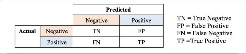

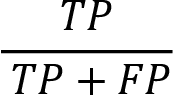 , and
, and 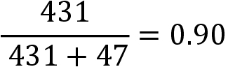 in our case.
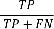 and
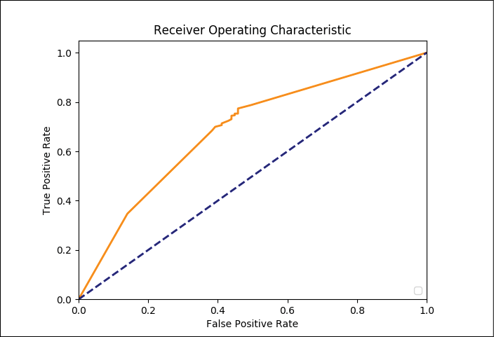
and 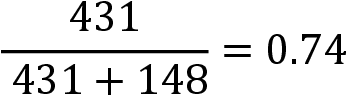 in our case. Recall is also called the true positive rate.
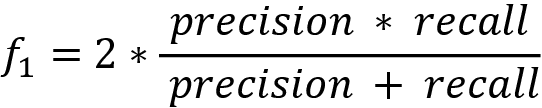 . We tend to value the f1 score above precision or recall alone.