

Identifying and Focusing on the Right Attributes
Whether you're trying to meet your marketing goals or solve problems in an existing marketing campaign, a structured dataset may comprise numerous rows and columns. In such cases, deriving actionable insights by studying each attribute might prove challenging and time-consuming. The better your data analysis skills are, the more valuable the insights you'll be able to generate in a shorter amount of time. A prudent marketing analyst would use their experience to determine the attributes that are not needed for the study; then, using their data analysis skills, they'd remove such attributes from the dataset. It is these data analysis skills that you'll be building in this chapter.
Learning to identify the right attributes is one aspect of the problem, though. Marketing goals and campaigns often involve target metrics. These metrics may depend on domain knowledge and business acumen and are known as key performance indicators (KPIs). As a marketing analyst, you'll need to be able to analyze the relationships between the attributes of your data to quantify your data in line with these metrics. For example, you may be asked to derive any of the following commonly used KPIs from a dataset comprising 30 odd columns:
- Revenue: What are the total sales the company is generating in a given time frame?
- Profit: What is the money a company makes from its total sales after deducting its expenses?
- Customer Life Cycle Value: What is the metric that indicates the total revenue the company can expect from a customer throughout his association?
- Customer Acquisition cost: What is the amount of money a company spends to convert a prospective lead to a customer?
- Conversion rate: How many of all the people you have targeted for a marketing campaign have actually bought the product or used the company's services?
- Churn: How many customers have stopped using the company's services or have stopped buying the product?
Note
These are only the commonly used KPIs. You'll find that there are numerous more in the marketing domain.
You will of course have to get rid of columns that are not needed, and then use your data analysis tools to calculate the needed metrics. pandas, the library we encountered in the previous chapter, provides quite a lot of such tools in the form of functions and collections that help generate insights and summaries. One such useful function is groupby.
The groupby( ) Function
Take a look at the following data stored in an Excel sheet:
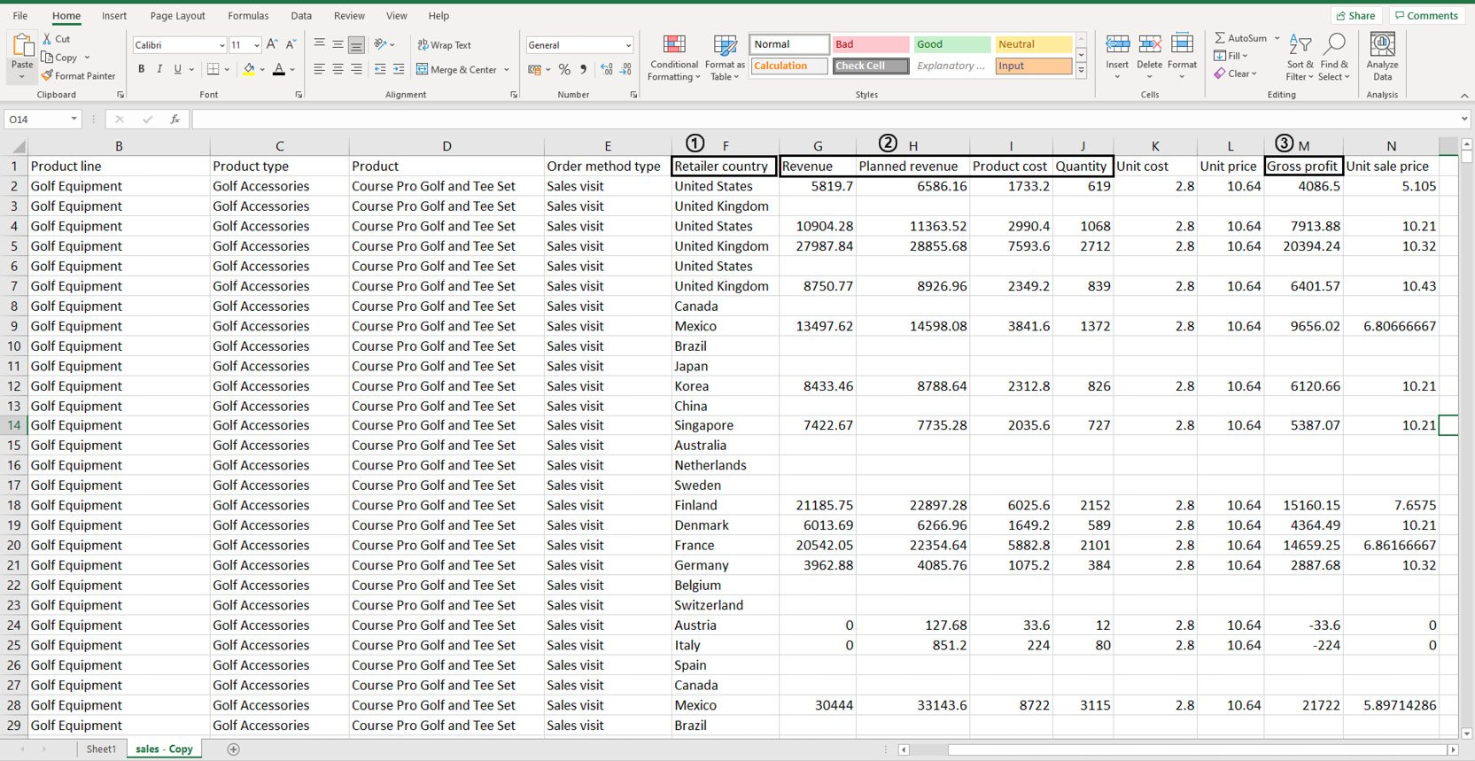
Figure 2.1: Sample sales data in an Excel sheet
You don't need to study all the attributes of the data as you'll be working with it later on. But suppose, using this dataset, you wanted to individually calculate the sums of values stored in the following columns: Revenue, Planned Revenue, Product Cost, Quantity (all four columns annotated by 2), and Gross profit (annotated by 3). Then, you wanted to segregate the sums of values for each column by the countries listed in column Retailer_country (annotated by 1). Before making any changes to it, your first task would be to visually analyze the data and find patterns in it.
Looking at the data, you can see that country names are repeated quite a lot. Now instead of calculating how many uniquely occurring countries there are, you can simply group these rows together using pivot tables as follows:
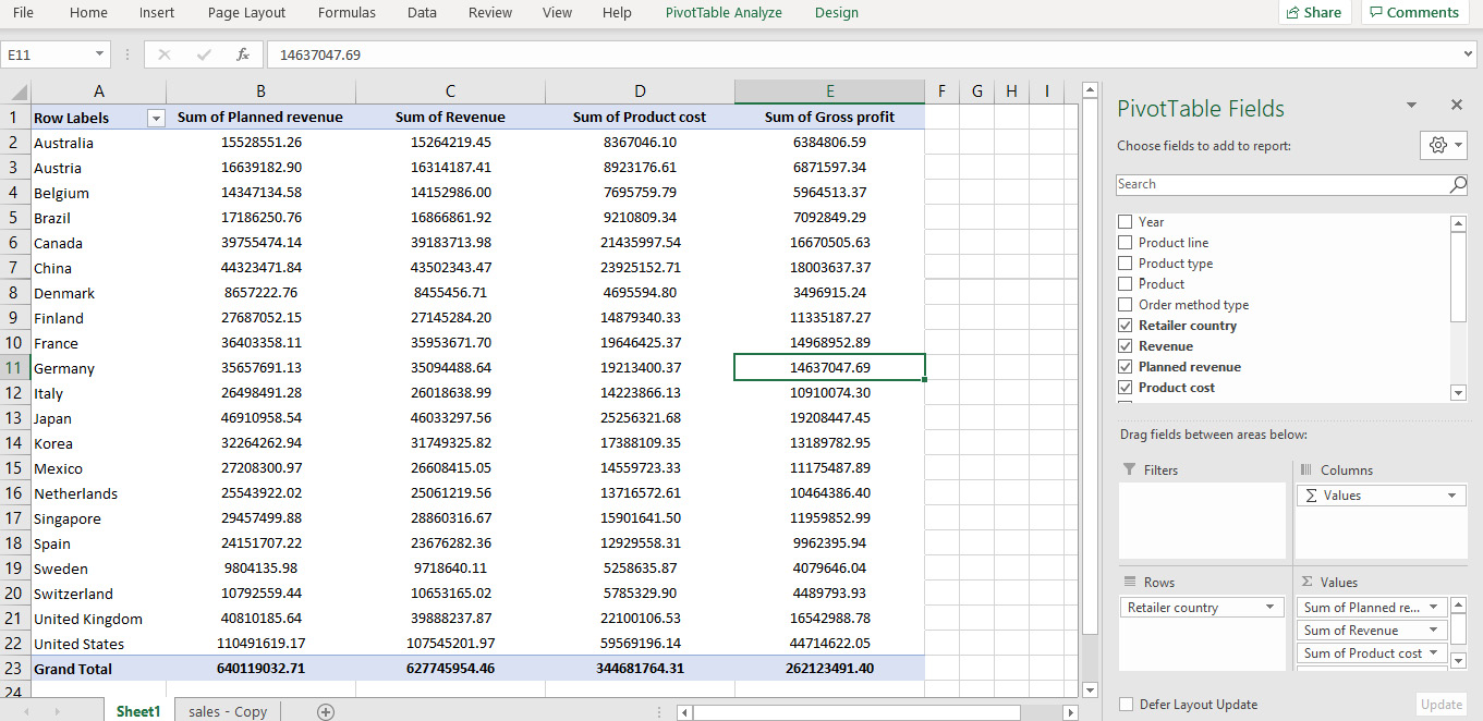
Figure 2.2: Pivot of sales data in Excel
In the preceding figure, not only is the data grouped by various countries, the values for Planned Revenue, Revenue, Product cost, and Gross profit are summed as well. That solves our problem. But what if this data was stored in a DataFrame?
This is where the groupby function comes in handy.
groupby(col)[cols].agg_func
This function groups rows with similar values in a column denoted by col and applies the aggregator function agg_func to the column of the DataFrame denoted by cols.
For example, think of the sample sales data as a DataFrame df. Now, you want to find out the total planned revenue by country. For that, you will need to group the countries and focusing on the Planned revenue column, sum all the values that correspond to the grouped countries. In the following command, we are grouping the values present in the Retailer country column and adding the corresponding values of the Planned revenue column.
df.groupby('Retailer country')['Planned revenue'].sum()
You'd get an output similar to the following:
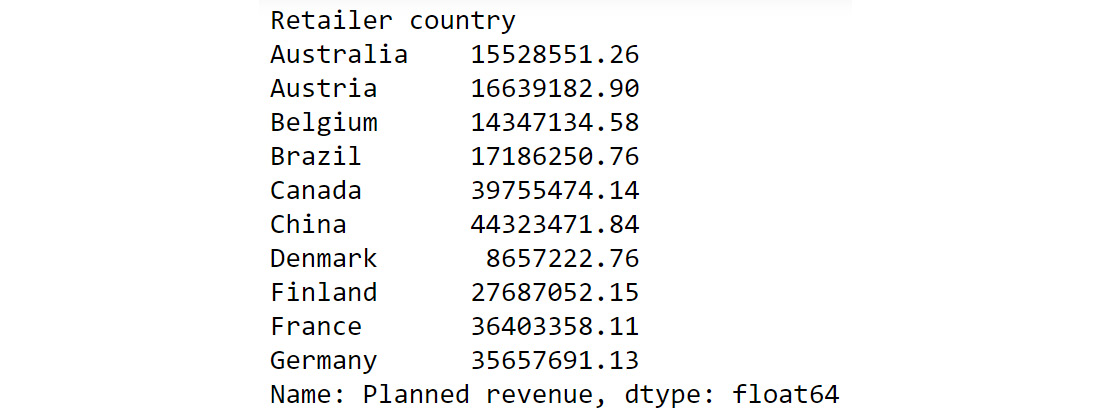
Figure 2.3: Calculating total Planned Revenue Using groupby()
The preceding output shows the sum of planned revenue grouped by country. To help us better compare the results we got here with the results of our pivot data in Figure 2.2, we can also chain another command as follows:
df.groupby('Retailer country')['Planned revenue'].sum().round()
You should get the following output:
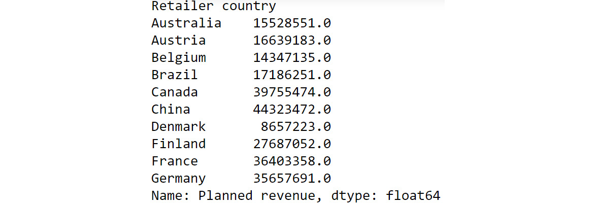
Figure 2.4: Chaining multiple functions to groupby
If we compare the preceding output to what we got in Figure 2.2, we can see that we have achieved the same results as the pivot functionality in Excel but using a built-in pandas function.
Some of the most common aggregator functions that can be used alongside groupby function are as follows:
- count(): This function returns the total number of values present in the column.
- min(): This function returns the minimum value present in the column.
- max(): This function returns the maximum value present in the column.
- mean(): This function returns the mean of all values in the column.
- median(): This function returns the median value in the column.
- mode(): This function returns the most frequently occurring value in the column.
Next, let us look into another pandas function that can help us derive useful insights.
The unique( ) function
While you know how to group data based on certain attributes, there are times when you don't know which attribute to choose to group the data by (or even make other analyses). For example, suppose you wanted to focus on customer life cycle value to design targeted marketing campaigns. Your dataset has attributes such as recency, frequency, and monetary values. Just looking at the dataset, you won't be able to understand how the attributes in each column vary. For example, one column might comprise lots of rows with numerous unique values, making it difficult to use the groupby() function on it. The other might be replete with duplicate values and have just two unique values. Thus, examining how much your values vary in a column is essential before doing further analysis. pandas provides a very handy function for doing that, and it's called unique().
For example, let's say you have a dataset called customerdetails that contains the names of customers, their IDs, and their countries. The data is stored in a DataFrame df and you would like to see a list of all the countries you have customers in.
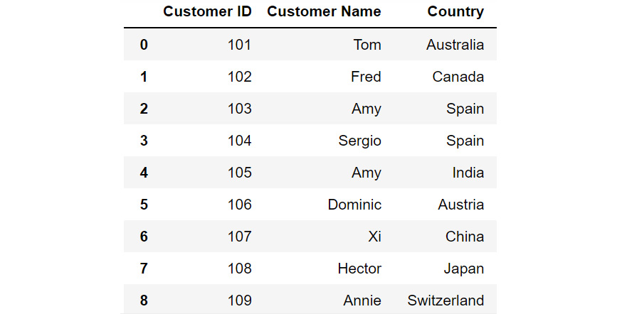
Figure 2.5: DataFrame df
Just by looking at the data, you see that there are a lot of countries in the column titled Country. Some country names are repeated multiple times. To know where your customers are located around the globe, you'll have to filter out all the unique values in this column. To do that, you can use the unique function as follows:
df['Country'].unique()
You should get the following output:

Figure 2.6: Different country names
You can see from the preceding output that the customers are from the following countries – Australia, Canada, Spain, India, Austria, China, Japan, Switzerland, the UK, New Zealand, and the USA.
Now that you know which countries your customers belong to, you may also want to know how many customers are present in each of these countries. This can be taken care of by the value_counts() function provided by pandas.
The value_counts( ) function
Sometimes, apart from just seeing what the unique values in a column are, you also want to know the count of each unique value in that column. For example, if, after running the unique() function, you find out that Product 1, Product 2, and Product 3 are the only three values that are repeated in a column comprising 1,000 rows; you may want to know how many entries of each product there are in the column. In such cases, you can use the value_counts() function. This function displays the unique values of the categories along with their counts.
Let's revisit the customerdetails dataset we encountered in the previous section. To find out the number of customers present in each country, we can use the value_counts() function as follows:
df['Country'].value_counts()
You will get output similar to the following:
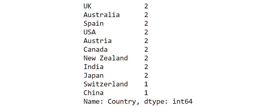
Figure 2.7: Output of value_counts function
From the preceding output, you can see that the count of each country is provided against the country name. Now that you have gotten a hang of these methods, let us implement them to derive some insights from sales data.
Exercise 2.01: Exploring the Attributes in Sales Data
You and your team are creating a marketing campaign for a client. All they've handed you is a file called sales.csv, which as they explained, contains the company's historical sales records. Apart from that, you know nothing about this dataset.
Using this data, you'll need to derive insights that will be used to create a comprehensive marketing campaign. Not all insights may be useful to the business, but since you will be presenting your findings to various teams first, an insight that's useful for one team may not matter much for the other team. So, your approach would be to gather as many actionable insights as possible and present those to the stakeholders.
You neither know the time period of these historical sales nor do you know which products the company sells. Download the file sales.csv from GitHub and create as many actionable insights as possible.
Note
You can find sales.csv at the following link: https://packt.link/Z2gRS.
- Open a new Jupyter Notebook to implement this exercise. Save the file as Exercise2-01.ipnyb. In a new Jupyter Notebook cell, import the pandas library as follows
import pandas as pd
- Create a new pandas DataFrame named sales and read the sales.csv file into it. Examine if your data is properly loaded by checking the first few values in the DataFrame by using the head() command:
sales = pd.read_csv('sales.csv')
sales.head()
Note
Make sure you change the path (highlighted) to the CSV file based on its location on your system. If you're running the Jupyter Notebook from the same directory where the CSV file is stored, you can run the preceding code without any modification.
Your output should look as follows:
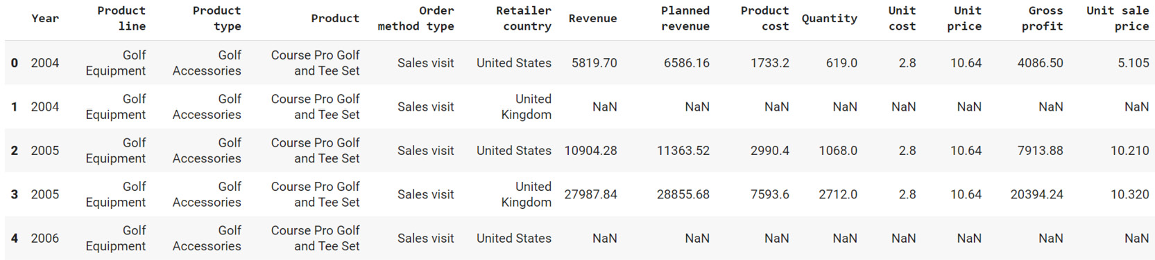
Figure 2.8: The first five rows of sales.csv
- Examine the columns of the DataFrame using the following code:
sales.columns
This produces the following output:

Figure 2.9: The columns in sales.csv
- Use the info function to print the datatypes of columns of sales DataFrame using the following code:
sales.info()
This should give you the following output:
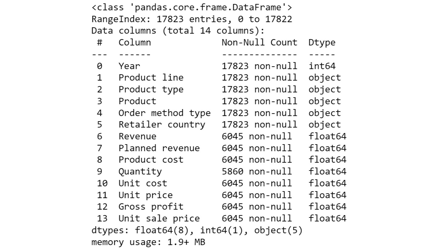
Figure 2.10: Information about the sales DataFrame
From the preceding output, you can see that Year is of int data type and columns such as Product line, Product type, etc. are of the object types.
- To check the time frame of the data, use the unique function on the Year column:
sales['Year'].unique()
You will get the following output:

Figure 2.11: The number of years the data is spread over
You can see that we have the data for the years 2004 – 2007.
- Use the unique function again to find out the types of products that the company is selling:
sales['Product line'].unique()
You should get the following output:

Figure 2.12: The different product lines the data covers
You can see that company is selling four different types of products.
- Now, check the Product type column:
sales['Product type'].unique()
You will get the following output:

Figure 2.13: The different types of products the data covers
From the above output, you can see that you have six different product types namely Golf Accessories, Sleeping Bags, Cooking Gear, First Aid, Insect Repellents, and Climbing Accessories.
- Check the Product column to find the unique categories present in it:
sales['Product'].unique()
You will get the following output:

Figure 2.14: Different products covered in the dataset
The above output shows the different products that are sold.
- Now, check the Order method type column to find out the ways through which the customer can place an order:
sales['Order method type'].unique()
You will get the following output:

Figure 2.15: Different ways in which people making purchases have ordered
As you can see from the preceding figure, there are seven different order methods through which a customer can place an order.
- Use the same function again on the Retailer country column to find out the countries where the client has a presence:
sales['Retailer country'].unique()
You will get the following output:

Figure 2.16: The countries in which products have been sold
The preceding output shows the geographical presence of the company.
- Now that you have analyzed the categorical values, get a quick summary of the numerical fields using the describe function:
sales.describe()
This gives the following output:
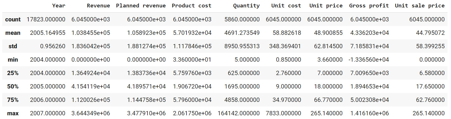
Figure 2.17: Description of the numerical columns in sales.csv
You can observe that the mean revenue the company is earning is around $103,846. The describe function is used to give us an overall idea about the range of the data present in the DataFrame.
- Analyze the spread of the categorical columns in the data using the value_counts() function. This would shed light on how the data is distributed. Start with the Year column:
sales['Year'].value_counts()
This gives the following output:

Figure 2.18: Frequency table of the Year column
From the above result, you can see that you have around 5451 records in the years 2004, 2005, and 2006 and the number of records in the year 2007 is 1470.
- Use the same function on the Product line column:
sales['Product line'].value_counts()
This gives the following output:

Figure 2.19: Frequency table of the Product line column
As you can see from the preceding output, Camping Equipment has the highest number of observations in the dataset followed by Outdoor Protection.
- Now, check for the Product type column:
sales['Product type'].value_counts()
This gives the following output:

Figure 2.20: Frequency table of the Product line column
Cooking gear followed by climbing accessories has the highest number of observations in the dataset which means that these product types are quite popular among the customers.
- Now, find out the most popular order method using the following code:
sales['Order method type'].value_counts()
This gives the following output:

Figure 2.21: Frequency table of the Product line column
Almost all the order methods are equally represented in the dataset which means customers have an equal probability of ordering through any of these methods.
- Finally, check for the Retailer country column along with their respective counts:
sales['Retailer country'].value_counts()
You should get the following output:
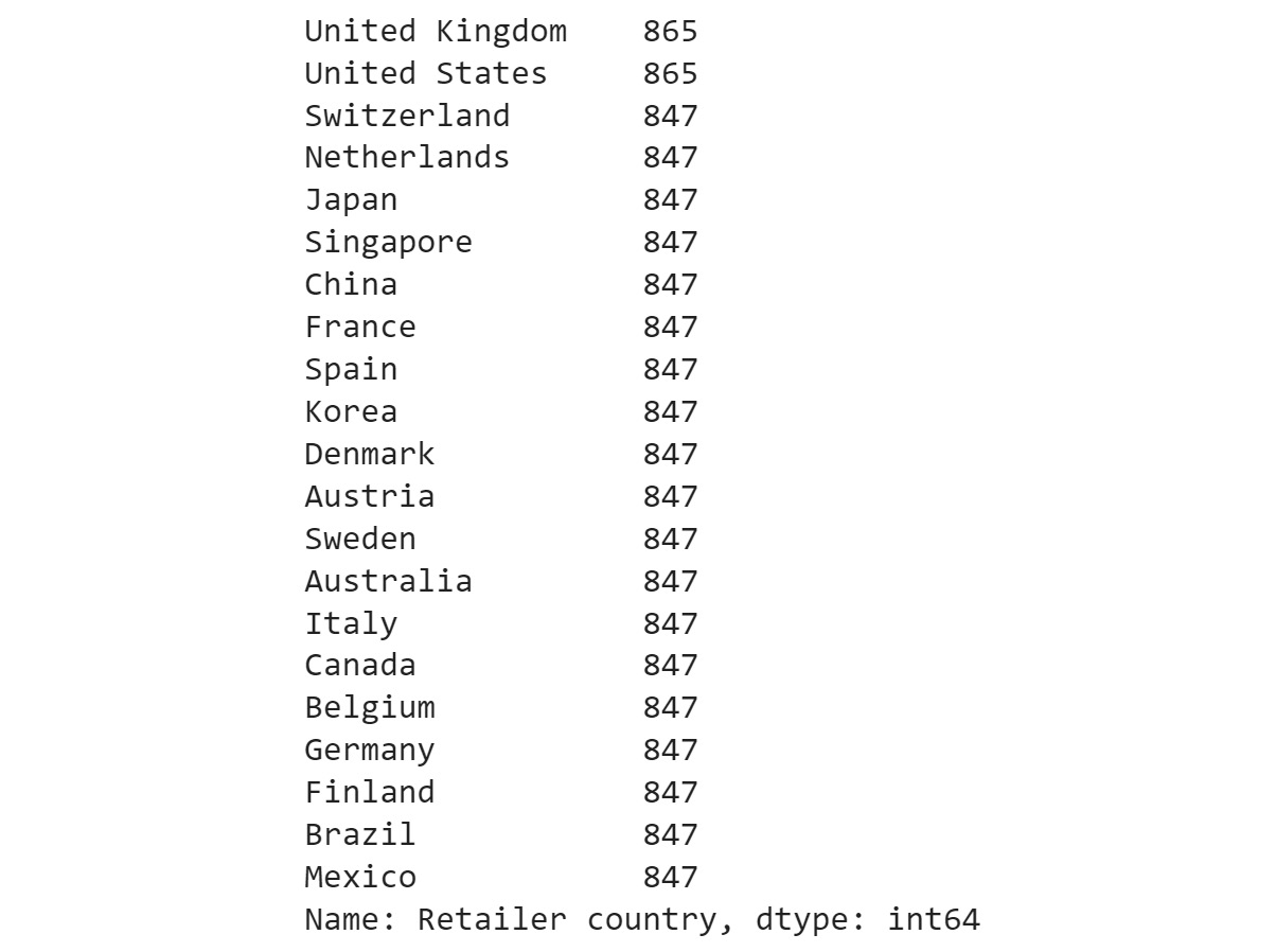
Figure 2.22: Frequency table of the Product line column
The preceding result shows that data points are evenly distributed among all the countries showing no bias.
- Get insights into country-wide statistics now. Group attributes such as Revenue, Planned revenue, Product cost, Quantity, and Gross profit by their countries, and sum their corresponding values. Use the following code:
sales.groupby('Retailer country')[['Revenue',\
'Planned revenue',\
'Product cost',\
'Quantity',\
'Gross profit']].sum()
You should get the following output:
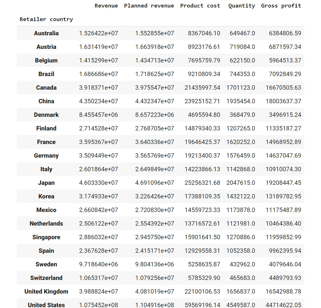
Figure 2.23: Total revenue, cost, quantities sold, and profit in each country in the past four years
From the preceding figure, you can infer that Denmark had the least revenue and the US had the highest revenue in the past four years. Most countries generated revenue of around 20,000,000 USD and almost reached their revenue targets.
- Now find out the country whose product performance was affected the worst when sales dipped. Use the following code to group data by Retailer country:
sales.dropna().groupby('Retailer country')\
[['Revenue',\
'Planned revenue',\
'Product cost',\
'Quantity',\
'Unit cost',\
'Unit price',\
'Gross profit',\
'Unit sale price']].min()
You should get the following output:
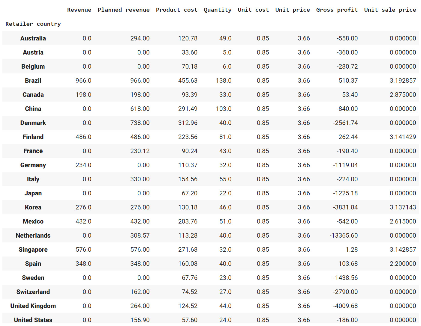
Figure 2.24: The lowest price, quantity, cost prices, and so on for each country
Since most of the values in the gross profit column are negative, you can infer that almost every product has at some point made a loss in the target markets. Brazil, Spain, Finland, and Canada are some exceptions.
- Similarly, generate statistics for other categorical variables, such as Year, Product line, Product type, and Product. Use the following code for the Year variable:
sales.groupby('Year')[['Revenue',\
'Planned revenue',\
'Product cost',\
'Quantity',\
'Unit cost',\
'Unit price',\
'Gross profit',\
'Unit sale price']].sum()
This gives the following output:
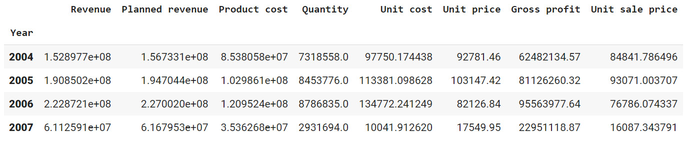
Figure 2.25: Total revenue, cost, quantities, and so on sold every year
From the above figure, it appears that revenue, profits, and quantities have dipped in the year 2007.
- Use the following code for the Product line variable:
sales.groupby('Product line')[['Revenue',\
'Planned revenue',\
'Product cost',\
'Quantity',\
'Unit cost',\
'Unit price',\
'Gross profit',\
'Unit sale price']].sum()
You should get the following output:
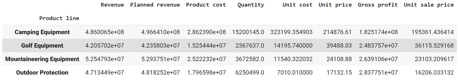
Figure 2.26: Total revenue, cost, quantities, and so on, generated by each product division
The preceding figure indicates that the sale of Camping Equipment contributes the highest to the overall revenue of the company.
- Now, find out which order method contributes to the maximum revenue:
sales.groupby('Order method type')[['Revenue',\
'Planned revenue',\
'Product cost',\
'Quantity',\
'Gross profit']].sum()
You should get the following output:
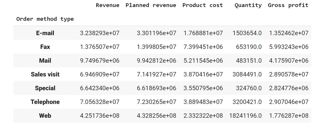
Figure 2.27: Average revenue, cost, quantities, and so on generated by each method of ordering
Observe that the highest sales were generated through the internet (more than all the other sources combined).
Now that you've generated the insights, it's time to select the most useful ones, summarize them, and present them to the business as follows:
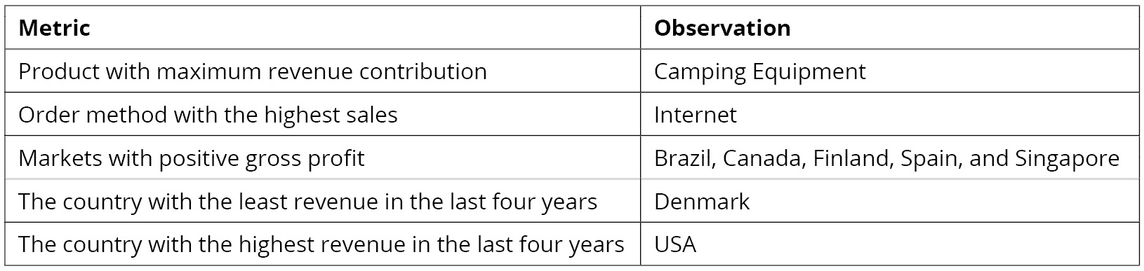
Figure 2.28: Summary of the derived insights
In this exercise, you have successfully explored the attributes in a dataset. In the next section, you will learn how to generate targeted insights from the prepared data.
Note
You'll be working with the sales.csv data in the upcoming section as well. It's recommended that you keep the Jupyter Notebook open and continue there.