Visualizing Data
There are a lot of benefits to presenting data visually. Visualized data is easy to understand, and it can help reveal hidden trends and patterns in data that might not be so conspicuous compared to when the data is presented in numeric format. Furthermore, it is much quicker to interpret visual data. That is why you'll notice that many businesses rely on dashboards comprising multiple charts. In this section, you will learn the functions that will help you visualize numeric data by generating engaging plots. Once again, pandas comes to our rescue with its built-in plot function. This function has a parameter called kind that lets you choose between different types of plots. Let us look at some common types of plots you'll be able to create.
Density plots:
A density plot helps us to find the distribution of a variable. In a density plot, the peaks display where the values are concentrated.
Here's a sample density plot drawn for the Product cost column in a sales DataFrame:
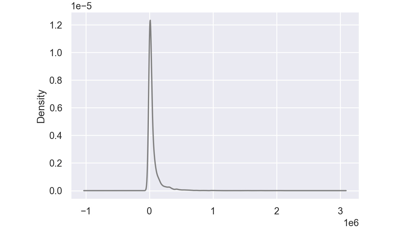
Figure 2.48: Sample density plot
In this plot, the Product cost is distributed with a peak very close to 0. In pandas, you can create density plots using the following command:
df['Column'].plot(kind = 'kde',color='gray')
Note
The value gray for the attribute color is used to generate graphs in grayscale. You can use other colors like darkgreen, maroon, etc. as values of color parameters to get the colored graphs.
Bar Charts:
Bar charts are used with categorical variables to find their distribution. Here is a sample bar chart:
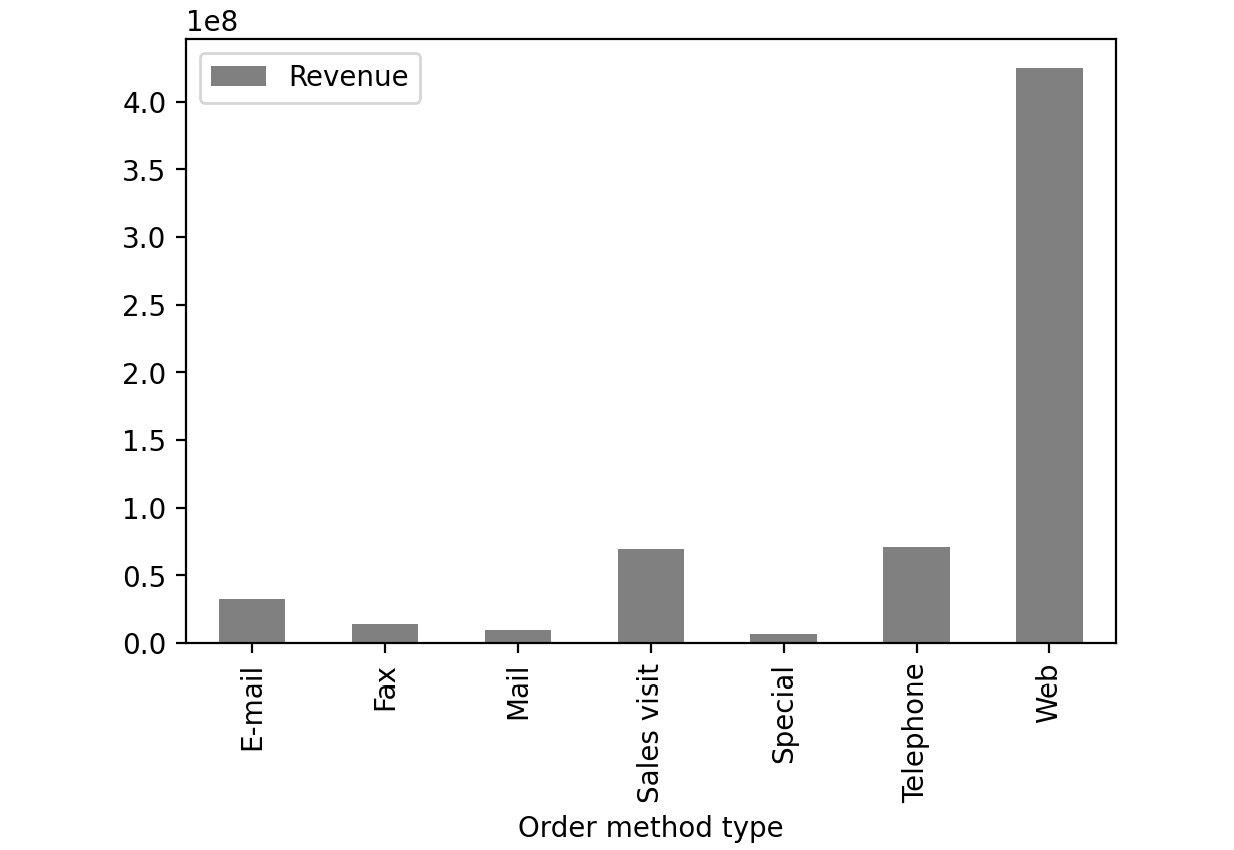
Figure 2.49: Sample bar chart
In this plot, you can see the distribution of revenue of the product via different order methods. In pandas, you can create bar plots by passing bar as value to the kind parameter.
df['Column'].plot(kind = 'bar', color='gray')
Box Plot:
A box plot is used to depict the distribution of numerical data and is primarily used for comparisons. Here is a sample box plot:
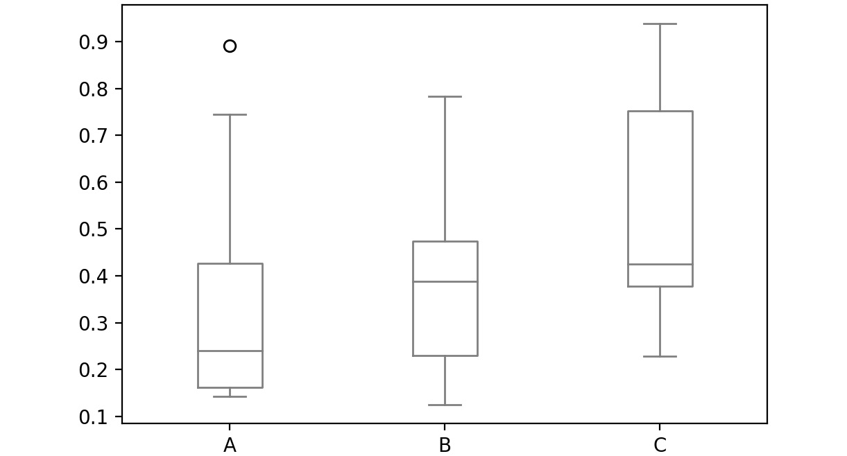
Figure 2.50: Sample box plot
The line inside the box represents the median values for each numerical variable. In pandas, you can create a box plot by passing box as a value to the kind parameter:
df['Column'].plot(kind = 'box', color='gray')
Scatter Plot:
Scatter plots are used to represent the values of two numerical variables. Scatter plots help you to determine the relationship between the variables.
Here is a sample scatter plot:
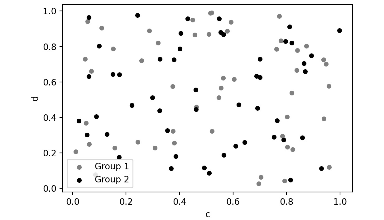
Figure 2.51: Sample scatter plot
In this plot, you can observe the relationship between the two variables. In pandas, you can create scatter plots by passing scatter as a value to the kind parameter.
df['Column'].plot(kind = 'scatter', color='gray')
Let's implement these concepts in the exercise that follows.
Exercise 2.03: Visualizing Data With pandas
In this exercise, you'll be revisiting the sales.csv file you worked on in Exercise 2.01, Exploring the Attributes in Sales Data. This time, you'll need to visualize the sales data to answer the following two questions:
- Which mode of order generates the most revenue?
- How have the following parameters varied over four years: Revenue, Planned revenue, and Gross profit?
Note
You can find the sales.csv file here: https://packt.link/dhAbB.
You will make use of bar plots and box plots to explore the distribution of the Revenue column.
- Open a new Jupyter Notebook to implement this exercise. Save the file as Exercise2-03.ipnyb.
- Import the pandas library using the import command as follows:
import pandas as pd
- Create a new panda DataFrame named sales and load the sales.csv file into it. Examine if your data is properly loaded by checking the first few values in the DataFrame by using the head() command:
sales = pd.read_csv("sales.csv")
sales.head()
Note
Make sure you change the path (highlighted) to the CSV file based on its location on your system. If you're running the Jupyter notebook from the same directory where the CSV file is stored, you can run the preceding code without any modification.
You will get the following output:
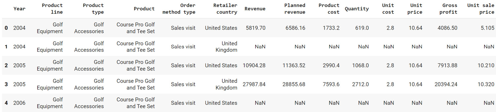
Figure 2.52: Output of sales.head()
- Group the Revenue by Order method type and create a bar plot:
sales.groupby('Order method type').sum()\
.plot(kind = 'bar', y = 'Revenue', color='gray')
This gives the following output:
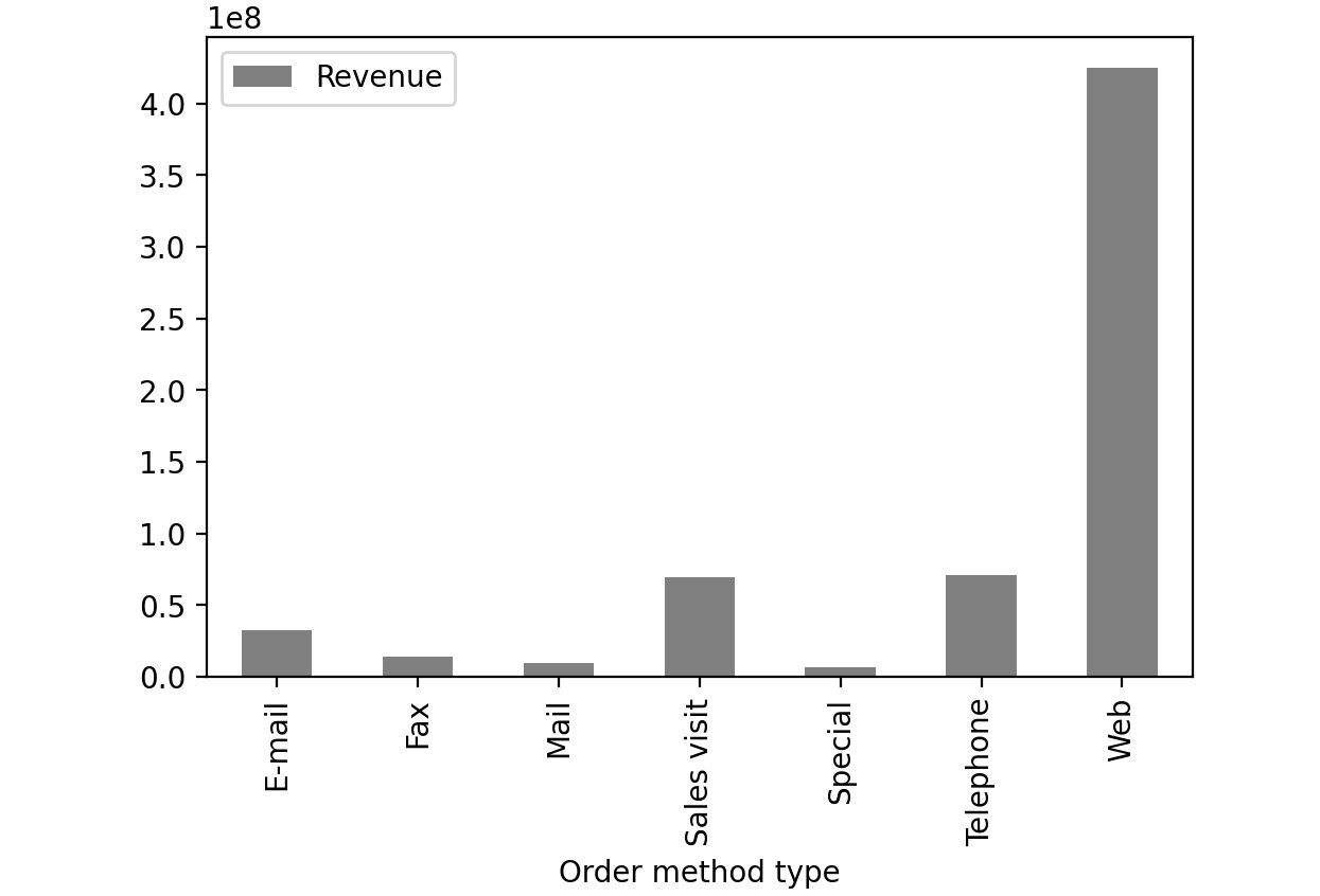
Figure 2.53: Revenue generated through each order method type in sales.csv
From the preceding image, you can infer that web orders generate the maximum revenue.
- Now group the columns by year and create boxplots to get an idea on a relative scale:
sales.groupby('Year')[['Revenue', 'Planned revenue', \
'Gross profit']].plot(kind= 'box',\
color='gray')
Note
In Steps 4 and 5, the value gray for the attribute color (emboldened) is used to generate graphs in grayscale. You can use other colors like darkgreen, maroon, etc. as values of color parameter to get the colored graphs. You can also refer to the following document to get the code for the colored plot and the colored output: https://packt.link/NOjgT.
You should get the following plots:
The first plot represents the year 2004, the second plot represents the year 2005, the third plot represents the year 2006 and the final one represents 2007.
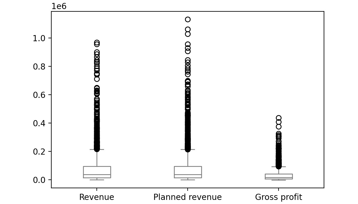
Figure 2.54: Boxplot for Revenue, Planned revenue and Gross profit for year 2004
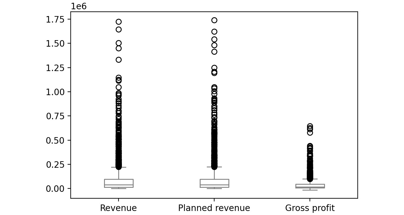
Figure 2.55: Boxplot for Revenue, Planned revenue and Gross profit for year 2005
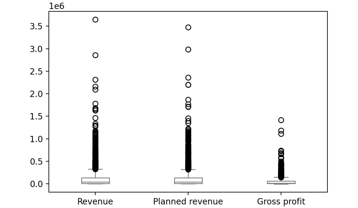
Figure 2.56: Boxplot for Revenue, Planned revenue and Gross profit for year 2006
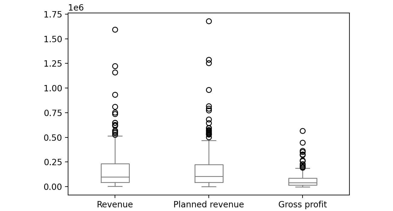
Figure 2.57: Boxplot for Revenue, Planned revenue and Gross profit for year 2007
The bubbles in the plots represent outliers. Outliers are extreme values in the data. They are caused either due to mistakes in measurement or due to the real behavior of the data. Outlier treatment depends entirely on the business use case. In some of the scenarios, outliers are dropped or are capped at a certain value based on the inputs from the business. It is not always advisable to drop the outliers as they can give us a lot of hidden information in the data.
From the above plots, we can infer that Revenue and Planned revenue have a higher median than Gross profit (the median is represented by the line inside the box).
Even though pandas provides you with the basic plots, it does not give you a lot of control over the look and feel of the visualizations.
Python has alternate packages such as seaborn which allow you to generate more fine-tuned and customized plots. Let's learn about this package in the next section.
Visualization through Seaborn
Even though pandas provides us with many of the most common plots required for analysis, Python also has a useful visualization library, seaborn. It provides a high-level API to easily generate top-quality plots with a lot of customization options.
You can change the environment from regular pandas/Matplotlib to seaborn directly through the set function of seaborn. Seaborn also supports a displot function, which plots the actual distribution of the pandas series passed to. To generate histograms through seaborn, you can use the following code:
import seaborn as sns
sns.set()
sns.displot(sales['Gross profit'].dropna(),color='gray')
The preceding code plots a histogram of the values of the Gross profit column. We have set the parameter dropna() which tells the plotting function to ignore null values if present in the data. The sns.set() function changes the environment from regular pandas/Matplotlib to seaborn.
The color attribute is used to provide colors to the graphs. In the preceding code, gray color is used to generate grayscale graphs. You can use other colors like darkgreen, maroon, etc. as values of color parameters to get the colored graphs.
This gives the following output:
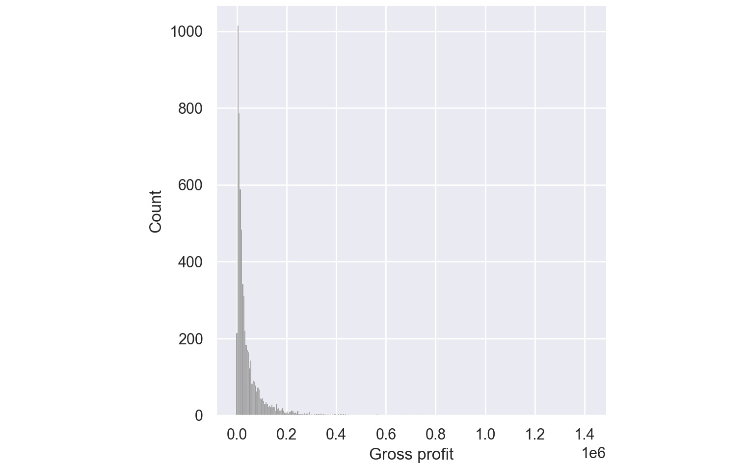
Figure 2.58: Histogram for Gross Profit through Seaborn
From the preceding plot, you can infer that most of the gross profit is around $1,000.
Pair Plots:
Pair plots are one of the most effective tools for exploratory data analysis. They can be considered as a collection of scatter plots between the variables present in the dataset. With a pair plot, one can easily study the distribution of a variable and its relationship with the other variables. These plots also reveal trends that may need further exploration.
For example, if your dataset has four variables, a pair plot would generate 16 charts that show the relationship of all the combinations of variables.
To generate a pair plot through seaborn, you can use the following code:
import seaborn as sns
sns.pairplot(dataframe, palette='gray')
The palette attribute is used to define the color of the pair plot. In the preceding code, gray color is used to generate grayscale graphs.
An example pair plot generated using seaborn would look like this:
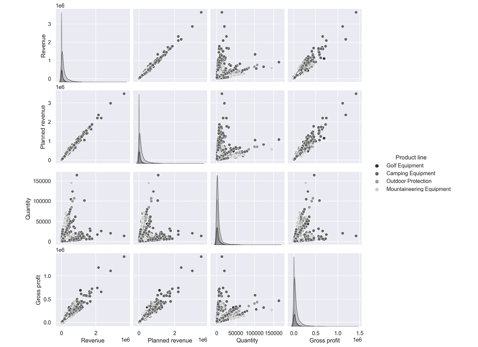
Figure 2.59: Sample pair plot
The following inferences can be made from the above plot.
- Revenue and Gross profit have a linear relationship; that is, when Revenue increases the Gross Profit increases
- Quantity and Revenue show no trend; that is, there is no relationship.
Note
You can refer to the following link for more details about the seaborn library: https://seaborn.pydata.org/tutorial.html.
In the next section, we will understand how to visualize insights using the matplotlib library.
Visualization with Matplotlib
Python's default visualization library is matplotlib. matplotlib was originally developed to bring visualization capabilities from the MATLAB academic tool into an open-source programming language, Python. matplotlib provides low-level additional features that can be added to plots made from any other visualization library like pandas or seaborn.
To start using matplotlib, you need to first import the matplotlib.pyplot object as plt. This plt object becomes the basis for generating figures in matplotlib.
import matplotlib.pyplot as plt
We can then run any functions on this object as follows:
plt.<function name>
Some of the functions that we can call on this plt object for these options are as follows:
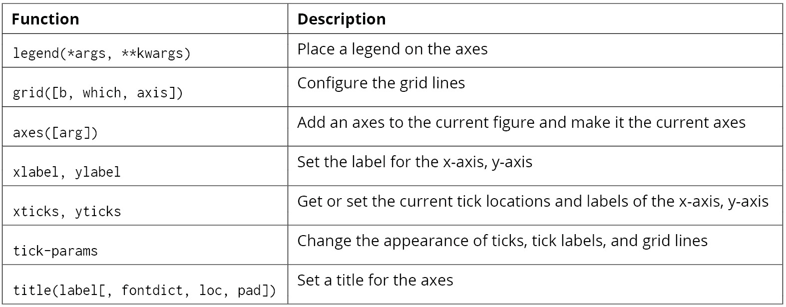
Figure 2.60: Functions that can be used on plt
For example, on the sales DataFrame, you can plot a bar graph between products and revenue using the following code.
# Importing the matplotlib library
import matplotlib.pyplot as plt
#Declaring the color of the plot as gray
plt.bar(sales['Product line'], sales['Revenue'], color='gray')
# Giving the title for the plot
plt.title("Products with their corresponding revenue")
# Naming the x and y axis
plt.xlabel('Products')
plt.ylabel('Revenue')
# Rotates X-Axis labels by 45-degrees
plt.xticks(rotation = 45)
# Displaying the bar plot
plt.show()
This gives the following output:
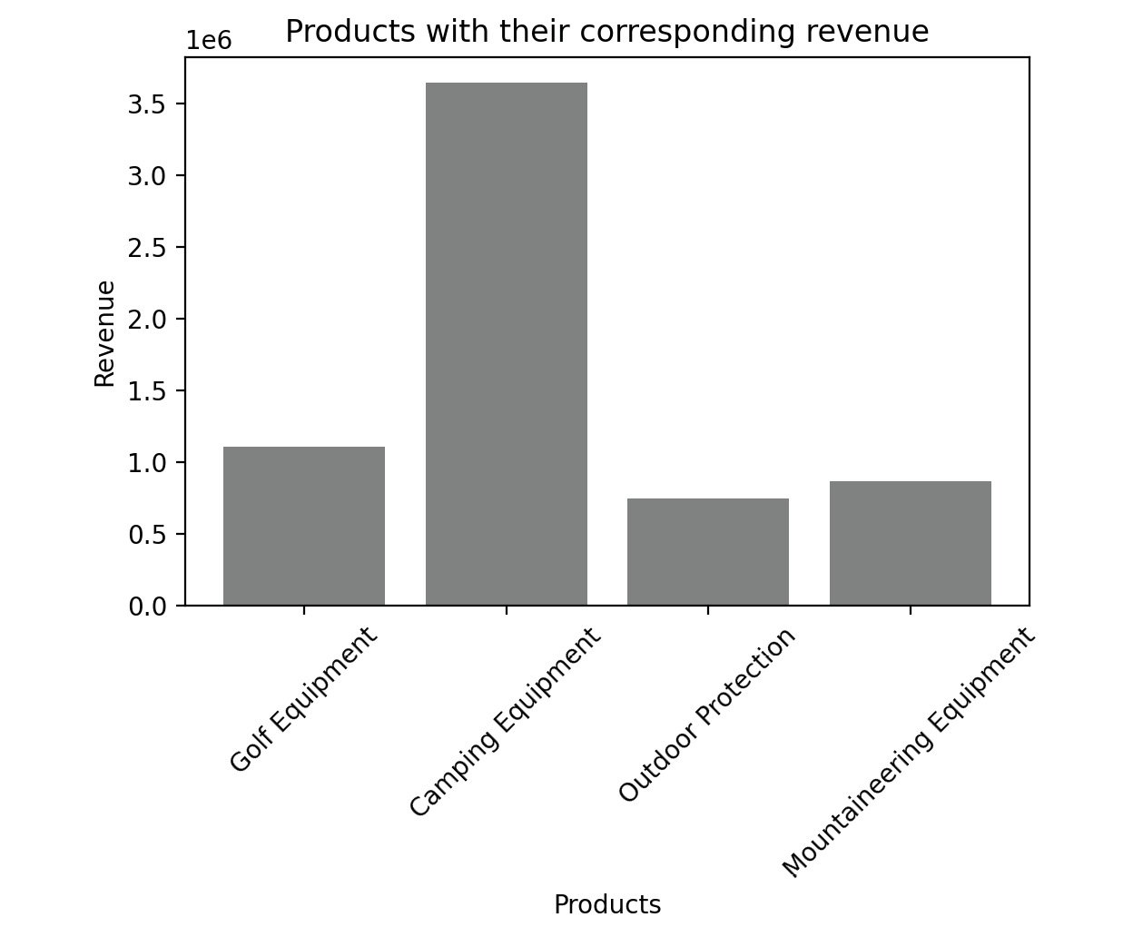
Figure 2.61: Sample bar graph
The color of the plot can be altered with the color parameter. We can use different colors such as blue, black, red, and cyan.
Note
Feel free to explore some of the things you can do directly with Matplotlib by reading up the official documentation at https://matplotlib.org/stable/api/_as_gen/matplotlib.pyplot.html.
For a complete course on data visualization in general, you can refer to the Data Visualization Workshop: https://www.packtpub.com/product/the-data-visualization-workshop/9781800568846.
Before we head to the activity, the following table shows some of the key plots along with their usage:
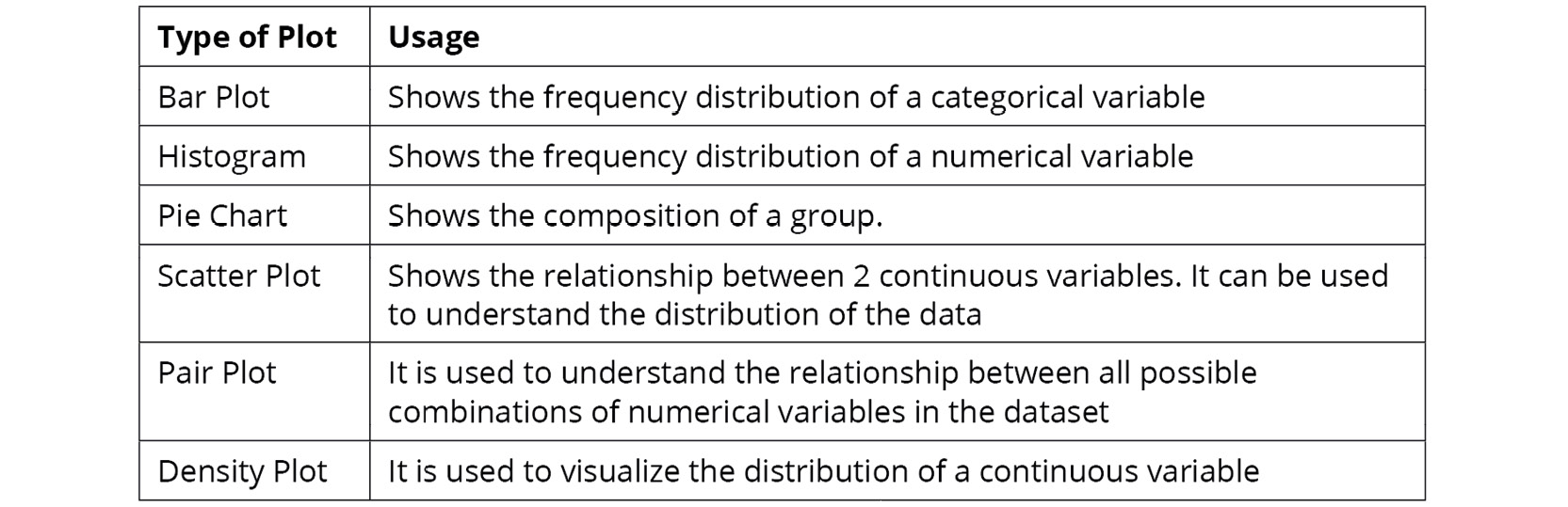
Figure 2.62: Key plots and their usage
With that, it's time to put everything you've learned so far to test in the activity that follows.
Activity 2.01: Analyzing Advertisements
Your company has collated data on the advertisement views through various mediums in a file called Advertising.csv. The advert campaign ran through radio, TV, web, and newspaper and you need to mine the data to answer the following questions:
- What are the unique values present in the Products column?
- How many data points belong to each category in the Products column?
- What are the total views across each category in the Products column?
- Which product has the highest viewership on TV?
- Which product has the lowest viewership on the web?
To do that, you will need to examine the dataset with the help of the functions you have learned, along with charts wherever needed.
Note
You can find the Advertising.csv file here: https://packt.link/q1c34.
Follow the following steps to achieve the aim of this activity:
- Open a new Jupyter Notebook and load pandas and the visualization libraries that you will need.
- Load the data into a pandas DataFrame named ads and look at the first few rows. Your DataFrame should look as follows:
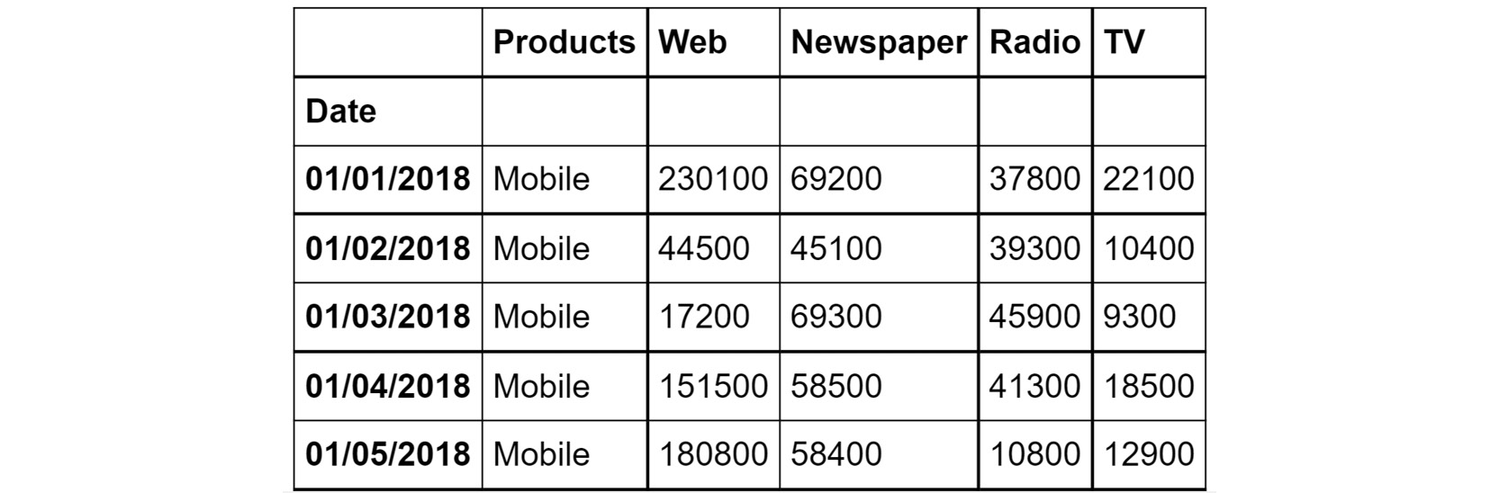
Figure 2.63: The first few rows of Advertising.csv
- Understand the distribution of numerical variables in the dataset using the describe function.
- Plot the relationship between the variables in the dataset with the help of pair plots. You can use the hue parameter as Products. The hue parameter determines which column can be used for color encoding. Using Products as a hue parameter will show the different products in various shades of gray.
You should get the below output:
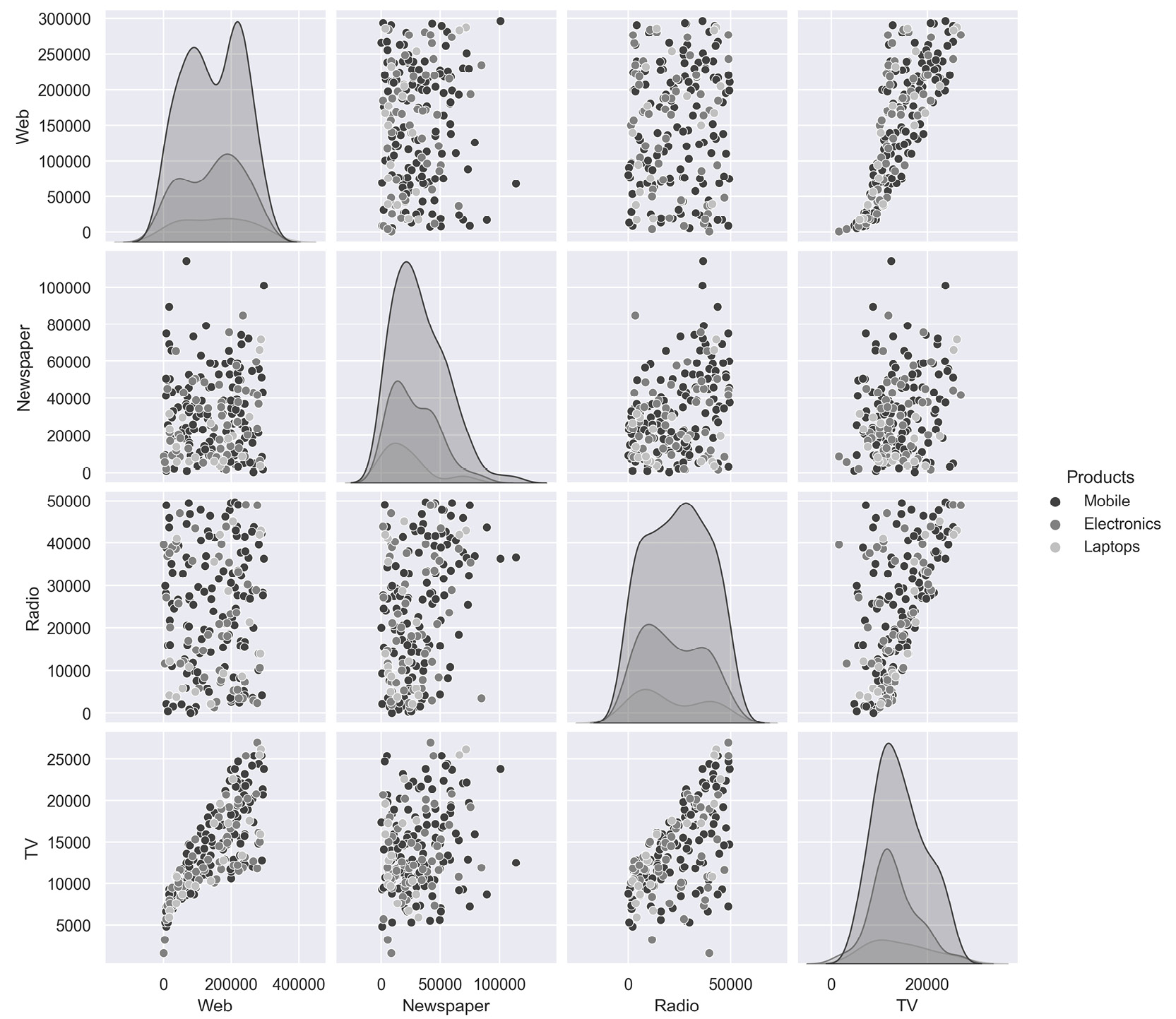
Figure 2.64: Expected output of Activity 2.01
Note
The solution to this activity can be found via this link.


 Free Chapter


