Sign In Start Free Trial
Account

Add to playlist

Create a Playlist

Modal Close icon
You need to login to use this feature.
  • Book Overview & Buying The Data Visualization Workshop
  • Table Of Contents Toc
The Data Visualization Workshop

The Data Visualization Workshop

By : Mario Döbler , Tim Großmann , Rohan Chikorde, Joshua Görner, Anshu Kumar , Piotr Malak, Ankit Verma
4 (1)
close
close
The Data Visualization Workshop

The Data Visualization Workshop

4 (1)
By: Mario Döbler , Tim Großmann , Rohan Chikorde, Joshua Görner, Anshu Kumar , Piotr Malak, Ankit Verma

Overview of this book

Do you want to transform data into captivating images? Do you want to make it easy for your audience to process and understand the patterns, trends, and relationships hidden within your data? The Data Visualization Workshop will guide you through the world of data visualization and help you to unlock simple secrets for transforming data into meaningful visuals with the help of exciting exercises and activities. Starting with an introduction to data visualization, this book shows you how to first prepare raw data for visualization using NumPy and pandas operations. As you progress, you’ll use plotting techniques, such as comparison and distribution, to identify relationships and similarities between datasets. You’ll then work through practical exercises to simplify the process of creating visualizations using Python plotting libraries such as Matplotlib and Seaborn. If you’ve ever wondered how popular companies like Uber and Airbnb use geoplotlib for geographical visualizations, this book has got you covered, helping you analyze and understand the process effectively. Finally, you’ll use the Bokeh library to create dynamic visualizations that can be integrated into any web page. By the end of this workshop, you’ll have learned how to present engaging mission-critical insights by creating impactful visualizations with real-world data.
Table of Contents (9 chapters)
close
close
Preface
7
7. Combining What We Have Learned
Distribution Plots

Distribution plots give a deep insight into how your data is distributed. For a single variable, a histogram is effective. For multiple variables, you can either use a box plot or a violin plot. The violin plot visualizes the densities of your variables, whereas the box plot just visualizes the median, the interquartile range, and the range for each variable.

Histogram

A histogram visualizes the distribution of a single numerical variable. Each bar represents the frequency for a certain interval. Histograms help get an estimate of statistical measures. You see where values are concentrated, and you can easily detect outliers. You can either plot a histogram with absolute frequency values or, alternatively, normalize your histogram. If you want to compare distributions of multiple variables, you can use different colors for the bars.

Use

Get insights into the underlying distribution for a dataset.

Example

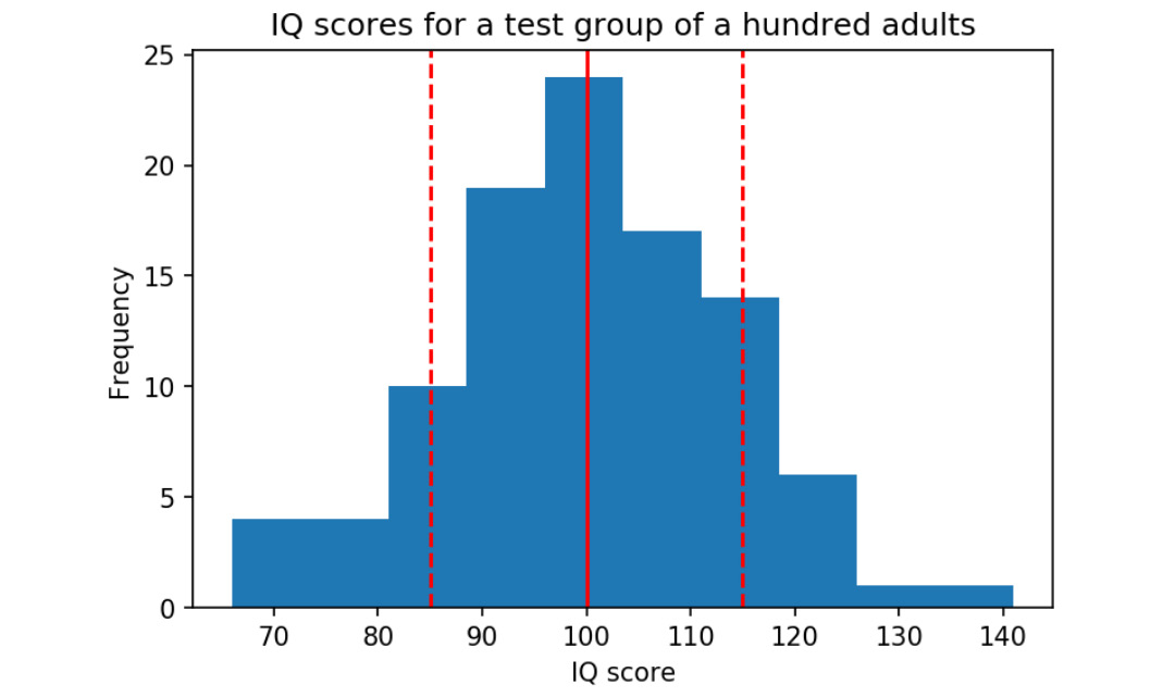
The following diagram shows the distribution of the Intelligence Quotient (IQ) for a test group. The dashed lines represent the standard deviation each side of the mean (the solid line):

Figure 2.30: Distribution of IQ for a test group of a hundred adults

Figure 2.30: Distribution of IQ for a test group of a hundred adults

Design Practice

  • Try different numbers of bins (data intervals), since the shape of the histogram can vary significantly.

Density Plot

A density plot shows the distribution of a numerical variable. It is a variation of a histogram that uses kernel smoothing, allowing for smoother distributions. One advantage these have over histograms is that density plots are better at determining the distribution shape since the distribution shape for histograms heavily depends on the number of bins (data intervals).

Use

To compare the distribution of several variables by plotting the density on the same axis and using different colors.

Example

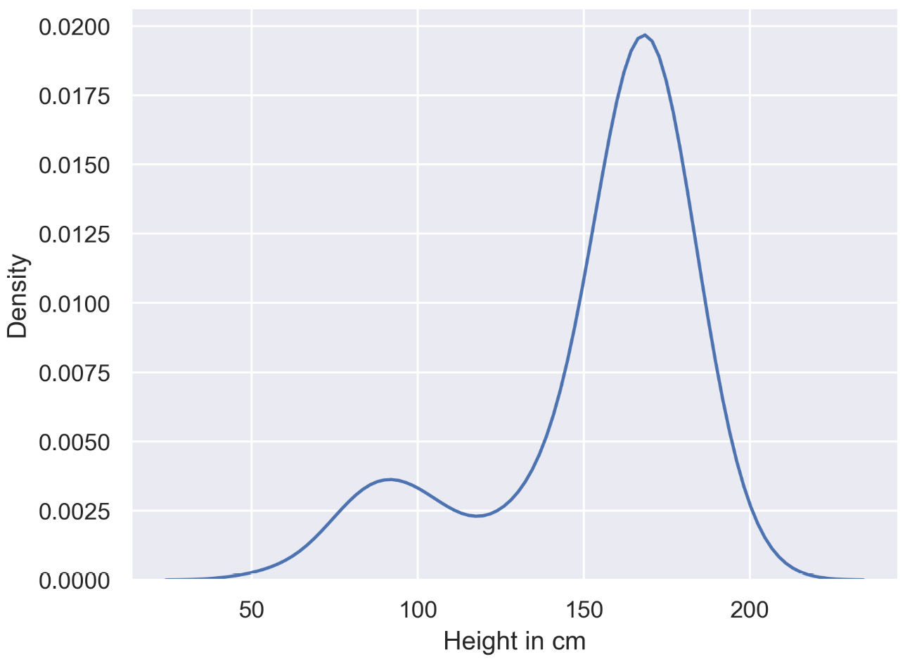
The following diagram shows a basic density plot:

Figure 2.31: Density plot

Figure 2.31: Density plot

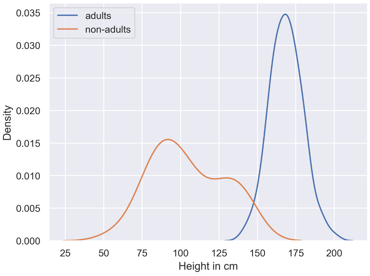
The following diagram shows a basic multi-density plot:

Figure 2.32: Multi-density plot

Figure 2.32: Multi-density plot

Design Practice

  • Use contrasting colors to plot the density of multiple variables.

Box Plot

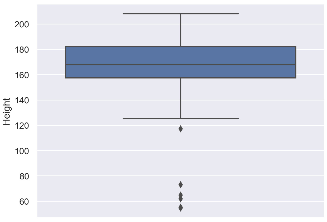
The box plot shows multiple statistical measurements. The box extends from the lower to the upper quartile values of the data, thus allowing us to visualize the interquartile range (IQR). The horizontal line within the box denotes the median. The parallel extending lines from the boxes are called whiskers; they indicate the variability outside the lower and upper quartiles. There is also an option to show data outliers, usually as circles or diamonds, past the end of the whiskers.

Use

Compare statistical measures for multiple variables or groups.

Examples

The following diagram shows a basic box plot that shows the height of a group of people:

Figure 2.33: Box plot showing a single variable

Figure 2.33: Box plot showing a single variable

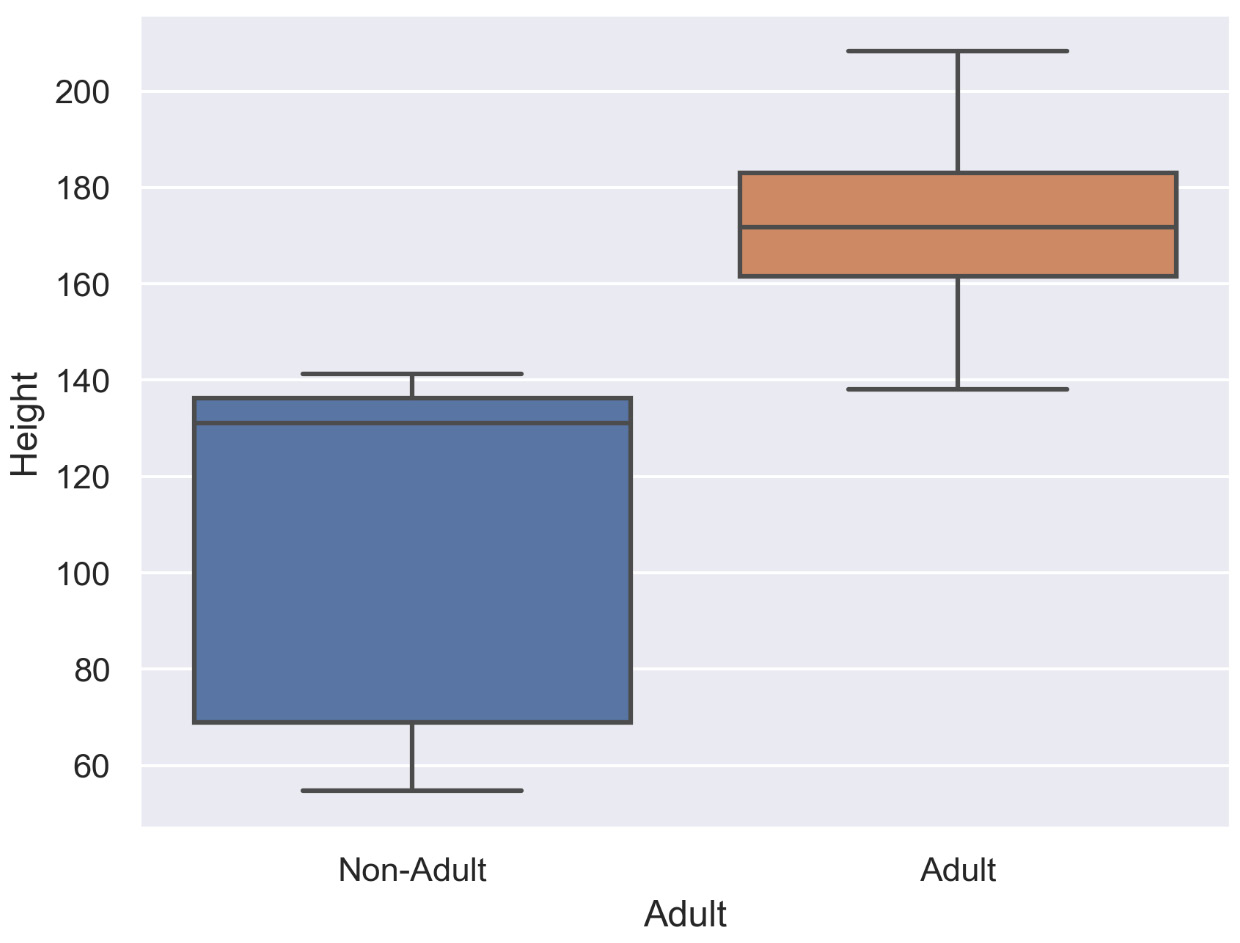
The following diagram shows a basic box plot for multiple variables. In this case, it shows heights for two different groups – adults and non-adults:

Figure 2.34: Box plot for multiple variables

Figure 2.34: Box plot for multiple variables

In the next section, we will learn what the features, uses, and best practices are of the violin plot.

Violin Plot

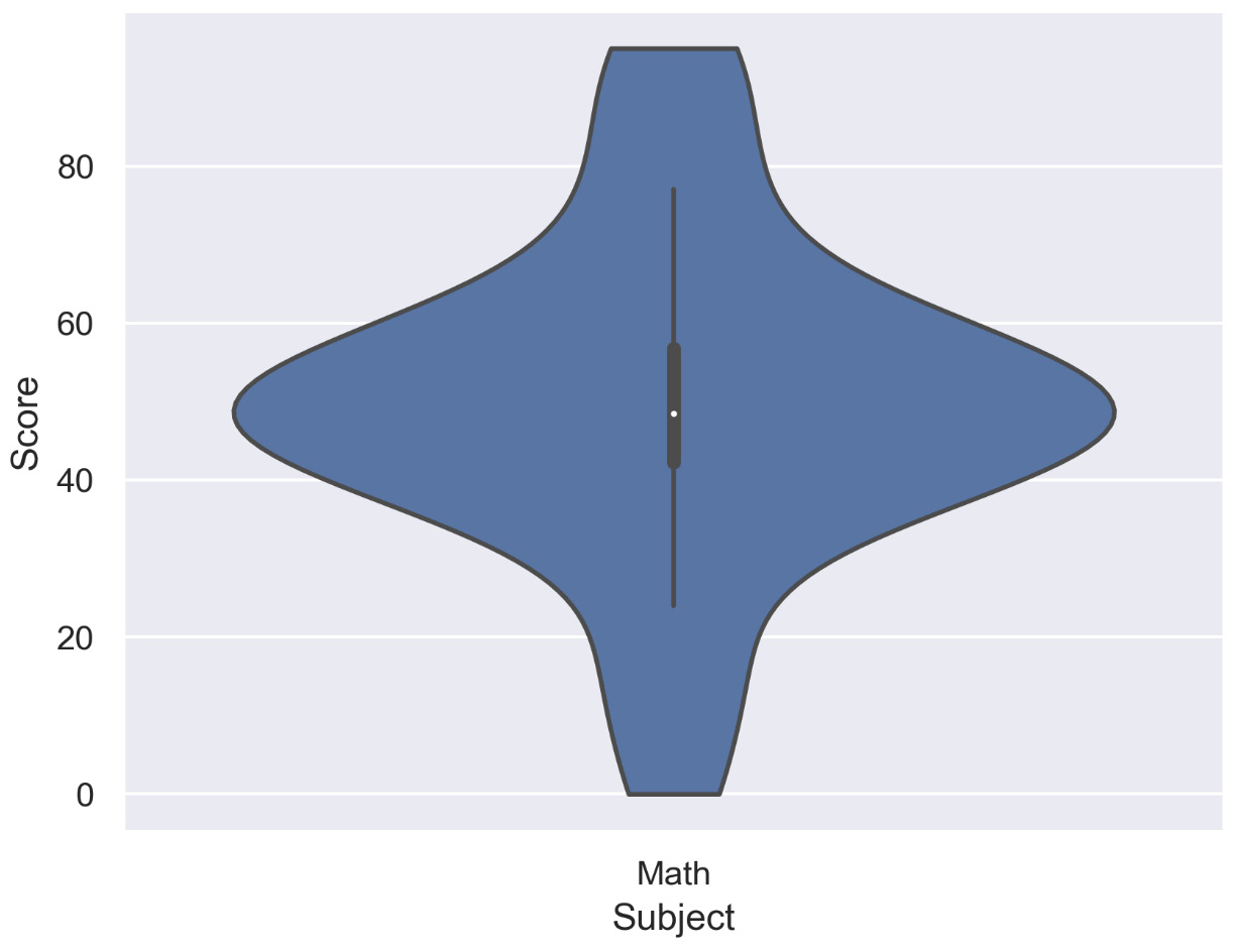
Violin plots are a combination of box plots and density plots. Both the statistical measures and the distribution are visualized. The thick black bar in the center represents the interquartile range, while the thin black line corresponds to the whiskers in a box plot. The white dot indicates the median. On both sides of the centerline, the density is visualized.

Use

Compare statistical measures and density for multiple variables or groups.

Examples

The following diagram shows a violin plot for a single variable and shows how students have performed in Math:

Figure 2.35: Violin plot for a single variable (Math)

Figure 2.35: Violin plot for a single variable (Math)

From the preceding diagram, we can analyze that most of the students have scored around 40-60 in the Math test.

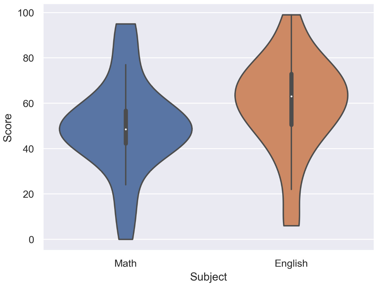
The following diagram shows a violin plot for two variables and shows the performance of students in English and Math:

Figure 2.36: Violin plot for multiple variables (English and Math)

Figure 2.36: Violin plot for multiple variables (English and Math)

From the preceding diagram, we can say that on average, the students have scored more in English than in Math, but the highest score was secured in Math.

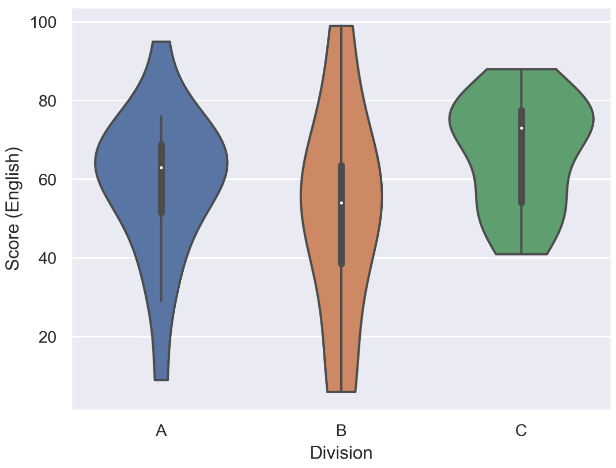
The following diagram shows a violin plot for a single variable divided into three groups, and shows the performance of three divisions of students in English based on their score:

Figure 2.37: Violin plot with multiple categories (three groups of students)

Figure 2.37: Violin plot with multiple categories (three groups of students)

From the preceding diagram, we can note that on average, division C has scored the highest, division B has scored the lowest, and division A is, on average, in between divisions B and C.

Design Practice

  • Scale the axes accordingly so that the distribution is clearly visible and not flat.

In this section, distribution plots were introduced. In the following activity, we will have a closer look at histograms.

Activity 2.04: Frequency of Trains during Different Time Intervals

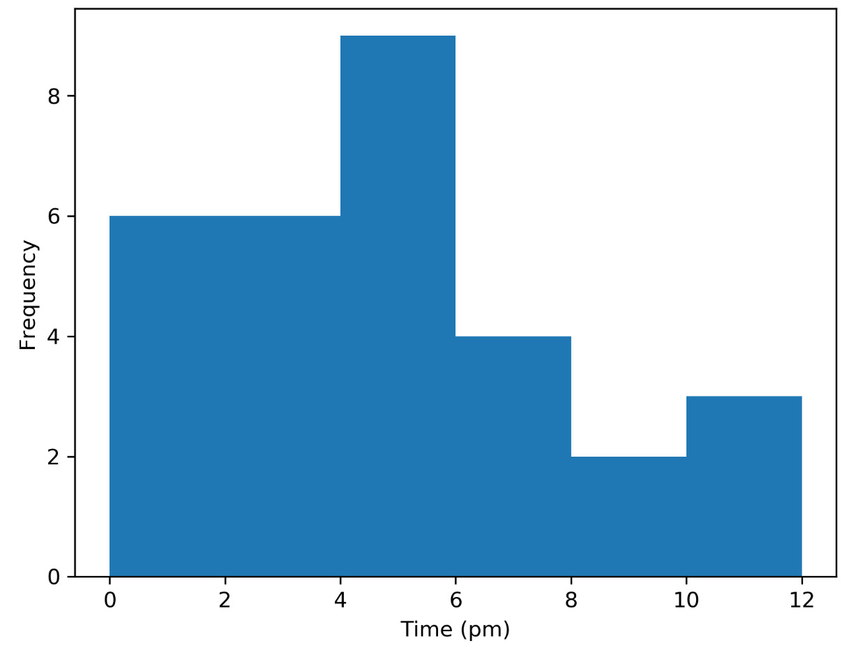
You are provided with a histogram that states the number of trains arriving at different time intervals in the afternoon to determine the maximum number of trains arriving in 2-hour time intervals. The goal of this activity is to gain a deeper insight into histograms:

  1. Looking at the following histogram, can you identify the interval during which a maximum number of trains arrive?
  2. How would the histogram change if in the morning, the same total number of trains arrive as in the afternoon, and if you have the same frequencies for all time intervals?
    Figure 2.38: Frequency of trains during different time intervals

Figure 2.38: Frequency of trains during different time intervals

Note

The solution for this activity can be found via this link.

With that activity, we conclude the section about distribution plots and we will introduce geoplots in the next section.

CONTINUE READING
83
Tech Concepts
36
Programming languages
73
Tech Tools
Icon Unlimited access to the largest independent learning library in tech of over 8,000 expert-authored tech books and videos.
Icon Innovative learning tools, including AI book assistants, code context explainers, and text-to-speech.
Icon 50+ new titles added per month and exclusive early access to books as they are being written.
The Data Visualization Workshop
notes
bookmark Notes and Bookmarks search Search in title playlist Add to playlist download Download options font-size Font size

Change the font size

margin-width Margin width

Change margin width

day-mode Day/Sepia/Night Modes

Change background colour

Close icon Search
Country selected

Close icon Your notes and bookmarks

Confirmation

Modal Close icon
claim successful

Buy this book with your credits?

Modal Close icon
Are you sure you want to buy this book with one of your credits?
Close
YES, BUY

Submit Your Feedback

Modal Close icon
Modal Close icon
Modal Close icon