-
Book Overview & Buying

-
Table Of Contents

AWS Certified Machine Learning Specialty: MLS-C01 Certification Guide
By :

AWS Certified Machine Learning Specialty: MLS-C01 Certification Guide
By:
Overview of this book
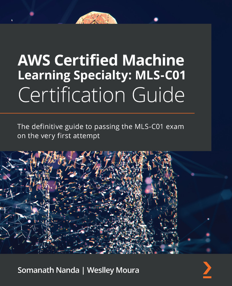
The AWS Certified Machine Learning Specialty exam tests your competency to perform machine learning (ML) on AWS infrastructure. This book covers the entire exam syllabus using practical examples to help you with your real-world machine learning projects on AWS.
Starting with an introduction to machine learning on AWS, you'll learn the fundamentals of machine learning and explore important AWS services for artificial intelligence (AI). You'll then see how to prepare data for machine learning and discover a wide variety of techniques for data manipulation and transformation for different types of variables. The book also shows you how to handle missing data and outliers and takes you through various machine learning tasks such as classification, regression, clustering, forecasting, anomaly detection, text mining, and image processing, along with the specific ML algorithms you need to know to pass the exam. Finally, you'll explore model evaluation, optimization, and deployment and get to grips with deploying models in a production environment and monitoring them.
By the end of this book, you'll have gained knowledge of the key challenges in machine learning and the solutions that AWS has released for each of them, along with the tools, methods, and techniques commonly used in each domain of AWS ML.
Table of Contents (14 chapters)
Preface
Section 1: Introduction to Machine Learning
 Free Chapter
Chapter 1: Machine Learning Fundamentals
Chapter 2: AWS Application Services for AI/ML
Section 2: Data Engineering and Exploratory Data Analysis
Chapter 3: Data Preparation and Transformation
Chapter 4: Understanding and Visualizing Data
Chapter 5: AWS Services for Data Storing
Chapter 6: AWS Services for Data Processing
Section 3: Data Modeling
Chapter 7: Applying Machine Learning Algorithms
Chapter 8: Evaluating and Optimizing Models
Chapter 9: Amazon SageMaker Modeling
