

Putting everything together in a dashboard
Often, you’ll need more than a single visualization to communicate the full story of the data. In these cases, Tableau makes it very easy for you to use multiple visualizations together on a dashboard. In Tableau, a dashboard is a collection of views, filters, parameters, images, and other objects that work together to communicate a data story. Dashboards are often interactive and allow end users to explore different facets of the data.
Dashboards serve a wide variety of purposes and can be tailored to suit a wide variety of audiences. Consider the following possible dashboards:
- A summary-level view of profit and sales to allow executives to take a quick glimpse at the current status of the company
- An interactive dashboard, allowing sales managers to drill into sales territories to identify threats or opportunities
- A dashboard allowing doctors to track patient readmissions, diagnoses, and procedures to make better decisions about patient care
- A dashboard allowing executives of a real-estate company to identify trends and make decisions for various apartment complexes
- An interactive dashboard for loan officers to make lending decisions based on portfolios broken down by credit ratings and geographic location
Considerations for different audiences and advanced techniques will be covered in detail in Chapter 8, Telling a Data Story with Dashboards.
The dashboard interface
You can create a new dashboard by clicking the New Dashboard button next to the tabs at the bottom of the Tableau window or by selecting Dashboard | New Dashboard from the menu.
When you create a new dashboard, the interface will be slightly different than it is when designing a single view. We’ll start designing your first dashboard after a brief look at the interface. You might navigate to the Superstore Sales sheet and take a quick look at it yourself.
The dashboard window consists of several key components. Techniques for using these objects will be detailed in Chapter 8, Telling a Data Story with Dashboards. For now, focus on gaining some familiarity with the options that are available.
One thing you’ll notice is that the left sidebar has been replaced with dashboard-specific content:
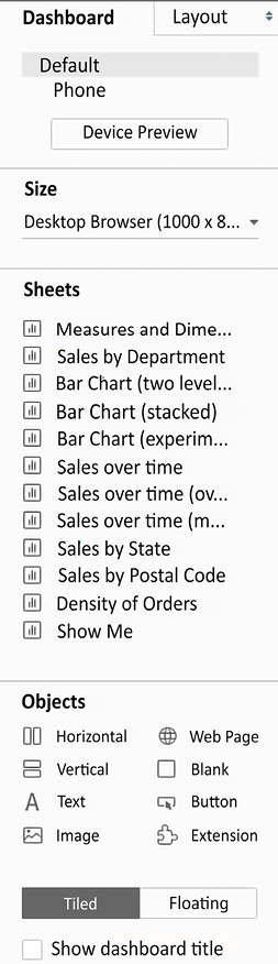
Figure 1.26: The sidebar for dashboards
The left sidebar contains two tabs:
- A Dashboard tab, for sizing options and adding sheets and objects to the dashboard
- A Layout tab, for adjusting the layout of various objects on the dashboard
The Dashboard pane contains options for previewing based on the target device along with several sections:
- A Size section, for dashboard sizing options
- A Sheets section, containing all sheets (views) available to place on the dashboard
- An Objects section with additional objects that can be added to the dashboard
You can add sheets and objects to a dashboard by dragging and dropping. As you drag the view, a light-gray shading will indicate the location of the sheet in the dashboard once it is dropped. You can also double-click on any sheet and it will be added automatically.
In addition to adding sheets, the following objects may be added to the dashboard:
- Horizontal and Vertical layout containers will give you finer control over the layout
- Text allows you to add text labels and titles
- An Image and even embedded Web Page content can be added
- A Blank object allows you to preserve blank space in a dashboard, or it can serve as a placeholder until additional content is designed
- A Navigation object allows the user to navigate between dashboards
- An Export button allows end users to export the dashboard as a PowerPoint, PDF, or image
- An Extension gives you the ability to add controls and objects that you or a third party have developed for interacting with the dashboard and providing extended functionality
Using the toggle, you can select whether new objects will be added as Tiled or Floating. Tiled objects will snap into a tiled layout next to other tiled objects or within layout containers. Floating objects will float on top of the dashboard in successive layers. Benefits and scenarios for why you would use either tiled or floating design methods are covered in detail in Chapter 8, Telling a Data Story with Dashboards. In this chapter, we’ll leave the default of Tiled selected, allowing views to easily “snap into” the dashboard.
When a worksheet is first added to a dashboard, any legends, filters, or parameters that were visible in the worksheet view will be added to the dashboard. If you wish to add them at a later point, select the sheet in the dashboard and click on the little drop-down caret on the upper-right side. Nearly every object has the drop-down caret, providing many options for fine-tuning the appearance of the object and controlling behavior.
Take note of the various controls that become visible for selected objects on the dashboard:
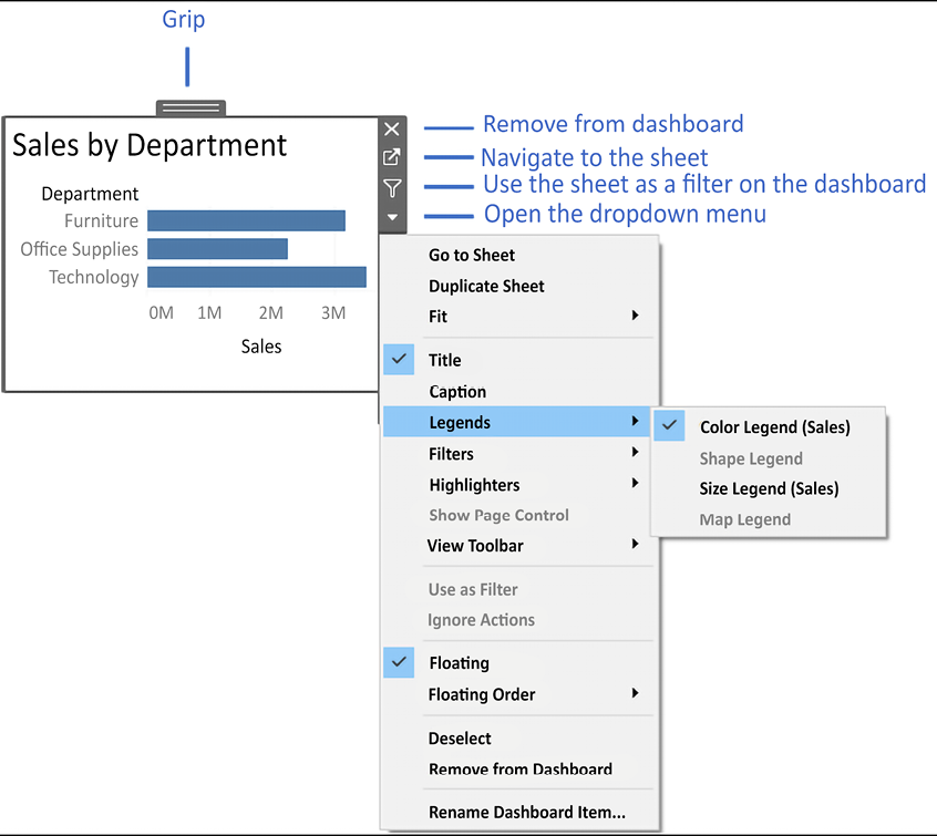
Figure 1.27: Various controls and UI elements become visible when selecting an object on a dashboard
You can resize an object on the dashboard using the border. The Grip, labeled in Figure 1.27, allows you to move the object once it has been placed. We’ll consider other options as we go.
Building your dashboard
With an overview of the interface, you are now ready to build a dashboard by following these steps:
- Navigate to the Superstore Sales sheet. You should see a blank dashboard.
- Successively double-click on each of the following sheets listed in the Dashboard section on the left: Sales by Department, Sales over time, and Sales by Postal Code. Notice that double-clicking on the object adds it to the layout of the dashboard.
- Add a title to the dashboard by checking Show Dashboard title at the lower left of the sidebar.
- Select the Sales by Department sheet in the dashboard and click on the drop-down arrow to show the menu.
- Select Fit | Entire View. The Fit options describe how the visualization should fill any available space.
Be careful when using various fit options. If you are using a dashboard with a size that has not been fixed, or if your view dynamically changes the number of items displayed based on interactivity, then what might have once looked good might not fit the view nearly as well.
- Select the Sales size legend by clicking on it. Use the X option to remove the legend from the dashboard:
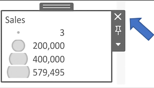
Figure 1.28: Select the legend by clicking on it, then click the X to remove it from the dashboard
- Select the Profit color legend by clicking on it. Use the Grip to drag it and drop it under the map.
- For each view (Sales by Department, Sales by Postal Code, and Sales over time), select the view by clicking on an empty area in the view. Then, click on the Use as Filter option to make that view an interactive filter for the dashboard:

Figure 1.29: Click on the Use as Filter button to use a view as a filter in a dashboard
Your dashboard should look like this:

Figure 1.30: The final dashboard consisting of three views
- Take a moment to interact with your dashboard. Click on various marks, such as the bars, states, and points of the line. Notice that each selection filters the rest of the dashboard. Clicking on a selected mark will deselect it and clear the filter. Also, notice that selecting marks in multiple views causes filters to work together. For example, selecting the bar for Furniture in Sales by Department and the 2019 Q4 in Sales over time allows you to see all the ZIP codes that had furniture sales in the fourth quarter of 2019.
Congratulations! You have now created a dashboard that allows you to carry out interactive analysis!
As an analyst for the Superstore chain, your visualizations allowed you to explore and analyze the data. The dashboard you created can be shared with members of management, and it can be used as a tool to help them see and understand the data to make better decisions. When a manager selects the furniture department, it immediately becomes obvious that there are locations where sales are quite high, but the profit is actually very low. This may lead to decisions such as a change in marketing or a new sales focus for that location. Most likely, this will require additional analysis to determine the best course of action. In this case, Tableau will empower you to continue the cycle of discovery, analysis, and storytelling.