

Moving around in KNIME
As we enter the world of KNIME, it makes sense to familiarize ourselves with the two keywords we are going to use most often: nodes and workflows:
- A node is the essential building block of any data operation that happens in KNIME. Every action you apply on data—like loading a file, filtering out rows, applying some formula, or building a machine learning model—is represented by a square icon in KNIME, called a node.
- A workflow is the full sequence of nodes that describe what you want to do with your data, from the beginning to the end. To build a data process in KNIME you will have to select the nodes you need and connect them in the desired order, designing the workflow that is right for you:

Figure 2.1: KNIME user interface: your workbench for crafting analytics
KNIME's user interface has got all you need to pick and mix nodes to construct the workflow that you need. Let's go through the six fundamental elements of the interface that will welcome you as soon as you start the application:
- Explorer. This is where your workflows will be kept handy and tidy. In here you will find: the LOCAL workspace, which contains the folders stored on your local machine; the KNIME public server, storing many EXAMPLES organized by topic that you can use for inspiration and replication; the My-KNIME-Hub space, linked to your user on the KNIME Hub cloud, where you can share private and public workflows and reusable modules—called Components in KNIME—with others (you can create your space for free by registering at hub.knime.com).
- Node Repository. In this space, you can find all the nodes available to you, ready to be dragged and dropped into your workflow. Nodes are arranged in hierarchical categories: if you click on the chevron sign > on the left of each header, you will go to the level below. For instance, the first category is IO (input/output) which includes multiple subcategories, such as Read, Write, and Connectors. You can search for the node you need by entering some keywords in the textbox at the top right. Try entering the word
Excelin the search box: you will obtain all nodes that let you import and export data in the Microsoft spreadsheet format. As a painter would find all available colors in the palette, the repository will give you access to all available nodes for your workflow:
Figure 2.2: The Node Repository lists all the nodes available for you to pick
- Workflow Editor. This is where the magic happens: in here you will combine the nodes you need, connect them as required, and see your workflow come to life. Following the analogy we started above with the color palette, the Workflow Editor will be the white canvas on which you will paint your data masterpiece.
- Node Description. This is an always-on reference guide for each node. When you click on any node—lying either in the repository or in the Workflow Editor—this window gets updated with all you need to know about the node. The typical description of a node includes three parts: a summary of what it does and how it works, a list of the various steps of configuration we can apply (Dialog Options), and finally, a description of the input and output ports of the node (Ports).
- Outline. Your workflow can get quite big and you might not be able to see it fully within your Workflow Editor: the Outline gives you a full view of the workflow and shows which part you are currently visualizing in the Workflow Editor. If you drag the blue rectangle around, you can easily jump to the part of the workflow you are interested in.
- Console and Node Monitor. In this section, you will find a couple of helpful diagnostics and debugging gadgets. The Console will show the full description of the latest warnings and errors while the Node Monitor shows a summary of the data available at the output port of the currently selected node.
You can personalize the look and feel of the user interface by adding and removing elements from the View menu. Should you want to go back to the original setup, as displayed in the figure above, just click on View | Reset Perspective....
Although these six sections cover all the essential needs, the KNIME user interface offers more sections that you might be curious enough to explore. For instance, on the left, you have the Workflow Coach, which suggests the next most likely node you are going to add to the workflow, based on what other users do. Lastly, in the same window of the Node Description, you will find an additional panel (look for its header at the top) called KNIME Hub: in here, you can search for examples, additional packages, and modules that you can directly drag and drop into your workflow, as you would do from the Node Repository.
Nodes
Nodes are the backbone of KNIME and we need to feel totally confident with them: let's discover how they work and what types of nodes are available:
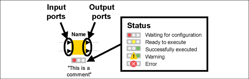
Figure 2.3: Anatomy of a node in KNIME: the traffic light tells us the current status
As you can see from the figure above, nodes look like square icons with some text and shapes around them. More precisely:
- On top of a node, you will find its Name in bold. The name tells you, in a nutshell, what that type of node does. For example, to rename some columns in a table, we use the node called Column Rename.
- At the bottom of the square, you find a Comment . This is a label that should explain the specific role of that node in your workflow. By default, KNIME applies a counter to every new node as it gets added to the workflow, like Node 1, Node 2, and so on. You can modify the comment by just double-clicking on it.
I strongly encourage you to comment on every single node in your workflow with a short description that explains what it does. When workflows get complex you will quickly forget what each node was meant to do there. Trust me: it's a worthy investment of your time!
- Nodes are connected through Ports, lying at the left and at the right of the square. By convention, the ports on the left are input ports, as they bring data into the node, while ports on the right are output ports, carrying the results of the node execution. Ports can have different shapes and colors, depending on what they carry: most of them are triangles, as they convey data tables, but they could be squares (models, connections, images, and more) or circles (variables).
- At the bottom of every node, you have a traffic light that signals the current Status of the node. If the red light is on, the node is not ready yet to do its job: it could be that some required data has not been given as an input or some configuration step is needed. When the light is amber, the node has all it needs and is ready to be executed on your command. The green light is good news: it means that the node was successfully executed and the results are available at the output ports. Some icons can appear on the traffic light if something is not right: a yellow triangle with an exclamation mark indicates a warning while a red circle with a cross announces an error. In these cases, you can learn more about what went wrong by keeping your mouse on them for a second (a label will appear) or by reading the Console.
As we have already started to see in the Node Repository, there are several families of nodes available in KNIME, each responding to a different class of data analytics needs. Here are the most popular ones:
- Input & Output: these nodes will bring data in and out of KNIME. Normally, input nodes are at the beginning of workflows: they can open files in different formats (CSV, Excel, images, webpages, to mention some) or connect to remote databases and pull the data they need. As you can see from Figure 2.4, the input nodes have only output ports on the right and do not have any input ports on the left (unless they require a connection with a database). This makes sense as they have the role of initiating a workflow by pulling data into it after reading it from somewhere. Conversely, output nodes tend to be used at the end of a workflow as they can save data to files or cloud locations. They rarely have output ports as they close our chain of operations.
- Manipulation: These nodes are capable of handling data tables and transforming them according to our needs. They can apply steps for aggregating, combining, sorting, filtering, and reshaping tables, but also managing missing values, normalizing data points, and converting data types. These nodes, together with those in the previous family, are virtually unmissable in any data analytics workflow: they can jointly clean the data and prepare it in the format required by any subsequent step, like creating a model, a report, or a chart. These nodes can have one or more input ports and one or more output ports, as they are capable of merging and splitting tables.
- Analytics: These are the smartest nodes of the pack, able to build statistical models and support the implementation of artificial intelligence algorithms. We will learn how to use these nodes in the chapters dedicated to machine learning. For now, it will be sufficient to keep with us the reassuring thought that even complex AI procedures (like creating a deep neural network) can be obtained by wisely combining the right modeling nodes, available in our Node Repository. As you will notice in Figure 2.4, some of the ports are squares as they stand for statistical models instead of data tables.
- Flow Control: Sometimes, our workflows will need to go beyond the simple one-branch structure where data flows only once and follows a single chain of nodes. These nodes can create loops across branches so we can repeat several steps through cycles, like a programmer would do with flow control statements (for those of you who can program, think of
whileorforconstructs). We can also dynamically change the behavior of nodes by controlling their configuration through variables. These nodes are more advanced and, although we don't need them most of the time, they are a useful resource when the going gets tough. - All others: On top of the ones above, KNIME offers many other types of nodes, which can help us with more specific needs. Some nodes let us interact systematically with third-party applications through interfaces called Application Programming Interfaces (APIs): for example, an extension called KNIME Twitter Connectors lets you search for tweets or download public user information in mass to run some analytics on it. Other extensions will let you blend KNIME with programming languages like Python and R so you can run snippets of code in KNIME or execute KNIME workflows from other environments. You will also have nodes for running statistical tests and for building visualizations or full reports.
When you are looking for advanced functionality in KNIME, you can check the KNIME Hub or run a search on nodepit.com, a search engine for KNIME workflows, components, and nodes.
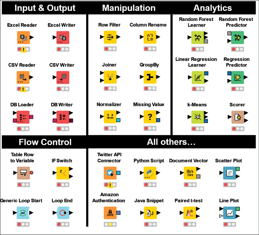
Figure 2.4: A selection of KNIME nodes by type: these are the LEGO® bricks of your data analytics flow
I hope that reading about the broad variety of things you can do with nodes has whetted your appetite for more. It's finally time to see nodes in action and build a simple KNIME workflow.