
Learning about common time series challenges
Time series data is a very compact way to encode multi-scale behaviors of the measured phenomenon: this is the key reason why fundamentally unique approaches are necessary compared to tabular datasets, acoustic data, images, or videos. Multivariate datasets add another layer of complexity due to the underlying implicit relationships that can exist between multiple signals.
This section will highlight key challenges that ML practitioners must learn to tackle to successfully uncover insights hidden in time series data.
These challenges can include the following:
- Technical challenges
- Visualization challenges
- Behavioral challenges
- Missing insights and context
Technical challenges
In addition to time series data, contextual information can also be stored as separate files (or tables from a database): this includes labels, related time series, or metadata about the items being measured. Related time series will have the same considerations as your main time series dataset, whereas labels and metadata will usually be stored as a single file or a database table. We will not focus on these items as they do not pose any challenges different from any usual tabular dataset.
Time series file structure
When you discover a new time series dataset, the first thing you have to do before you can apply your favorite ML approach is to understand the type of processing you need to apply to it. This dataset can actually come in several files that you will have to assemble to get a complete overview, structured in one of the following ways:
- By time ranges: With one file for each month and every sensor included in each file. In the following screenshot, the first file will cover the range in green (April 2018) and contains all the data for every sensor (from
sensor_00tosensor_09), the second file will cover the range in red (May 2018), and the third file will cover the range in purple (June 2018):

Figure 1.7 – File structure by time range (example: one file per month)
- By variable: With one file per sensor for the complete time range, as illustrated in the following screenshot:

Figure 1.8 – File structure by variable (for example, one sensor per file)

Figure 1.9 – File structure by variable and by time range (for example, one file for each month and each sensor)
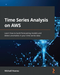
When you deal with multiple time series (either independent or multivariate), you might want to assemble them in a single table (or DataFrame if you are a Python pandas practitioner). When each time series is stored in a distinct file, you may suffer from misaligned timestamps, as in the following case:
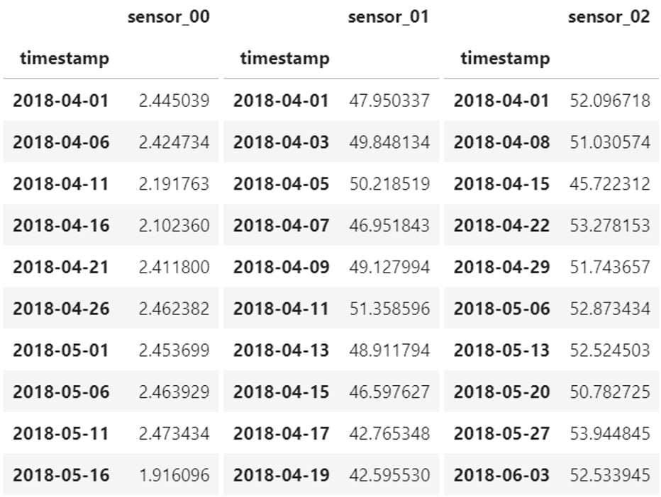
Figure 1.10 – Multivariate time series with misaligned timestamps
There are three approaches you can take, and this will depend on the actual processing and learning process you will set up further down the road. You could do one of the following:
- Leave each time series in its own file with its own timestamps. This leaves your dataset untouched but will force you to consider a more flexible data structure when you want to feed it into an ML system.
- Resample every time series to a common sampling rate and concatenate the different files by inserting each time series as a column in your table. This will be easier to manipulate and process but you won't be dealing with your raw data anymore. In addition, if your contextual data also provides timestamps (to separate each batch of a manufactured product, for instance), you will have to take them into account (one approach could be to slice your data to have time series per batch and resample and assemble your dataset as a second step).
- Merge all the time series and forward fill every missing value created at the merge stage (see all the
NaNvalues in the following screenshot). This process is more compute-intensive, especially when your timestamps are irregular:
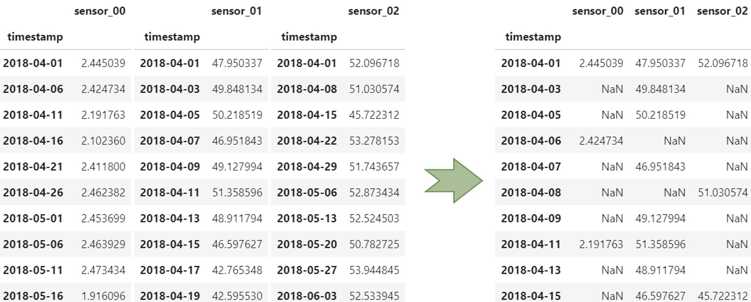
Figure 1.11 – Merging time series with misaligned timestamps
Storage considerations
The format used to store the time series data itself can vary and will have its own benefits or challenges. The following list exposes common formats and the Python libraries that can help tackle them:
- Comma-separated values (CSV): One of the most common and—unfortunately—least efficient formats to deal with when it comes to storing time series data. If you need to read or write time series data multiple times (for instance, during EDA), it is highly recommended to transform your CSV file into another more efficient format. In Python, you can read and write CSV files with
pandas(read_csvandto_csv), and NumPy (genfromtxtandsavetxt). - Microsoft Excel (XLSX): In Python, you can read and write Excel files with
pandas(read_excelandto_excel) or dedicated libraries such asopenpyxlorxlsxwriter. At the time of this writing, Microsoft Excel is limited to 1,048,576 rows (220) in a single file. When your dataset covers several files and you need to combine them for further processing, sticking to Excel can generate errors that are difficult to pinpoint further down the road. As with CSV, it is highly recommended to transform your dataset into another format if you plan to open and write it multiple times during your dataset lifetime. - Parquet: This is a very efficient column-oriented storage format. The Apache Arrow project hosts several libraries that offer great performance to deal with very large files. Writing a 5 gigabyte (GB) CSV file can take up to 10 minutes, whereas the same data in Parquet will take up around 3.5 GB and be written in 30 seconds. In Python, Parquet files and datasets can be managed by the
pyarrow.parquetmodule. - Hierarchical Data Format 5 (HDF5): HDF5 is a binary data format dedicated to storing huge amounts of numerical data. With its ability to let you slice multi-terabyte datasets on disk to bring only what you need in memory, this is a great format for data exploration. In Python, you can read and write HDF5 files with
pandas(read_hdfandto_hdf) or theh5pylibrary. - Databases: Your time series might also be stored in general-purpose databases (that you will query using standard Structured Query Language (SQL) languages) or may be purpose-built for time series such as Amazon Timestream or InfluxDB. Column-oriented databases or scalable key-value stores such as Cassandra or Amazon DynamoDB can also be used while taking benefit from anti-patterns useful for storing and querying time series data.
Data quality
As with any other type of data, time series can be plagued by multiple data quality issues. Missing data (or Not-a-Number values) can be filled in with different techniques, including the following:
- Replace missing data points by the mean or median of the whole time series: the
fancyimpute(http://github.com/iskandr/fancyimpute) library includes aSimpleFillmethod that can tackle this task. - Using a rolling window of a reasonable size before replacing missing data points by the average value: the
impyutemodule (https://impyute.readthedocs.io) includes several methods of interest for time series such asmoving_windowto perform exactly this. - Forward fill missing data points by the last known value: This can be a useful technique when the data source uses some compression scheme (an industrial historian system such as OSIsoft PI can enable compression of the sensor data it collects, only recording a data point when the value changes). The
pandaslibrary includes functions such asSeries.fillnawhereby you can decide to backfill, forward fill, or replace a missing value with a constant value. - You can also interpolate values between two known values: Combined with a resampling to align every timestamp for multivariate situations, this yields a robust and complete dataset. You can use the
Series.interpolatemethod frompandasto achieve this.
For all these situations, we highly recommend plotting and comparing the original and resulting time series to ensure that these techniques do not negatively impact the overall behavior of your time series: imputing data (especially interpolation) can make outliers a lot more difficult to spot, for instance.
Important note
Imputing scattered missing values is not mandatory, depending on the analysis you want to perform—for instance, scattered missing values may not impair your ability to understand a trend or forecast future values of a time series. As a matter of fact, wrongly imputing scattered missing values for forecasting may bias the model if you use a constant value (say, zero) to replace the holes in your time series. If you want to perform some anomaly detection, a missing value may actually be connected to the underlying reason of an anomaly (meaning that the probability of a value being missing is higher when an anomaly is around the corner). Imputing these missing values may hide the very phenomena you want to detect or predict.
Other quality issues can arise regarding timestamps: an easy problem to solve is the supposed monotonic increase. When timestamps are not increasing along with your time series, you can use a function such as pandas.DataFrame.sort_index or pandas.DataFrame.sort_values to reorder your dataset correctly.
Duplicated timestamps can also arise. When they are associated with duplicated values, using pandas.DataFrame.duplicated will help you pinpoint and remove these errors. When the sampling rate is lesser or equal to an hour, you might see duplicate timestamps with different values: this can happen around daylight saving time changes. In some countries, time moves forward by an hour at the start of summer and back again in the middle of the fall—for example, Paris (France) time is usually Central European Time (CET); in summer months, Paris falls into Central European Summer Time (CEST). Unfortunately, this usually means that you have to discard all the duplicated values altogether, except if you are able to replace the timestamps with their equivalents, including the actual time zone they were referring to.
Data quality at scale
In production systems where large volumes of data must be processed at scale, you may have to leverage distribution and parallelization frameworks such as Dask, Vaex, or Ray. Moreover, you may have to move away from Python altogether: in this case, services such as AWS Glue, AWS Glue DataBrew, and Amazon Elastic MapReduce (Amazon EMR) will provide you a managed platform to run your data transformation pipeline with Apache Spark, Flink, or Hive, for instance.
Visualization challenges
Taking a sneak peek at a time series by reading and displaying the first few records of a time series dataset can be useful to make sure the format is the one expected. However, more often than not, you will want to visualize your time series data, which will lead you into an active area of research: how to transform a time series dataset into a relevant visual representation.
Here are some key challenges you will likely encounter:
- Plotting a high number of data points
- Preventing key events from being smoothed out by any resampling
- Plotting several time series in parallel
- Getting visual cues from a massive amount of time series
- Uncovering multiple scales behavior across long time series
- Mapping labels and metadata on time series
Let's have a look at different techniques and approaches you can leverage to tackle these challenges.
Using interactive libraries to plot time series
Raw time series data is usually visualized with line plots: you can easily achieve this in Microsoft Excel or in a Jupyter notebook (thanks to the matplotlib library with Python, for instance). However, bringing long time series in memory to plot them can generate heavy files and images difficult or long to render, even on powerful machines. In addition, the rendered plots might consist of more data points than what your screen can display in terms of pixels. This means that the rendering engine of your favorite visualization library will smooth out your time series. How do you ensure, then, that you do not miss the important characteristics of your signal if they happen to be smoothed out?
On the other hand, you could slice a time series to a more reasonable time range. This may, however, lead you to inappropriate conclusions about the seasonality, the outliers to be processed, or potential missing values to be imputed on certain time ranges outside of your scope of analysis.
This is where interactive visualization comes in. Using such a tool will allow you to load a time series, zoom out to get the big picture, zoom in to focus on certain details, and pan a sliding window to visualize a movie of your time series while keeping full control of the traveling! For Python users, libraries such as plotly (http://plotly.com) or bokeh (http://bokeh.org) are great options.
Plotting several time series in parallel
When you need to plot several time series and understand how they evolve with regard to each other, you have different options depending on the number of signals you want to visualize and display at once. What is the best representation to plot several time series in parallel? Indeed, different time series will likely have different ranges of possible values, and we only have two axes on a line plot.
If you have just a couple of time series, any static or interactive line plot will work. If both time series have a different range of values, you can assign a secondary axis to one of them, as illustrated in the following screenshot:
Figure 1.12 – Visualizing a low number of plots
If you have more than two time series and fewer than 10 to 20 that have similar ranges, you can assign a line plot to each of them in the same context. It is not too crowded yet, and this will allow you to detect any level shifts (when all signals go through a sudden significant change). If the range of possible values each time series takes is widely different from one another, a solution is to normalize them by scaling them all to take values comprised between 0.0 and 1.0 (for instance). The scikit-learn library includes methods that are well known by ML practitioners for doing just this (check out the sklearn.preprocessing.Normalizer or the sklearn.preprocessing.StandardScaler methods).
The following screenshot shows a moderate number of plots being visualized:

Figure 1.13 – Visualizing a moderate number of plots
Even though this plot is a bit too crowded to focus on the details of each signal, we can already pinpoint some periods of interest.
Let's now say that you have hundreds of time series. Is it possible to visualize hundreds of time series in parallel to identify shared behaviors across a multivariate dataset? Plotting all of them on a single chart will render it too crowded and definitely unusable. Plotting each signal in its own line plot will occupy a prohibitive real estate and won't allow you to spot time periods when many signals were impacted at once.
This is where strip charts come in. As you can see in the following screenshot, transforming a single-line plot into a strip chart makes the information a lot more compact:

Figure 1.14 – From a line plot to a strip chart
The trick is to bin the values of each time series and to assign a color to each bin. You could decide, for instance, that low values will be red, average values will be orange, and high values will be green. Let's now plot the 52 signals from the previous water pump example over 5 years with a 1-minute resolution. We get the following output:
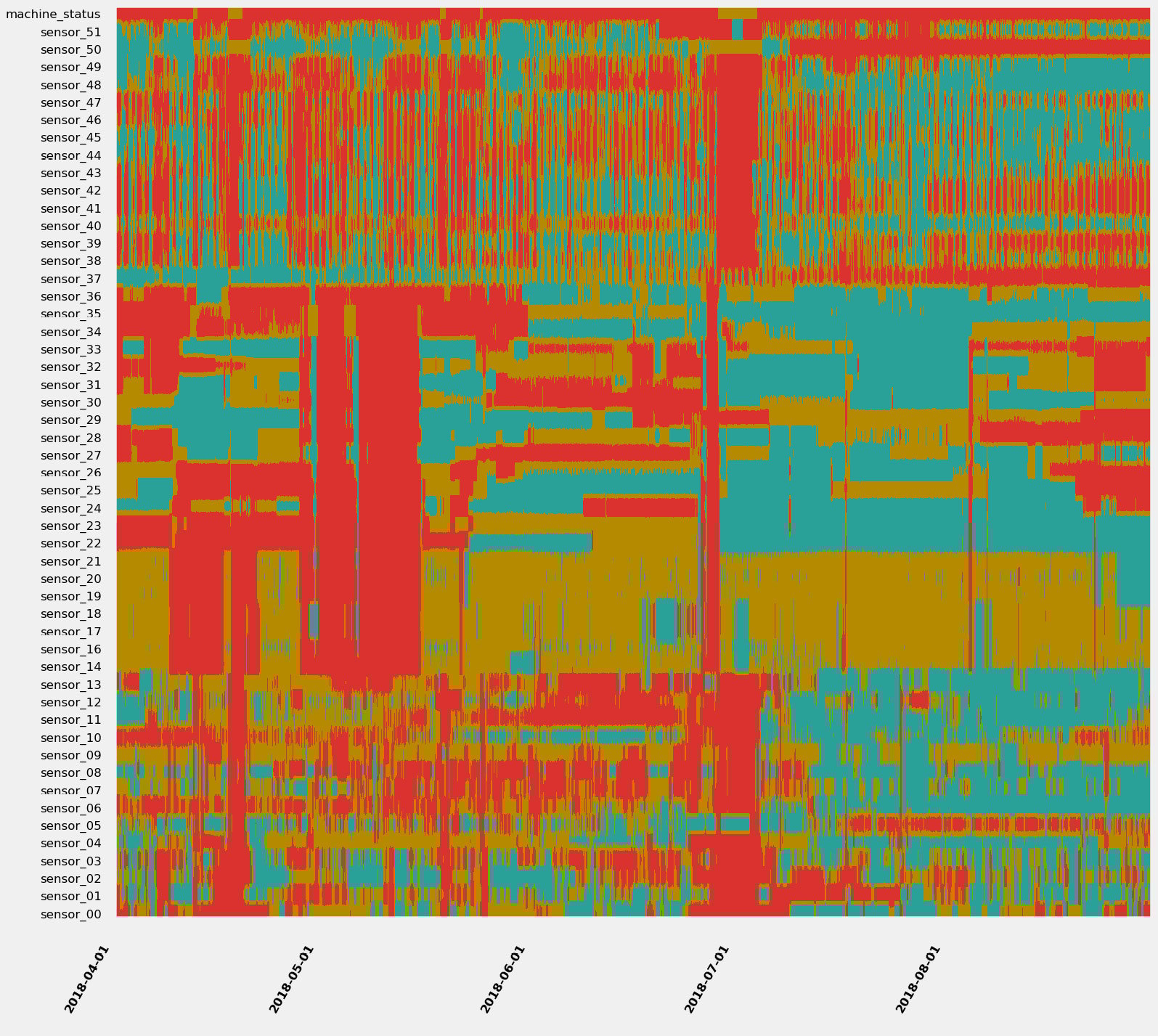
Figure 1.15 – 11.4 million data points at a single glance
Do you see some patterns you would like to investigate? I would definitely isolate the red bands (where many, if not all, signals are evolving in their lowest values) and have a look at what is happening between early May or at the end of June (where many signals seem to be at their lowest). For more details about strip charts and in-depth demonstration, you can refer to the following article: https://towardsdatascience.com/using-strip-charts-to-visualize-dozens-of-time series-at-once-a983baabb54f
Enabling multiscale exploration
If you have very long time series, you might want to find interesting temporal patterns that may be harder to catch than the usual weekly, monthly, or yearly seasonality. Detecting patterns is easier if you can adjust the time scale at which you are looking at your time series and the starting point. A great multiscale visualization is the Pinus view, as outlined in this paper: http://dx.doi.org/10.1109/TVCG.2012.191.
The approach of the author of this paper makes no assumption about either time scale or the starting points. This makes it easier to identify the underlying dynamics of complex systems.
Behavioral challenges
Every time series encodes multiple underlying behaviors in a sequence of measurements. Is there a trend, a seasonality? Is it a chaotic random walk? Does it sport major shifts in successive segments of time? Depending on the use case, we want to uncover and isolate very specific behaviors while discarding others.
In this section, we are going to review what time series stationarity and level shifts are, how to uncover these phenomena, and how to deal with them.
Stationarity
A given time series is said to be stationary if its statistical mean and variance are constant and its covariance is independent of time when we take a segment of the series and shift it over the time axis.
Some use cases require the usage of parametric methods: such a method considers that the underlying process has a structure that can be described using a small number of parameters. For instance, the autoregressive integrated moving average (ARIMA) method (detailed later in Chapter 7, Improving and Scaling Your Forecast Strategy) is a statistical method used to forecast future values of a time series: as with any parametric method, it assumes that the time series is stationary.
How do you identify if your time series is non-stationary? There are several techniques and statistical tests (such as the Dickey-Fuller test). You can also use an autocorrelation plot. Autocorrelation measures the similarity between data points of a given time series as a function of the time lag between them.
You can see an example of some autocorrelation plots here:
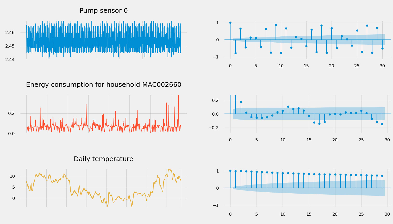
Figure 1.16 – Autocorrelation plots (on the left) for different types of signal
Such a plot can be used to do the following:
- Detect seasonality: If the autocorrelation plot has a sinusoidal shape and you can find a period on the plot, this will give you the length of the season. Seasonality is indeed the periodic fluctuation of the values of your time series. This is what can be seen on the second plot in Figure 1.16 and, to a lesser extent, on the first plot (the pump sensor data).
- Assess stationarity: Stationary time series will have an autocorrelation plot that drops quickly to zero (which is the case of the energy consumption time series), while a non-stationary process will see a slow decrease of the same plot (see the daily temperature signal in Figure 1.16).
If you have seasonal time series, an STL procedure (which stands for seasonal-trend decomposition based on Loess) has the ability to split your time series into three underlying components: a seasonal component, a trend component, and the residue (basically, everything else!), as illustrated in the following screenshot:

Figure 1.17 – Seasonal trend decomposition of a time series signal
You can then focus your analysis on the component you are interested in: characterizing the trends, identifying the underlying seasonal characteristics, or performing raw analysis on the residue.
If the time series analysis you want to use requires you to make your signals stationary, you will need to do the following:
- Remove the trend: To stabilize the mean of a time series and eliminate a trend, one technique that can be used is differencing. This simply consists of computing the differences between consecutive data points in the time series. You can also fit a linear regression model on your data and subtract the trend line found from your original data.
- Remove any seasonal effects: Differencing can also be applied to seasonal effects. If your time series has a weekly component, removing the value from 1 week before (lag difference of 1 week) will effectively remove this effect from your time series.
Level shifts
A level shift is an event that triggers a shift in the statistical distribution of a time series at a given point in time. A time series can see its mean, variance, or correlation suddenly shift. This can happen for both univariate and multivariate datasets and can be linked to an underlying change of the behavior measured by the time series. For instance, an industrial asset can have several operating modes: when the machine switches from one operating mode to another, this can trigger a level shift in the data captured by the sensors that are instrumenting the machine.
Level shifts can have a very negative impact on the ability to forecast time series values or to properly detect anomalies in a dataset. This is one of the key reasons why a model's performance starts to drift suddenly at prediction time.
The ruptures Python package offers a comprehensive overview of different change-point-detection algorithms that are useful for spotting and segmenting a time series signal as follows:

Figure 1.18 – Segments detected on the weather temperature with a binary segmentation approach
It is generally not suitable to try to remove level shifts from a dataset: detecting them properly will help you assemble the best training and testing datasets for your use case. They can also be used to label time series datasets.
Missing insights and context
A key challenge with time series data for most use cases is the missing context: we might need some labels to associate a portion of the time series data with underlying operating modes, activities, or the presence of anomalies or not. You can either use a manual or an automated approach to label your data.
Manual labeling
Your first option will be to manually label your time series. You can build a custom labeling template on Amazon SageMaker Ground Truth (https://docs.aws.amazon.com/sagemaker/latest/dg/sms-custom-templates.html) or install an open source package such as the following:
- Label Studio (https://labelstud.io): This open source project hit the 1.0 release in May 2021 and is a general-purpose labeling environment that happens to include time series annotation capabilities. It can natively connect to datasets stored in Amazon S3.
- TRAINSET (https://github.com/geocene/trainset): This is a very lightweight labeling tool exclusively dedicated to time series data.
- Grafana (https://grafana.com/docs/grafana/latest/dashboards/annotations): Grafana comes with a native annotation tool available directly from the graph panel or through their hyper text transfer protocol (HTTP) application programming interface (API).
- Curve (https://github.com/baidu/Curve): Currently archived at the time of writing this book.
Providing reliable labels on time series data generally requires significant effort from subject-matter experts (SMEs) who may not have enough availability to perform this task. Automating your labeling process could then be an option to investigate.
Automated labeling
Your second option is to perform automatic labeling of your datasets. This can be achieved in different ways depending on your use cases. You could do one of the following:
- You can use change-point-detection algorithms to detect different activities, modes, or operating ranges. The
rupturesPython package is a great starting point to explore the change-point-detection algorithms. - You can also leverage unsupervised anomaly scoring algorithms such as scikit-learn Isolation Forest (
sklearn.ensemble.IsolationForest), the Random Cut Forest built-in algorithm from Amazon SageMaker (https://docs.aws.amazon.com/sagemaker/latest/dg/randomcutforest.html), or build a custom deep learning (DL) neural network based on an autoencoder architecture. - You can also transform your time series (see the different analysis approaches in the next section): tabular, symbolic, or imaging techniques will then let you cluster your time series and identify potential labels of interest.
Depending on the dynamics and complexity of your data, automated labeling can actually require additional verification to validate the quality of the generated labels. Automated labeling can be used to kick-start a manual labeling process with prelabelled data to be confirmed by a human operator.