Seaborn is a Python data visualization library based on Matplotlib. It offers a sophisticated drawing tool for creating eye-catching and educational statistical visuals.
The primary distinction between Seaborn and Matplotlib is how well Seaborn handles pandas DataFrames. Beautiful graphics are provided in Python by using simple sets of functions. When dealing with DataFrames and arrays, Matplotlib performs well. It views axes and figures as objects. There are several stateful plotting APIs in it.
Here, we will start our examples using the “tips” dataset, which contains a mixture of numeric and categorical variables:
import seaborn as sns
import matplotlib.pyplot as plt
tips = sns.load_dataset("tips")
f, ax = plt.subplots(figsize=(12, 6))
sns.scatterplot(data=tips, x="total_bill", y="tip", hue="time")
In the preceding code snippet, we have imported Seaborn and Matplotlib; the latter allows users to control certain aspects of the plots created, such as the figure size, which we defined as a 12 by 6 inches size. This creates the layout in which Seaborn will place the visualization.
We are using the scatterplot() function to create a visualization of points where the X-axis refers to the total_bill variable and the Y-axis refers to the tip variable. Here, we are using the hue parameter to color the different dots according to the time categorical variable, which allows us to plot numerical data with a categorical dimension:
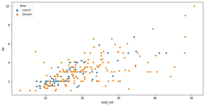
Figure 1.1: Seaborn scatterplot with the color depending on the categorical variable
This generated figure shows the distribution of the data according to the color codes that we have specified, which in our case are the tips that were received, their relationship with the total bill amount, and whether it was during lunch or dinner.
The interpretation that we can make is that there might be a linear relationship between the total amount of the bill and the tip received. But if we look closer, we can see that the highest total bill amounts are placed during dinner, also leading to the highest values in tips.
This information can be really useful in the context of business, but it first needs to be validated with proper hypothesis testing approaches, which can be a t-test to validate these hypotheses, plus a linear regression analysis to conclude that there is a relationship between the total amount and the tip distribution, accounting for the differences in the time in which this occurred. We will look into these analyses in the next chapter.
We can now see how a simple exploration graph can help us construct the hypothesis over which we can base decisions to better improve business products or services.
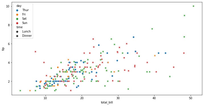
We can also assign hue and style to different variables that will vary colors and markers independently. This allows us to introduce another categorical dimension in the same graph, which in the case of Seaborn can be used with the style parameter, which will assign different types of markers according to our referenced categorical variable:
f, ax = plt.subplots(figsize=(12, 6))
sns.scatterplot(data=tips, x="total_bill", y="tip", hue="day", style="time")
The preceding code snippet will create a layout that’s 12 x 6 inches and will add information about the time categorical variable, as shown in the following graph:
Figure 1.2: Seaborn scatterplot with color and shape depending on the categorical variable
This kind of graph allows us to pack a lot of information into a single plot, which can be beneficial but also can lead to a cluttering of information that can be difficult to digest at once. It is important to always account for the understanding of the information that we want to show, making it easier for the stakeholders to be able to see the relationships at a glance.
Here, it is much more difficult to see any kind of interpretation of the days of the week at first glance. This is because a lot of information is already being shown. These differences that cannot be obtained by simply looking at a graph can be achieved through other kinds of analysis, such as statistical tests, correlations, and causations.
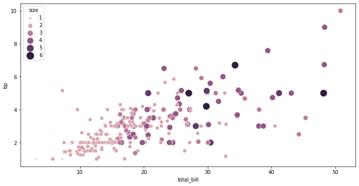
Another way to add more dimensions to the graphics created with Seaborn is to represent numerical variables as the size of the points in the scatterplot. Numerical variables can be assigned to size to apply a semantic mapping to the areas of the points.
We can control the range of marker areas with sizes, and set the legend parameter to full to force every unique value to appear in the legend:
f, ax = plt.subplots(figsize=(12, 6))
sns.scatterplot(
    data=tips, x="total_bill", y="tip", hue="size",
    size="size", sizes=(20, 200), legend="full"
)
The preceding code snippet creates a scatterplot where the points have a size and color that depends on the size variable. This can be useful to pack another numerical dimension into these kinds of plots:
Figure 1.3: Seaborn scatterplot with size depending on a third variable
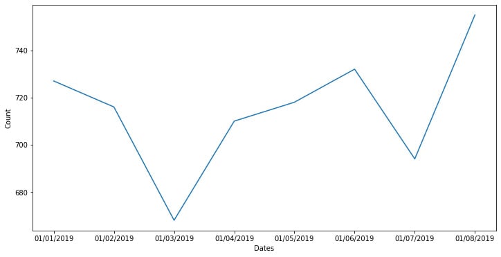
Another important way to represent data is by looking at time series information. We can use the Seaborn package to display time series data without the need to give the data any special treatment.
In the following example, we are creating a pandas DataFrame with dates, using Matplotlib to create a figure that’s 15 x 8 inches, and then using the Seaborn lineplot function to display the information:
df = pd.DataFrame({"Dates":
['01/01/2019','01/02/2019','01/03/2019','01/04/2019',
'01/05/2019','01/06/2019','01/07/2019','01/08/2019'],
"Count": [727,716,668,710,718,732,694,755]})
plt.figure(figsize = (15,8))
sns.lineplot(x = 'Dates', y = 'Count',data = df)
The preceding example creates a wonderful plot with the dates on the x axis and the count variable on the y axis:
Figure 1.4: Seaborn line plot with a time-based axis
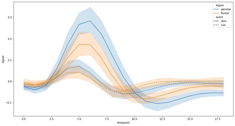
For the following example, we will load a pre-defined dataset from Seaborn known as the FMRI dataset, which contains time series data.
First, we will load an example dataset with long-form data and then plot the responses for different events and regions. To do this, we will create a 15 x 8 inches Matplotlib figure and use the lineplot function to show the information, using the hue parameter to display categorical information about the region, and the style parameter to show categorical information about the type of event:
fmri = sns.load_dataset("fmri")
f, ax = plt.subplots(figsize=(15, 8))
sns.lineplot(x="timepoint", y="signal", hue="region", style="event",data=fmri)
The preceding code snippet creates a display of the information that allows us to study how the variables move through time according to the different categorical aspects of the data:
Figure 1.5: Seaborn line plot with confidence intervals
One of the features of the Seaborn lineplot function is that it shows us the confidence intervals of all points within a range of 95% confidence; the solid line represents the main. This way of showing us the information can be really useful when showing time series data that contains multiple data points for each point in time. Trends can be visualized by the mean as well as to give us a sense of the degree of dispersion, which is something that can be important when analyzing behavior patterns.
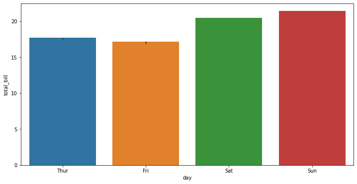
One of the ways we can visualize data is through bar plots. Seaborn uses the barplot function to create bar plots:
f, ax = plt.subplots(figsize=(12, 6))
ax = sns.barplot(x="day", y="total_bill", data=tips,ci=.9)
The preceding code uses Matplotlib to create a 12 x 6 inches figure where the Seaborn bar plot is created. Here, we will display the days on the x axis and the total bill on the y axis, showing the confidence bars as whiskers above the bars. The preceding code generates the following graph:
Figure 1.6: Seaborn bar plot
In the preceding graph, we cannot see the whiskers in detail as the data has a very small amount of dispersion. We can see this in better detail by drawing a set of vertical bars while grouping them by two variables:
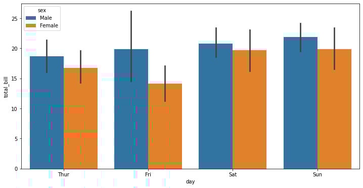
f, ax = plt.subplots(figsize=(12, 6))
ax = sns.barplot(x="day", y="total_bill", hue="sex", data=tips)
The preceding code snippet creates a bar plot on a 12 x 6-inch Matplotlib figure. The difference is that we use the hue parameter to show gender differences:
Figure 1.7: Seaborn bar plot with categorical data
One of the conclusions that can be extracted from this graph is that females get to have total bills that are lower than males on average, with Saturday being the only day when there’s a difference between the means, though there’s a much lower basepoint for the dispersion.
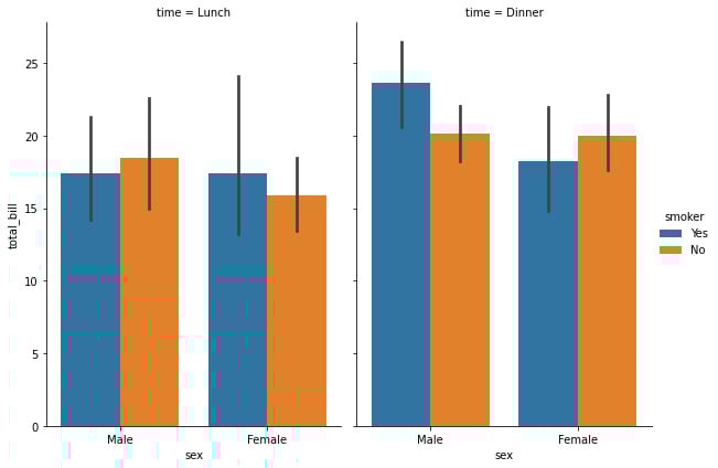
We can add another categorical dimension to the visualization using catplot to combine a barplot with a FacetGrid to create multiple plots. This allows us to group within additional categorical variables. Using catplot is safer than using FacetGrid to create multiple graphs as it ensures synchronization of variable order across different facets:
sns.catplot(x="sex", y="total_bill",hue="smoker", col="time",data=tips, kind="bar",height=6, aspect=.7)
The preceding code snippet generates a categorical plot that contains the different bar plots. Note that the size of the graph is controlled using the height and aspect variables instead of via a Matplotlib figure:
Figure 1.8: Seaborn bar plot with two categorical variables
Here, we can see an interesting trend during lunch, where the mean of the male smokers is lower than the non-smokers, while the female smoker’s mean is higher than those of non-smokers. This tendency is inverted during dinner when there are more male smokers on average than female smokers.
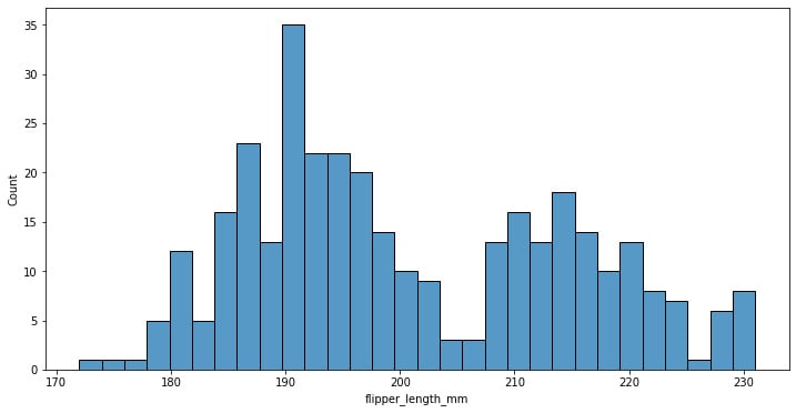
Analyzing trends using histograms is a wonderful tool to be used while analyzing patterns. We can use them with the Searbon hisplot function. Here, we will use the penguins dataset and create a Matplotlib figure that’s 12 x 6 inches:
penguins = sns.load_dataset("penguins")
f, ax = plt.subplots(figsize=(12, 6))
sns.histplot(data=penguins, x="flipper_length_mm", bins=30)
The preceding code creates a histogram of the flipper length grouping data in 30 bins:
Figure 1.9: Seaborn histogram plot
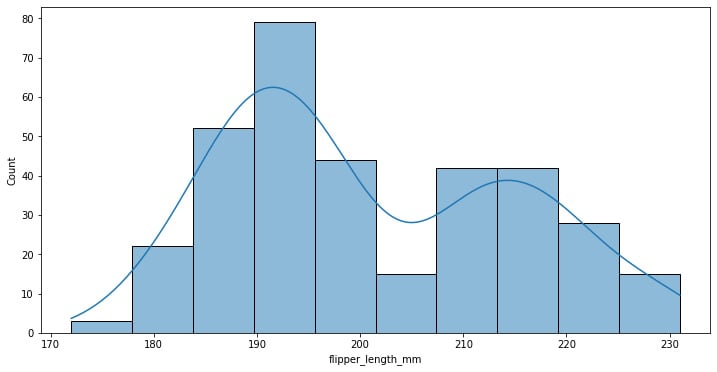
Here, we can add a kernel density line estimate, which softens the histogram, providing more information about the shape of the data distribution.
The following code adds the kde parameter set to True to show this line:
f, ax = plt.subplots(figsize=(12, 6))
sns.histplot(data=penguins, x="flipper_length_mm", kde=True)
Figure 1.10: Seaborn histogram plot with KDE estimated density
Here, we can see that the data approaches some superimposed standard distribution, which can mean that we are looking at different kinds of data.
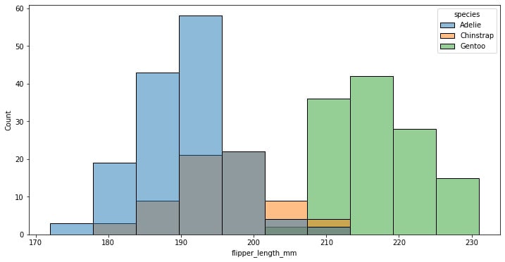
We can also add more dimensions to the graph by using the hue parameter on the categorical species variable:
f, ax = plt.subplots(figsize=(12, 6))
sns.histplot(data=penguins, x="flipper_length_mm", hue="species")
Figure 1.11: Seaborn histogram plot with categorical data
As suspected, we were looking at the superposition of different species of penguins, each of which has a normal distribution, though some of them are more skewed than others.
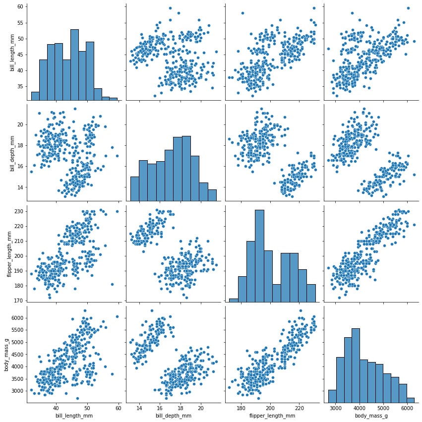
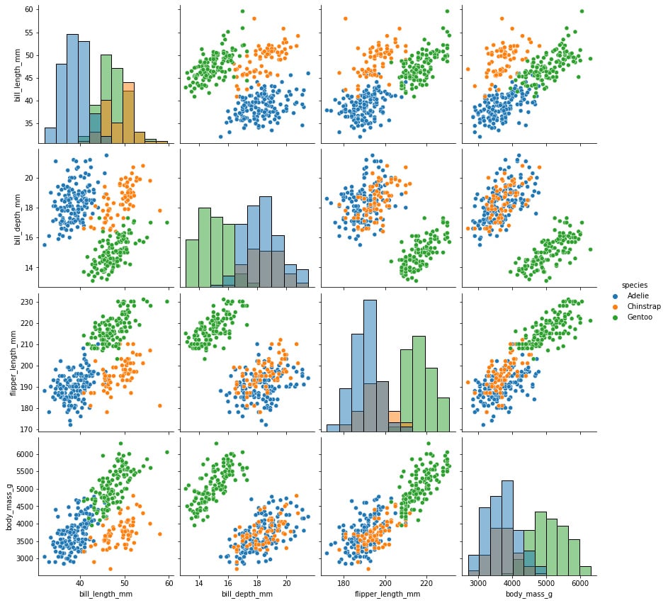
The pairplot function can be used to plot several paired bivariate distributions in a dataset. The diagonal plots are the univariate plots, and this displays the relationship for the (n, 2) combination of variables in a DataFrame as a matrix of plots. pairplot is used to determine the most distinct clusters or the best combination of features to explain the relationship between two variables. Constructing a linear separation or some simple lines in our dataset also helps to create some basic classification models:
sns.pairplot(penguins,height=3)
The preceding line of code creates a pairplot of the data where each box has a height of 3 inches:
Figure 1.12: Variable relationship and histogram of selected features
The variable names are shown on the matrix’s outer borders, making it easy to comprehend. The density plot for each variable is shown in the boxes along the diagonals. The scatterplot between each variable is displayed in the boxes in the lower left corner.
We can also use the hue parameter to add categorical dimensions to the visualization:
sns.pairplot(penguins, hue="species", diag_kind="hist",height=3)
Figure 1.13: Variable relationship and histogram with categorical labels
Although incredibly useful, this graph can be very computationally expensive, which can be solved by looking only at some of the variables instead of the whole dataset.
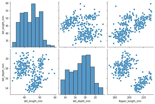
We can reduce the time required to render the visualization by reducing the number of graphs shown. We can do this by specifying the types of variables we want to show in each axis, as shown in the following block of code:
sns.pairplot(
    penguins,
    x_vars=["bill_length_mm", "bill_depth_mm",
           "flipper_length_mm"],
    y_vars=["bill_length_mm", "bill_depth_mm"],
    height=3
)
Figure 1.14: Variable relationship and histogram of selected features
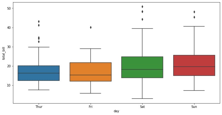
A box plot, sometimes referred to as a box-and-whisker plot in descriptive statistics, is a type of chart that is frequently used in explanatory data analysis. Box plots use the data’s quartiles (or percentiles) and averages to visually depict the distribution of numerical data and skewness.
We can use them in Seaborn using the boxplot function, as shown here:
f, ax = plt.subplots(figsize=(12, 6))
ax = sns.boxplot(x="day", y="total_bill", data=tips)
Figure 1.15: Seaborn box plot
The seaborn box plot has a very simple structure. Distributions are represented visually using box plots. When you want to compare data between two groups, they are helpful. A box plot may also be referred to as a box-and-whisker plot. Any box displays the dataset’s quartiles, and the whiskers extend to display the remainder of the distribution.
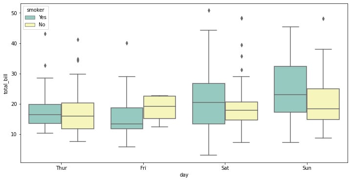
Here, we can specify a type of categorical variable we might want to show using the hue parameter, as well as specify the palette of colors we want to use from Seaborn’s default options:
f, ax = plt.subplots(figsize=(12, 6))
ax = sns.boxplot(x="day", y="total_bill", hue="smoker",data=tips, palette="Set3")
Figure 1.16: Seaborn box plot with categorical data
There is always the question of when you would use a box plot. Box plots are used to display the distributions of numerical data values, particularly when comparing them across various groups. They are designed to give high-level information at a glance and provide details like the symmetry, skew, variance, and outliers of a set of data.


 Free Chapter