


-
Book Overview & Buying
-
Table Of Contents

Applying Math with Python - Second Edition
By :
Applying Math with Python
By:
Overview of this book
The updated edition of Applying Math with Python will help you solve complex problems in a wide variety of mathematical fields in simple and efficient ways. Old recipes have been revised for new libraries and several recipes have been added to demonstrate new tools such as JAX.
You'll start by refreshing your knowledge of several core mathematical fields and learn about packages covered in Python's scientific stack, including NumPy, SciPy, and Matplotlib. As you progress, you'll gradually get to grips with more advanced topics of calculus, probability, and networks (graph theory). Once you’ve developed a solid base in these topics, you’ll have the confidence to set out on math adventures with Python as you explore Python's applications in data science and statistics, forecasting, geometry, and optimization. The final chapters will take you through a collection of miscellaneous problems, including working with specific data formats and accelerating code.
By the end of this book, you'll have an arsenal of practical coding solutions that can be used and modified to solve a wide range of practical problems in computational mathematics and data science.
Table of Contents (13 chapters)
Preface

Chapter 1: An Introduction to Basic Packages, Functions, and Concepts
 Free Chapter
Chapter 2: Mathematical Plotting with Matplotlib
Chapter 3: Calculus and Differential Equations
Chapter 4: Working with Randomness and Probability
Chapter 5: Working with Trees and Networks
Chapter 6: Working with Data and Statistics
Chapter 7: Using Regression and Forecasting
Chapter 8: Geometric Problems
Chapter 9: Finding Optimal Solutions
Chapter 10: Improving Your Productivity
Index
 -value)
  and
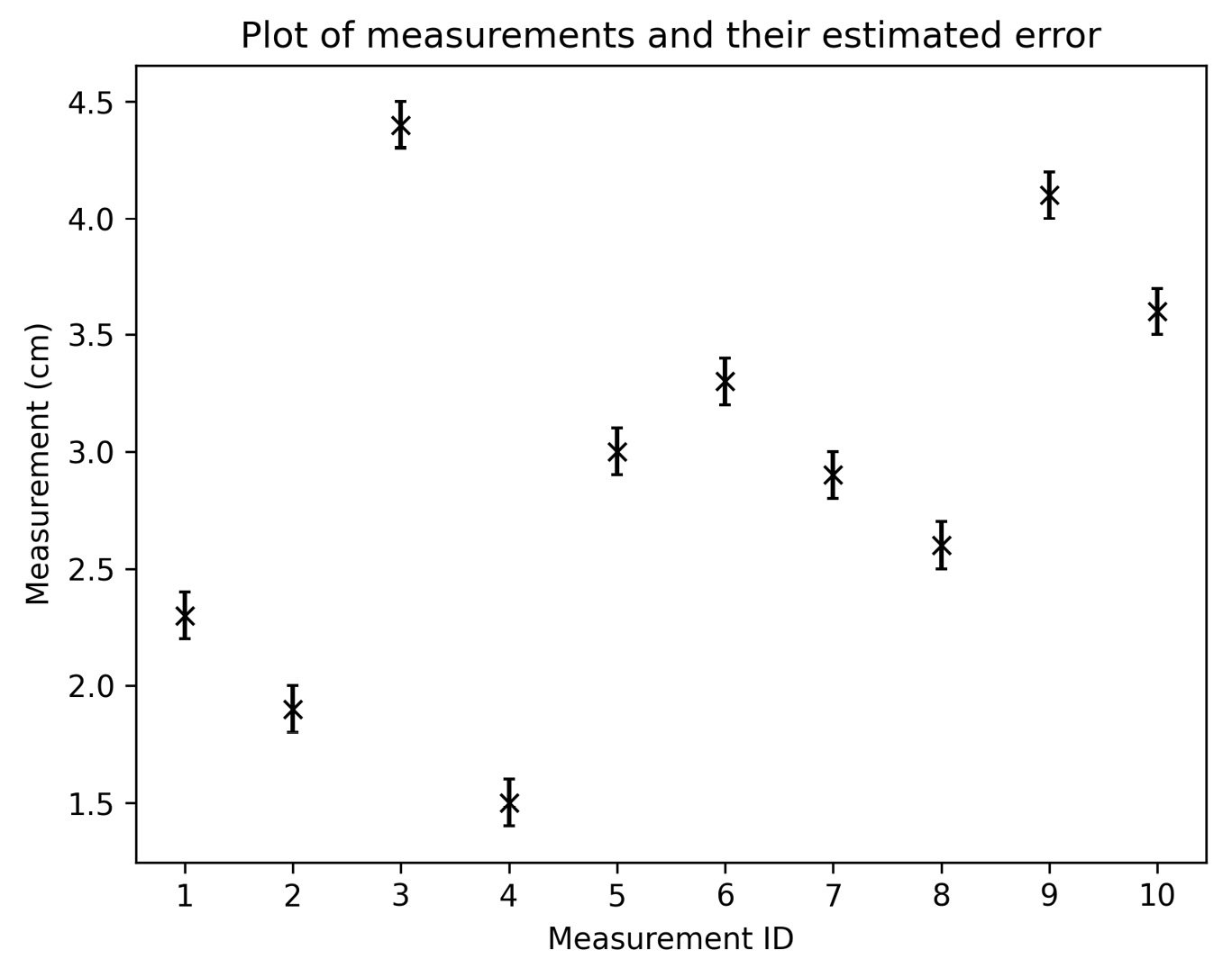
and  coordinates of the points to be plotted. (Note that both must be provided, which is not the case for other plotting methods.) The
  axis because the
  values were simply ID values. If both sets of values have uncertainty, you can also specify the
  error values using the
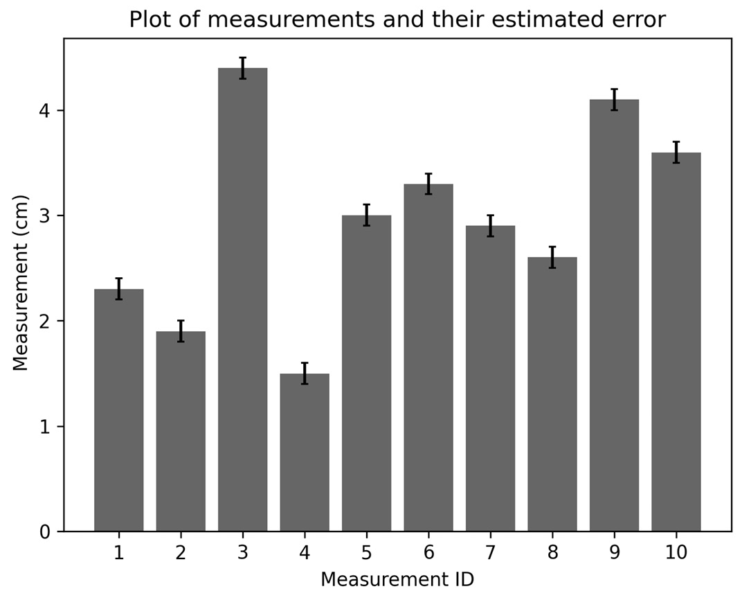
 range in which we expect the true measurement


