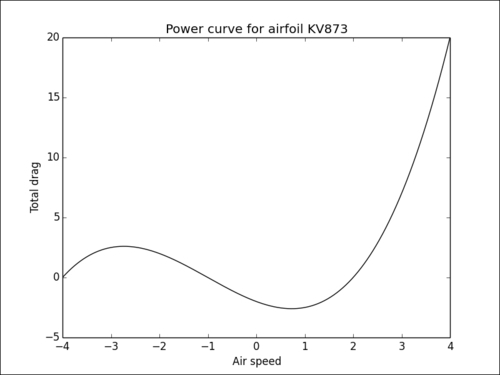
After a title, a proper description of the figure's axis helps a great deal for users understand a graphic. In this recipe, we will show you how to get a label next to each axis of a figure.
Adding such annotations is very simple, as demonstrated in the following example:
import numpy as np
import matplotlib.pyplot as plt

X = np.linspace(-4, 4, 1024)
Y = .25 * (X + 4.) * (X + 1.) * (X - 2.)

plt.title('Power curve for airfoil KV873')
plt.xlabel('Air speed')
plt.ylabel('Total drag')

plt.plot(X, Y, c = 'k')
plt.show()
The figure will be the same as the one obtained in the first recipe of this chapter. However, both the axes will feature a legend.