Book Image

gnuplot Cookbook

By : Lee Phillips
Book Image

gnuplot Cookbook

By: Lee Phillips

Overview of this book

gnuplot is the world's finest technical plotting software, used by scientists, engineers, and others for many years. It is in constant development and runs on practically every operating system, and can produce output in almost any format. The quality of its 3d plots is unmatched and its ability to be incorporated into computer programs and document preparation systems is excellent. gnuplot Cookbook ñ it will help you master gnuplot. Start using gnuplot immediately to solve your problems in data analysis and presentation. Quickly find a visual example of the graph you want to make and see a complete, working script for producing it. Learn how to use the new features in gnuplot 4.4. Find clearly explained, working examples of using gnuplot with LaTeX and with your own computer programming language. You will master all the ins and outs of gnuplot through gnuplot Cookbook. You will learn to plot basic 2d to complex 3d plots, annotate from simple labels to equations, integrate from simple scripts to full documents and computer progams. You will be taught to annotate graphs with equations and symbols that match the style of the rest of your text, thus creating a seamless, professional document. You will be guided to create a web page with an interactive graph, and add graphical output to your simulation or numerical analysis program. Start using all of gnuplot's simple to complex features to suit your needs, without studying its 200 page manual through this Cookbook.
Table of Contents (18 chapters)
gnuplot Cookbook
Credits
About the Author
About the Reviewers
www.PacktPub.com
Preface
Finding Help and Information
Index

Labeling the axes


In this recipe, we add labels to our axes to explain what is being plotted and the significance of the tics and numerical scales. We also add an overall title that will appear at the top of the graph.

Getting ready

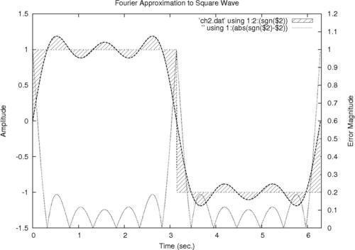
Make sure the supplied datafile ch2.dat is in your current directory. It is the result of adding the first three terms in the Fourier series approximation to the square wave. It is not important to understand what that means to follow the gnuplot recipes; we are using this file because it leads to a good graph for the purpose of illustrating annotations and labeling.

How to do it…

Following is the script that produces the previous annotated graph:

set yrange [-1.5:1.5]
set xrange [0:6.3]
set ytics nomirror
set y2tics 0,.1
set y2range [0:1.2]
set style fill pattern 5
set xlabel "Time (sec.)"
set ylabel "Amplitude"
set y2label "Error Magnitude"
set title "Fourier Approximation to Square Wave"
plot 'ch2.dat' using 1:2:(sgn($2)) with filledcurves,\'' using 1:2 with lines...