Book Image

IBM Cognos Business Intelligence 10.1 Dashboarding Cookbook

By : Ankit Garg
Book Image

IBM Cognos Business Intelligence 10.1 Dashboarding Cookbook

By: Ankit Garg

Overview of this book

IBM Cognos 10 BI is the leader in the Gartner quadrant in terms of BI capabilities. There have been new features introduced with IBM Cognos 10 BI in terms of dashboards and BI. The book intends to highlight the latest and advanced dashboarding features introduced with IBM Cognos 10 BI. The book covers Business Insight and Business Insight Advanced in a comprehensive manner. It also covers best practices in terms of creating and distributing dashboards using IBM Cognos 10 BI, without which no BI solution would look presentable, usable and efficient. The book covers the new IBM Cognos 10 dashboarding capabilities in detail and a comprehensive manner. There whole content is divided in to step-by-step recipes, each of which covers a specific link in the whole chain of understanding and learning.Recipes are augmented with real steps and screenshots which nullify chances of error or misjudgement.These along with explanation, tips and information will help users to completely follow recipes and have a clear and concise understanding and will eventually enable them to use these in their own areas of interest.
Table of Contents (12 chapters)
IBM Cognos Business Intelligence 10.1 Dashboarding Cookbook
Credits
About the Author
About the Reviewers
www.PacktPub.com
Preface

Inserting a chart widget


In this recipe we will insert a chart widget to the newly created dashboard.

Getting ready

We will use the same setup that we started with in the previous recipe.

How to do it...

To insert a chart widget, perform the following steps:

  1. 1. We will now insert a chart in our dashboard—5825-04-Sample1. We already have the dashboard from the previous recipe open in Cognos Business Insight Advanced.

  2. 2. In the top-left quadrant, drop the icon from the Toolbox tab. From the Insert Chart dialog box, select the Gauge chart, as shown in the following screenshot:

  3. 3. From the Source tab, drag-and-drop Expected volume and Products to Default measure (y-axis) and Gauge Axes respectively, as shown in the following screenshot. The idea is to show product forecast in the term Expected volume categorized by Products as plotted in the graph in the top-left quadrant of the dashboard.

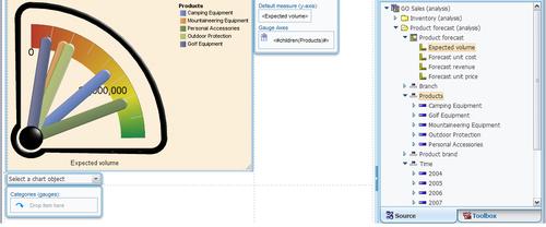
  4. 4. Click on the gauge chart in the dashboard area and in the Properties pane define the title of the widget...