Book Image

Unity 2021 Cookbook - Fourth Edition

By : Shaun Ferns
Book Image

Unity 2021 Cookbook - Fourth Edition

By: Shaun Ferns

Overview of this book

If you are a Unity developer looking to explore the newest features of Unity 2021 and recipes for advanced challenges, then this fourth edition of Unity Cookbook is here to help you. With this cookbook, you’ll work through a wide variety of recipes that will help you use the essential features of the Unity game engine to their fullest potential. You familiarize yourself with shaders and Shader Graph before exploring animation features to enhance your skills in building games. As you progress, you will gain insights into Unity's latest editor, which will help you in laying out scenes, tweaking existing apps, and building custom tools for augmented reality and virtual reality (AR/VR) experiences. The book will also guide you through many Unity C# gameplay scripting techniques, teaching you how to communicate with database-driven websites and process XML and JSON data files. By the end of this Unity book, you will have gained a comprehensive understanding of Unity game development and built your development skills. The easy-to-follow recipes will earn a permanent place on your bookshelf for reference and help you build better games that stay true to your vision.
Table of Contents (15 chapters)
Free Chapter
2
Responding to User Events for Interactive UIs
3
Inventory and Advanced UIs
6
2D Animation and Physics
13
Advanced Topics - Gizmos, Automated Testing, and More
15
Virtual and Augmented Reality (VR/AR)

There's more...

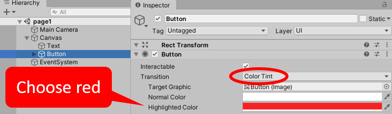
There are several ways in which we can visually inform the user that the button is interactive when they move their mouse over it. The simplest way is to add a Color Tint that will appear when the mouse is over the button – this is the default Transition. With Button selected in the Hierarchy window, choose a tint color (for example, red), for the Highlighted Color property of the Button (Script) component in the Inspector window:

Figure 2.6 – Adjusting the mouseover settings for buttons

Another form of visual Transition to inform the user of an active button is Sprite Swap. In this case, the properties of different images for Targeted/Highlighted/Pressed/Disabled are available in the Inspector window. The default Targeted Graphic is the built-in Unity Button (Image) – this is the gray rounded rectangle default when GameObject buttons are created. Dragging in a very different-looking image for the Highlighted sprite is an effective alternative to setting a Color Tint:

Figure 2.7 – Example of an image as a button 

We have provided a rainbow.png image with the project for this recipe that can be used for the Button mouseover's Highlighted sprite. You will need to ensure this image asset has its Texture Type set to Sprite (2D and UI) in the Inspector window. The preceding screenshot shows the button with this rainbow background image.