
As Prezi is so different to other presentation tools both technically and aesthetically, we need to ensure that we approach it in a very different way compared to how we might go about designing a PowerPoint presentation.
It goes without saying that a presentation designed in any media should have a good degree of planning first, but even more so in Prezi. The reason is that Prezi's infinite canvas gives you such a huge expanse of space that it is very easy to lose elements of your design within it.
By simply planning your Prezi in the right way, you can save lots of time in the design stage and really take advantage of this space.
Tip
Forget Slides
It's easy to keep using the term slides when building a Prezi, but slides don't exist in this software, and this kind of thinking will keep you stuck in the old way of presenting. Force yourself and your colleagues to use Prezi terms such as canvas and frames to break the mold and get yourself focused on the right type of approach.
You probably moved over to Prezi because you were getting tired and fed up with the rigid nature of PowerPoint or some other slide-based tool. You felt trapped and confined by the slides that only allowed you to deliver your presentations in one way, that is, in a linear fashion from beginning to end. Then, you saw Prezi and were blown away by the fact that it is a completely open canvas that doesn't have any walls or restrictions like slides do. In other words, it has a three-dimensional canvas as opposed to the traditional two-dimensional slide.
For some though, this fact can be very difficult to embrace and they very quickly return to the comfort of their slide-walled prisons because too much freedom scares them. They simply don't know how to use the space well to deliver their message. If you watch them closely, you will see that they try to build a slideshow in Prezi, and the way they think just doesn't match up with the way Prezi works.
These prisoners can easily be freed if they learn how to think and plan for Prezi, and we believe there are three key steps to master your Prezi designs, which we will explore later in this chapter.
If you ask any Prezi master why they love it so much, you might hear the words "nonlinear presenting" quite a lot. In order to master Prezi, it's important to know what a nonlinear presentation exactly means.
If we want a presentation that teaches someone how to drive, then we will need to start with the absolute basics and build from there. This type of presentation will have to be linear and might have a flow similar to the following:
Unlock the driver's side door.
Get in and put your seat belt on.
Put your foot down on the clutch to check whether you are in gear.
Put the keys into the ignition.
Start the car.
The instructions would follow in a similar manner so that the task is carried out in the right way. This is a linear path, and any presentation built to visually represent it would have to start at step one and then move on to step two, and so on.
Information of this kind always needs to be presented in a linear fashion, so you can use PowerPoint's slide-based design or build a Prezi that uses a series of paths. Both will have clear start and end points.
What if your subject matter had several different areas or modules that didn't have to be presented in a certain order? Who decides where the start and end should be? You? Your manager? The CEO? We'll give you a clue. They're going to be sitting right in front of you during your presentation.
One of the main reasons why presentations don't hit the mark is because they don't consider which elements of the content are most important to their audiences. So why not ask them where they'd like to start? Or at least start your presentation with some friendly introductions; start a conversation and then find out what is the most important part of the topic to them. If enough people agree on the same area, then zoom straight into that area and get going.
This is a nonlinear and more conversational approach to presenting, and it is extremely easy to implement with Prezi.
The beauty of using this approach in Prezi is that it engages your audience more and lets the conversation you have with them unfold very naturally. Following is an example template of how you can structure your nonlinear presentation to cover five separate modules:
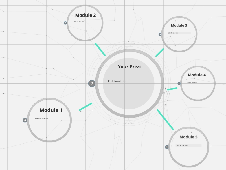
All of the modules are contained inside one giant circular frame, and each module's content is contained inside its own frame within that.
Even though a nonlinear approach is much more creative, there may be elements to your presentation that are best explained in a linear order for your audience to make sense of them.
If this is the case, you can join the different elements of your Prezi together with paths. This gives you the benefit of allowing your audience to decide the direction of your presentation (nonlinear), but also the opportunity to break down key points into a logical order (linear).
Using Prezi's paths tool with this method, your presentation might look similar to the one shown in the following screenshot:
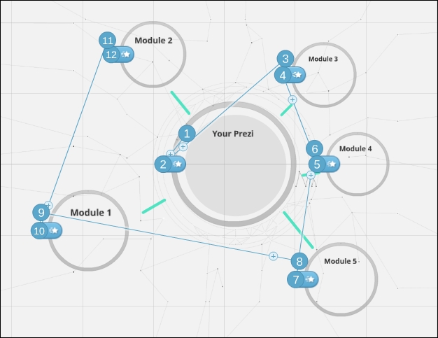
If your audience decides that they would like to start on Module 3, simply zoom in to that frame using your mouse. This can be done quickly by clicking on the desired frame or title. After this, you can let the paths take over so that you flow through the content of Module 3 in a linear manner if needed.
We already mentioned previously that Prezi can (and should) be used in a nonlinear way, but most of us are so used to the linear method of PowerPoint and other slide-based tools that we find it very hard to break out of that mold and use this crazy nonlinear concept.
By thinking in the old linear slide-by-slide way, you can end up with what looks like a PowerPoint presentation, but with some fancy transitions in between slides. If you end up with a presentation like this, then you might as well have continued using PowerPoint because you're not taking full advantage of what Prezi has to offer. Realizing that your presentation's movement doesn't just have to go from left (slide 1) to right (slide 2), but that it can also zoom in to detail and back out to show an overview of everything, will unlock a whole new world of presentation mastery to you.
There's no doubt that to master Prezi you need to learn two things:
The Prezi software
The Prezi mindset
Simply knowing what all the buttons do isn't enough to become a Prezi master. You must ensure that you take the time to train your brain to think differently as well. Failing to do so will kill a Prezi design.