
Ok, we've got the bits. How do we use them? Adding jQuery Mobile support to a website requires the following three steps at a minimum:
First, add the HTML5
DOCTYPEdeclaration to the page:<!DOCTYPE html>This is used to help inform the browser about the type of content it will be dealing with
Add a
viewportmeta tag:<meta name="viewport" content="width=device-width, initial-scale=1">This will help set better defaults for pages when viewed on a mobile device
Finally, the CSS, the JavaScript library, and jQuery itself need to be included into the file.
Let's look at a modified version of our previous HTML file that adds all of these:
Listing 1-2: test2.html
<!DOCTYPE html>
<html>
<head>
<title>First Mobile Example</title>
<meta name="viewport" content="width=device-width, initial-scale=1">
<link rel="stylesheet" href="jquery.mobile-1.4.5.min.css" />
<script type="text/javascript" src="http://code.jquery.com/jquery-2.1.3.min.js"></script>
<script type="text/javascript" src="jquery.mobile-1.4.5.min.js"></script>
</head>
<body>
<h1>Welcome</h1>
<p>
Welcome to our first mobile web site.
It's going to be the best site you've ever seen.
Once we get some content. And a business plan.
But the hard part is done!
</p>
<p>
<i>Copyright Megacorp © 2015</i>
</p>
</body>
</html>For the most part, this version is the exact same as listing 1, except for the addition of the DOCTYPE declaration, the CSS link, and our two JavaScript libraries. Notice that we pointed to the hosted version of the jQuery library. It's perfectly fine to mix local JavaScript files and remote ones. If you want to ensure that you can work offline, you can simply download the jQuery library as well.
So, while nothing changed in the code between the body tags, there is going to be a radically different view now in the browser. The following screenshot shows how the iOS mobile browser renders the page now:
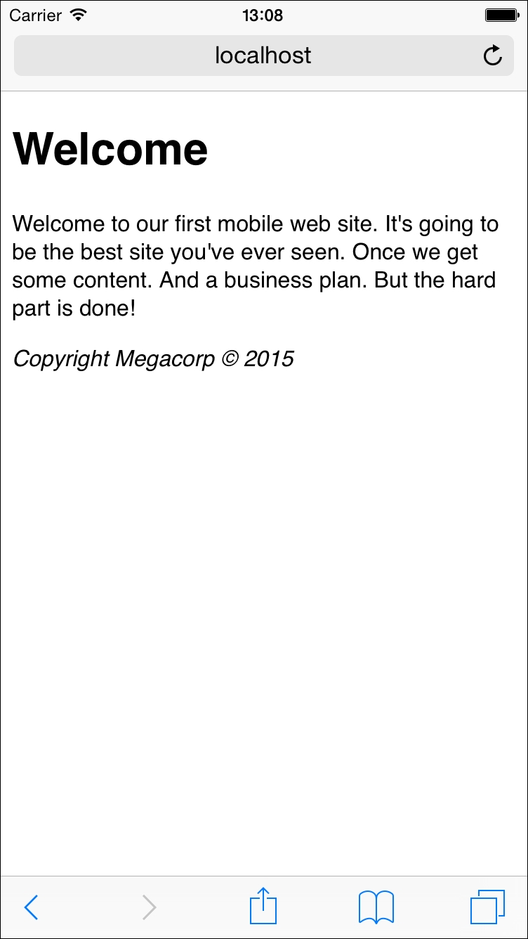
Right away, you see a couple of differences. The biggest difference is the relative size of the text. Notice how much bigger and easier to read it is. As we said, the user could have zoomed in on the previous version, but many mobile users aren't aware of this technique. This page loads up immediately in a manner that is much more usable on a mobile device.