Book Image

Learning Ionic, Second Edition - Second Edition

By : Arvind Ravulavaru
Book Image

Learning Ionic, Second Edition - Second Edition

By: Arvind Ravulavaru

Overview of this book

Ionic makes it incredibly easy to build beautiful and interactive mobile apps using HTML5, SCSS, and Angular. Ionic also makes app development easier, faster, and more fun. This hands-on guide will help you understand the Ionic framework and how you can leverage it to create amazing real-time applications. We begin by covering the essential features of Angular 2, and then dive straight into how Ionic fits in today’s world of hybrid app development and give you a better understanding of the mobile hybrid architecture along the way. Further on, you will learn how to work with Ionic decorators, services, and components, which will allow you to build complex apps using the Ionic framework. We will take a look at theming Ionic apps using the built-in SCSS setup. After that, we will explore Ionic Native, and you will learn how to integrate device-specific features, such as notifications, with the Ionic app. To complete our learning, we will be building a Rider app, using Ionic and Uber API, to book a ride. Next, you will learn how to unit test, end-to-end test, monkey test, and execute device testing on AWS Device farm. Then, we will take a look at migrating the existing Ionic 1 apps to Ionic 2 and deploy them to the App Store. The final chapter on Ionic 3 wraps up this book by explaining the new features of Ionic 3 at the time of writing this book. By the end of this book, you will be able to develop, deploy, and manage hybrid mobile applications built with Cordova, Ionic, and Angular. All the examples in this book are valid for both Ionic 2 and Ionic 3.
Table of Contents (13 chapters)

Angular

Angular (2) has added a bunch of new features and updated existing features and removed a few over Angular 1.x. In this section, we will go through some of the essential features of Angular.

Components

Angular components are inspired by the Web Components specification. At a very high level, Web Components have four pieces:

  • Custom elements: A user can create their own HTML element.
  • HTML imports: Import one HTML document into another.
  • Templates: HTML definitions of the custom elements.
  • Shadow DOM: A specification to write encapsulated logic of custom elements.

The preceding four specifications explain how a frontend developer can develop their own standalone, isolated, and reusable components, similar to a HTML select box (<select></select>), or a text area (<textarea></textarea>), or an input (<input />).
You can read more about the Web Component specification here: https://www.w3.org/standards/techs/components#w3c_all.

If you would like to dig deeper into the Web Component, check out: http://webcomponents.org/.

As mentioned, Angular is (loosely) built on Web Components, where the preceding four specifications are implemented in an Angular way.

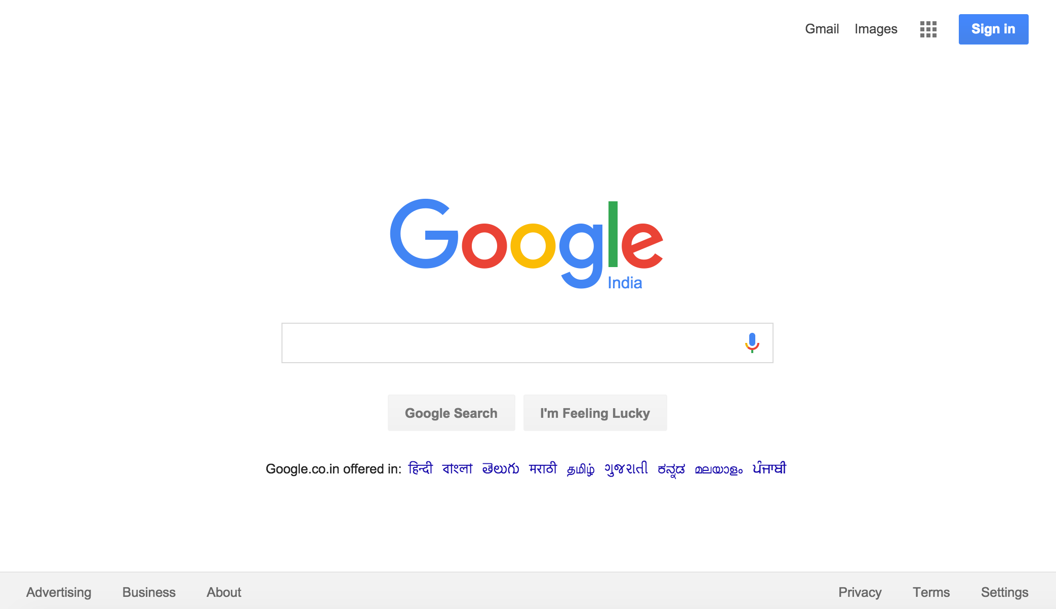
In simple terms, our entire app is a tree of components. For example, if we look at the world's most viewed page, https://www.google.com, it would look something like this:

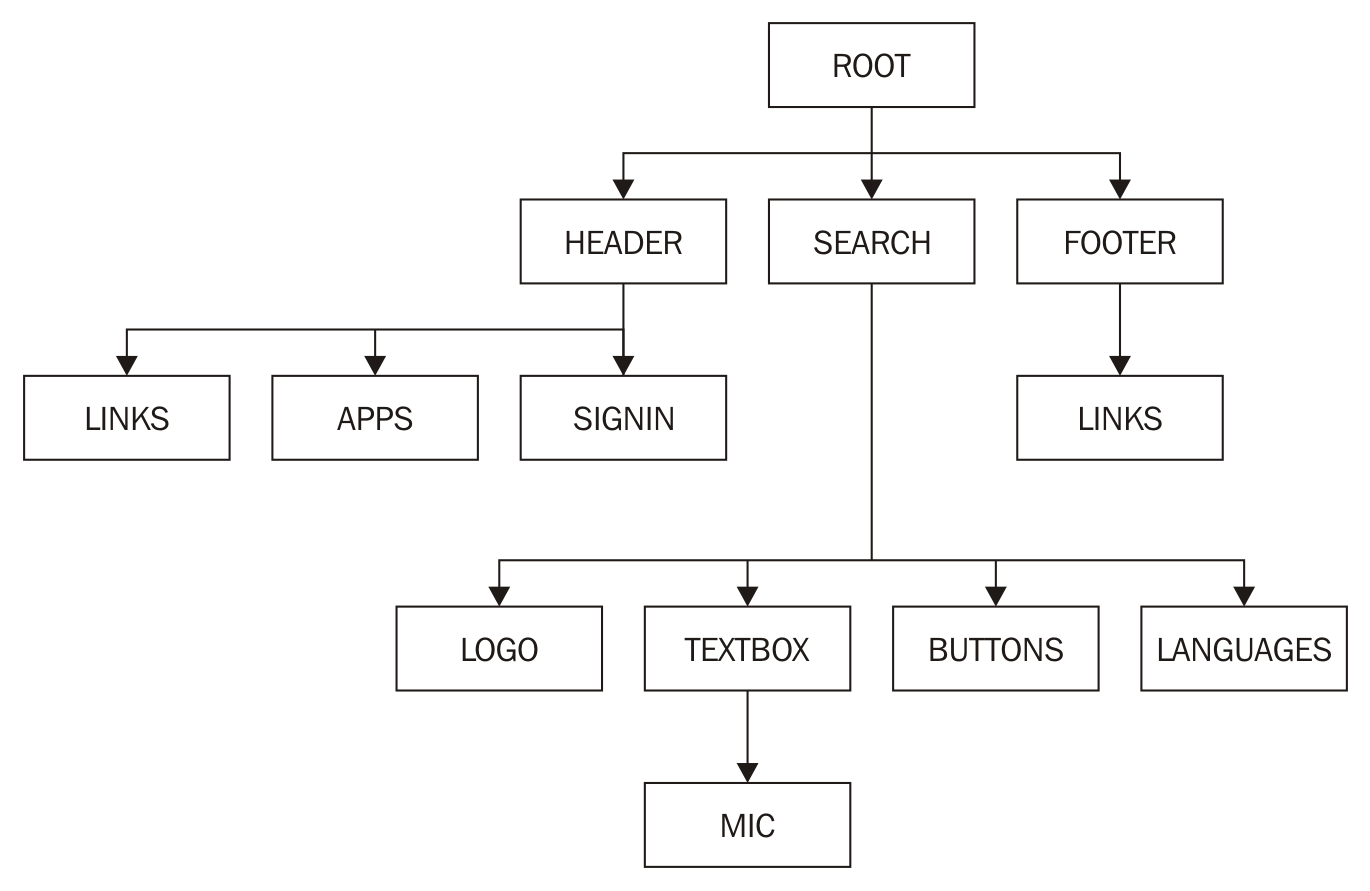
And if we had to build this page in Angular, we would first split the page into components.

A visual representation of all the components that go into the preceding page would look like this:

Note: Each black box is a (custom) component.

As we can see from the preceding figure, the entire page is a tree of custom components.

A (custom) component would typically consist of three pieces:

  • component.ts: This represents the component logic
  • component.html: This represents the component view (template)
  • component.css: This represents the component specific styles

To build a custom component, we need to use a Component decorator on top of a class. In simple terms, a decorator lets us configure a class with specific metadata on them. This metadata will then be used by Angular to understand the behavior of that class. Decorators start with an @, followed by the name of the decorator.

The component decorator tells Angular that the class being processed needs to exhibit the behavior of an Angular component. A simple decorator would look as follows:

@Component({ 
selector: 'app-root',
templateUrl: './app.component.html',
styleUrls: ['./app.component.css']
})
export class AppComponent {
// This is where we write the component logic!
title = 'Hello World!';
}

Some of the properties that go into a component decorator are:

  • selector: CSS selector that identifies this component in a template
  • templateUrl: URL to an external file containing a template for the view
  • styleUrls: List of URLs to style sheets to be applied to this component's view
  • providers : List of providers available to this component and its children
To know more about the Component decorator, refer to the following link: https://angular.io/docs/ts/latest/api/core/index/Component-decorator.html

Zones

Zones are one of the new concepts that have been introduced in Angular. The concept of Zones was migrated from Dart to JavaScript.

The main reason why a lot of developers were attracted towards Angular initially was by its Auto-magic Data Binding among other things. This was achieved using scopes in Angular 1.x. In Angular 2, we are using Zone.js (https://github.com/angular/zone.js) to achieve the same.

Whenever there is a change in the data, Angular updates the appropriate stakeholders (variables, interfaces, providers, and so on) with new data. Angular can track all synchronous activities quite easily. But for change detection in asynchronous code, such as event handling, AJAX calls, or Timers, Angular 2 uses Zone.js.

To know more about zones, how they work, and change detection in Angular, check out Zones in Angular: http://blog.thoughtram.io/angular/2016/02/01/zones-in-angular-2.html and Angular change detection explained: http://blog.thoughtram.io/angular/2016/02/22/angular-2-change-detection-explained.html.

Templates

Templates are used to bind the component logic to the HTML. Templates are also used as an interface between the user interaction of the user and app logic.

Templates have changed quite a bit when compared to version 1 of Angular. But there are a few things that still remain the same. For instance, the way we take a value from a component and display it in the user interface remains the same with the double curly brace notation (interpolation syntax).

The following is a sample app.component.ts:

@Component({ 
selector: 'app-root',
templateUrl: './app.component.html',
styleUrls: ['./app.component.css']
})
export class AppComponent {
// This is where we write the component logic!
title = 'Hello World!';
}

The app.component.html would look something like this:

<h1>
{{title}} <!-- This value gets bound from app.component.ts -->
</h1>

Templates can also be made inline by passing in the template metadata to the decorator instead of templateUrl. This would look something like this:

 @Component({ 
selector: 'app-root',
template: '<h1>{{title}}</h1>',
styleUrls: ['./app.component.css']
})
export class AppComponent {
// This is where we write the component logic!
title = 'Hello World!';
}
The template metadata takes higher priority over templateUrl. For example, if we have defined both a template and templateUrl metadata, template is picked up and rendered.
We can also write multiline templates using backtick(`) instead of quotes, in both ES6 as well as TypeScript. For more information, refer to Template Literals: https://developer.mozilla.org/en/docs/Web/JavaScript/Reference/Template_literals

In Angular 1.x, we have core/custom directives. But in Angular (2), we have various notations, using which we achieve the same behavior of a directive from Angular 1.

For instance, if we want to add a custom class to an element based on the truthiness of an expression, it would look this:

<div [class.highlight]="shouldHighlight">Hair!</div>

The preceding is a replacement for the famous ng-class Angular 1.x directive.

To handle events, we use the ( ) notation, as in:

<button (click)=pullHair($event)">Pull Hair</button>

And this pullhair() is defined inside the component class.

To keep the data bindings up to date, we use the [( )] notation, as in:

<input type="text" [(ngModel)]="name">

This keeps the name property in the component class in sync with the textbox.

An example of *ngFor, which is a replacement for ng-repeat, is shown here:

<ul> 
<li *ngFor="let todo in todos">{{todo.title}}</li>

</ul>

Note that let in front of todo indicates that it is a local variable in that zone.

These are some of the basic concepts that we need to get started with our hands-on example. I will talk about other Angular (2) concepts as and when they appear in our app.