
Shapes
In SwiftUI, we have five preset shapes that you can work with, and they are super easy to create. The Circle, Rectangle, Ellipse, and Capsule are all created the same way. Let's look at each one and stop when you get to Rounded Rectangle.
Circle
Open ShapesCircle and let's take a look at how we can create a circle:
struct ShapesCircle: View {
    var body: some View {
        Circle()
            .fill(Color.red)
            .frame(width: 50, height: 50)
    }
}
If you tap the Resume button on the left, you'll see the following:
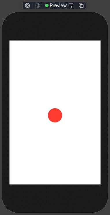
Figure 1.12
Creating shapes is easy in SwiftUI; in the preceding example, our circle is filled with red and is 50x50 in size. We will use custom shapes to create our UI. We can now move on to Rectangle.
Rectangle
We are now going to take a look at the Rectangle. Open ShapesRectangle and in our next example, let's take a look at creating a basic rectangle:
struct ShapesRectangle: View {
    var body: some View {
        Rectangle()
            .fill(Color.red)
            .frame(width: 50, height: 50)
    }
}
Tap on the Resume button, and you'll see the following:
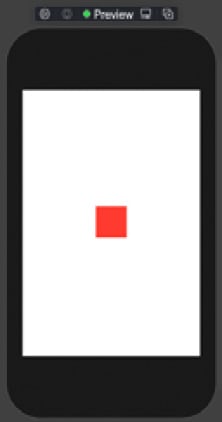
Figure 1.13
In this last example, our Rectangle is filled with red and is 50 x 50 in size. Let's move on to our next example.
Ellipse
We'll now take a look at an ellipse. Open ShapesEllipse, and you will see we applied the same red fill with a size of 100 x 50:
struct ShapesEllipse: View {
    var body: some View {
        Ellipse()
            .fill(Color.red)
            .frame(width: 100, height: 50)
    }
}
Tap the Resume button, and you'll see the following:
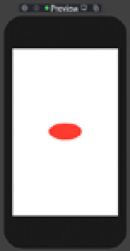
Figure 1.14
We created an Ellipse, and as you can see, the code is not changing – the shape making, for the most part, has the same pattern. Let's move to the Capsule next.
Capsule
We are onto the next to last shape, the Capsule. Capsules are handy for creating bar charts, which we do later in this book. Let's take a minute and look at a basic Capsule. Open up ShapesCapsule:
struct ShapesCapsule: View {
    var body: some View {
        Capsule()
            .fill(Color.red)
            .frame(width: 200, height: 50)
    }
}
Tap the Resume button, and you'll see the following:
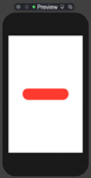
Figure 1.15
We now have a capsule sitting in the center of the screen. We can now move on to the final shape, and that's the Rounded Rectangle.
Rounded Rectangle
The Rounded Rectangle is the only shape that has a parameter, .cornerRadius, when you create one. Let's open ShapesRoundedRectangle and check out our final shape:
struct ShapesRoundedRectangle: View {
    var body: some View {
        RoundedRectangle(cornerRadius: 25)
            .fill(Color.red)
            .frame(width: 200, height: 25)
    }
}
Tap the Resume button, and you'll see the following:
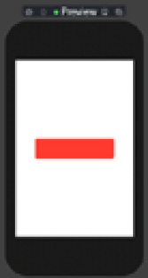
Figure 1.16
We are finished looking at shapes, but remember that all shapes by default have a fill color of black. Next, we'll focus on the view layout and presentation.