
View layout and presentation
Let's get into this next section, but keep in mind that you can embed these views inside of other views. We won't cover that in this chapter as it is something we do a ton throughout this book. Let's move to VStack.
VStack
When you use a VStack, it arranges all of its children in a vertical line. Let's take a look at this in operation by opening ViewLayoutVStack:
struct ViewLayoutVStack: View {
    var body: some View {
        VStack {
            Rectangle()
                .fill(Color.red)
                .frame(width: 50, height: 50)
            Rectangle()
                .fill(Color.red)
                .frame(width: 50, height: 50)
        }
    }
}
Tap the Resume button, and you'll see the following:
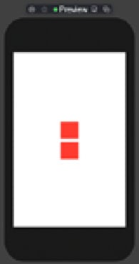
Figure 1.17
In this example, we are displaying two Rectangles on a vertical line in the center of the stack. To make our Rectangle fill all available vertical space, we would need to use a spacer. Let's see what happens when we add a spacer.
VStack with a spacer
Using a spacer allows us to manipulate how our objects respond inside of the VStack. In this specific example, we are adding a spacer in between each rectangle. Open ViewLayoutVStackSpacer:
struct ViewLayoutVStackSpacer: View {
    var body: some View {
        VStack {
            Rectangle()
                .fill(Color.red)
                .frame(width: 50, height: 50)
            Spacer()
            Rectangle()
                .fill(Color.red)
                .frame(width: 50, height: 50)
        }
    }
}
Tap the Resume button, and you'll see the following:
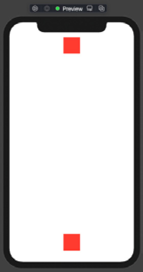
Figure 1.18
Putting our spacer in between each rectangle pushes our rectangles to the top and bottom, respectively. If you move the spacer below the two Rectangles, this moves both Rectangles to the top of the screen. You would get the opposite if you moved the spacer above both Rectangles.
Take a minute to move the spacer around inside of the VStack, to see how it behaves. When finished, let's move to the HStack.
HStack
Our next container is called an HStack, and you probably guessed it – the HStack displays its children on a horizontal line:
struct ViewLayoutHStack: View {
    var body: some View {
        HStack {
            Rectangle()
                .fill(Color.red)
                .frame(width: 50, height: 50)
            Rectangle()
                .fill(Color.red)
                .frame(width: 50, height: 50)
        }
    }
}
Tap the Resume button, and you'll see the following:
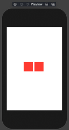
Figure 1.19
We pretty much have the same code as we did for the VStack example, except using an HStack as the main container. HStack, by default, is aligned in the center of the screen. Now, just as we did with VStack and a spacer, we can do the same by manipulating the Rectangles here to get the layout we need.
HStack with spacer
To illustrate a spacer in an HStack, we use two spacers, instead of one, along with three rectangles. Open ViewLayoutHStackSpacer, and let's see it in action:
struct ViewLayoutHStackSpacer: View {
    var body: some View {
        HStack {
            Rectangle()
                .fill(Color.red)
                .frame(width: 50, height: 50)
            Spacer()
            Rectangle()
                .fill(Color.red)
                .frame(width: 50, height: 50)

            Spacer()
            Rectangle()
                .fill(Color.red)
                .frame(width: 50, height: 50)
        }
    }
}
Tap the Resume button, and you'll see the following:
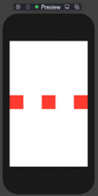
Figure 1.20
By adding two spacers, we get rectangles on the right, on the left, and directly in the middle. Take some time and move the spacers around, so you get a feel for how it works as we use it throughout the book. Finally, in our last stack example, we'll take a look at the ZStack.
ZStack
ZStack is a bit different than VStack and HStack because instead of its children aligning along a particular axis when they are added to the container, with ZStack they are stacked on top of each other. Open ViewLayoutZStack to see this in action:
struct ViewLayoutZStack: View {
    var body: some View {
        ZStack {
            Color.black
            Text('Craig Clayton')
                .foregroundColor(.white)
        }
    }
}
Tap the Resume button, and you'll see the following:
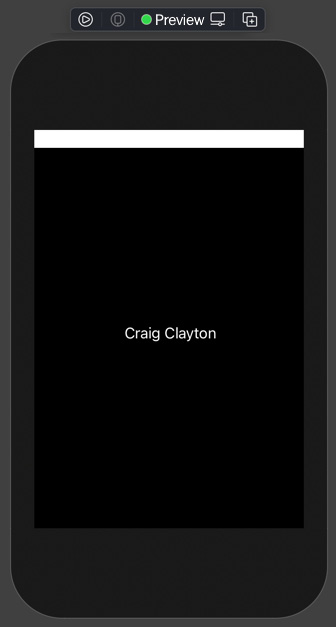
Figure 1.21
In this ZStack example, we add the color black to our ZStack along with a Text view. You might be asking how we can add a color to our view. Well, colors are nothing more than views, which means they can be added just like other views. Right now, you might be thinking that ZStack is nothing special, but it is, as you will see soon. Let's look at another example by opening ViewLayoutZStack:
struct ViewLayoutZStack: View {
    var body: some View {
        ZStack {
            Color.black
                .edgesIgnoringSafeArea(.all)
            Text('Craig Clayton')
                .foregroundColor(.white)
            Text('Craig Clayton')
                .foregroundColor(.white)
				.offset(x: 0, y: 100)
        }
    }
}
Tap the Resume button, and you'll see the following:
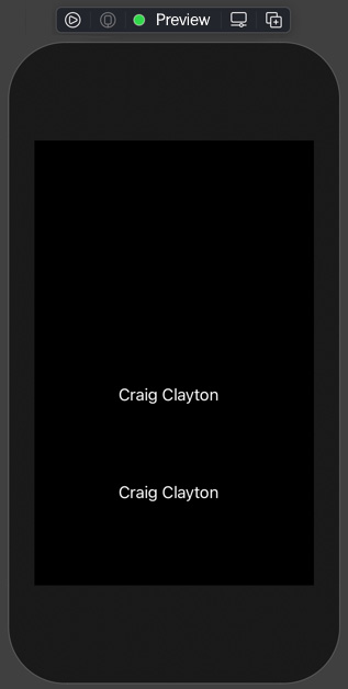
Figure 1.22
In the preceding example, we set the background color to black. Then we extend the color to the edges and ignore the safe areas on all edges of the device. Next, we have two Text views, but one of them has an offset. If you remove the offset, the Text views get stacked on top of each other, just as you would expect when adding views to a ZStack. Using the offset, we can move our views around on a ZStack. Let's look at one more ZStack example; this time, we will use an alignment with a ZStack.
Maybe this example will show you the reason for my excitement over using ZStack. Open ViewLayoutZStackAlignment:
struct ViewLayoutZStackAlignment: View {
    var body: some View {
        ZStack(alignment:Alignment(horizontal: .trailing,                  vertical: .top)) {
            Color.black
                .edgesIgnoringSafeArea(.all)
            Text('Another Example')
                .foregroundColor(.white)
                .offset(y: 25)

            Text('Craig Clayton')
                .foregroundColor(.white)
                .offset(y: 50)

            Rectangle()
                .fill(Color.red)
                .frame(width: 100, height: 25)
        }
    }
}
Tap the Resume button, and you'll see the following:
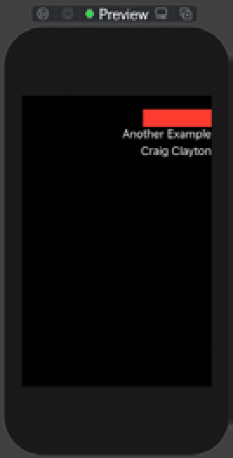
Figure 1.23
HStacks have vertical alignments, and VStacks have horizontal alignments. ZStacks can utilize both horizontal and vertical alignments. A ZStack with an alignment helps get the views in the general direction required, and we can then fine-tune the placement using x and y offsets. As we work through more and more designs in this book, this will make more sense to you.
ZStack is one of my favorite features in SwiftUI, and I use it a ton in this book; the more you get familiar with it, the more you'll understand why.
Take some time messing with ZStack, and when you are ready, move on to the next example.
Group
A Group in SwiftUI is a container that you can use to group view elements without any special alignment. Open ViewLayoutGroup, and let's take a look at how Group works:
struct ViewLayoutGroup: View {
    var body: some View {
        VStack {
            Group {
                Text('Gabriel Lang')
                Text('John Brunelle')
                Text('Matthew Arieta')
                Text('Ralph Dugue')
            }
            .foregroundColor(.red)
            .font(.largeTitle)
			Group {
                Text('Alex Burnett')
                Text('Craig Heneveld')
                Text('Bill Munsell')
                Text('Wayne Ohmer')
            }
            .foregroundColor(.red)
            .font(.largeTitle)
        }
    }
}
Tap the Resume button, and you'll see the following:
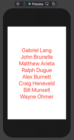
Figure 1.24
In this example, we have text views that are inside of a VStack, and instead of adding foregroundColor to each text, I added it to the Group. Also note that you can use this technique with VStack, HStack, and ZStack. Grouping is also great for applying animations to the entire Group or if you want to manipulate the Group differently based on the device in use. Let's move to the next example.
ForEach
A ForEach struct is a bit different than the forEach() you might be accustomed to. SwiftUI's ForEach is a view struct, which allows us to add it directly to the body. We can create views using the ForEach struct because it takes an array of unique items. Open ViewLayoutForEach, and let's take a few moments to see how ForEach works:
struct ViewLayoutForEach: View {
    let coworkers = ['Gabriel Lang', 'John Brunelle', 'Matthew
        Arieta', 'Wayne Ohmer', 'Ralph Dugue', 'Alex
         Burnett', 'Craig Heneveld', 'Bill Munsell']
    var body: some View {
        VStack {
            ForEach(coworkers, id: \.self) { name in
                Text(name.uppercased())
            }
        }
        .foregroundColor(.blue)
        .font(.headline)
    }
}
Tap the Resume button, and you'll see the following:
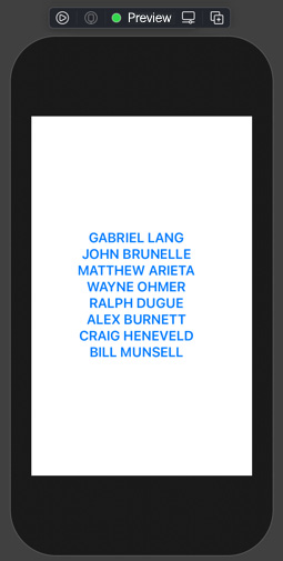
Figure 1.25
In this example, we use a ForEach struct to loop through the array of coworkers. Each time it loops through, it grabs the id (which needs to be unique; we are using each name as our unique identifier). During the loop, it also sets the name to uppercase, sets the text foreground color to blue, and finally sets the font to headline. We can use ForEach as a way to work with an array of data. Let's now take the time to look at List.
List
A List is a container that displays a row of data in a single column. Open ViewLayoutList and let's see a List in action:
struct ViewLayoutList: View {
    var body: some View {
        List {
            Text('1')
            Text('2')
            Text('3')
        }
    }
}
Tap the Resume button, and you'll see the following:
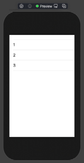
Figure 1.26
Here, we are displaying a list of text views that are embedded into a List. Now, let's take a minute and understand the difference between ForEach and List.
Differences between ForEach and List
When you are working with a List, you can display mixed content as well as scroll. List also utilizes the reusing cell pattern, which is super-efficient. Now, as far as design goes, it is much harder to customize List view defaults. When you use a ForEach struct, it works only with a collection.
ScrollView
A ScrollView allows you to scroll content either horizontally or vertically. Open ViewLayoutScrollHorizontal to move to the next example:
struct ViewLayoutScrollHorizontal: View {
    var body: some View {
        ScrollView(.horizontal) {
            HStack(spacing: 15) {
                ForEach(0..<10) { _ in
                    Rectangle()
                        .fill(Color.red)
                        .frame(width: 50, height: 50)
                }
            }
        }
    }
}
Tap the Resume button, and you'll see the following:
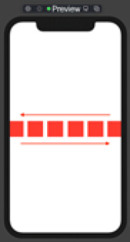
Figure 1.27
For this example, we have a ScrollView wrapped around an HStack, which means its contents will scroll horizontally. In our ForEach, we are creating 10 Rectangles, which are red and 50 x 50. Open ViewLayoutScrollVertical, and let's see how we can do this vertically:
struct ViewLayoutScrollVertical: View {
    var body: some View {
        ScrollView {
            VStack(spacing: 15) {
                ForEach(0..<20) { _ in
                    Rectangle()
                        .frame(width: 50, height: 50)
                }
            }
        }
    }
}
Tap the Resume button, and you'll see the following:
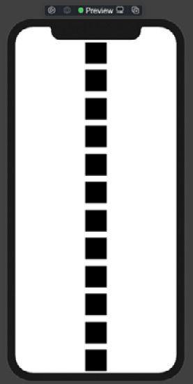
Figure 1.28
In this final example, we changed the HStack to a VStack from our last example. SwiftUI makes it easy to create a specific UI design. We have looked at views and controls, shapes, and view layouts. We now understand that we can use modifiers to update how they look visually and where they will be laid out on the screen. By the end of this book, you will have learned how to break down designs specifically for SwiftUI apps.