Sign In Start Free Trial
Account

Add to playlist

Create a Playlist

Modal Close icon
You need to login to use this feature.
  • Book Overview & Buying SwiftUI Projects
  • Table Of Contents Toc
SwiftUI Projects

SwiftUI Projects

By : Craig Clayton
3 (11)
close
close
SwiftUI Projects

SwiftUI Projects

3 (11)
By: Craig Clayton

Overview of this book

Released by Apple during WWDC 2019, SwiftUI provides an innovative and exceptionally simple way to build user interfaces for all Apple platforms with the power of Swift. This practical guide involves six real-world projects built from scratch, with two projects each for iPhone, iPad, and watchOS, built using Swift programming and Xcode. Starting with the basics of SwiftUI, you’ll gradually delve into building these projects. You’ll learn the fundamental concepts of SwiftUI by working with views, layouts, and dynamic types. This SwiftUI book will also help you get hands-on with declarative programming for building apps that can run on multiple platforms. Throughout the book, you’ll work on a chart app (watchOS), NBA draft app (watchOS), financial app (iPhone), Tesla form app (iPhone), sports news app (iPad), and shoe point-of-sale system (iPad), which will enable you to understand the core elements of a SwiftUI project. By the end of the book, you’ll have built fully functional projects for multiple platforms and gained the knowledge required to become a professional SwiftUI developer.
Table of Contents (13 chapters)
close
close

Charts

Building charts is pretty fun in SwiftUI because it requires very little code. Here is an example of the three screens that we are looking to create in this section:
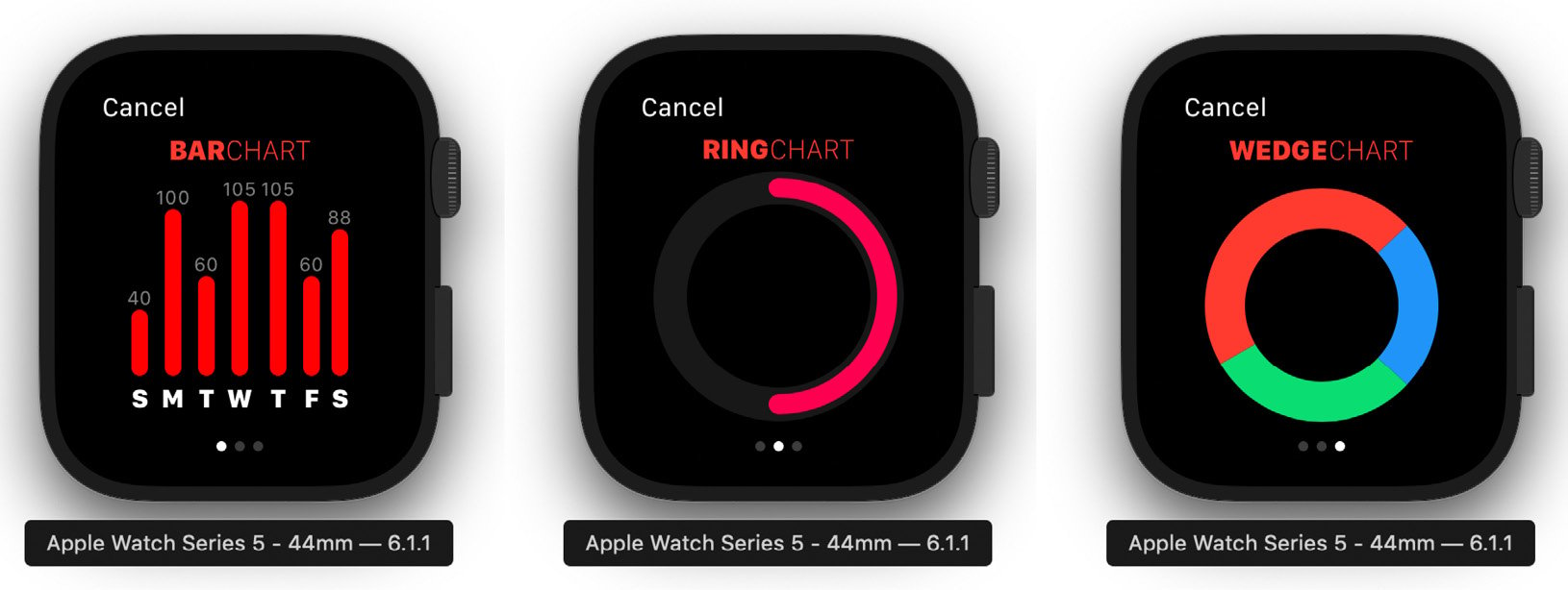
Figure 2.7

Figure 2.7

We will start on the Bar Chart first using the Capsule shape.

Bar charts

Bar charts are a great way to display information to users. In this example, we will create a static Bar Chart that you can use to display data on the watch. We can also take all of these examples and show them on the larger screens of other devices. Whenever we work in SwiftUI, we will use Swift Previews to review our work, making our workflow go much faster than having to wait for the simulator to launch and display. Please note that to use Swift Previews, you must be on macOS Catalina. If you are not, then just run the simulator.

Creating a header

First, we will start by creating our header for our view. This view is just two text views stacked horizontally next to each other. Open BarChartView, and we will start by first replacing Text ('Bar Chart') with the following code:

HStack(spacing: 0) {
    Text('BAR')
        .fontWeight(.heavy)
    Text('CHART')
        .fontWeight(.thin)
}
.foregroundColor(Color.red)
// Add next step here

In this code, we have an HStack with two Text views, which also has a spacing of 0. We apply a foregroundColor of red to the HStack; this gives a red color to both Text views.

You should see the following in the Preview:

Figure 2.8

Figure 2.8

Next, we need to create the container that our bar chart will go in. Replace // Add the next step here with the following:

VStack(spacing: 0) { // Step 1
    // Header
    HStack(spacing: 0) { // Step 2
        Text('BAR')
            .fontWeight(.heavy)
        Text('CHART')
            .fontWeight(.thin)
    }
    .foregroundColor(Color.red) // Step 3
    
    // Add next step here
}

We are adding our Header first; let's break down the code:

  1. We use a VStack as our main container with 0 spacing.
  2. Inside the VStack, we have an HStack that we are using for a header.
  3. We set the foreground to red for the entire HStack. Both BAR and CHART will now be red.

You should now see the following in the Swift Preview:

Figure 2.9

Figure 2.9

Now that we have our header, let's add our capsule. Replace // Add next step here with the following code:

HStack(alignment: .bottom, spacing: 2) { // Step 1
    VStack { // Step 2
        VStack(spacing: 2) { // Step 3
            Text('99')
                .font(.system(size: 11))
                .foregroundColor(Color(.gray))
            Capsule()
                .frame(width: 10, height: 100)
                .foregroundColor(Color(.red))
        }
        Text('M') // Step 4
            .font(.system(size: 12))
            .fontWeight(.black)
            .padding(.top, 0)
    }
}
.padding(.top, 10) // Step 5

We have a lot going on inside this HStack so let's go through each step together:

  1. We are using an HStack for alignment purposes only. The alignment is set to bottom with the spacing set to 2. I am putting the alignment to the bottom because I want my graph to start bottom-up. If I weren't trying to get everything aligned to the bottom, I wouldn't use the HStack.
  2. Next, we have a VStack that is our actual main container.
  3. Inside the main container, we have another VStack that holds the Capsule shape and the Text view for the value.
  4. Here, we use a Text view to display the day of the week.
  5. We add a 10-pixel padding to the top to create a bit of space between the Capsule and the title.

When you are done, you will see the following in the Preview:

Figure 2.10

Figure 2.10

We need to make this a bit more dynamic because we want to create more than one instance of our Capsule shape. Let's refactor this code so that we can reuse this.

Cleaning up our code

Creating child views is a great way to clean up our code, and we can clean up two things in this view. First, our Header code will be used for multiple views, so we can move the headers into a child view. Lastly, the Capsule code we just added can also be made into a view to be dynamic. Let's check out our code and see what I mean:

Figure 2.11

Figure 2.11

We want to take the HStack that holds our header contents and move it to HeaderView. We also want to take the other HStack and move it to CapsuleView.

Creating a reusable header view

First, highlight and cut the first HStack that we have inside our VStack. Then, open the HeaderView class, and paste it into the body variable in place of Text('Header View'). Save the file and you should see the following inside HeaderView:

struct HeaderView: View {
    var body: some View {
        HStack(spacing: 0) {
            Text('BAR')
                .fontWeight(.heavy)
            Text('CHART')
                .fontWeight(.thin)
        }
        .foregroundColor(Color.red)
    }
}

Next, go back to BarChartView and type HeaderView() on the line where we just removed the code. Then hit Resume in Swift Previews, and you should still see the bar chart just as you did before. Let's do the same with our Capsule code.

Creating a reusable bar view

Find the remaining HStack that is inside the VStack, then select and cut the code. Open CapsuleView, which is inside the Views folder, and inside the body variable, paste the Capsule code in place of Text ('Capsule View'). Save the file, go back to BarChartView, and under HeaderView(), add CapsuleView().

When you are done, your BarChartView code will now look like the following:

struct BarChartView: View {
    var body: some View {
        VStack(spacing: 0) {
            HeaderView()
            CapsuleView()
        }
    }
}

Your code is now refactored, but we need to allow each view to take data. First, let's update our HeaderView so that it can take a title and subtitle.

HeaderView with dynamic text

Open the HeaderView file again and above the body variable but below the struct declaration, add the following variables:

let title: String
let subtitle: String

Then, under Swift Previews, update the preview variable by replacing HeaderView() with the following: HeaderView(title: 'BAR', subtitle: 'CHART').

That now gets rid of our errors, so let's update the two Text views to use both the title and subtitle variables. Update BAR inside our body variable with title.uppercased().

Then, update CHART inside our body variable with subtitle.uppercased(). Lastly, back in BarChartView, update HeaderView() with HeaderView(title: 'BAR', subtitle: 'CHART').

We should still see what we saw before, but now we can reuse this view in our next two examples. Lastly, we want to make it so that we display seven capsules (covering the week from Sunday to Saturday). Let's do this now.

Capsule with dynamic data

For our Capsule, we need to pass two values, one for day and another for value that we use at the top of the bar, which we also use for the height. Setting this up is similar to what we did with HeaderView. Open the Capsule view and file and, above the body variable but below the struct declaration, add the following variables:

let value: Int
let day: String

Then under SwiftPreviews, update the preview variable by replacing HeaderView() with the following:

CapsuleView(value: 75, day: 'S')

Next, let's update our Text('99') view with Text('\(value)'). Then, update the Capsule height with CGFloat(value).

Finally, update the Text('M') view with Text(day.uppercased()), then back in BarChartView, update CapsuleView() with CapsuleView(value: 75, day: 'S').

Now, we want to display seven of these CapsuleViews, so press Command + click on the CapsuleView text and select Embed in HStack. Sometimes, holding Command and clicking doesn't work, so you might have to restart Xcode or do it manually.

Now, copy and paste seven CapsuleViews into the HStack, as follows:

HStack {
    CapsuleView(value: 75, day: 'S')
    CapsuleView(value: 100, day: 'M')
    CapsuleView(value: 50, day: 'T')
    CapsuleView(value: 25, day: 'W')
    CapsuleView(value: 40, day: 'T')
    CapsuleView(value: 25, day: 'F')
    CapsuleView(value: 40, day: 'S')
}

Mix up the data however you'd like. When you've finished, notice that our data is not lining up correctly in the Preview:

Figure 2.12

Figure 2.12

The HStack container we are using needs the alignment set. Add HStack(alignment: .bottom). You should now see that all of the capsules, no matter their heights, line up along the bottom of our view:

Figure 2.13

Figure 2.13

We are done with Bar Charts, so we can now move on to Activity Rings next.

Activity Ring

In this section, we want to create an Activity Ring. First, we need to create our container and HeaderView. Open the RingView file and find the following line inside the body variable:

Text('Ring View ')

Once found, replace it with the following code:

VStack {
    HeaderView(title: 'ACTIVITY', subtitle: 'RING')
    
	// Ring goes here
}

We now just need to add the code for our Activity Ring. Find the following comment:

// Ring goes here

Replace this with the following code:

ZStack { // Step 1
    Circle() // Step 2
        .stroke(lineWidth: 20)
        .fill(Color(.darkGray))
    Circle() // Step 3
        .trim(from: 0.5, to: 1)
        .stroke(Color(.red), style: StrokeStyle(lineWidth: 12,            lineCap: .round, lineJoin: .round))
        .rotationEffect(.degrees(180))
        .rotation3DEffect(.degrees(180), axis: (x: 1, y: 0, z: 0))
}
.frame(width: 130, height: 130) // Step 4
.rotationEffect(.degrees(90), anchor: .center)
.padding(.top, 10)

We now have an activity ring, but let's discuss what we just added:

  1. We are using a ZStack as our container. Since the ZStack lets us stack views on top of each other, it's a no-brainer what to use here.
  2. We have two Circles in a ZStack (which allows us to overlap the Circles). The first circle in our ZStack has a stroke line width of 20 and a fill color of Dark Gray.
  3. In the other Circle, we have trim set to 0.5, which specifies how much of the ring is filled. In this case, 0.5 equals 50% of the ring. We added a StrokeStyle, which lets us add a round lineCap and lineJoin with a lineWidth of 12. We have two rotation effects applied to this circle. We use this to flip the inner ring, filling it from the top and rotating clockwise. If you remove one of the rotation effects, it flips and makes the ring go counterclockwise.
  4. Our ZStack also has a rotation of 90 degrees, which means that it starts from the center and top of the circle at the 12 o'clock position.

In the Preview, you should see the following:

Figure 2.14

Figure 2.14

We have completed our Activity Ring, and we can now move on to our last chart, the Wedge.

Creating our wedge

In our final view, we are going to make a wedge shape. To simplify this next shape, I have already created the Wedge shape for you. Open WedgeView in Views. Now, just like we did for the Bar Chart and Activity Ring, let's add our HeaderView inside a VStack. Add the following code inside the body variable, replacing Text ('Wedge Chart'):

VStack {
	HeaderView(title: 'WEDGE', subtitle: 'CHART')
	
	// Last step
}

Good, now we have our title displaying before we create our wedge. We need to create an array of wedges. Above the body variable, add the following array:

let wedges = [
    Wedge(startAngle: -43, endAngle: 43, color: Color.blue),
    Wedge(startAngle: 43, endAngle: 150, color: Color.green),
    Wedge(startAngle: 150, endAngle: -43, color: Color.red)
]

Our array creates three wedges we can use to make our WedgeShape. You can mess with the start and end angles and change the color of each wedge. Finally, replace the comment 'Last step' with the following code:

ZStack {
    ForEach(0 ..< wedges.count) {
        WedgeShape(
            startAngle: Angle(degrees: self.wedges[$0]. 
        startAngle),
            endAngle: Angle(degrees: self.wedges[$0].endAngle),
            lineWidth: 24
        )
        .foregroundColor(self.wedges[$0].color)
    }
}.frame(width: 140)

In the preceding code, we use a ZStack to hold all of the wedges. We then use a ForEach loop and loop through our wedges array. Each time we loop through, we create a new Wedge shape, taking the start and end angle along with the color from our array.

CONTINUE READING
83
Tech Concepts
36
Programming languages
73
Tech Tools
Icon Unlimited access to the largest independent learning library in tech of over 8,000 expert-authored tech books and videos.
Icon Innovative learning tools, including AI book assistants, code context explainers, and text-to-speech.
Icon 50+ new titles added per month and exclusive early access to books as they are being written.
SwiftUI Projects
notes
bookmark Notes and Bookmarks search Search in title playlist Add to playlist download Download options font-size Font size

Change the font size

margin-width Margin width

Change margin width

day-mode Day/Sepia/Night Modes

Change background colour

Close icon Search
Country selected

Close icon Your notes and bookmarks

Confirmation

Modal Close icon
claim successful

Buy this book with your credits?

Modal Close icon
Are you sure you want to buy this book with one of your credits?
Close
YES, BUY

Submit Your Feedback

Modal Close icon
Modal Close icon
Modal Close icon