
A TabStrip widget is used to display a group of navigation buttons. More often than not, these navigation buttons are placed in the footer of the application's layout widget.
The TabStrip widget is created by assigning the value tabstrip to the data-role attribute of the target element. Each tab or button in the TabStrip widget is used to show one of the views defined in the application. On clicking the tab, the current view as well as the selected tab's state is updated.
Create a document containing a layout widget with a navbar in the header.
Create a
TabStripwidget by setting thedata-roleattribute totabstrip.Place the
Tabstripwidget in the footer of the layout widget.<div data-role="layout" data-id="applayout"> <div data-role="header"> <div data-role="navbar"> <span data-role="view-title"></span> </div> </div> <div data-role="footer"> <div data-role="tabstrip"> <a href="#contactslist" data-icon="contacts"> Contacts </a> <a href="#favorites" data-icon="favorites"> Favorites </a> <a href="#about" data-icon="about"> About </a> </div> </div> </div>
The previous code snippet defines an application-wide layout widget and it has the header and footer widgets defined in it. The footer widget has the TabStrip widget (data-role='tabstrip'). The TabStrip widget has three anchor elements and each of these anchor elements have an href and data-icon attribute. The href attribute refers to the view that should be displayed when the user selects the tab. The data-icon attribute specifies the icon to use for the tab. The framework provides several icons that can be used while defining tabs in the TabStrip widget. You can also add your own set of icons by defining the respective CSS class in the stylesheet.
Now let's add the three views that are mentioned in the TabStrip widget.
<div data-role="view"
  id="contactslist"
  data-layout="applayout"
  data-title="Contacts">

  <ul data-role="listview"
    data-style="inset"
    data-type="group">

    <li>
      <ul>
        <li>Adam</li>
        <li>Ben</li>
        <li>Charlie</li>
        <li>David</li>
        <li>Earl</li>
        <li>Frank</li>
        <li>Greg</li>
        <li>Hamish</li>
        <li>Jack</li>
        <li>Mellisa</li>
        <li>Terry</li>
        <li>Victoria</li>
      </ul>
    </li>

  </ul>

</div>

<div data-role="view"
  id="favorites"
  data-layout="applayout"
  data-title="Favorites">

  <ul data-role="listview"
    data-style="inset"
    data-type="group">

    <li>
      <ul>
        <li>Ben</li>
        <li>Charlie</li>
        <li>David</li>
        <li>Frank</li>
        <li>Terry</li>
        <li>Victoria</li>
      </ul>
    </li>
  </ul>
</div>

<div data-role="view"
  id="about"
  data-layout="applayout"
  data-title="About">

  A simple Tabstrip application

</div>
The previous code snippet defines three views. Notice that the id attribute of each of these views is specified as href for the anchor elements defined in TabStrip.
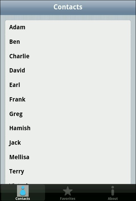
When you load the previous page, you will see that a list of contacts (the contactslist view) is shown and the first tab in the TabStrip widget is selected, as shown in the following screenshot:
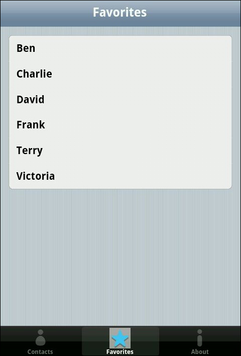
When you select the Favorites tab (<a href=#favorites>Favorites</a>), the selected tab and the view is updated to show a list of contacts marked as Favorites, as shown in the following screenshot:
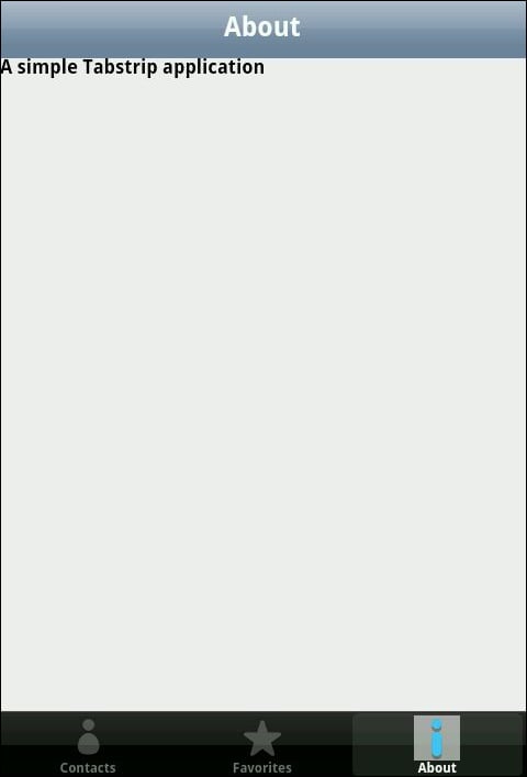
Again, when you select the About tab, the About view is shown.
You can define a JavaScript callback function that is fired when you select a tab in the TabStrip widget. To do that, specify the data-select attribute for the Tabstrip widget as follows:
<div data-role="tabstrip"
  data-select="selectEvent">
  ....
</div>
Now define the JavaScript callback function selectEvent.
function selectEvent () {
  console.log('Select Event');
}
The previous JavaScript callback function will be called whenever the user selects the tab in the TabStrip widget. A callback function can be used to make a call to the analytics server, which will record the user behavior on the screen.