Book Image

Qt5 C++ GUI Programming Cookbook - Second Edition

By : Lee Zhi Eng
Book Image

Qt5 C++ GUI Programming Cookbook - Second Edition

By: Lee Zhi Eng

Overview of this book

With the growing need to develop GUIs for multiple targets and multiple screens, improving the visual quality of your application becomes important so that it stands out from your competitors. With its cross-platform ability and the latest UI paradigms, Qt makes it possible to build intuitive, interactive, and user-friendly user interfaces for your applications. Qt5 C++ GUI Programming Cookbook, Second Edition teaches you how to develop functional and appealing user interfaces using the latest version of QT5 and C++. This book will help you learn a variety of topics such as GUI customization and animation, graphics rendering, implementing Google Maps, and more. You will also be taken through advanced concepts like asynchronous programming, event handling using signals and slots, network programming, various aspects of optimizing your application. By the end of the book, you will be confident to design and customize GUI applications that meet your clients' expectations and have an understanding of best practice solutions for common problems.
Table of Contents (15 chapters)

Creating a login screen using style sheets

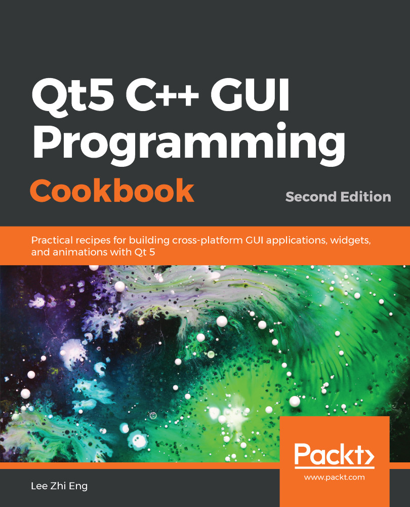
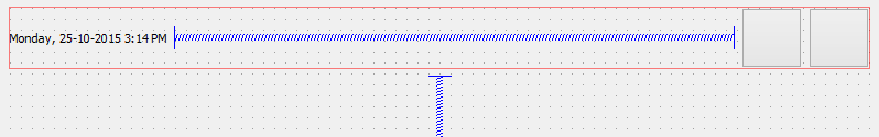
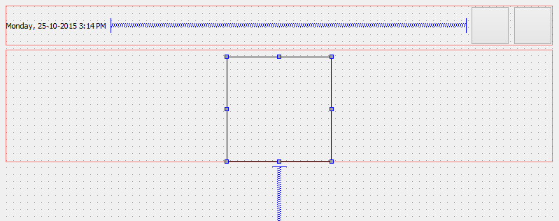
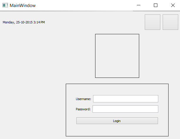
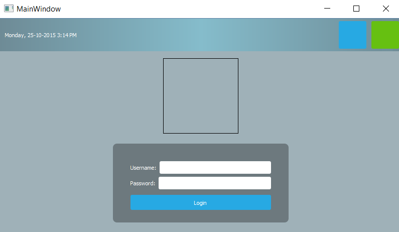
Next, we will learn how to put all the knowledge we've learned in the previous example together and create a fake graphical login screen for an imaginary operating system. Style sheets are not the only thing you need to master in order to design a good UI. You will also need to learn how to arrange the widgets neatly using the layout system in Qt Designer.

How to do it...

Let's get started by following these steps:

  1. We need to design the layout of the graphical login screen before we start doing anything. Planning is very important in order to produce good software. The following is a sample layout design I made to show you how I imagine the login screen will look. Just a simple line drawing like this is sufficient as long as it conveys the message clearly:


  1. Go back to Qt Designer again.
  2. We will be placing the widgets at the top panel first, then the logo and the login form beneath it.
  3. Select the main window and change its width and height from 400 and 300 to 800 and 600, respectively, because we'll need a bigger space in which to place all the widgets.
  4. Click and drag a label under the Display Widgets category from the Widget Box to the form editor.
  5. Change the objectName property of the label to currentDateTime and change its text property to the current date and time just for display purposes, such as Monday, 25-10-2015 3:14 PM.
  6. Click and drag a PushButton under the Buttons category to the form editor. Repeat this process once more because we have two buttons on the top panel. Rename the two buttons restartButton and shutdownButton.
  7. Select the main window and click the small icon button on the form toolbar that says Lay Out Vertically when you mouse over it. You will see the widgets are automatically arranged on the main window, but it's not exactly what we want yet.
  8. Click and drag a Horizontal Layout widget under the Layouts category to the main window.
  1. Click and drag the two push buttons and the text label into the horizontal layout. You will see the three widgets being arranged in a horizontal row, but vertically they are located in the middle of the screen. The horizontal arrangement is almost correct, but the vertical position is totally off.
  2. Click and drag a Vertical Spacer from the Spacers category and place it beneath the Horizontal Layout we created previously in step 9 (under the red rectangular outline). All the widgets are pushed to the top by the spacer.
  3. Place a Horizontal Spacer between the text label and the two buttons to keep them apart. This will ensure the text label always sticks to the left and the buttons align to the right.
  4. Set both the Horizontal Policy and Vertical Policy properties of the two buttons to Fixed and set the minimumSize property to 55 x 55. Set the text property of the buttons to empty, as we will be using icons instead of text. We will learn how to place an icon in the button widgets in the following Using resources in style sheets section.
  5. Your UI should look similar to this:

Next, we will be adding the logo using the following steps:

  1. Add a Horizontal Layout between the top panel and the Vertical Spacer to serve as a container for the logo.
  2. After adding the Horizontal Layout, you will find the layout is way too thin in height (almost zero height) to be able to add any widgets to it. This is because the layout is empty and it's being pushed by the vertical spacer under it into zero height. To solve this problem, we can set its vertical margin (either layoutTopMargin or layoutBottomMargin) to be temporarily bigger until a widget is added to the layout.
  3. Add a Label to the Horizontal Layout that you just created and rename it logo. We will learn more about how to insert an image into the label to use it as a logo in the following Using resources in style sheets section. For now, just empty out the text property and set both its Horizontal Policy and Vertical Policy properties to Fixed. Set the minimumSize property to 150 x 150.
  4. Set the vertical margin of the layout back to zero if you haven't already done so.
  1. The logo now appears to be invisible, so we will just place a temporary style sheet to make it visible until we add an image to it in the following Using resources in style sheets section. The style sheet is really simple:
border: 1px solid;
  1. Your UI should look similar to this:

Now, let's create the login form using the following steps:

  1. Add a Horizontal Layout between the logo's layout and the Vertical Spacer. Set the layoutTopMargin property to a large number (that is, 100), so that you can add a widget to it more easily.
  2. Add a Vertical Layout inside the Horizontal Layout you just created. This layout will be used as a container for the login form. Set its layoutTopMargin to a number lower than that of the horizontal layout (that is, 20) so that we can place widgets in it.
  3. Right-click the Vertical Layout you just created and choose Morph into | QWidget. The Vertical Layout is being converted into an empty widget. This step is essential because we will be adjusting the width and height of the container for the login form. A layout widget does not contain any properties for width and height, but only margins, due to the fact that a layout will expand toward the empty space surrounding it, which makes sense, considering that it does not have any size properties. After you have converted the layout to a QWidget object, it will automatically inherit all the properties from the widget class, and so we are now able to adjust its size to suit our needs.
  1. Rename the QWidget object, which we just converted from the layout, to loginForm and change both its Horizontal Policy and Vertical Policy properties to Fixed. Set the minimumSize parameter to 350 x 200.
  2. Since we already placed the loginForm widget inside the Horizontal Layout, we can now set its layoutTopMargin property back to zero.
  3. Add the same style sheet as for the logo to the loginForm widget to make it visible temporarily, except this time we need to add an ID selector in front, so that it will only apply the style to loginForm and not its children widgets:
#loginForm { border: 1px solid; }
  1. Your UI should look something like this:

We are not done with the login form yet. Now that we have created the container for the login form, it's time to put more widgets into the form:

  1. Place two horizontal layouts into the login form container. We need two layouts: one for the username field and another for the password field.
  2. Add a Label and a Line Edit to each of the layouts you just added. Change the text property of the upper label to Username: and the one beneath to Password:. Rename the two line edits to username and password, respectively.
  3. Add a push button beneath the password layout and change its text property to Login. Rename it to loginButton.
  4. You can add a Vertical Spacer between the password layout and the Login button to distance them slightly. After the Vertical Spacer has been placed, change its sizeType property to Fixed and change the Height to 5.
  5. Select the loginForm container and set all its margins to 35. This is to make the login form look better by adding some space to all its sides.
  6. Set the Height property of the Username, Password, and loginButton widgets to 25 so that they don't look so cramped.
  7. Your UI should look something like this:


We're not done yet! As you can see, the login form and the logo are both sticking to the top of the main window due to the Vertical Spacer beneath them. The logo and the login form should be placed at the center of the main window instead of the top. To fix this problem, use the following steps:

  1. Add another Vertical Spacer between the top panel and the logo's layout, which will counter the spacer at the bottom that balances out the alignment.
  2. If you think that the logo is sticking too close to the login form, you can add a Vertical Spacer between the logo's layout and the login form's layout. Set its sizeType property to Fixed and the Height property to 10.
  3. Right-click the top panel's layout and choose Morph into | QWidget. Rename it topPanel. The layout has to be converted into QWidget because we cannot apply style sheets to a layout, as it doesn't have any properties other than margins.
  4. There is a little bit of a margin around the edges of the main window—we don't want that. To remove the margins, select the centralWidget object from the Object Inspector window, which is right under the MainWindow panel, and set all the margin values to zero.
  5. Run the project by clicking the Run button (with the green arrow icon) to see what your program looks like. If everything went well, you should see something like this:
  1. Let's decorate the UI using style sheets! Since all the important widgets have been given an object name, it's easier for us to apply the style sheets to it from the main window, since we will only write the style sheets to the main window and let them inherit down the hierarchy tree.
  2. Right-click on MainWindow from the Object Inspector window and choose Change styleSheet....
  3. Add the following code to the style sheet:
#centralWidget { background: rgba(32, 80, 96, 100); }
  1. The background of the main window changes its color. We will learn how to use an image for the background in the following Using resources in style sheets section. So the color is just temporary.
  2. In Qt, if you want to apply styles to the main window itself, you must apply them to its centralWidget, instead of the main window because the window is just a container.
  3. Add a nice gradient color to the top panel:
#topPanel { 
background-color: qlineargradient(spread:reflect, x1:0.5, y1:0, x2:0, y2:0, stop:0 rgba(91, 204, 233, 100), stop:1 rgba(32, 80, 96, 100));
}
  1. Apply the black color to the login form and make it look semi-transparent. We will also make the corners of the login form container slightly rounded by setting the border-radius property:
#loginForm { 
background: rgba(0, 0, 0, 80);
border-radius: 8px;
}
  1. Apply styles to the general types of widgets:
QLabel { color: white; }
QLineEdit { border-radius: 3px; }
  1. The preceding style sheets will change all the labels' texts to a white color, which includes the text on the widgets as well because, internally, Qt uses the same type of label on the widgets that have text on them. Also, we made the corners of the line edit widgets slightly rounded.
  1. Apply style sheets to all the push buttons on our UI:
QPushButton {
color: white;
background-color: #27a9e3;
border-width: 0px;
border-radius: 3px;
}
  1. The preceding style sheet changes the text of all the buttons to a white color, then sets its background color to blue, and makes its corners slightly rounded as well.
  2. To push things even further, we will make it so that the color of the push buttons changes when we mouse over it, using the hover keyword:
QPushButton:hover { background-color: #66c011; }
  1. The preceding style sheet will change the background color of the push buttons to green when we mouse over them. We will talk more about this in the following Customizing properties and sub-controls section.
  2. You can further adjust the size and margins of the widgets to make them look even better. Remember to remove the border line of the login form by removing the style sheet that we applied directly to it earlier in step 6.
  3. Your login screen should look something like this:

How it works...

This example focuses more on the layout system of Qt. Qt's layout system allows our application GUI to automatically arrange itself within the given space by arranging the children objects of each widget. The spacer items used in the preceding example help to push the widgets contained in a layout outward to create spacing along the width of the spacer item.

To locate a widget to the middle of the layout, put two spacer items to the layout: one on the left side of the widget and one on the right side of the widget. The widget will then be pushed to the middle of the layout by the two spacers.