
Qt Meta Language or Qt Modeling Language (QML) is a JavaScript-inspired user interface markup language used by Qt to design user interfaces. Qt provides you with Qt Quick Components (widgets powered by the QML technology) to easily design touch-friendly UI without C++ programming. We will learn more about how to use QML and Qt Quick Components to design our program's UI by following the steps given in the following section.
Styling in Qt Modeling Language (QML)
How to do it...
Let's follow these steps to learn about styling in QML:
- Create a new project by going to File | New File or Project. Select Application under the Projects category and choose Qt Quick Application - Empty.
- Press the Choose... button, which will bring you to the next window. Insert a name for your project and click the Next button again.
- Another window will appear and ask you to choose the minimum Qt version required. Pick the latest version installed on your computer and click Next.
- Click Next again, followed by Finish. Qt Creator will now create a new project for you.
- There are some differences between a QML project and a C++ Qt project. You will see a main.qml file inside the project resource. This .qml file is the UI description file written using the QML mark-up language. If you double-click the main.qml file, Qt Creator will open up the script editor and you will see something like this:
import QtQuick 2.5
import QtQuick.Window 2.2
Window {
    visible: true
    width: 640
    height: 480
    title: qsTr("Hello World")
}
- This file tells Qt to create an empty window with 640 x 480 resolution and a window title that says Hello World.
- If you open up the main.cpp file in your project, you will see this line of code:
QQmlApplicationEngine engine;
engine.load(QUrl(QStringLiteral("qrc:/main.qml")));
- The preceding code tells Qt's QML engine to load the main.qml file when the program starts. If you want to load the other .qml file, you know where to look for the code.
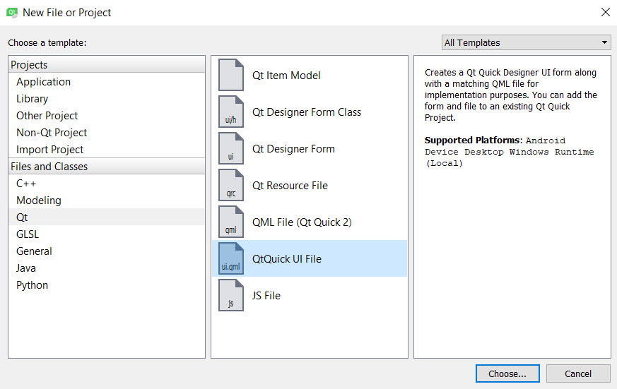
- If you build the project now, all you get is an empty window. To add in UI elements, let's first create a QtQuick UI File by going to File | New File or Project and selecting QtQuick UI File under the Files and Classes | Qt category:
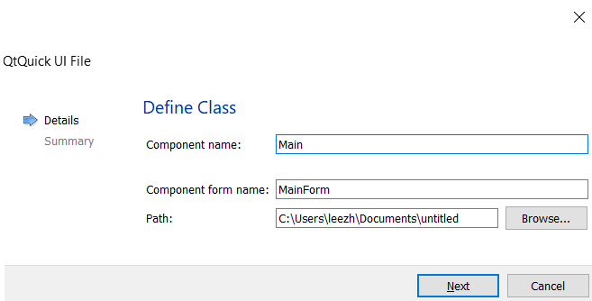
- Enter the component name as Main, followed by the component form name as MainForm. Click Next, followed by Finish:
- A new file called MainForm.ui.qml has been added to your project resources. Try to open the MainForm.ui.qml file by double-clicking on it, if it hasn't been automatically opened by Qt Designer (UI editor) upon creation. You will see a completely different UI editor compared to the C++ project we did in all previous recipes. This editor is also called the Qt Quick Designer; it is specially designed for editing QML-based UIs only.
- When main.qml is loaded by the QML engine, it will also import MainForm.ui.qml into the UI, since MainForm is being called in the main.qml file. Qt will check whether MainForm is a valid UI by searching for its .qml file based on the naming convention. The concept is similar to the C++ project we did in all our previous recipes; the main.qml file acts like the main.cpp file and MainForm.ui.qml acts like the MainWindow class. You can also create other UI templates and use them in main.qml. Hopefully, this comparison will make it easier to understand how QML works.
- Open up MainForm.ui.qml. You should see only one item listed on the Navigator window: Item. The Item item is basically the base layout of the window, which shouldn't be deleted. It is similar to the centralWidget we used in the previous section.
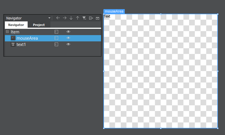
- The canvas is really empty at the moment, let's drag a Mouse Area and Text items, to the canvas from the QML Types panel on the left. Resize the Mouse Area to fill the entire canvas. Also, make sure that both Mouse Area and Text items are being placed under the Item item in the Navigator panel, as in the following screenshot:
- The Mouse Area item is an invincible item that gets triggered when the mouse is clicking on it, or when a finger is touching it (for mobile platforms). The Mouse Area item is also used in a button component, which we will be using in a while. The Text item is self-explanatory: it is a label that displays a block of text on the application.
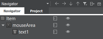
- On the Navigator window, we can hide or show an item by clicking on the icon, beside the item, that resembles an eye. When an item is hidden, it will not show on the canvas nor the compiled application. Just like the widgets in a C++ Qt project, Qt Quick Components are arranged in a hierarchy based on the parent-child relationship. All the child items will be placed under the parent item with an indented position. In our case, you can see the Mouse Area and Text items are positioned slightly to the right compared to the Item item, because they are both the children of the Item item. We can rearrange the parent-child relationship, as well as their position in the hierarchy, by using a click-and-drag method from the Navigator window. You can try clicking on the Text item and dragging it on top of the mouse area. You will then see that the Text item changes its position and is now located beneath the mouse area with a wider indentation:
- We can rearrange them by using the arrow buttons located on top of the Navigator window, as shown in the preceding screenshot. Anything that happens to the parent item will also affect all its children, such as moving the parent item, and hiding and showing the parent item.
You can pan around the canvas view by holding the middle mouse button (or mouse scroll) while moving your mouse around. You can also zoom in and out by scrolling your mouse while holding the Ctrl key on your keyboard. By default, scrolling your mouse will move the canvas view up and down. However, if your mouse cursor is on top of the horizontal scroll bar of the canvas, scrolling the mouse will move the view to the left and right.
- Delete both the Mouse Area and Text items as we will be learning how to create a user interface from scratch using QML and Qt Quick.
- Set the Item item's size to 800 x 600, as we're going to need a bigger space for the widgets.
- Copy the images we used in the previous C++ project, the Using resources in style sheets recipe, over to the QML project's folder, because we are going recreate the same login screen, with QML.
- Add the images to the resource file so that we can use them for our UI.
- Open up Qt Quick Designer and switch to the Resources window. Click and drag the background image directly to the canvas. Switch over to the Layout tab on the Properties pane and click the fill anchor button, indicated here by a red circle. This will make the background image always stick to the window size:
- Click and drag a Rectangle component from the Library window to the canvas. We will use this as the top panel for our program.
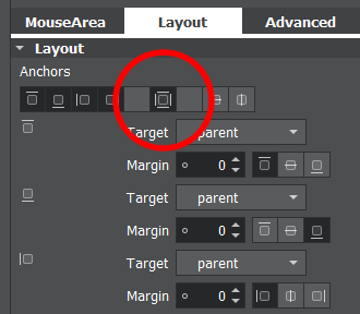
- For the top panel, enable the top anchor, left anchor, and right anchor so that the panel sticks to the top of the window and follows its width. Make sure all the margins are set to zero.
- Go to the Color property of the top panel and select the Gradient mode. Set the first color to #805bcce9 and the second color to #80000000. This will create a half-transparent panel with a blue gradient.
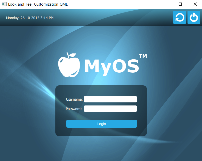
- Add a Text widget to the canvas and make it a child of the top panel. Set its text property to the current date and time (for example, Monday, 26-10-2015 3:14 PM) for display purposes. Then, set the text color to white.
- Switch over to the Layout tab and enable top anchor and left anchor so that the text widget will always stick to the top-left corner of the screen.
- Add a Mouse Area to the screen and set its size to 50 x 50. Then, make it a child of the top panel by dragging it on top of the top panel in the Navigator window.
- Set the color of the mouse area to blue (#27a9e3) and set its radius to 2 to make its corners slightly rounded. Enable the top anchor and right anchor to make it stick to the top-right corner of the window. Set the top anchor's margin to 8 and the right anchor's margin to 10 to create some space.
- Open up the Resources window and drag the shutdown icon to the canvas. Make it a child of the Mouse Area item we created a moment ago. Then, enable the fill anchor to make it fit the size of the mouse area.
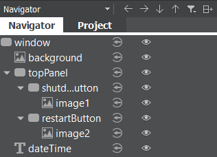
- Phew, that's a lot of steps! Now your items should be arranged as follows on the navigator window:
- The parent-child relationship and the layout anchors are both very important to keep the widgets in the correct positions when the main window changes its size. Your top panel should look something like this:

- Let's work on the login form. Add a new Rectangle to the canvas by dragging it from the Library window. Resize the rectangle to 360 x 200 and set its radius to 15.
- Set its color to #80000000, which will change it to black with 50% transparency.
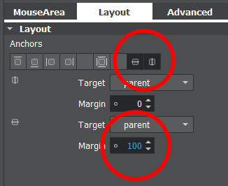
- Enable the vertical center anchor and the horizontal center anchor to make the rectangle always align to the center of the window. Then, set the margin of the vertical center anchor to 100 so that it moves slightly lower to the bottom, so that we have the space to place the logo. The following screenshot illustrates the settings of the Anchors:
- Add the text objects to the canvas. Make them children of the login form (Rectangle widget) and set their text property to Username: and Password:. Change their text color to white and position them accordingly. We don't need to set a margin this time because they will follow the rectangle's position.
- Add two text input objects to the canvas and place them next to the text widgets we just created. Make sure the text input are also the children of the login form. Since the text input don't contain any background color property, we need to add two rectangles to the canvas to use as their background.
- Add two rectangles to the canvas and make each of them a child of one of the text input we just created. Set the radius property to 5 to give them some rounded corners. After that, enable fill anchors on both of the rectangles so that they will follow the size of the text input widgets.
- Let's create the login button beneath the password field. Add a mouse area to the canvas and make it a child of the login form. Resize it to your preferred dimension and move it into place.
- Since the mouse area does not contain any background color property, we need to add a Rectangle widget and make it a child of the mouse area. Set the color of the rectangle to blue (#27a9e3) and enable the fill anchor so that it fits nicely with the mouse area.
- Add a text object to the canvas and make it a child of the login button. Change its text color to white and set its text property to Login. Finally, enable the horizontal center anchor and the vertical center anchor to align it to the center of the button.
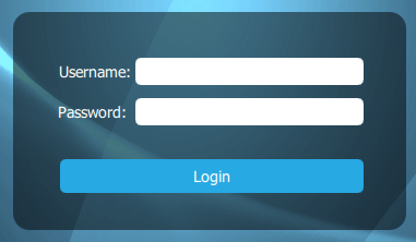
- You will now get a login form that looks pretty similar to the one we made in the C++ project:
- It's time to add the logo, which is actually very simple. Open up the Resources window and drag the logo image to the canvas.
- Make it a child of the login form and set its size to 512 x 200.
- Position it on top of the login form and you're done.
- This is what the entire UI looks like when compiled. We have successfully recreated the login screen from the C++ project, but this time we did it with QML and Qt Quick:
How it works...
Qt Quick editor uses a very different approach for placing widgets in the application compared to the form editor. The user can decide which method is best suited to their purposes. The following screenshot shows what the Qt Quick Designer looks like:
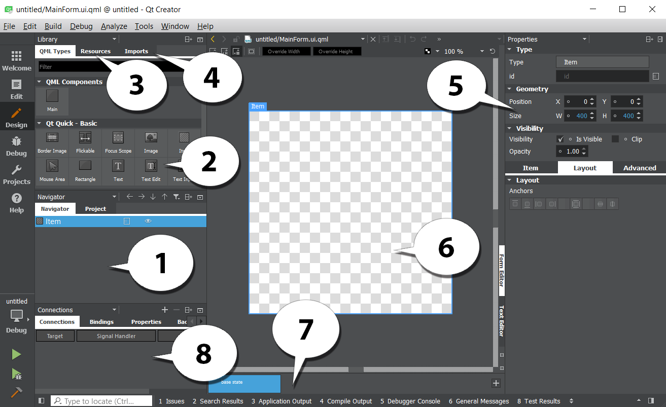
We will now look at the various elements of the editor's UI:
- Navigator: The Navigator window displays the items in the current QML file as a tree structure. It's similar to the object operator window in the other Qt Designer we used in the previous Using style sheets with Qt Designer section.
- Library: The Library window displays all the Qt Quick Components or Qt Quick Controls available in QML. You can click and drag it to the canvas window to add to your UI. You can also create your own custom QML components and display it here.
- Resources: The Resources window displays all the resources in a list that can then be used in your UI design.
- Imports: The Imports window allows you to import different QML modules into your current QML file, such as a Bluetooth module, a WebKit module, or a positioning module, to add additional functionality to your QML project.
- Properties pane: Similar to the Property Editor we used in previous recipe, the Properties pane in QML Designer displays the properties of the selected item. You can also change the properties of the items in the code editor.
- anvas: The canvas is the working area where you create QML components and design applications.
- tate pane: The State pane displays the different states in the QML project, describing UI configurations, such as the UI controls, their properties and behavior, and the available actions.
- onnections: This panel is where you set the signal handlers for each QML component in your canvas, which empowers the signals and slots mechanism provided by Qt.